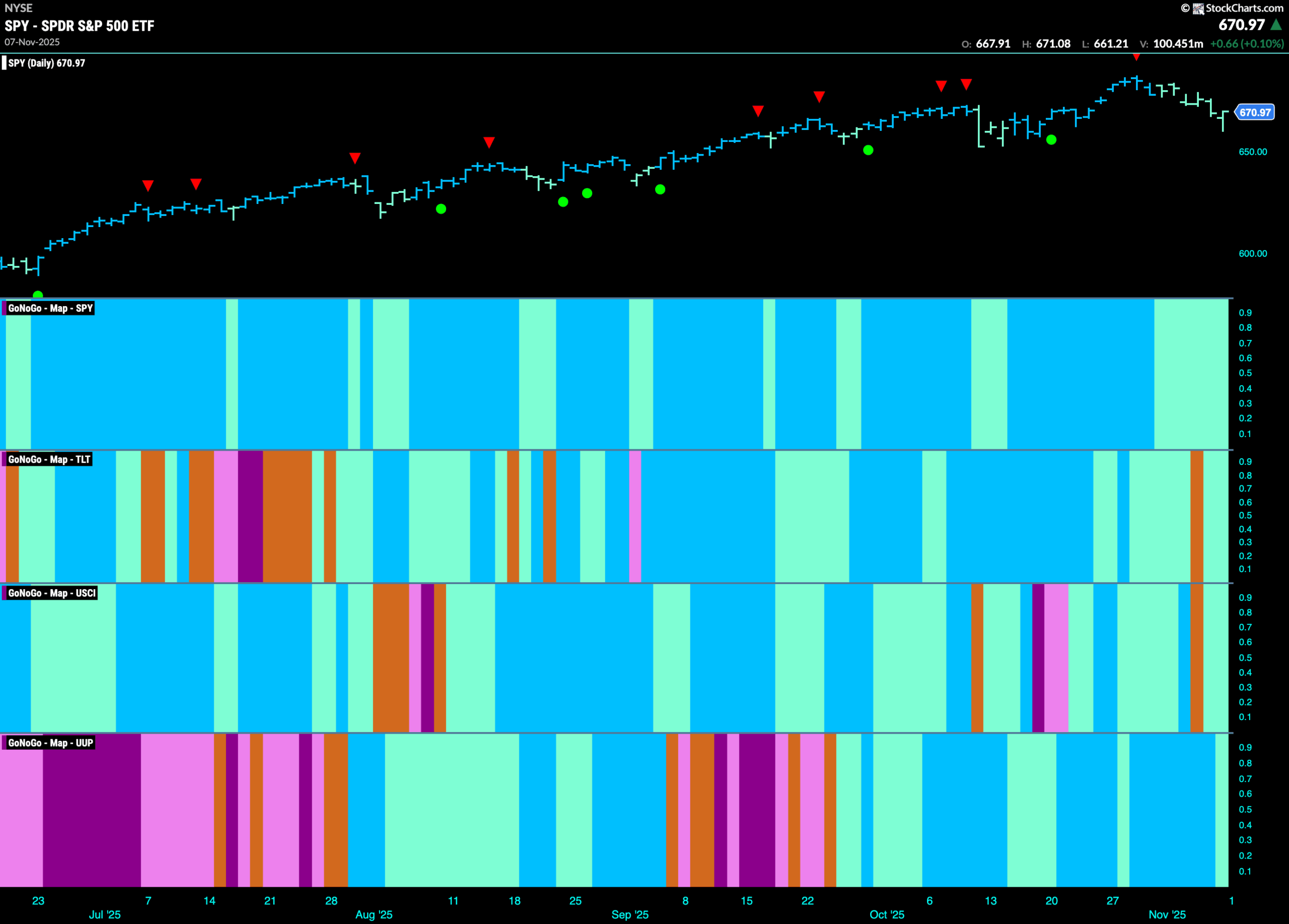
Good morning and welcome to this week’s Flight Path. The equity trend hung on this week. After last week’s Go Countertrend Correction Icon (red arrow) we have seen a string of weaker aqua bars as price has fallen from the high. Treasury bond prices have also experienced weakness over the last two weeks and we even saw an amber “Go Fish” bar last week. The same can be said for U.S. commodities as market uncertainty triggered an amber “Go Fish” bar last week amid weaker aqua “Go” bars. The dollar is also still in a “Go” trend but on the final bar of the week succumbed to weakness as well.
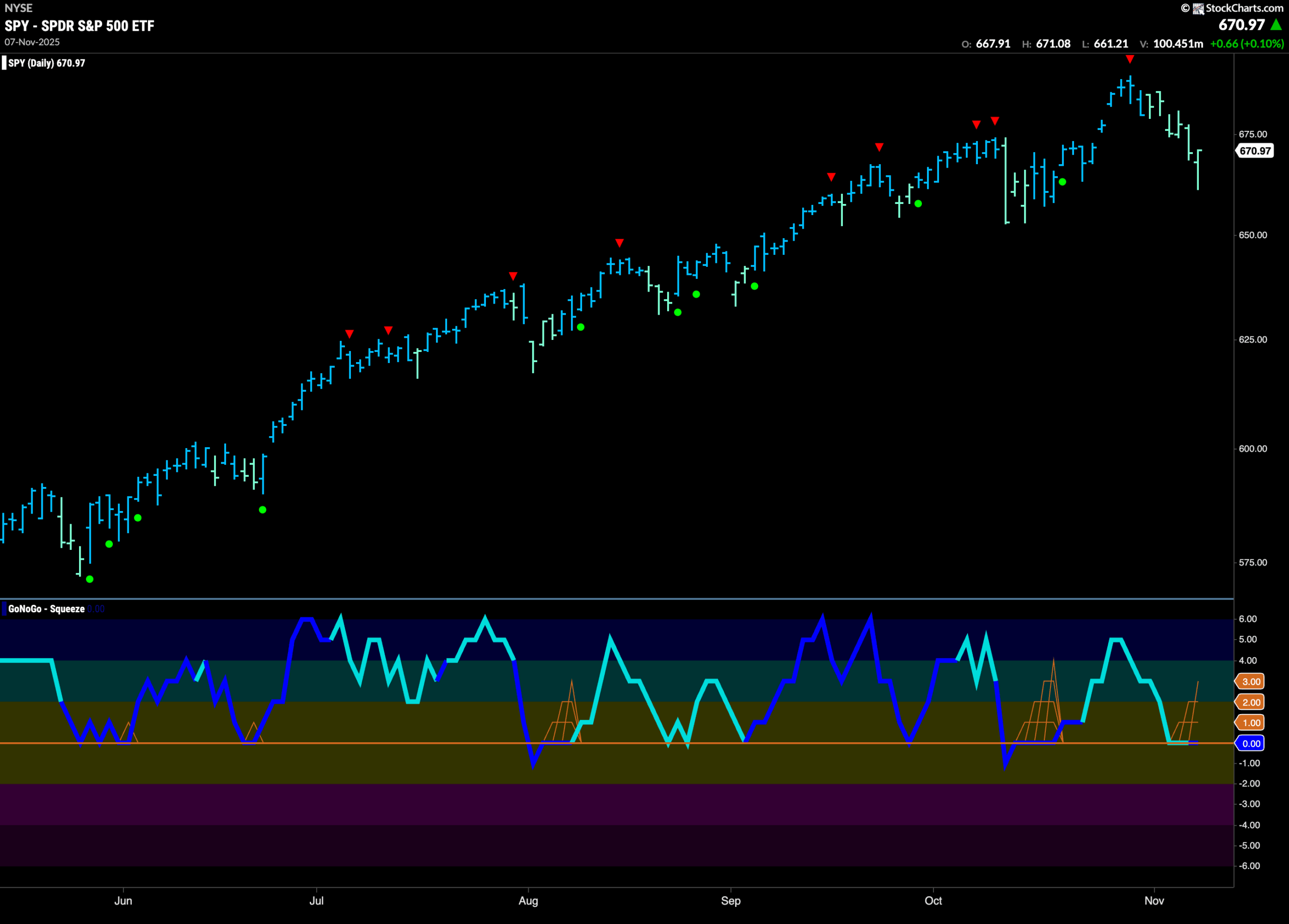
$SPY Displays Weakness after High
The GoNoGo chart below shows that the “Go” trend continued this week but we saw a string of weaker aqua bars the entire week. This came after price hit another higher high and we saw a Go Countertrend Correction Icon (red arrow). This told us that momentum was waning after the high. If we look at the oscillator panel we see that it has fallen to test the zero line from above. It will be important to note whether it is able to find support at that level. For price to remain in trend it would be ideal if momentum was to stay at or above zero.
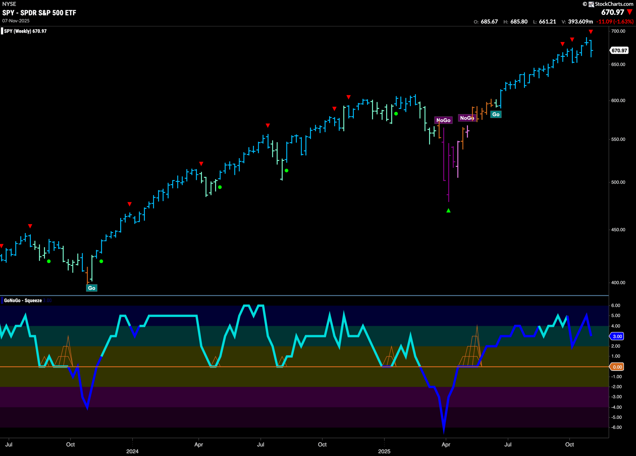
The weekly chart shows another strong blue “Go” bar but the close was lower this week. We also see another Go Countertrend Correction Icon (red arrow). This comes on waning momentum as GoNoGo Oscillator falls out of overbought territory to a value of 3. Volume, as we can see, remains heavy.
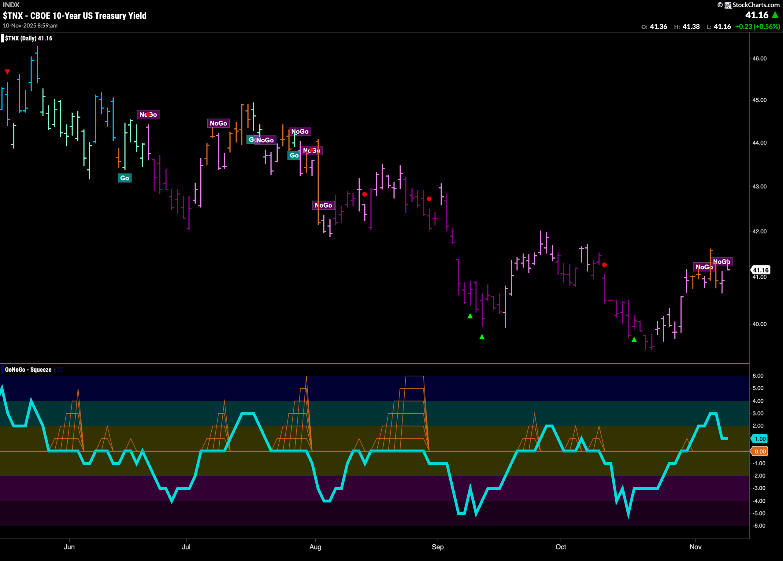
Treasury Rates Remain in Weak “NoGo”
GoNoGo Trend paints a couple of weak pink “NoGo” bars after a few uncertain amber “Go Fish” bars last week. Rates rallied from the lows a few weeks ago but has not yet set a higher high. We will watch the oscillator panel closely. GoNoGo Oscillator is in positive territory however it has fallen to a value of 1. If the oscillator cannot remain in positive territory then we would expect the “NoGo” in rates to continue. If it finds support at zero, then we may see trend change in the panel above.
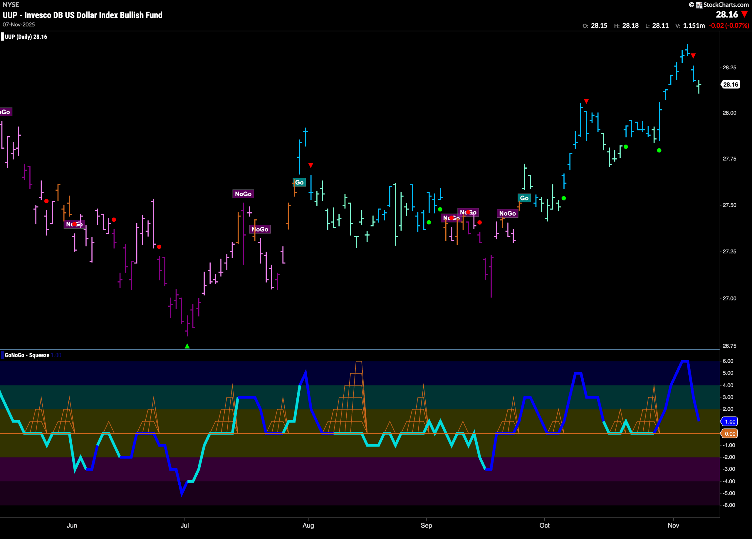
Dollar Sees Price Fall After Higher High
The chart below shows that the dollar remains in a “Go” trend. The greenback made a new higher high last week on strong blue bars. We then saw a Go Countertrend Correction Icon (red arrow) telling us that momentum has waned. Indeed, we now see a weaker aqua bar. GoNoGo Oscillator is fast approaching the zero line on heavy volume. It will be important to note whether or not the oscillator finds support at that level.
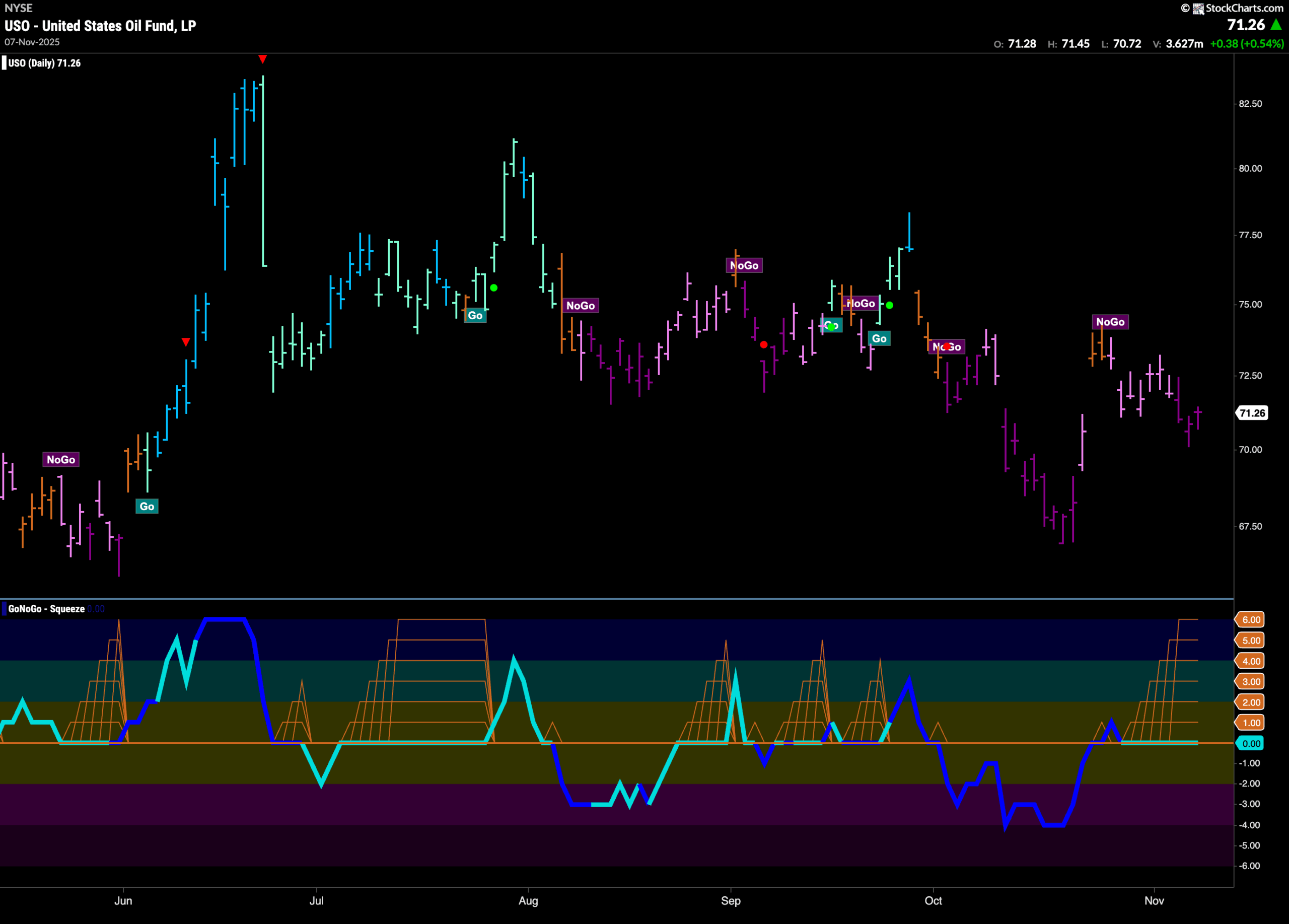
Oil Sees the “NoGo” Strengthen
GoNoGo Trend shows that the “NoGo” trend remained and in fact strengthened this past week as we see a return to purple bars. GoNoGo Oscillator is in an extended Max GoNoGo Squeeze and so the direction of the break will be paramount. Should the oscillator break out of the GoNoGo Squeeze into negative territory then that would indicate resurgent momentum in the direction of the “NoGo” trend and we could expect price to continue lower.
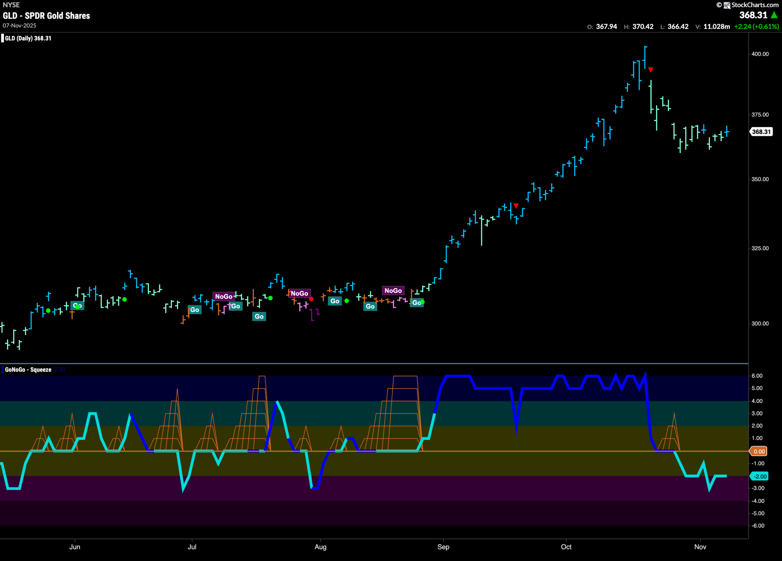
Gold Tries to Find its Feet
The chart below shows that the trend remains a “Go” and we saw a couple of strong blue “Go” bars sprinkled in last week to break the run of weaker aqua color. Price seems to have found some natural support however we turn our eye to the GoNoGo Oscillator panel and we see that it remains in negative territory having broken below zero over a week ago. For the “Go” trend to continue in earnest we will need to see the oscillator regain positive territory.
Sector RelMap
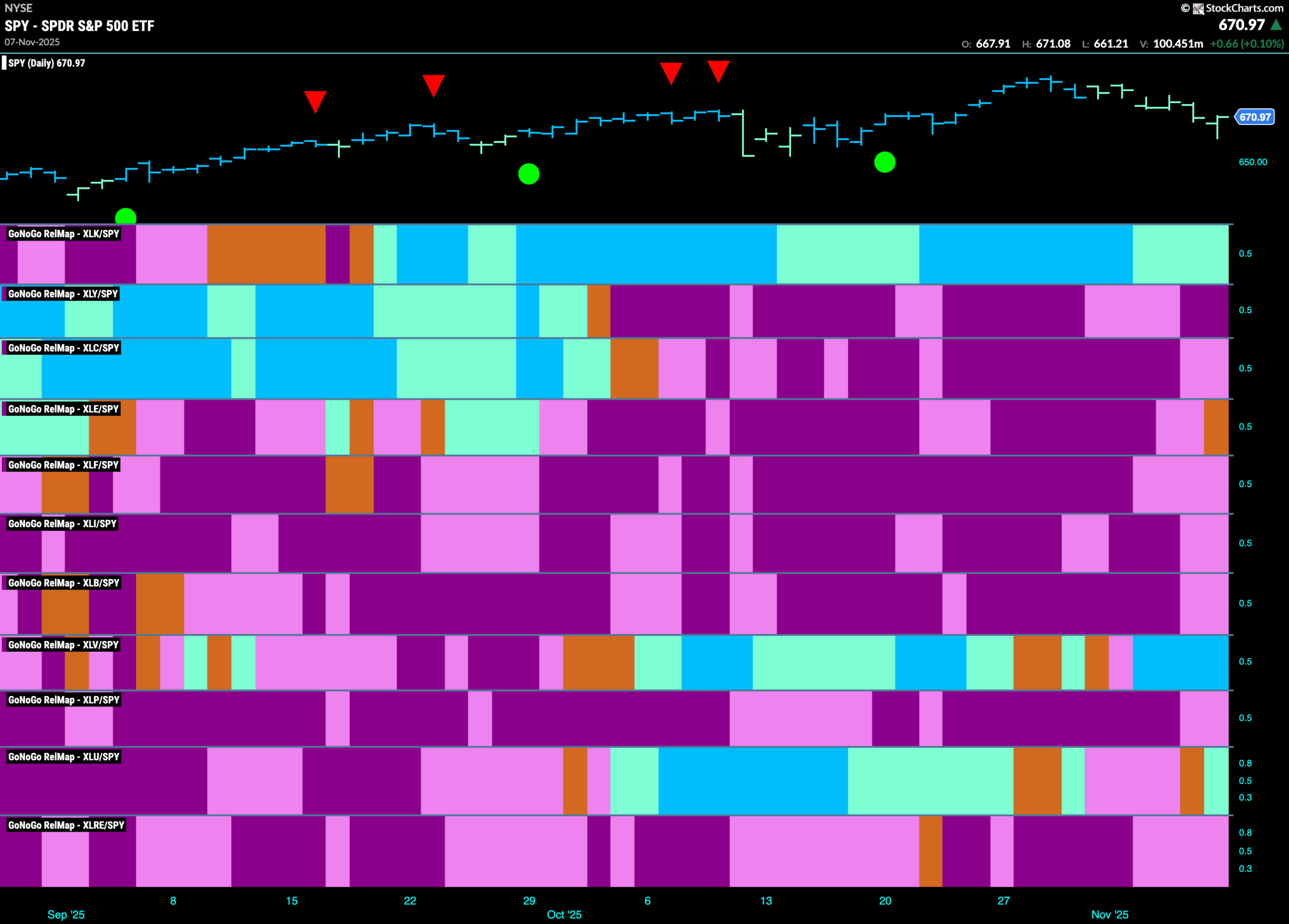
Below is the GoNoGo Sector RelMap. This GoNoGo RelMap applies the GoNoGo Trend to the relative strength ratios of the sectors to the base index. With this view we can get a sense of the relative out performance and relative underperformance of the sectors. 3 sectors are in relative “Go” trends. $XLK, $XLV, and $XLU are painting relative “Go” bars.
Healthcare Sub-Group RelMap
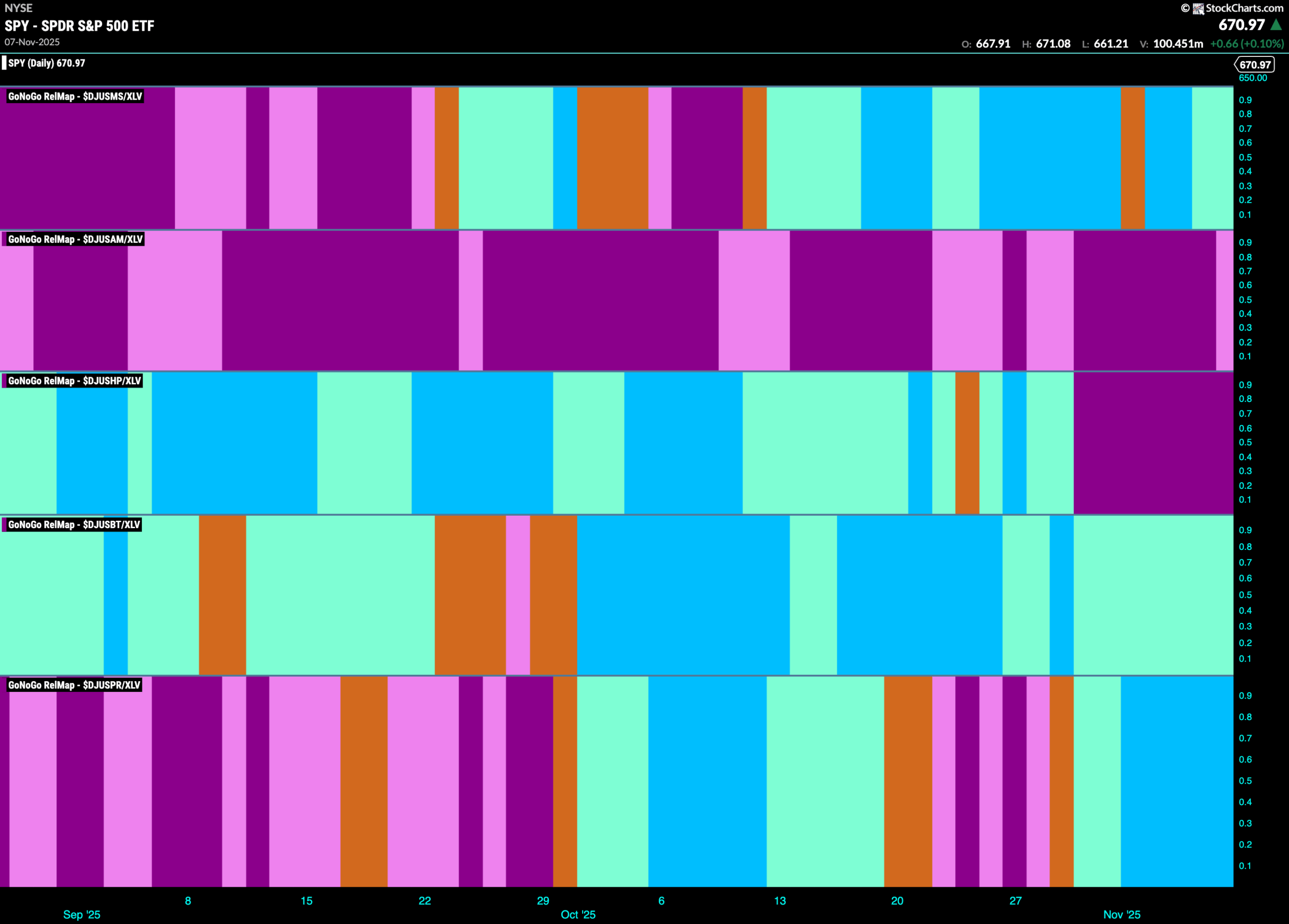
The chart below shows a relative trend breakdown of the sub groups within the healthcare sector this week. The Sub-Group RelMap plots the GoNoGo Trend of each sub index to the $XLV. We saw in the above GoNoGo Sector RelMap that $XLV is an out-performing sector and paints strong relative “Go” bars. When we look at the below RelMap we can see that the pharmaceuticals index in the lower panel is painting strong blue “Go” bars on a relative basis.
$PYXS Looks to Consolidate New Highs
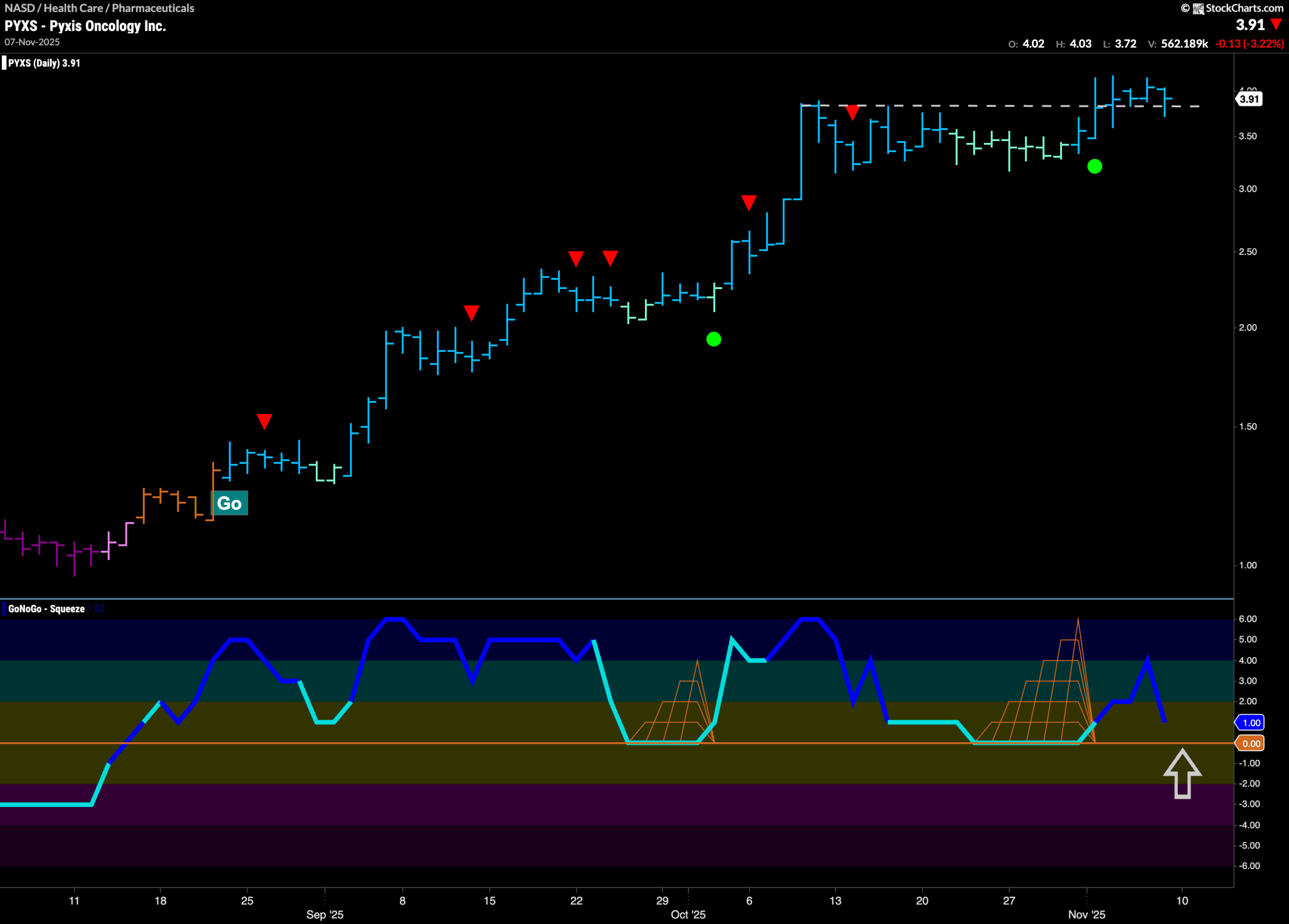
GoNoGo Trend shows that price has been in a “Go” trend since mid August and we have seen a series of higher highs and higher lows as GoNoGo Oscillator has been at or above zero the entire time, confirming the trend. After the last high, we saw a Go Countertrend Correction Icon (red arrow) and price moved mostly sideways following. GoNoGo Trend painted weakness with a string of aqua bars. During this period, we saw GoNoGo Oscillator fall to the zero line and a virtual tug of war played out at this level as we saw a Max GoNoGo Squeeze. The Squeeze was broken to the upside and on heavy volume, allowing price to climb above resistance. We will look for price to use this level as support going forward before potentially climbing higher.
$RZLT Breaks to New High
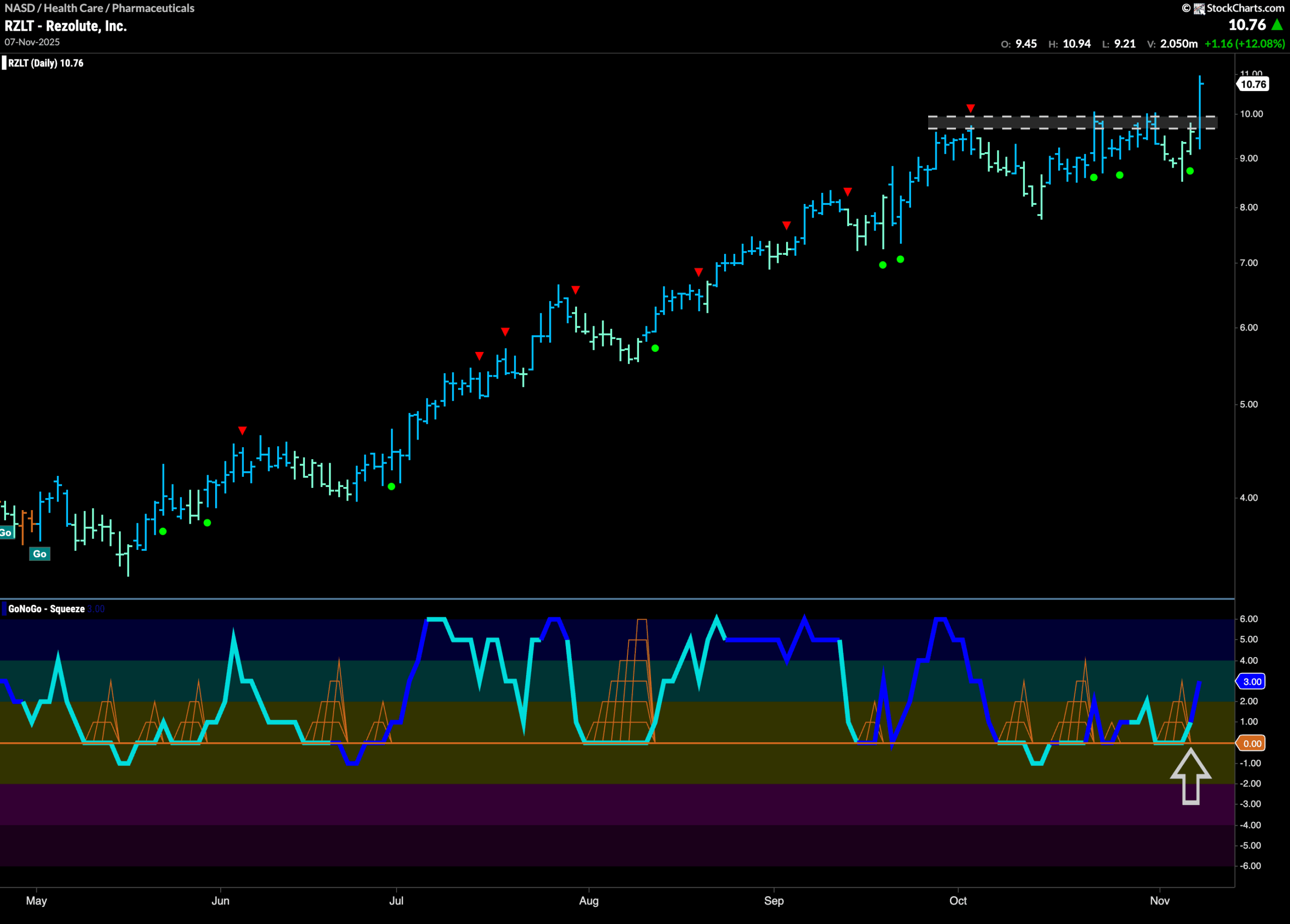
The chart below shows that $RZLT is in a very strong “Go” trend. Since May, we have seen a series of higher highs and higher lows as price has climbed to almost $11. During the trend, GoNoGo Oscillator has been primarily at or above the zero line confirming the trend and providing support. Most recently, GoNoGo Oscillator bounced off zero again, and we saw another Go Trend Continuation Icon (green circle) indicating resurgent momentum in the direction of the “Go” trend. Price has burst to a new high above resistance and we will look for price to use these prior highs as support going forward.