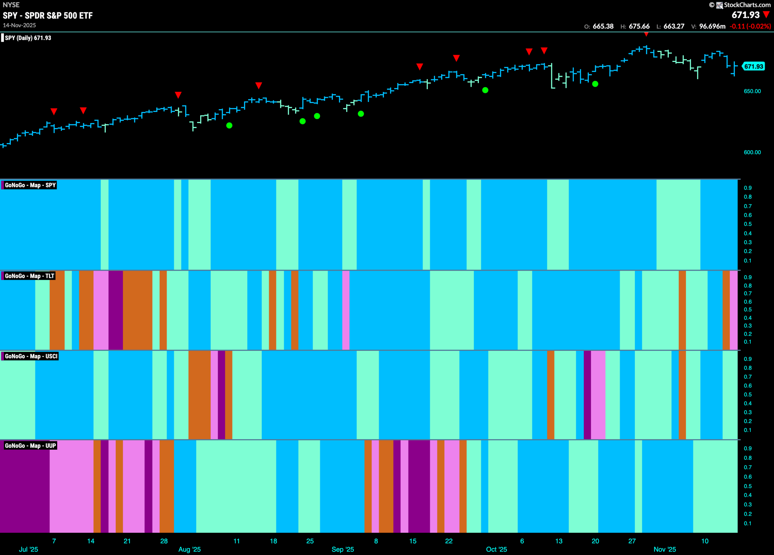
Good morning and welcome to this week’s Flight Path. The equity trend continues for another week and although price failed to hit another higher high we see that GoNoGo Trend painted strong blue “Go” bars. Treasury bond prices fell into a “NoGo” after having painted an amber “Go Fish” bar. U.S. commodities saw the “Go” trend survive but we do see weakness as the indicator paints paler aqua bars. Likewise, the dollar painted an entire week of “Go” bars but they were weaker aqua.
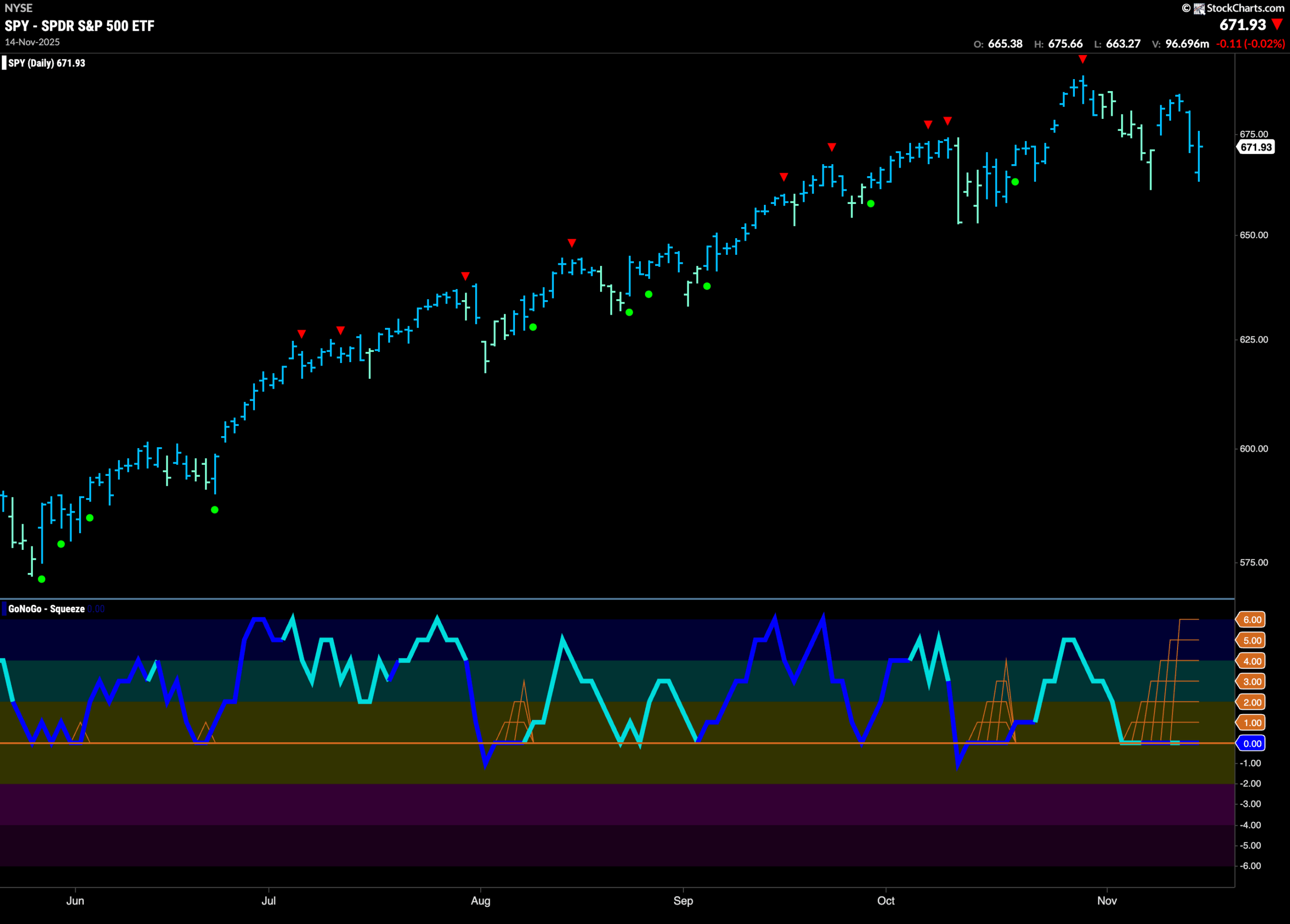
$SPY Looks For Support in “Go” Trend
The GoNoGo chart below shows that the “Go” trend continued this week as the indicator painted bright blue “Go” bars. This is even as price failed to make a higher high. We see that price is trying to find natural support at last week’s prior low. If we look at the lower panel we can see that GoNoGo Oscillator has fallen to test the zero line from above and has remained at that level for several bars. We see a Max GoNoGo Squeeze reflecting a virtual tug of war between buyers and sellers at this level. We will watch for the all important break of the Squeeze.
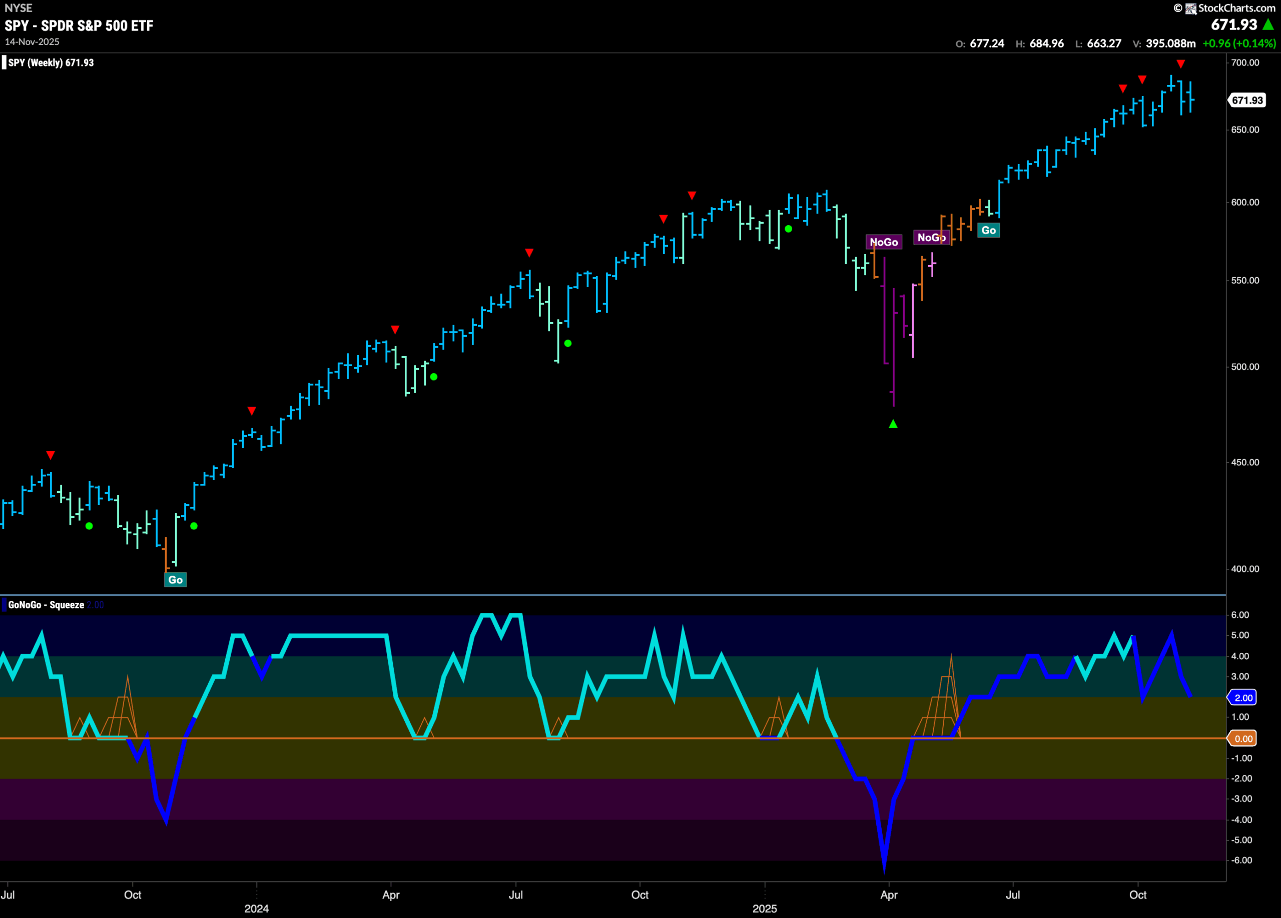
The weekly chart shows another strong blue “Go” bar this week as price tries to consolidate at the high levels we have seen for several weeks. We did see a Go Countertrend Correction Icon (red arrow) after the top indicating that price may struggle to go higher in the short term. GoNoGo Oscillator is in positive territory but no longer overbought at a value of of 2 and volume is heavy. We would want to see the oscillator at or above zero for the “Go” trend to continue.
Treasury Rates See a New “Go” Bar
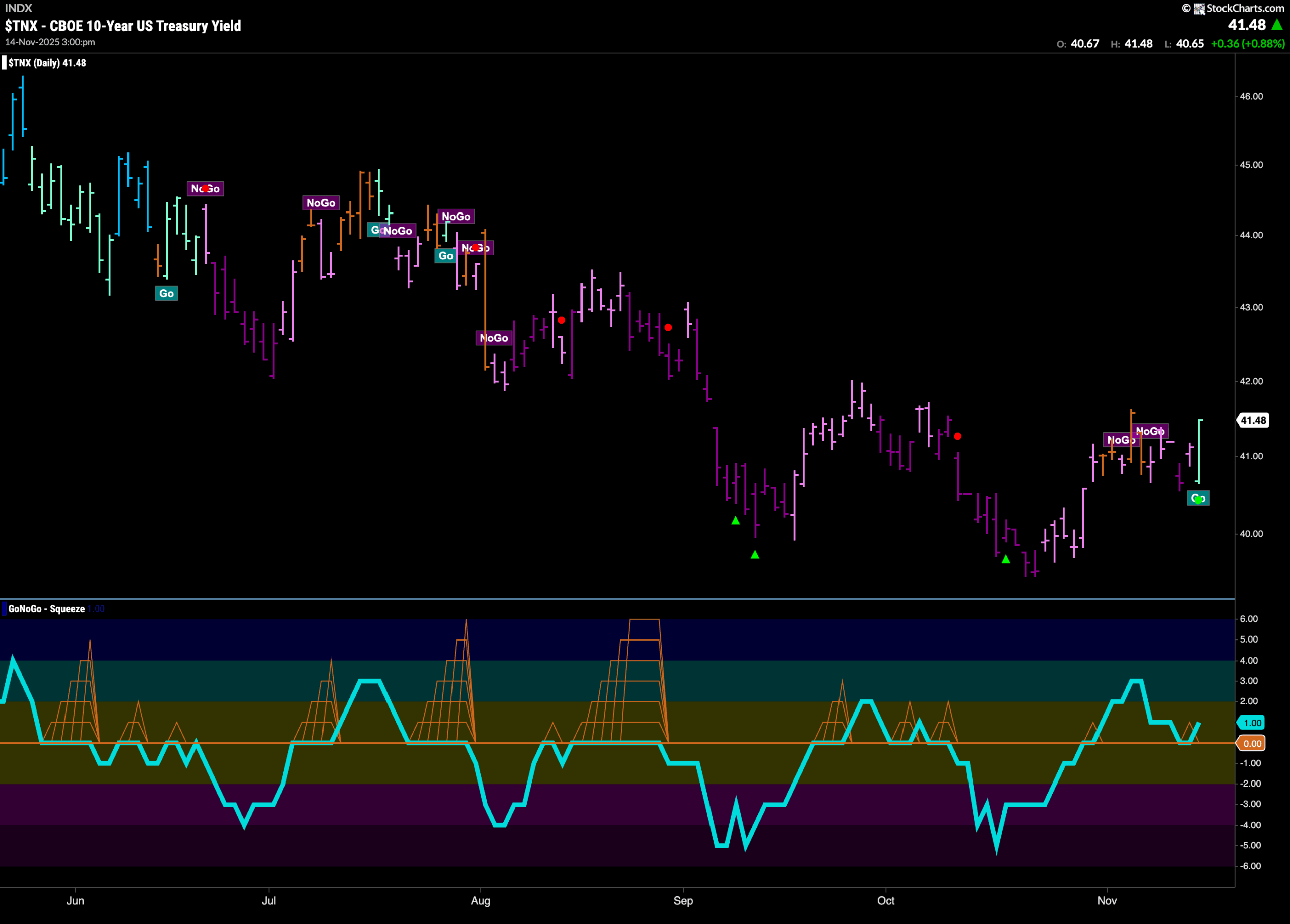
GoNoGo Trend paints a fresh “Go” bar this week after we saw rates rally off the last low. Several amber “Go Fish” bars and weaker pink bars in the last couple of weeks hinted at the weakening trend and ultimately the trend change on the last bar. This comes after GoNoGo Oscillator broke above zero and then found support at that level. Now, we know that momentum is inline with the new “Go” trend. We will look to see if rates can climb to a new high.
Dollar Looks for Support in “Go” Trend
The chart below shows that the dollar remains in a “Go” trend. After the recent high, we saw a Go Countertrend Correction Icon (red arrow) indicating that price may struggle to go higher in the short term. Indeed, we have seen a string of weaker aqua bars as price has fallen. If we look at the lower panel, we can see that GoNoGo Oscillator has fallen to test the zero line from above and has got stuck at that level causing the beginnings of a GoNoGo Squeeze. We will watch to see if the oscillator can find support and bounce back into positive territory.
Oil Remains in “NoGo” Territory
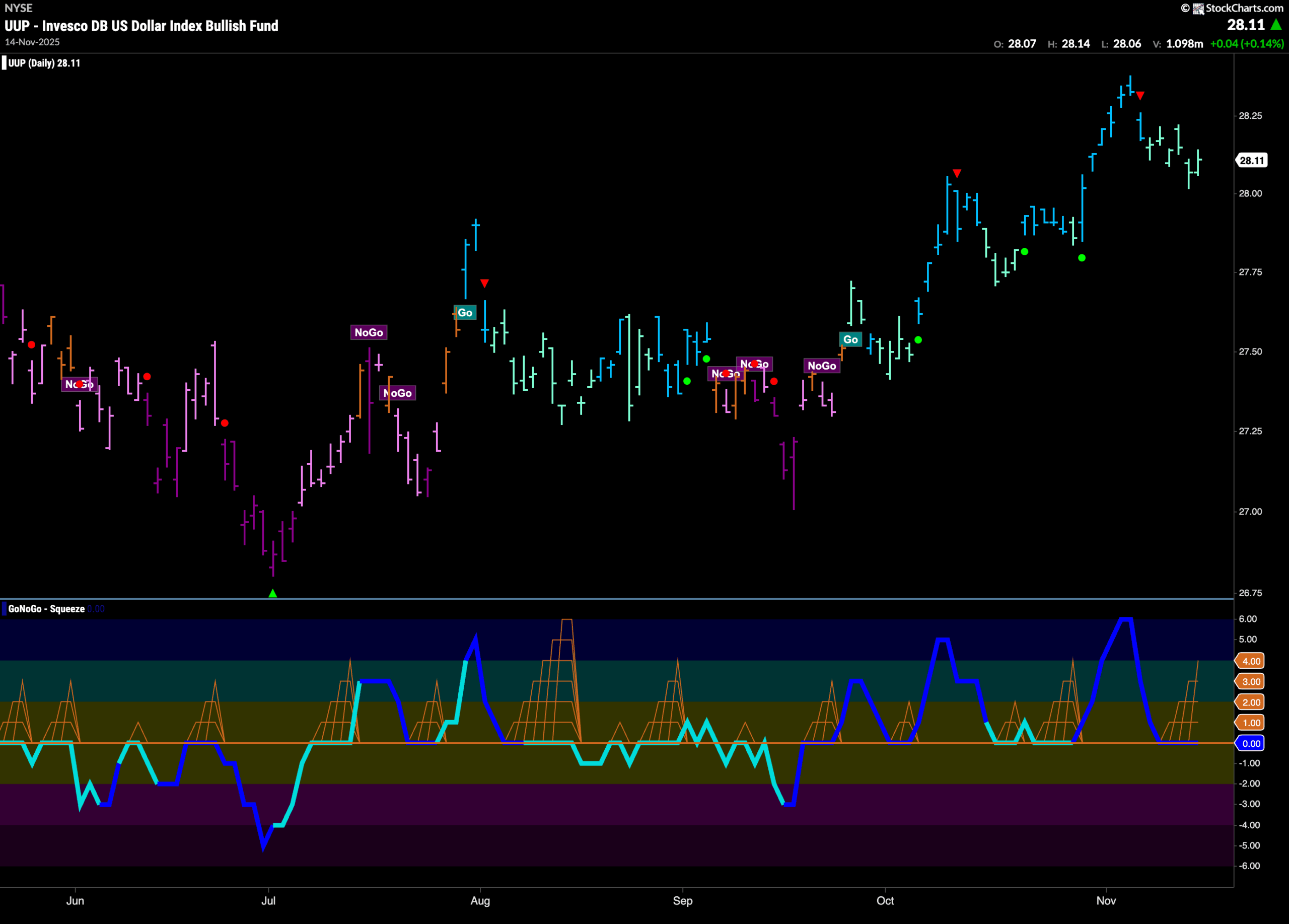
GoNoGo Trend shows that the “NoGo” trend stuck around last week even after an amber “Go Fish” bar hinted at uncertainty. The indicator is now painting strong purple bars once again. If we look at the oscillator panel we see that GoNoGo Oscillator has broken out of an extended Max GoNoGo Squeeze into negative territory. This has confirmed the “NoGo” trend and we could see further downside price action this week.
Gold Paints a Week of Bright Blue “Go” Bars
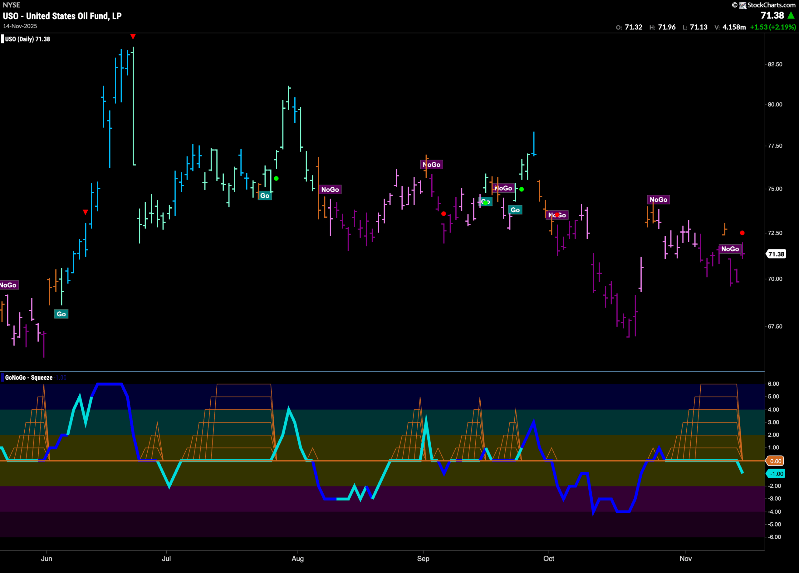
The chart below shows that it was a better week for gold. Price gapped higher and then we saw several strong blue “Go” bars. The last bar of the week showed more struggles but price recovered to close higher at the end of the session. GoNoGo Oscillator also broke back into positive territory last week and is now at a value of 1. This tells us that momentum is back in line with the “Go” trend offering support.
Sector RelMap
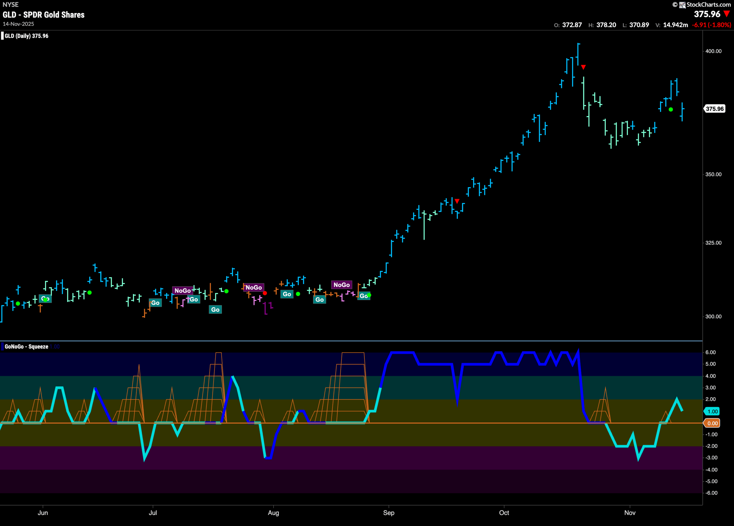
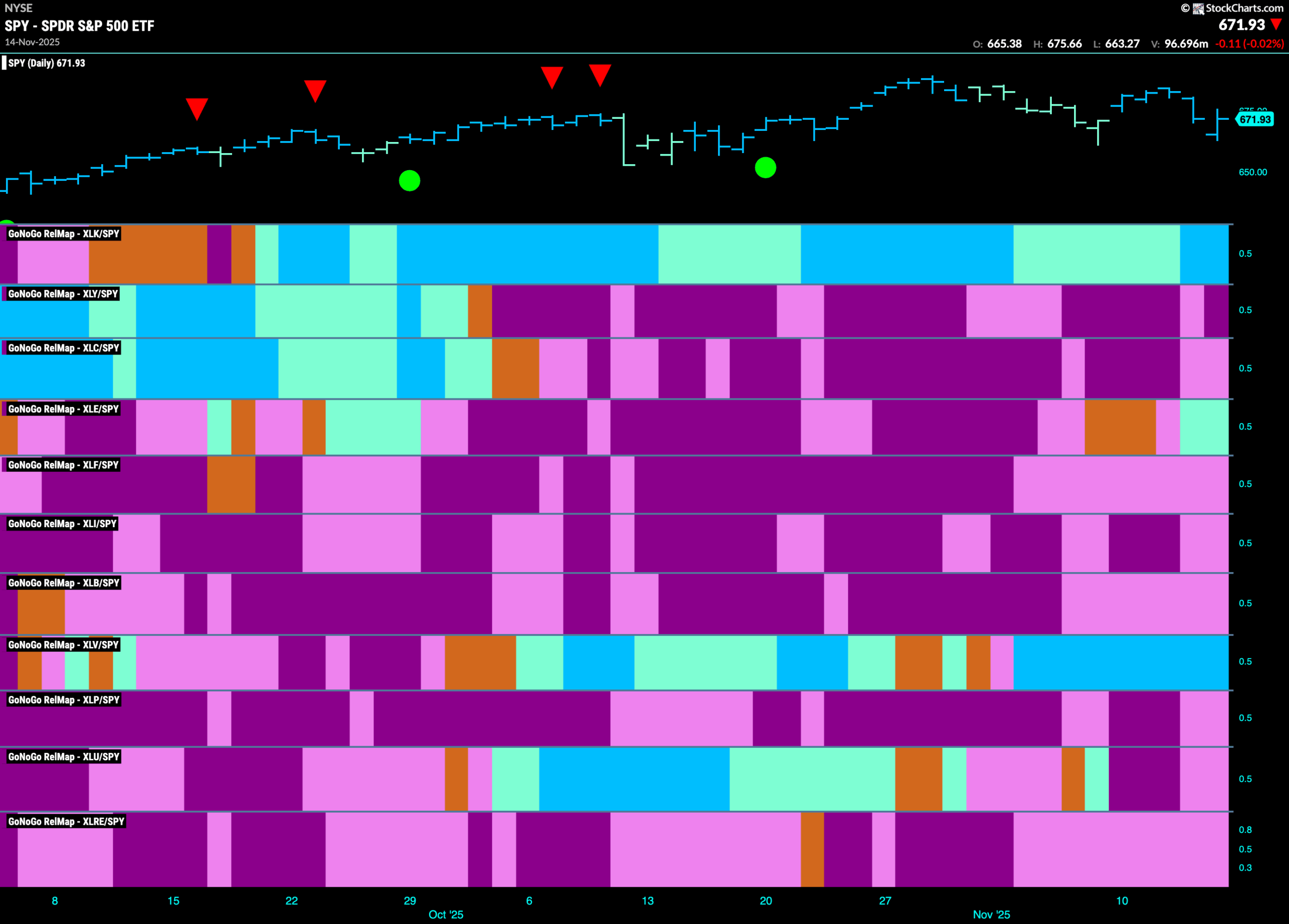
Below is the GoNoGo Sector RelMap. This GoNoGo RelMap applies the GoNoGo Trend to the relative strength ratios of the sectors to the base index. With this view we can get a sense of the relative out performance and relative underperformance of the sectors. 3 sectors are in relative “Go” trends. $XLK, $XLE, and $XLV are painting relative “Go” bars.
Technology Sub-Group RelMap
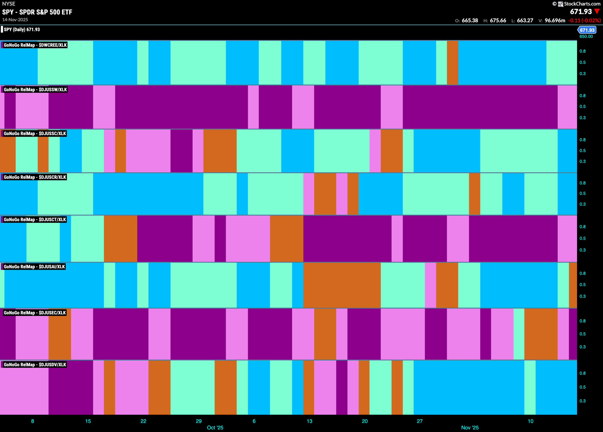
The chart below shows a relative trend breakdown of the sub groups within the technology sector this week. The Sub-Group RelMap plots the GoNoGo Trend of each sub index to the $XLK. We saw in the above GoNoGo Sector RelMap that $XLK is the longest out-performing sector and paints strong relative “Go” bars. When we look at the below RelMap we can see that the computer services index in the lower panel is painting strong blue “Go” bars on a relative basis.
$IBM Looks for Support in “Go” Trend
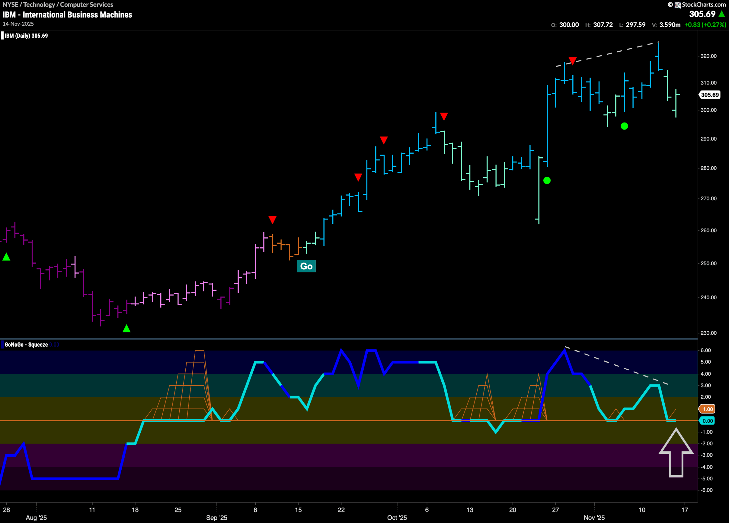
GoNoGo Trend shows that price has been in a “Go” trend since September and we have seen a series of higher highs and higher lows. We see momentum divergence as price looks for support. Price has made a new higher high but GoNoGo Oscillator in the lower panel has made a lower high. Now, with GoNoGo Trend painting weaker aqua bars having fallen from the high we see GoNoGo Oscillator is testing the zero line from above. If the oscillator finds support and regains positive territory then that might give price the boost it needs to remain in the “Go” trend and make an attempt at another higher high. If the oscillator should fall into negative territory then that would threaten the “Go” trend.
$WYY Struggling to Stay in “Go” Trend
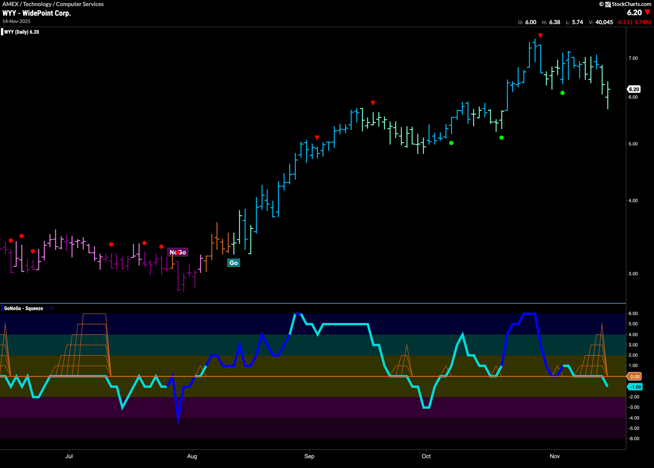
The chart below shows that $WYY has been in a “Go” trend since August and we have seen a series of higher highs and higher lows. Most recently we saw a Go Countertrend Correction Icon (red arrow) at the last high indicating that price may struggle to go higher in the short term. Indeed, since then, price has fallen and we have seen GoNoGo Trend sprinkle in a mix of weaker aqua bars. GoNoGo Oscillator fell to and settled at the zero line but we see it now dipping its nose into negative territory. With momentum out of step with the “Go” trend we may see price continue to struggle.