
Risk on investing is the prevailing theme for the week beginning Feb 15th. Stocks, Commodities, and Cryptos are in “Go” trends. Nasdaq breadth is setting records for net new highs. This is a bull market. We hope you enjoyed the market holiday (in the US) yesterday.
While GoNoGo Research and every analyst on Wall St. have expressed concerns over the strength of the dollar, there are signs of economic improvement coming from the 10-2 year yield spread in the bond market. A steepening of the yield curve is often an additional tailwind for stocks. For investors focused on capturing alpha and maximizing returns, the equity markets are a primary focus for allocations right now. But how many investors are allocating globally? Are all countries performing at the same rate? Which countries have the best market returns right now? Compare and contrast global equity indices using GoNoGo Charts in this week’s Flight Path.

The GoNoGo Heat Map® above shows us the daily trend performance of five asset classes: Equities, Bonds, Commodities, Currencies, and Digital Assets from the US perspective. The takeaway remains the same as it has been for several weeks. Equities, commodities, and the cryptocurrency markets are now in established “Go” trends.
Panel 1 – Stocks continue to paint strong blue “Go” bars as the trend persists. The $SPY ETF seeks to provide investment results that correspond generally to the price and yield performance of the S&P.
Panel 2 – Government bonds, continue to paint “NoGo” bars, as investors seek yield elsewhere. $IEF tracks a market-value-weighted index of debt issued by the US Treasury with 7-10 years to maturity remaining.
Panel 3 – Commodities are a “Go,” painting the strongest blue bars last week. $USCI tracks an equal-weighted index of 14 commodity futures contracts and holds at least one precious metal, industrial metal, energy, livestock, soft, and grain commodity.
Panel 4 – The US Dollar is trying to remain in the “Go” trend that it has been looking to establish over the last few weeks. $DXY is an index of the value of the United States Dollar relative to a basket of foreign currencies.
Panel 5 – Bitcoin’s “Go” trend continues with strength this week as it climbs ever higher on strong blue bars.
Derailed by the Dollar?
If there is any inkling of struggle ahead for stocks it is the efforts of the dollar to climb into a “Go” trend that causes concern. Dollar strength would make it more difficult for the risk assets such as equities and commodities to continue higher.
The chart below shows that after identifying a “Go” trend a few weeks ago the dollar has struggled to surge higher and after painting amber bars is now testing the zero line on the GoNoGo Oscillator®. It will have to find support here or we can expect the mighty greenback to fall out of the “Go” trend back into bearish price action.

Treasury Tailwind
A rising spread between the 10 and 2 year US Treasury notes is historically a good thing for stocks. As we look at the GoNoGo Chart below we can see that the “Go” trend is very strong, consistently making higher highs and higher lows. The GoNoGo Oscillator has also found support at the zero line throughout the move, as it should when a trend is strong. Currently, GoNoGo Oscillator is in positive territory and not yet overbought after rallying from close to zero once again.

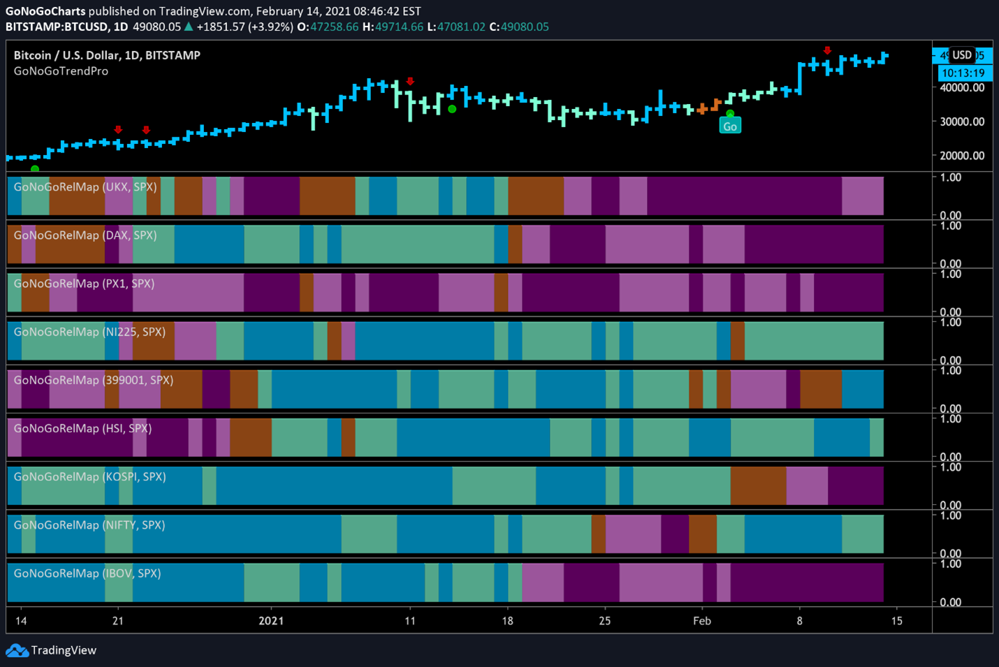
Global Equity Relative Strength
A GoNoGo RelMap® below shows worldwide indices and their relative GoNoGo Trends to the S&P 500. The map applies the GoNoGo Trend® indicator, a composite of technical conditions, to the relative strength ratio of each index to the U.S. benchmark. What we can see is that several emerging market indices are outperforming.
Europe is clearly underperforming, as the “NoGo” purple indicates the bearish relative performance in the UKX, DAX and CAC40 (top three panels). The blue “Go” trends show outperformance in the Nikkei (panel 4), the SZSE (panel 5), Hang Seng (panel 6) and Nifty 50 (panel 8).

Nikkei 225
The daily chart below shows the GoNoGo Trend® of the Japanese Nikkei 225 index and we can see that the trend is clearly a “Go”. Most recently, we saw another low-risk entry icon (green circle) as GoNoGo Oscillator bounced off the zero line 5 bars ago. Price in due course has made another higher high.

Shenzhen Index
While not as smooth of an uptrend, we can see that the Shenzhen component index has moved sharply higher at the beginning of 2021 after consolidating for a couple of months prior. After the sharp rise in early January, price has consolidated sideways again for much of the year albeit with more volatile price swings. More encouragingly, however, price has broken to a new high as GoNoGo Oscillator found support at the zero line.

Hang Seng
A similar chart for the Hang Seng shows a strong “Go” trend is in place with less price volatility. This trend has been supported by the GoNoGo Oscillator. After a relatively strong price correction, the GoNoGo Oscillator crashed to the zero line, where it needed to find support if the trend was to stay strong. That is exactly what happened, with the penultimate price bar on the chart finding itself sitting on top of a low-risk trend continuation icon (green circle). This bodes well for price as it tries to set a new high.

India’s Nifty 50
After a hiccup a few weeks ago, GoNoGo Trend painted a lone amber “Go Fish” bar which signals a lack of trend direction. Since then, the Nifty has rallied sharply and is painting a new high on strong “Go” bars with the GoNoGo Oscillator in positive territory. The “Go” trend seems to be back in place for the Indian equity index.

Single Stock Trend: Tencent Holdings
Given the resounding strength of the emerging markets as demonstrated above, it makes sense to look at the GoNoGo Charts of the two largest stocks in the emerging markets ETF, $EEM. Both technology stocks, they are also enjoying the resurgence of large-cap technology, an outperforming sector itself as we have shown in recent newsletters.
Let’s turn to the chart of Tencent holdings first. The GoNoGo chart looks strong of late. Price has powered out of a sideways correction and rallied sharply. As price corrected in the middle of the chart it was enough to push the GoNoGo Trend to paint “NoGo” bars. As we’d expect, the break back into a “Go” trend was preceded by the GoNoGo Oscillator breaking the resistance of the zero line and into positive territory. This rally was on heavy volume (dark blue coloring of the oscillator) which showed strong market participation confirming the price move.
Now, after a small pullback that saw the GoNoGo Oscillator rally off zero, price is trying to break above the prior high. The GoNoGo Oscillator is positive but not overbought, suggesting there may be room to run.

Alibaba
Alibaba has not seen the same strength as other massive Chinese tech companies. A relatively strong “NoGo” correction took price lower through the beginning of the year. We needed to see the GoNoGo Oscillator break above zero for $BABA to turn around.
As price painted a few amber “Go Fish” bars, GoNoGo Oscillator broke out to positive territory. This was the impetus needed for price to re-establish the “Go” trend. Price has rallied sharply since, and $BABA is now testing the prior high. GoNoGo Oscillator has rallied off the zero line and is not positive but not yet overbought.