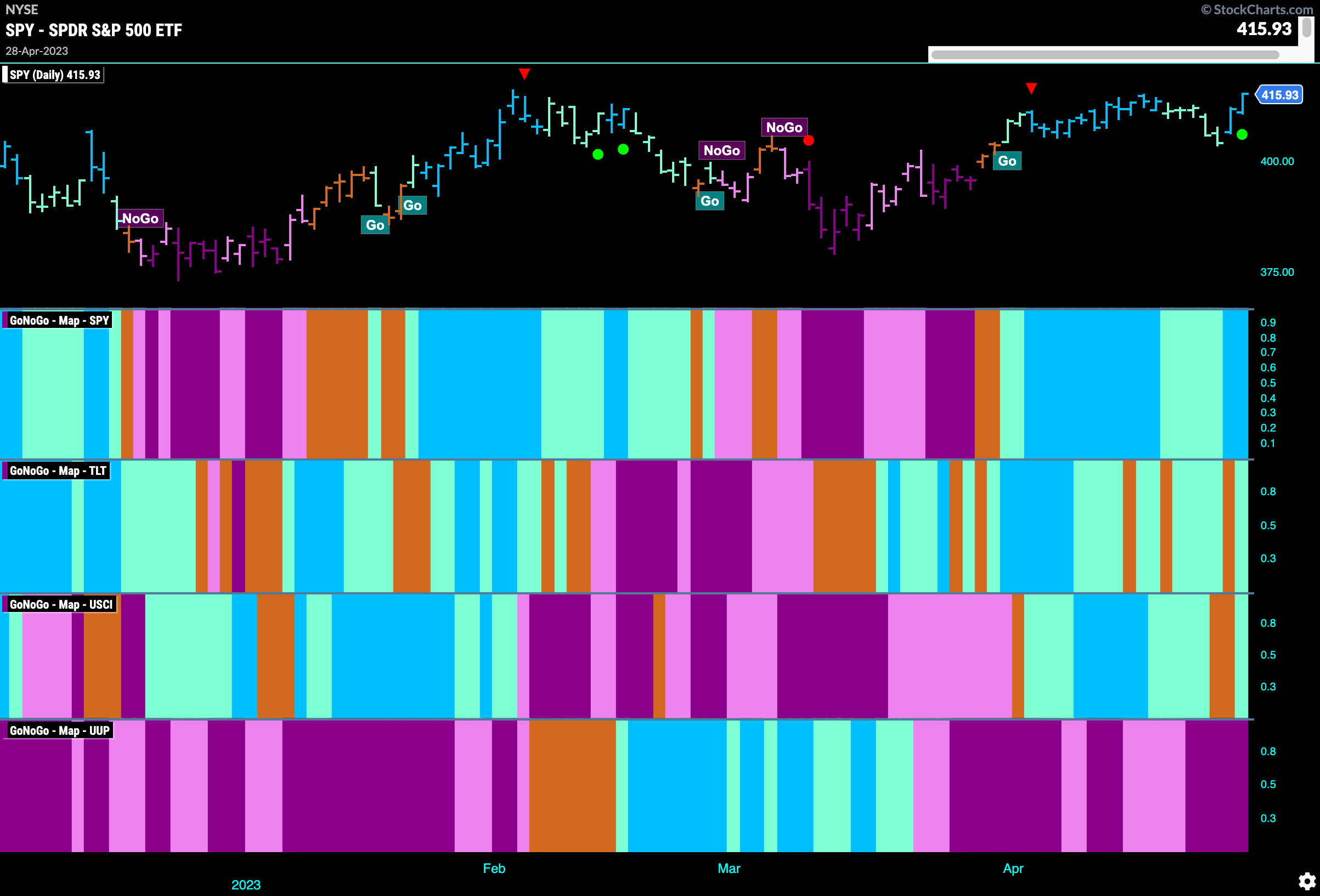
Good morning and welcome to this week’s Flight Path. What a week last week as we celebrated the 50th anniversary of the CMT association! It was fascinating to talk to and hear from the best of the best in our industry. With buoyed spirits, let’s take a look at the GoNoGo Asset map below. In what seemed like a joyous celebration of technical analysis the market ended with two banner days as we gathered in New York! This meant GoNoGo Trend returned to paint strong blue “Go” bars for U.S. equities. Treasury bond prices also managed to hang on to aqua bars as the week closed. After a little uncertainty, GoNoGo Trend was able to paint an aqua “Go” bar for the last session of the commodities trading week. The dollar, remains in its “NoGo” trend.
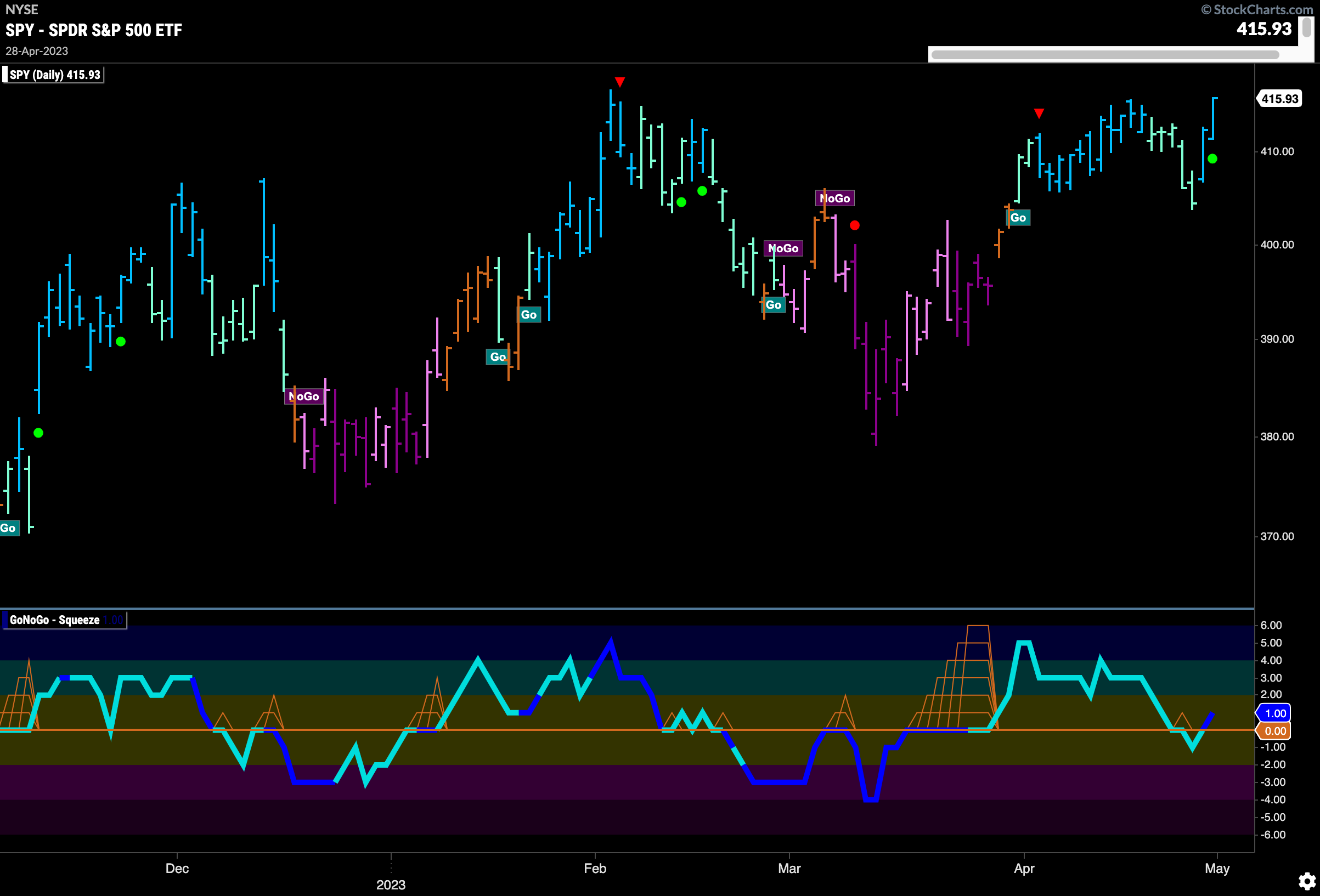
Equities Return Quickly to Test Prior Highs
After falling away from the overhead resistance we noted last week, price quickly returned to test those levels. With GoNoGo Oscillator once again in positive territory on heavy volume, we will look to see if price can continue to advance higher and set a new higher high.
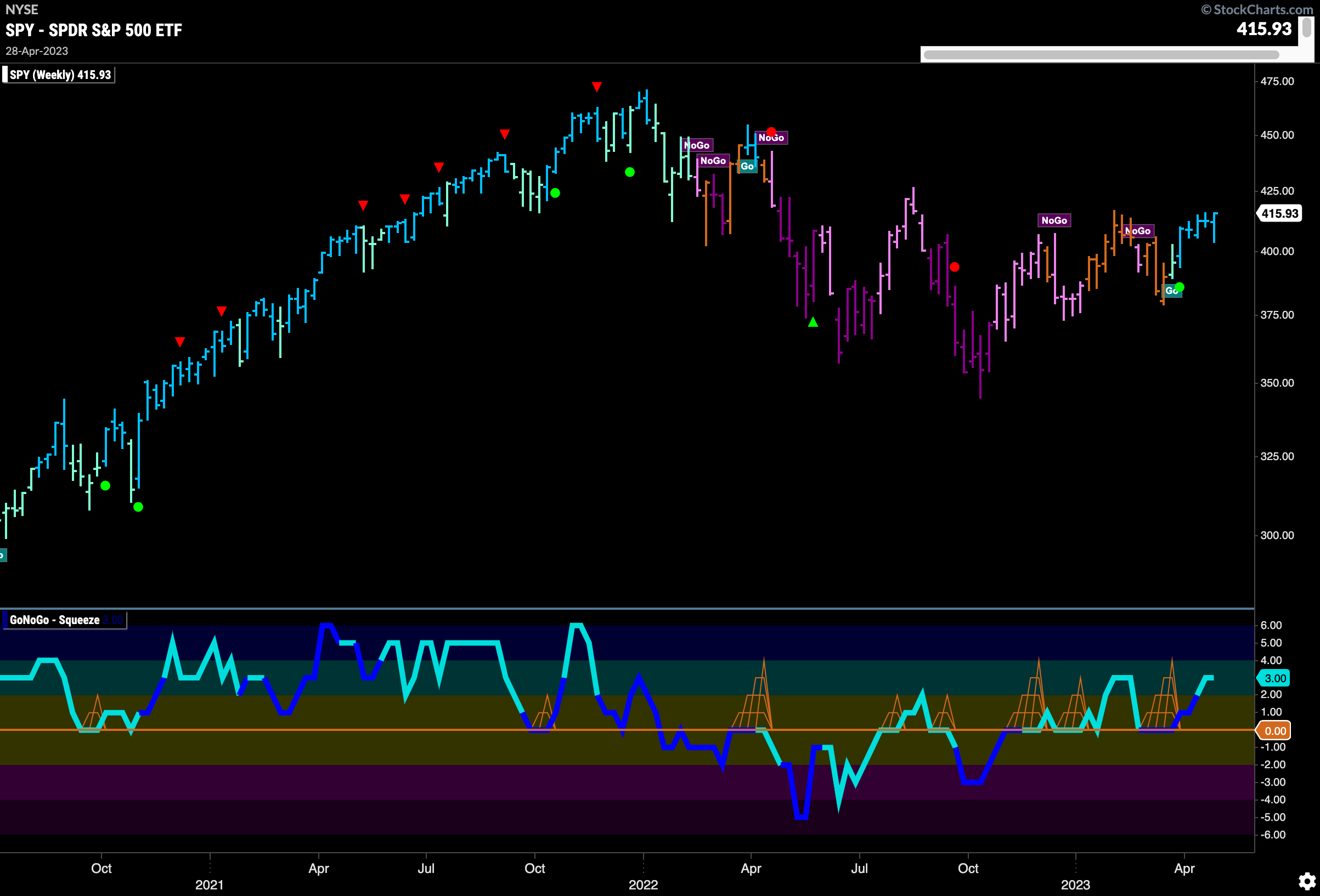
The longer term weekly chart continues to support the shorter time frame’s attack on higher prices. Another strong blue “Go” bar this week as price rallied to close higher. GoNoGo Oscillator is in positive territory but not yet overbought and so we will watch to see if this momentum can help nudge prices higher than the high from late summer last year.
Treasury Remains in “NoGo” Trend Amidst Signs of Divergence
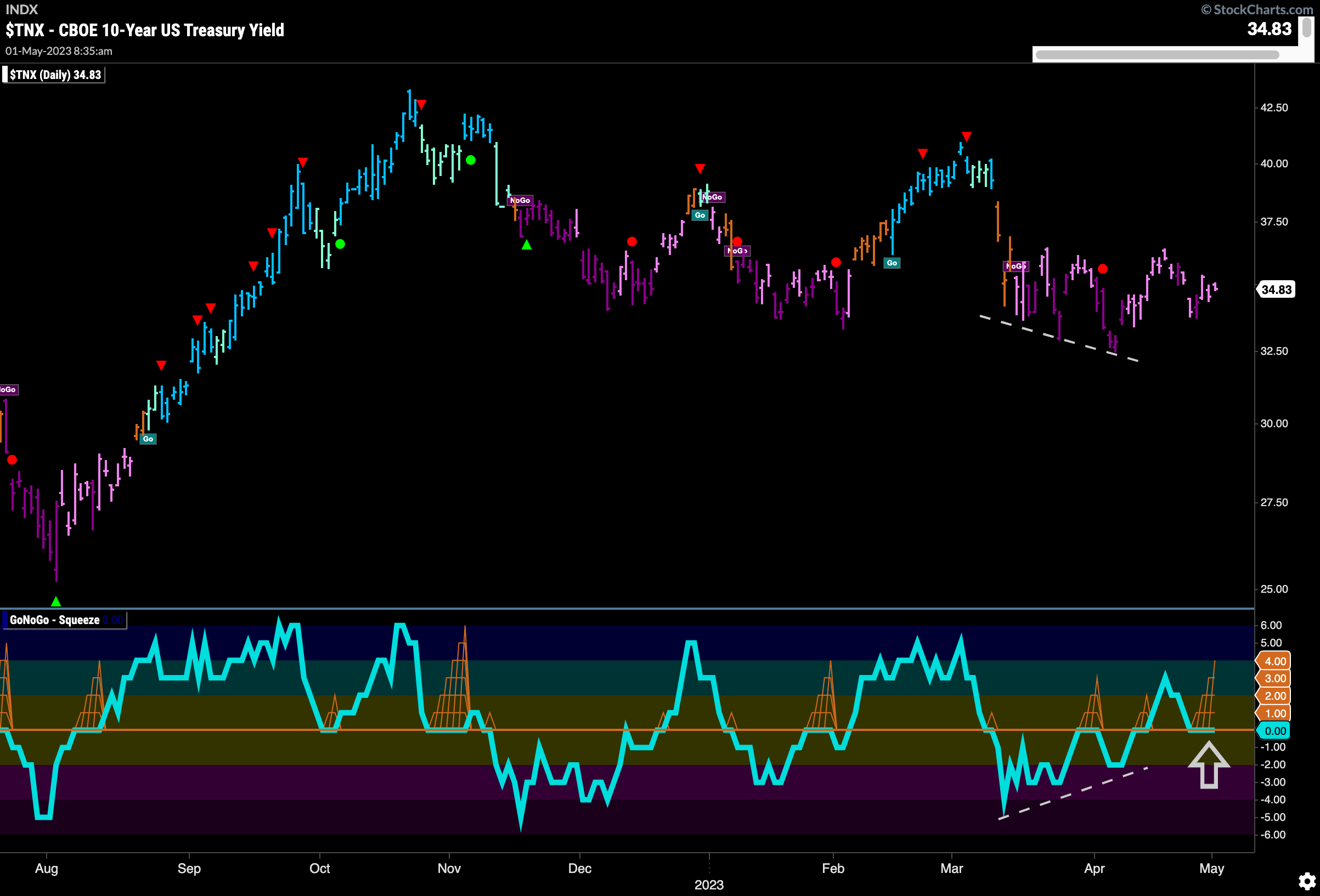
Treasury rates saw continued painting mostly pink “NoGo” bars this week. GoNoGo Oscillator after breaking above the zero line has fallen to test it from above. This comes after bullish divergence that we saw with price making lower lows but the oscillator making higher lows. As the oscillator remains at zero we see a GoNoGo Squeeze forming which shows a lack of directional momentum for daily prices.
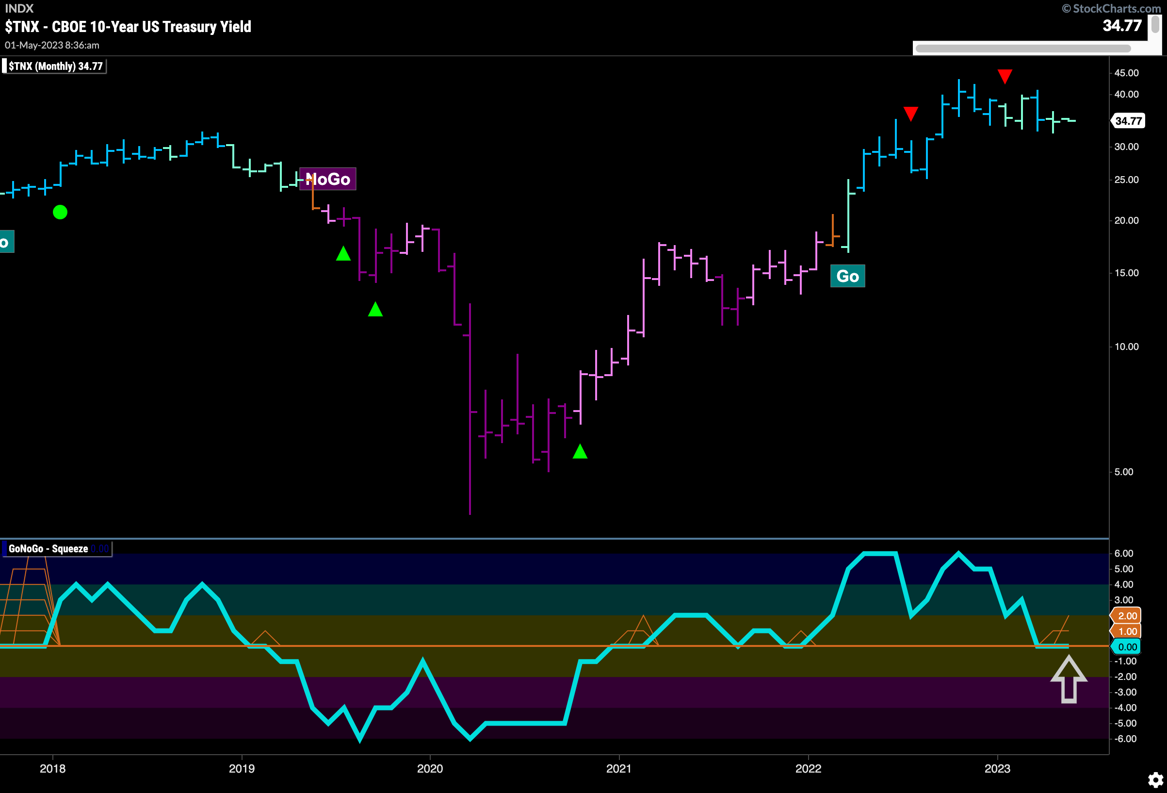
Zooming way out, looking at monthly bars, we can see that this relatively new “Go” trend in rates has been consolidating sideways for several months now. GoNoGo Oscillator is stuck at zero on this timeframe as well and we will watch closely to see in which direction the push comes for rates on the larger timeframe. Given the lack of movement on the monthly chart the possibility exists that we will see rates settle at these levels for a while.
Dollar “NoGo” Trend Remains
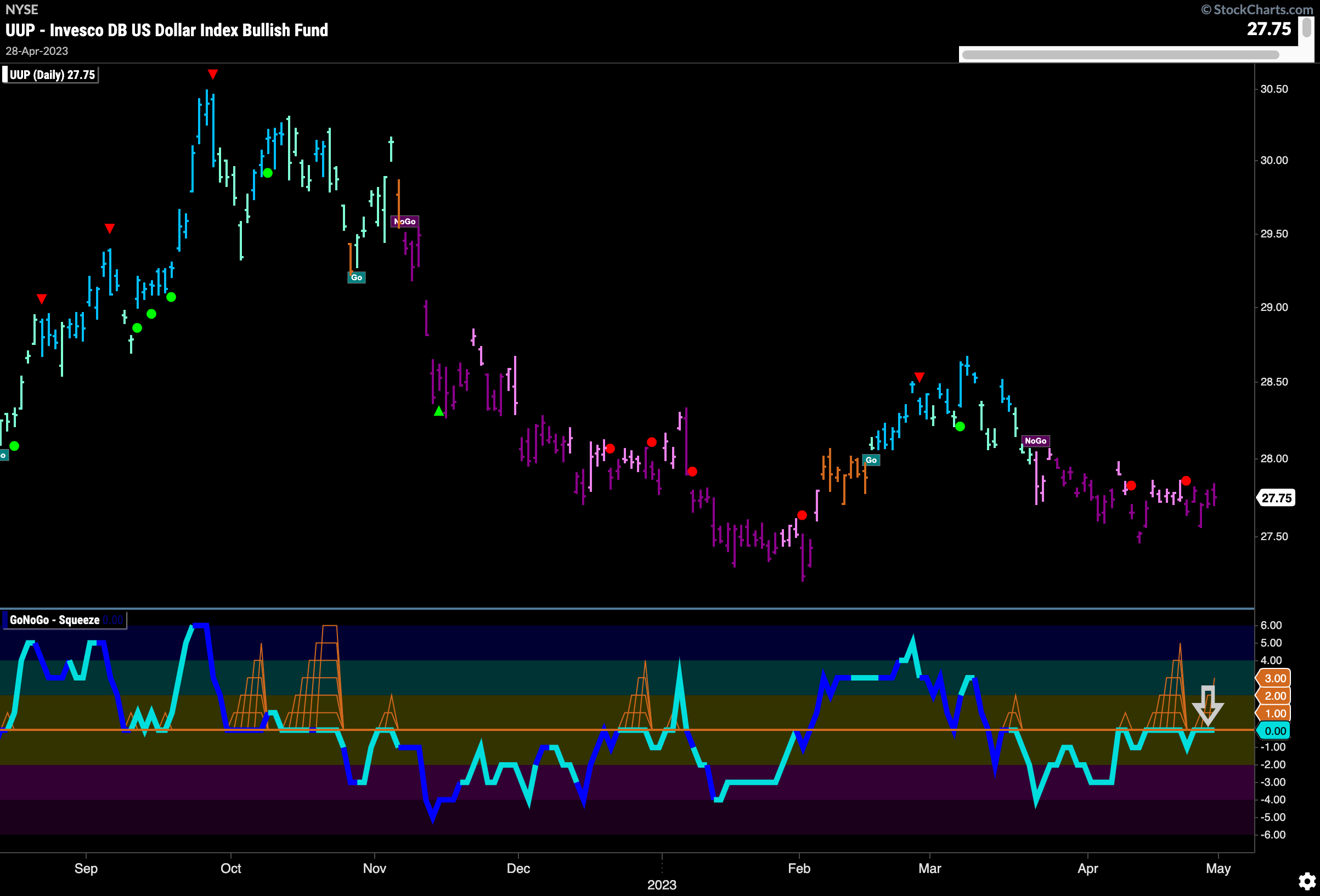
GoNoGo Trend paints strong purple “NoGo” bars this week as price remains depressed. No new ground has been made lower or higher for several weeks and we can see this reflected in the GoNoGo Oscillator as it is spending an increasing amount of time at the zero line. A break away from this level will be needed for price to break in one direction or the other.
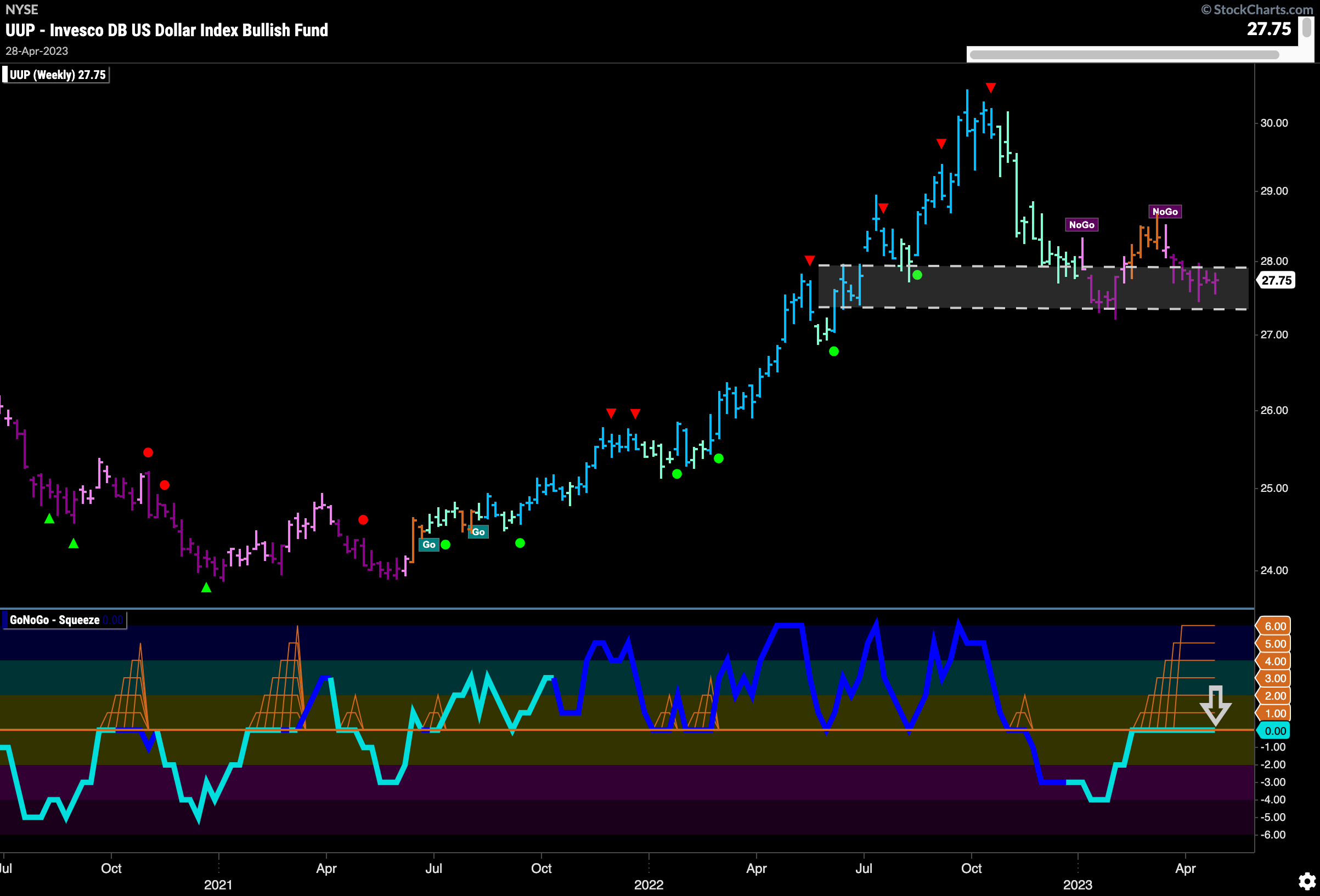
The weekly chart tells us that the tug of war continues. Price is trading in a range that looks to be providing some support and resistance. GoNoGo Oscillator spends another week at zero and GoNoGo Squeeze continues to be maxed out indicating a stalemate between buyers and sellers at this level. The breakout of the Squeeze could be significant and might determine the dollar’s next direction.
Oil Prices Back in Channel
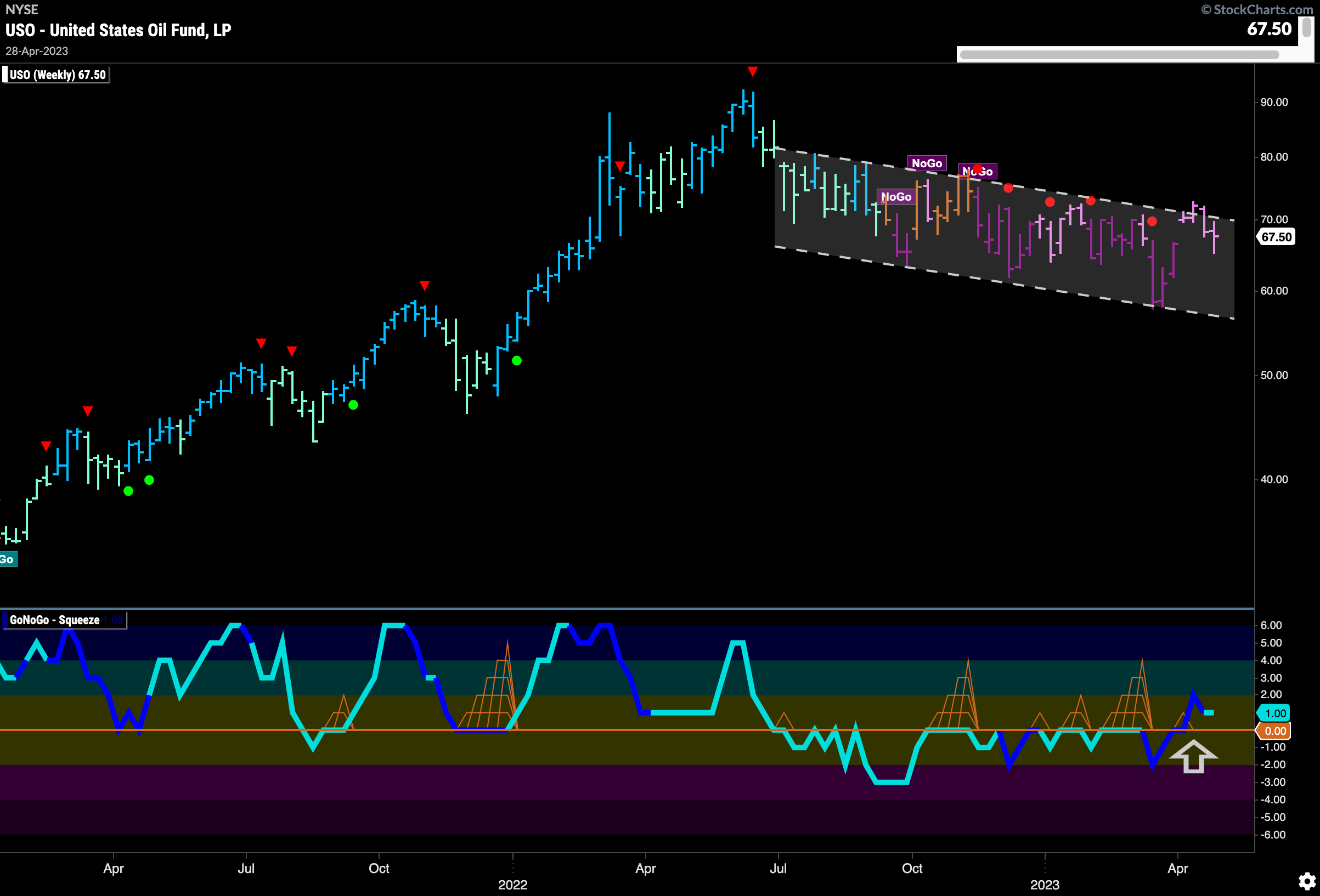
$USO stays in the downward sloping trend channel this week after failing at the upper bound a few weeks ago. We still see GoNoGo Oscillator in positive territory and so we will watch to see if it can remain positive or if it reverts to test the zero line as price continues to fall.
Gold Fights History
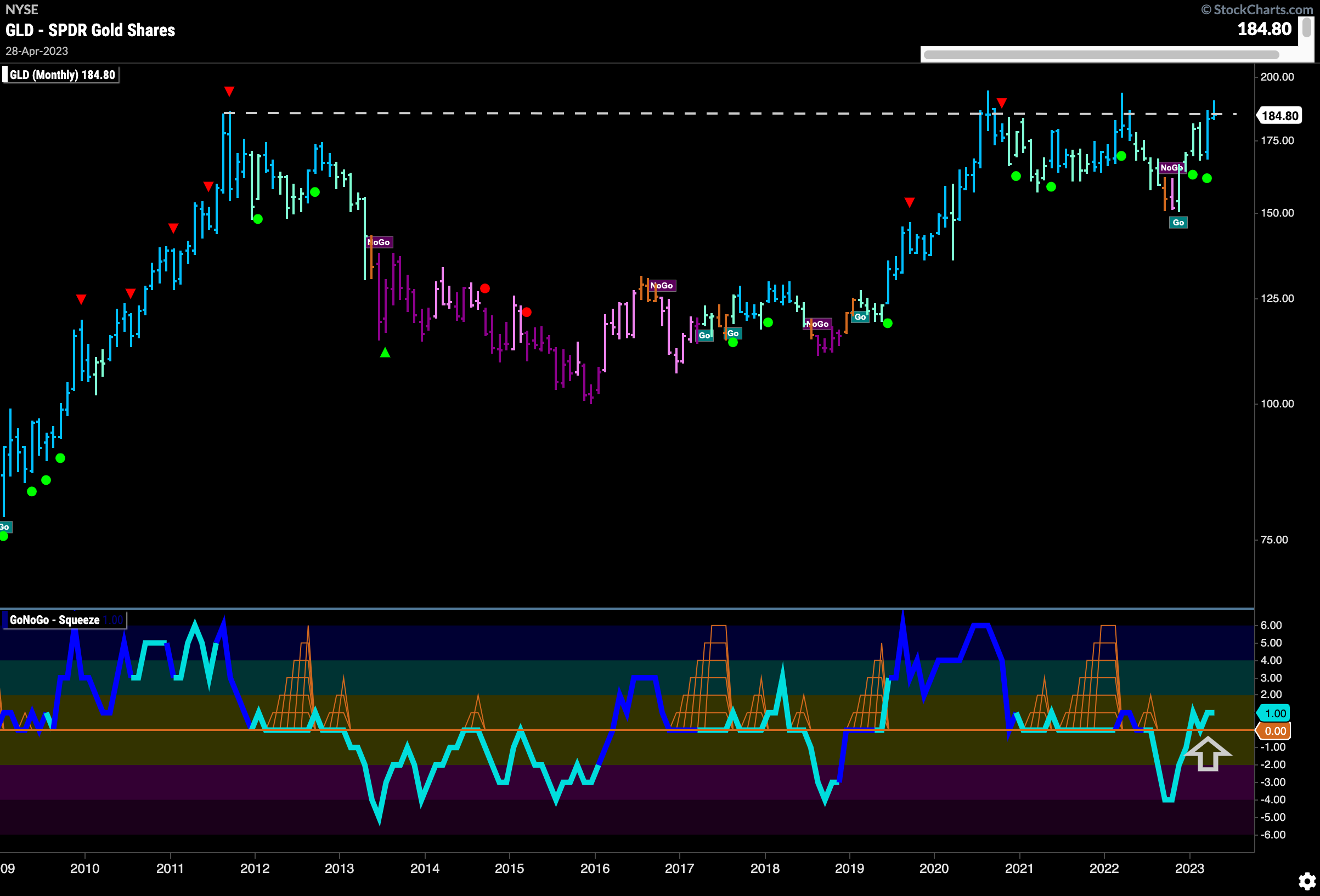
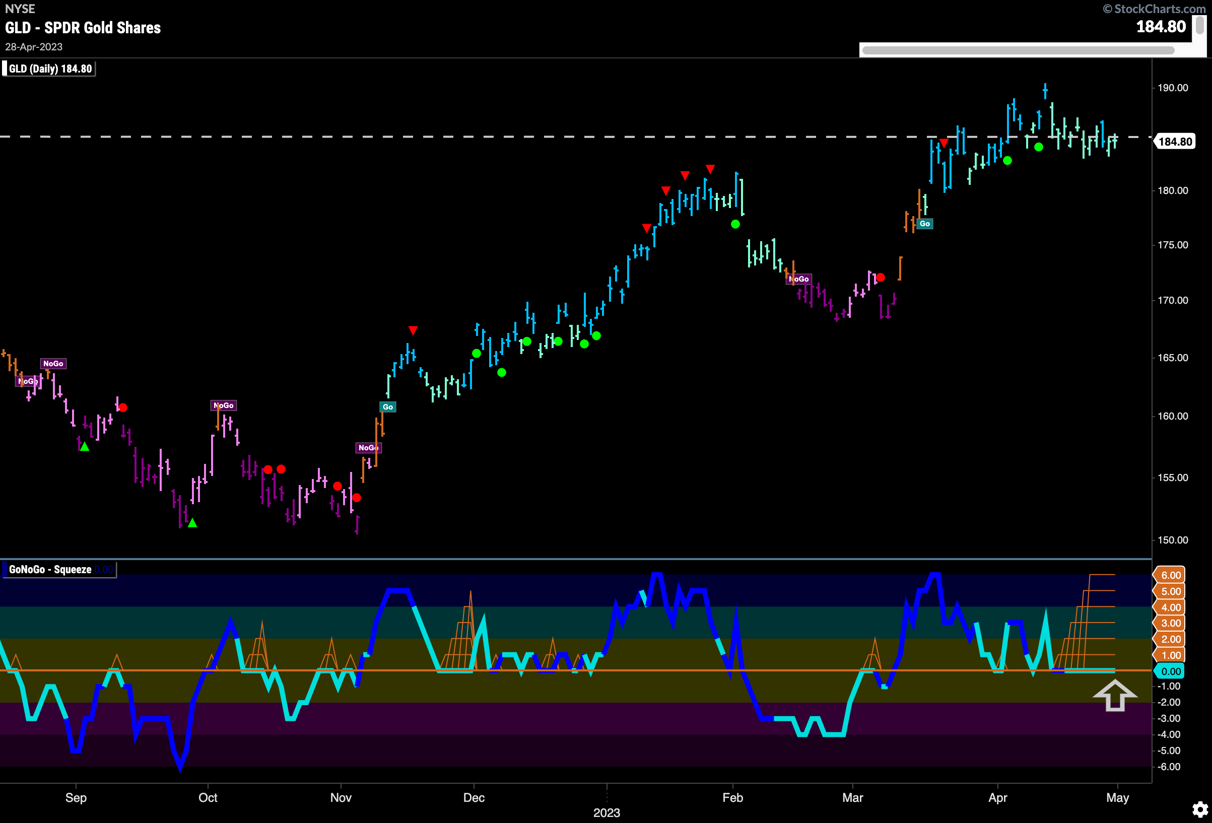
$GLD remains in a valiant battle for the glory of the first new high in over a decade and an all time high at that. The monthly chart below is one we’ve been watching closely as the handle part of the cup and handle proves to be difficult to complete. Further price movement higher would be needed this month for the pattern to complete. If it does, it could be exciting.
The daily chart below shows just how much trouble price is having with the resistance we saw on that monthly chart. Trading around those levels, we will look for a significant move over the next few weeks to tell us which way price is headed. GoNoGo Oscillator is stuck at zero and we have a Max GoNoGo Squeeze to help us visualize the stagnation. A break out of the Max GoNoGo Squeeze will be telling and will point to the direction of price going forward.
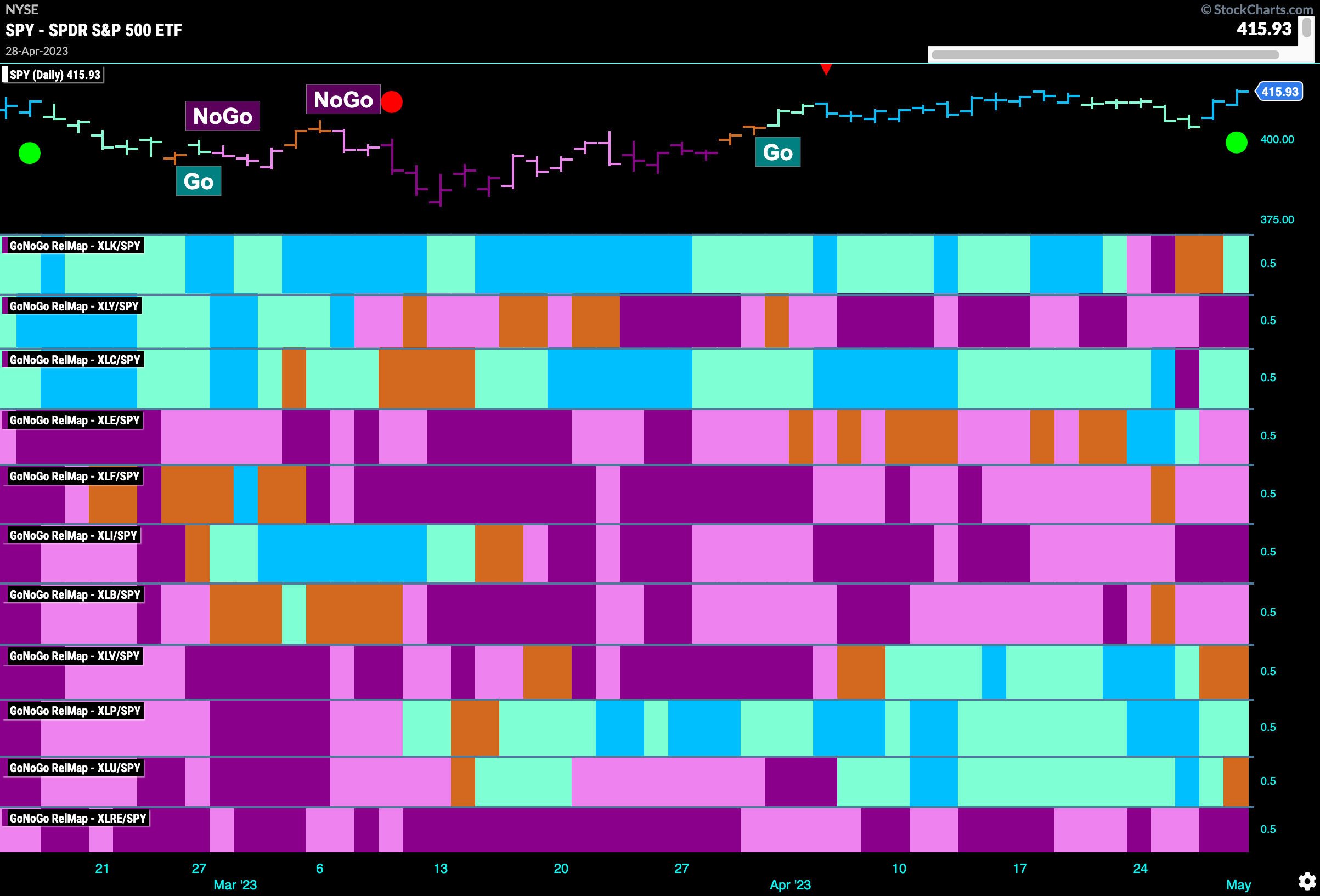
Sector RelMap
Below is the GoNoGo Sector RelMap. This GoNoGo RelMap applies the GoNoGo Trend to the relative strength ratios of the sectors to the base index. Looking at this map, we can quickly see where the relative outperformance is coming from as well as which sectors are lagging on a relative basis. 3 sectors are outperforming the base index this week. $XLK, $XLC, $XLP are painting “Go” bars.
Technology is Trying for New Highs
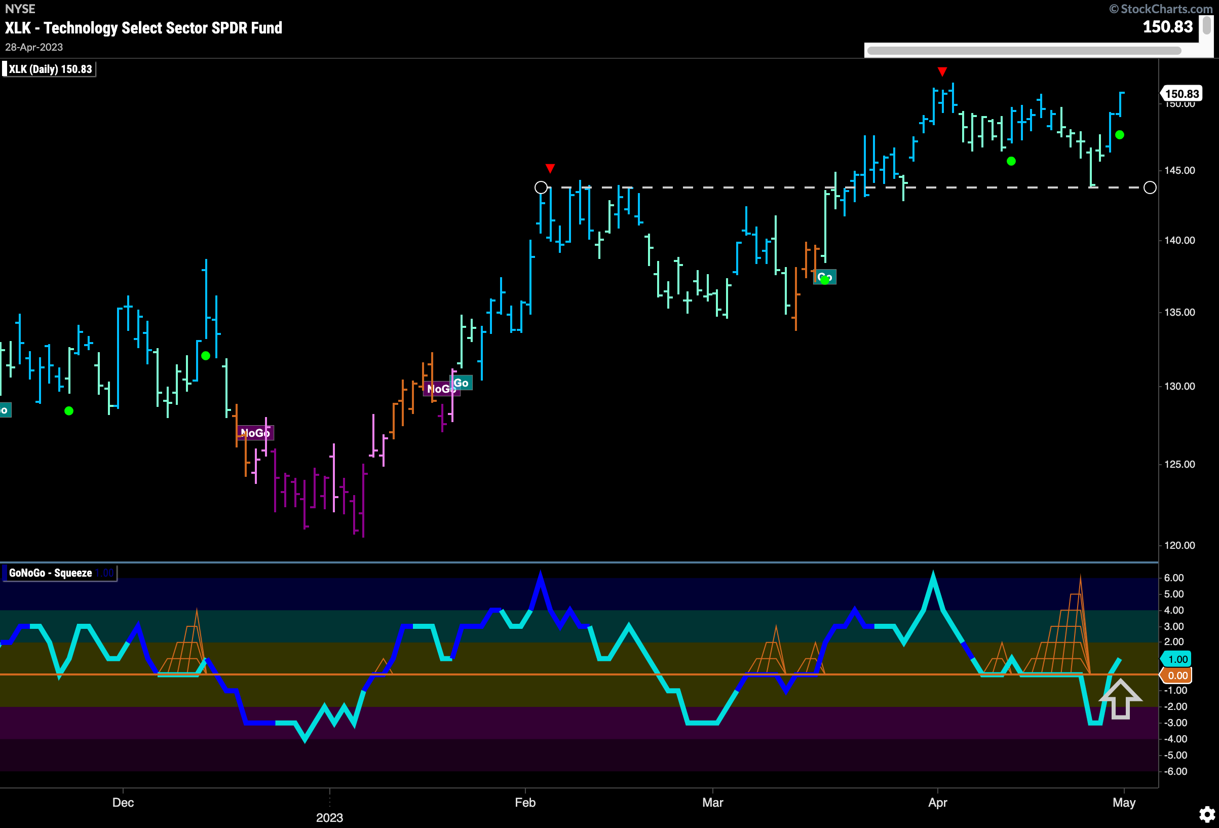
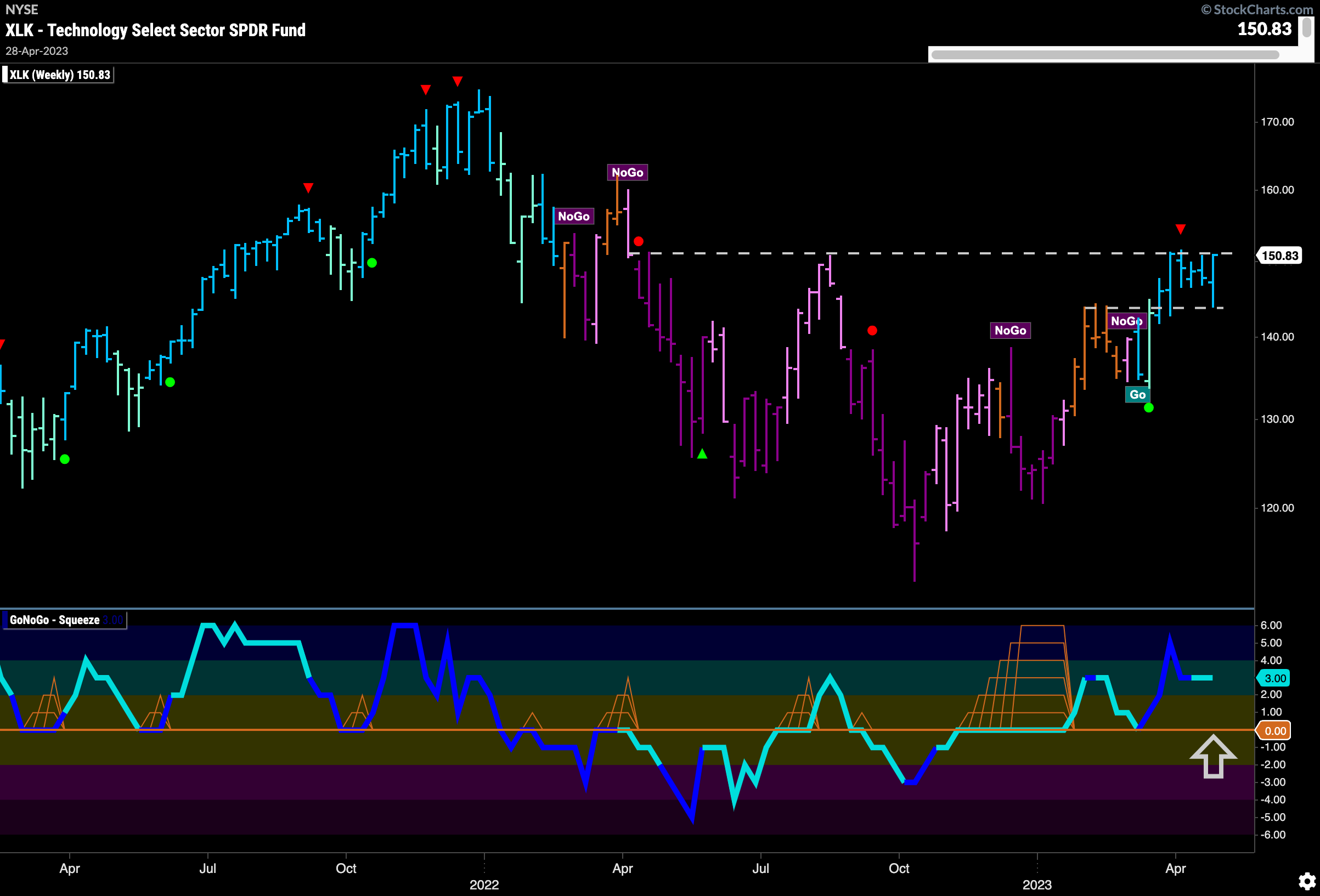
As we can see in the RelMap above, Technology wobbled a little in terms of relative strength but the final bar of the week saw outperformance return. On a pure trend basis, $XLK is looking strong on the daily chart. After correcting from recent highs, price looks to have found support from previous resistance (polarity). GoNoGo Oscillator after dipping briefly into negative territory has rallied and moved back above the zero line which triggered a Go Trend Continuation Icon (green circle) to appear under the price bar. We will look to see if this new momentum in the direction of the “Go” trend is enough to push price to new highs.
The weekly chart shows just what price is up against in the technology sector. Price is painting strong blue bars as it once again tests the horizontal level of resistance. GoNoGo Oscillator broke out of a Max GoNoGo Squeeze early this year and has since found support at the zero line. This is a good sign and tells us that momentum is in the direction of the “Go” trend. A new high in price here would be a strong sign for trend continuation.
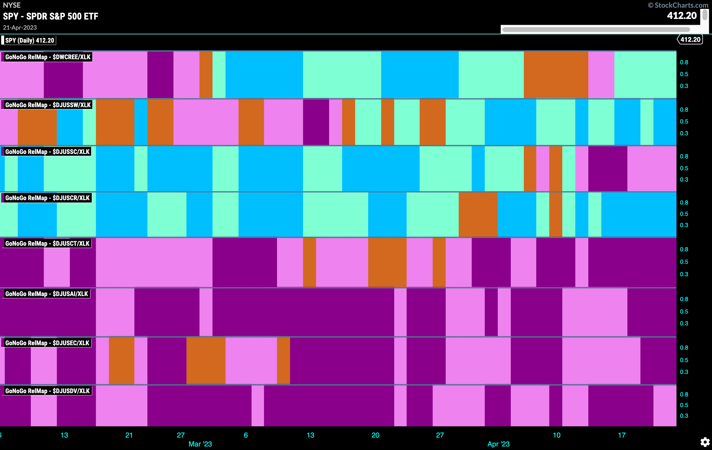
Technology Sub-Industry Group RelMap
In the above GoNoGo Sector RelMap, we saw the outperformance in the technology sector return. The below sub group RelMap shows that since the middle of March there has ben strong outperformance in the Software index relative to the larger technology sector itself. (Second panel below.)
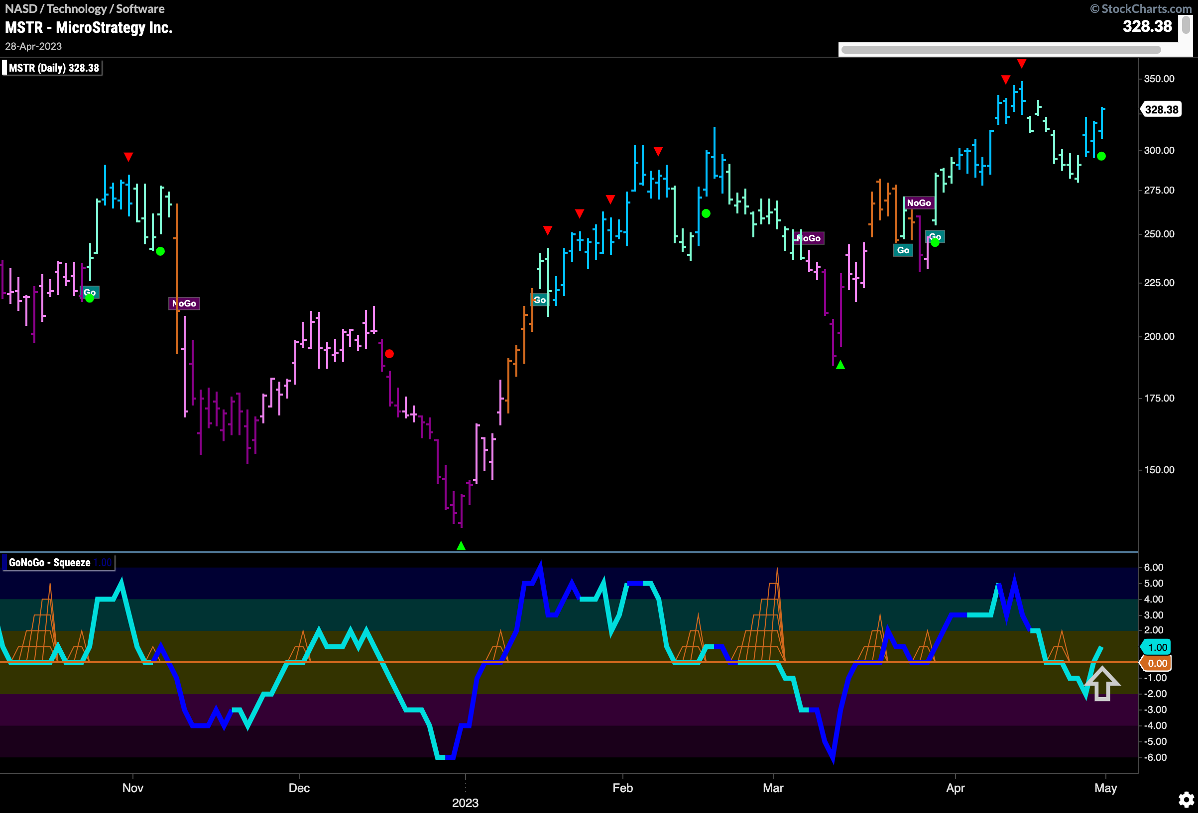
MicroStrategy Inc Flashes Trend Continuation
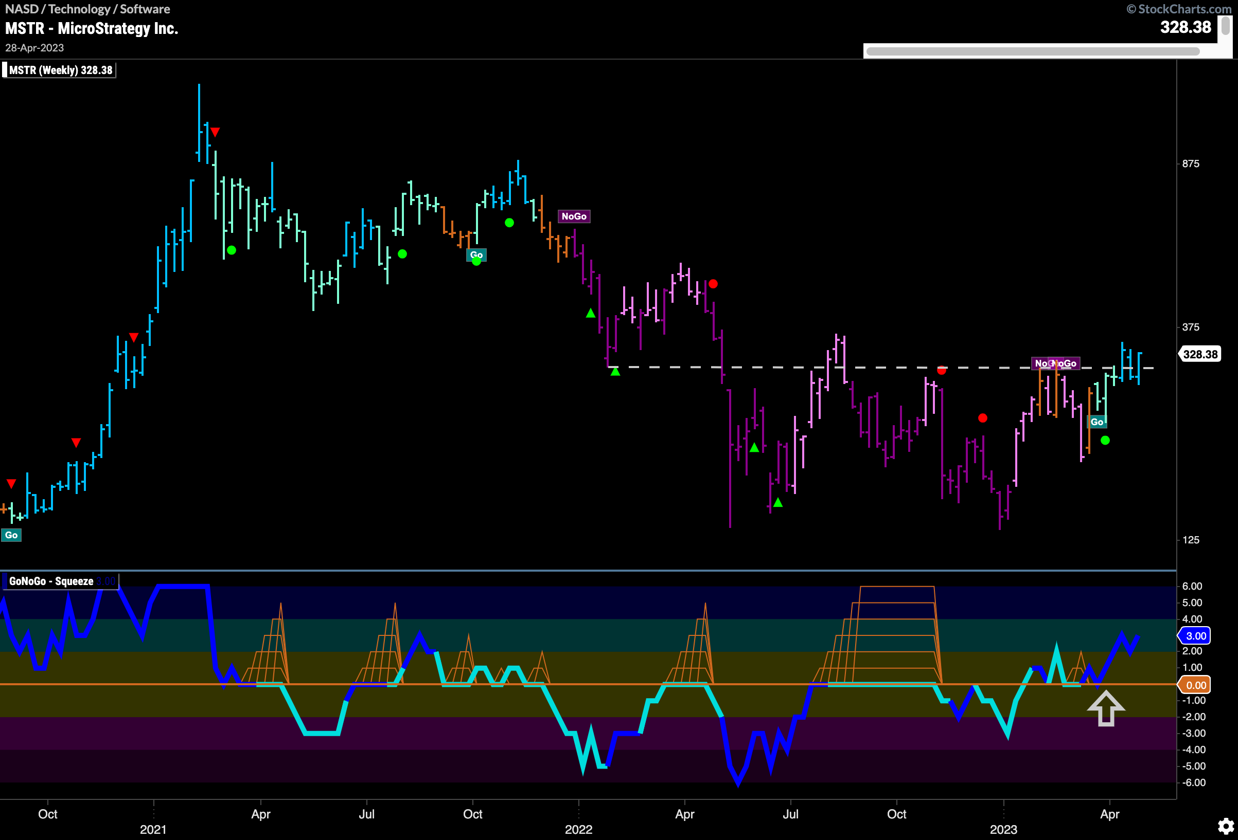
In the software index we can take a look at $MSTR. We can see that after making a new high we saw Go Countertrend Correction Icons (red arrows) indicating that price may pull back in the short term. This is what happened on a string of weaker aqua bars. However, the latter part of last week saw a return to strong blue “Go” bars and as the GoNoGo Oscillator moved back above the zero line a Go Trend Continuation Icon (green circle) appeared on the price chart telling us that momentum is resurgent in the direction of the “Go” trend.
The weekly chart below shows how new this “Go” trend is. Moving above longer term horizontal resistance at levels that have often provided both support and resistance (polarity again) we can see that GoNoGo Trend has painted another strong blue bar. GoNoGo Oscillator has remained in positive territory since finding support at zero and confirming the new “Go” trend. We also see that volume has been elevated as this new “Go” trend begins.
