Consolidation is healthy in bull markets

Consolidation is healthy in bull markets

18

January 2021

By

Tyler Wood

Remember that stocks are never too high for you to begin buying

or too low to begin selling.

– Jesse Livermore

As the headline news dominates this shortened trading week with socio-political unrest approaching the inauguration of President-Elect Joe Biden on Wednesday, it is important for investors to stick with their discipline and let the weight of the evidence from the market guide any and all trading decisions.  GoNoGo Research subscribers receive a chart pack every weekend providing an overview of the major themes across asset classes and global indices. As Launch Conditions highlighted again for the week ending Jan 15th, the early-stage bull market continues on the back of dovish fed policy and the promise of renewed fiscal stimulus to mitigate the ongoing effects of the Coronavirus pandemic.

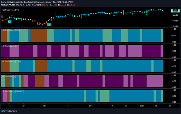
The evidence of the bull market is clear from a simple comparison of the five asset classes. See the GoNoGo Heat Map® below which shows us the daily trend performance of five asset classes: Equities, Bonds, Commodities, Currencies, and Digital Assets from the US perspective.

Asset Class Heat Map Jan 18 2021
The takeaway remains the same as it has been for several weeks.  Equities, commodities, and the cryptocurrency markets are now in established “Go” trends.

Panel 1 – Global stocks continue in the “Go” trend now in place for several weeks however, the end of the week brought some weakness with aqua bars. SPDR® S&P 500® ETF Trust seeks to provide investment results that correspond generally to the price and yield performance of the S&P 500 Index. It is a diversified large-cap U.S. index that holds companies across all eleven GICS sectors.

Panel 2 – Government bonds, continue to paint “NoGo” bars, although the downward trend conditions have weakened, shown by pink bars. $IEF tracks a market-value-weighted index of debt issued by the US Treasury with 7-10 years to maturity remaining.

Panel 3 – Commodities are a “Go,” continuing to paint strong blue bars. $USCI tracks an equal-weighted index of 14 commodity futures contracts and holds at least one precious metal, industrial metal, energy, livestock, soft, and grain commodity.

Panel 4 – The US Dollar remains in a “NoGo” trend. This week however we have seen a string of weaker pink bars as the dollar makes a countertrend rally. $DXY is an index of the value of the United States Dollar relative to a basket of foreign currencies.

Panel 5 – Bitcoin continues in a “Go” trend but is showing some weakness as price consolidates after its impressive run.

With the risk-on environment clearly shaping the backdrop for trading decisions, there will undoubtedly be countertrend corrections as the market consolidates the incredible gains of recent weeks. What are GoNoGo Charts® highlighting this week and what should investors be on the look-out for as we approach the week of trading?

DOLLAR DARING TO DREAM?

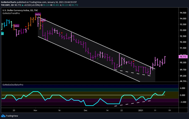
The daily GoNoGo Trend® chart below shows the US Dollar index $DXY forming a countertrend rally.  Highlighting this chart two weeks ago in the 1/4/21 issue of Flight Path, we noted that while the trend is clearly still a “NoGo” there were some signs of bullish divergence between GoNoGo Oscillator and price. These are highlighted below by the dashed trendlines sloping in opposite directions. We advised that watching the oscillator for a break above zero would be very important to the future price action of $DXY.

Since that report, prices have rallied, breaking out to the upside of the downward sloping trend channel. Investors must now determine if this is a base preceding a change in the NoGo trend, or merely a countertrend rally within a larger downside move. To be clear, GoNoGo Trend has not confirmed a new “Go” trend yet, but there are more bullish signs of late. The US Dollar posted a series of higher highs and higher lows over the past two weeks in opposition to the strong “NoGo” trend.  $DXY closed a choppy week higher and indicated weakening trend conditions with pink bars throughout last week. GoNoGo Oscillator hovered around the zero line before breaking into positive territory to end the week.

$DXY GoNoGo Trend Daily

CATCHING BREATH AFTER A RUN

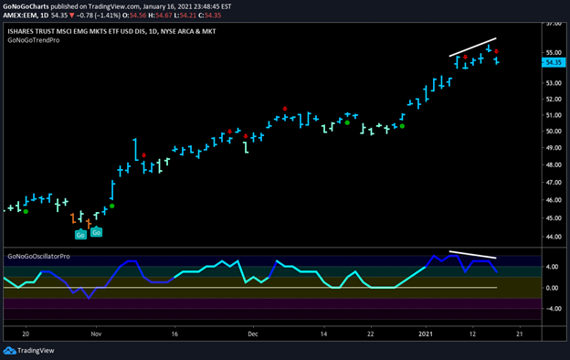
Just as dollar weakness has been a tailwind to major themes in commodities, emerging markets equities, and cyclical sectors, a rallying dollar will have the opposite impact in each of those areas.  Emerging markets could be affected as a strong dollar causes the value of foreign-currency-denominated assets to fall. We are seeing the first signs of this in the chart below.

Make no mistake, this is a bullish chart.  The trend for Emerging Markets stocks is a “Go” and GoNoGo Oscillator is in positive territory.  However, in the short-term, a counter-trend correction for $EEM is in concert with the rally in $DXY. There is also a bearish divergence between the oscillator and price highlighted by the white trendlines sloping in opposite directions. Furthermore, a countertrend correction arrow appeared on Monday and again Friday last week signaling that conditions support corrective action.

In the context of an early-stage bull market, this corrective pause in price gains may present a favorable opportunity for entry into the $EEM trade. If the correction is short-lived, look for a low-risk entry signal.

$EEM GoNoGo Trend Daily Jan 18, 2021

CONSOLIDATE OR VACATE?

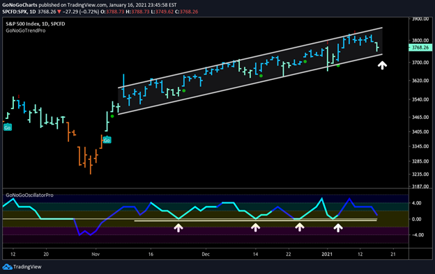
A strong US Dollar is also negatively correlated to U.S. stock prices. If investors are raising cash in portfolios it is inherently because they are out of riskier markets. The daily GoNoGo Trend chart of the S&P500 below shows a clear “Go” trend. However, if the $DXY is just beginning some larger move to the upside, investors will see a corresponding exodus from equities.

You will notice that $SPX is once again approaching the lower bound of the trend channel that has been a stalwart guidepost of the trend over the past few months. The closing aqua bar of last week’s trading session corresponds to a precipitous drop in GoNoGo Oscillator that is now approaching zero on heavy volume.

If this “Go” trend remains healthy, we will see the oscillator find support at zero and rally once more. Like the past four occurrences, a rally off zero should trigger a green low-risk entry signal indicating that the trend is reestablished.  However, if there is a real threat to this equity rally, GoNoGo Oscillator will be unable to find support at zero, in which case price may fall out of the trend channel and begin a path toward testing prior lows. For confirmation of such a change, investors would expect the rally in the dollar index to be significant.

$SPX GoNoGo Trend Daily Jan 18, 2021
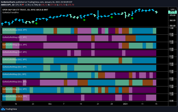
If the bull market in stocks becomes threatened, with a stronger dollar causing a counter-trend correction in equities, investors must look across sectors to see where investments will best be positioned.  A GoNoGo RelMap® reveals the relative performance of a group of securities against a benchmark using the GoNoGo Trend blend of indicators against each ratio. Below is a GoNoGo RelMap of the sectors against the S&P 500 index.
$SPY Relative Strength Sector Heat Map Jan 18 2021
What we can see from this chart is that half of the sectors are in “Go” trends and half are “NoGo”.  Financials have cropped up in our newsletters now for a few months now since we highlighted the “Go” trend in the 11/16/20 issue of Flight Path.  In the chart below, we can see that $XLF has been a “Go” throughout the recent period.  Information Technology ($XLK) with the heaviest weighting in the index, on the other hand, has recently shifted from aqua to amber and finally pink bands of weakly trending underperformance.

READING THE RATIO

The ratio of financials to technology has been a topic of conversation among analysts for some time as the relative strength of financials, $XLF has been in a persistent downtrend relative to its overachieving cousin, $XLK.  Indeed, David Keller, CMT – Chief Market Strategist of StockCharts and former Fidelity MD of Technical Research – posted the chart below on Friday:
Tweet from David Keller, CMT
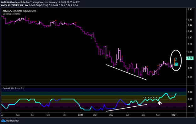
GoNoGo Charts were developed with respect for the tools most widely used by the industry’s most respected market analysts. So, if the professionals are seeing a decisive change in this ratio, GoNoGo Charts ought to confirm what they are seeing.  The chart below shows weekly prices of the ratio between $XLF and $XLK.
$XLF vs $XLK Weekly GoNoGo Trend Ratio Chart
The GoNoGo Chart confirms, after seeing bullish divergence between the GoNoGo Oscillator and price, the oscillator was able to break above the resistance of the zero line.  Now, this week sees a “Go” trend flagged by the GoNoGo Trend indicator, agreeing with the idea that a base has formed for this ratio.

OVERHEAD SELLING PRESSURE

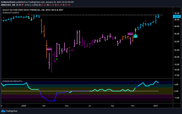
If financials are finally breaking out in terms of outperforming the tech sector, it will not have been without overcoming some significant overhead supply.  As we highlighted in the last issue of Flight Path, there is strong resistance from highs earlier this year that are at levels of all time 2007 highs.  The chart below shows that this week saw price run above those levels but not yet close above that resistance.  The signs are there, the trend is a “Go” and if price can consolidate at all-time highs then opportunities should exist within the sector for driving more alpha.
$XLF GoNoGo Trend Weekly

TAKE A BITE OUT OF APPLE?

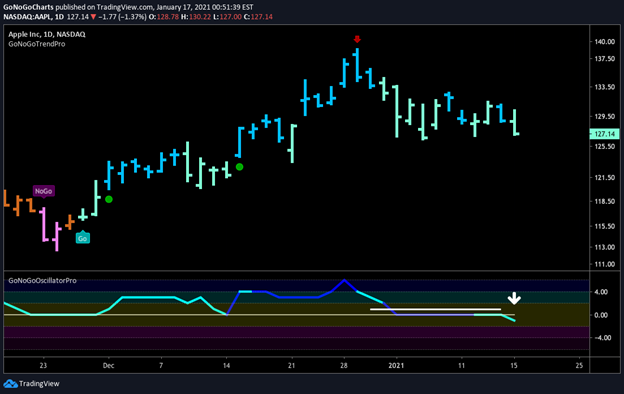
If mega-cap tech then is an underperforming sector on a relative basis, is it time for one of the behemoths to cool off in the short term?  The daily GoNoGo chart of $AAPL shows that while the “Go” trend is still in place, after signaling a counter-trend correction (red arrow) at the high, the GoNoGo Oscillator has now failed to find support at zero and is dipping its toes into negative territory.
$AAPL GoNoGo Trend Daily
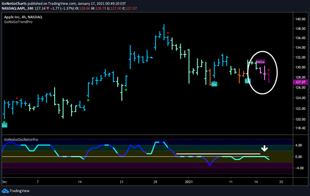
If we drill down into a shorter periodicity, in this case, the 4-hour chart, we can see that in the short term the trend has changed, with the GoNoGo Trend indicator flagging a “NoGo” as the GoNoGo Oscillator confirms by getting turned away by the zero-line from below.  With mega cap technology underperforming on a relative basis, an investor may consider allocating funds away from a stock such as Apple if he believes this scenario will continue.
$AAPL GoNoGo Trend 4hr
Whatever your process as an investor or trader, we encourage you to maintain an objective view. Look at the weight of the evidence and position your portfolio according to what the market is telling us. GoNoGo Charts were designed over years to blend a complete set of technical information into a clear and concise single picture that never obscures the most important indicator of all Price!

get in touch

Mon - Fri 8:00 - 16:00
Subscription Form
research
$1.99 / week
Trend Analysis and Charts Delivered Weekly
Flight Path
Pre-Market Monday Morning
Launch Conditions
Delivered Every Saturday Morning
Research Chart Pack
16 GoNoGo Charts Included with Every Report
Premium
$9.99 / week
Daily Research
Flight Path
Pre-Market Monday Morning
Launch Conditions
First Thing Saturday Morning
Daily Blast Off
Pre Market Daily
add-ons
Deploy GoNoGo Indicators on Your Favorite Platforms