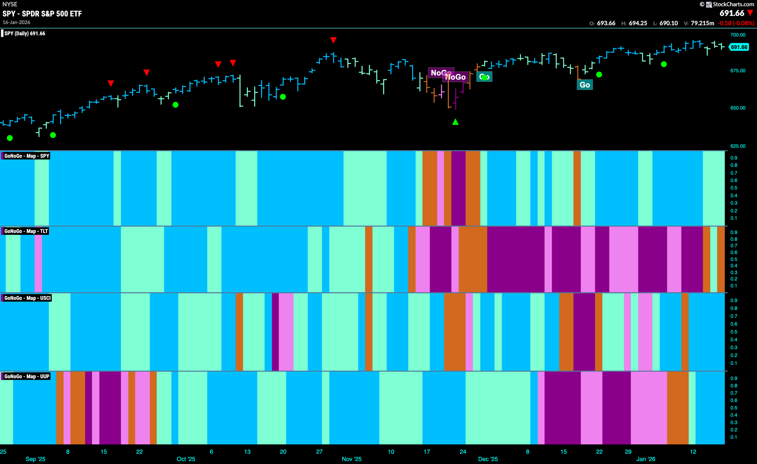
Good morning and welcome to this week’s Flight Path. Equities remain in a “Go” trend but we have seen weakness this week as the indicator paints weaker aqua bars. We see that treasury bond prices have flirted with uncertainty as two amber “Go Fish” bars surround an aqua “Go” bar. U.S. commodities paint a string of strong blue “Go” bars as the trend appears to take hold. After entering a new “Go” trend following a period of uncertainty represented by consecutive amber “Go Fish” bars, the dollar painted strength with bright blue bars after just one aqua bar.
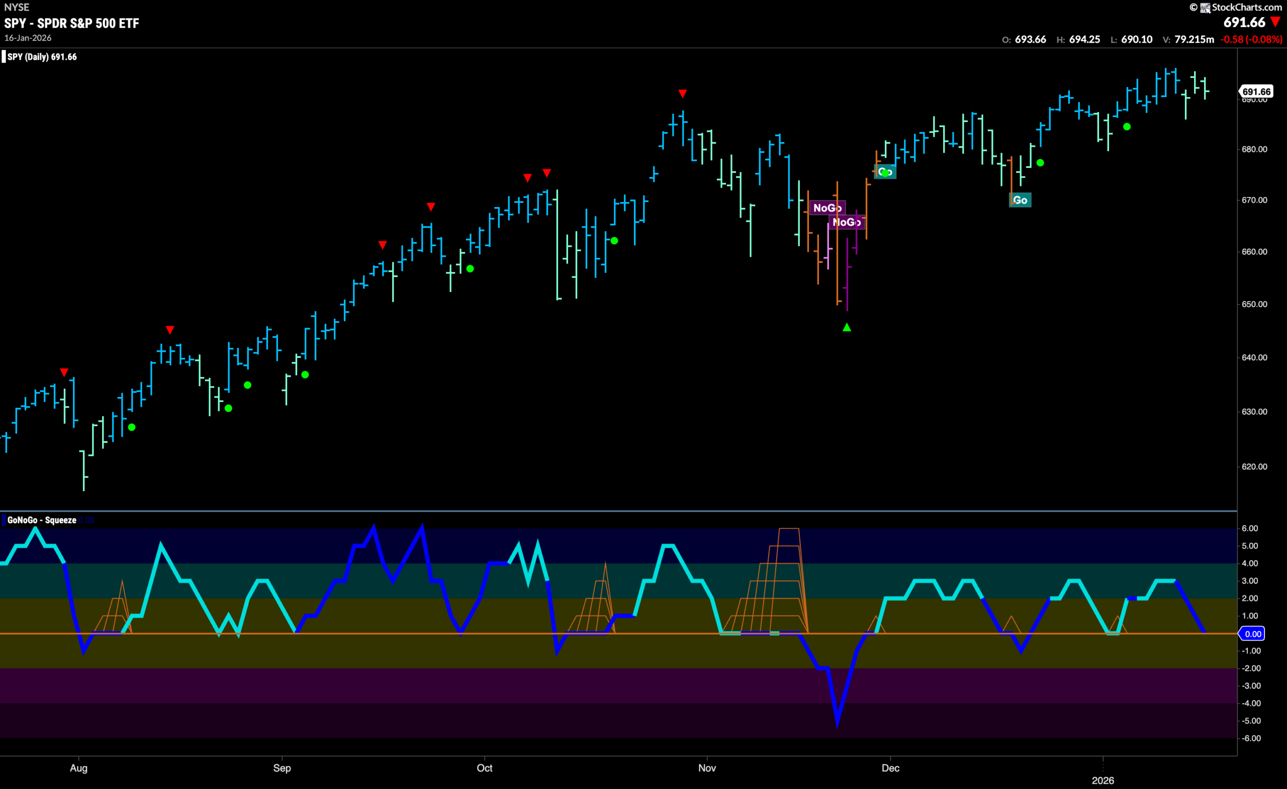
$SPY Shows a Little Weakness at the High
The GoNoGo chart below shows that the “Go” continued this week but after hitting a new high on the first day of the week we see prices stall and the indicator paint a string of weaker aqua “Go” bars. We will look for price to find support above November’s high. If we turn our attention to the lower panel, we see that GoNoGo Oscillator is testing the zero line again on heavy volume. We know that for the trend to remain healthy, GoNoGo Oscillator should stay at or above this level. We will watch to see if it finds support. Should it rally back into positive territory, we would know that momentum is resurgent in the direction of the “Go” trend.
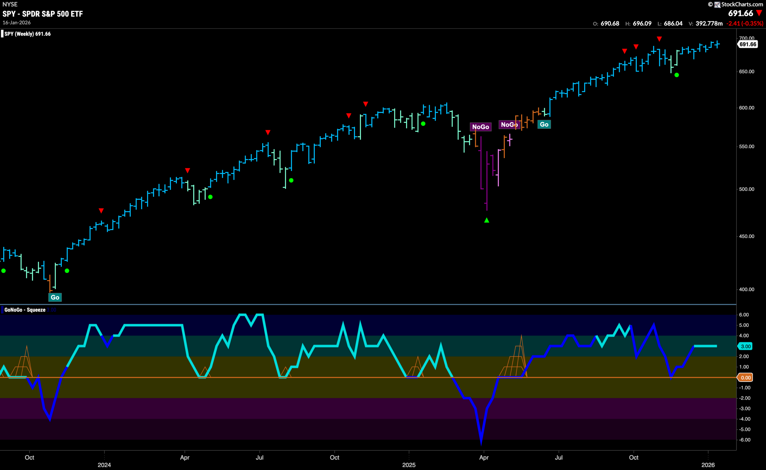
The weekly chart shows that on the longer time frame the trend has remained strong for another week. This remains true, even as the range of the bar stays very small. We see that price is only making very small movements higher as investors interpret the trend. GoNoGo Oscillator is in positive territory but not overbought at a value of 3. With momentum in line with the “Go” trend, there are no immediate concerns for trend change.
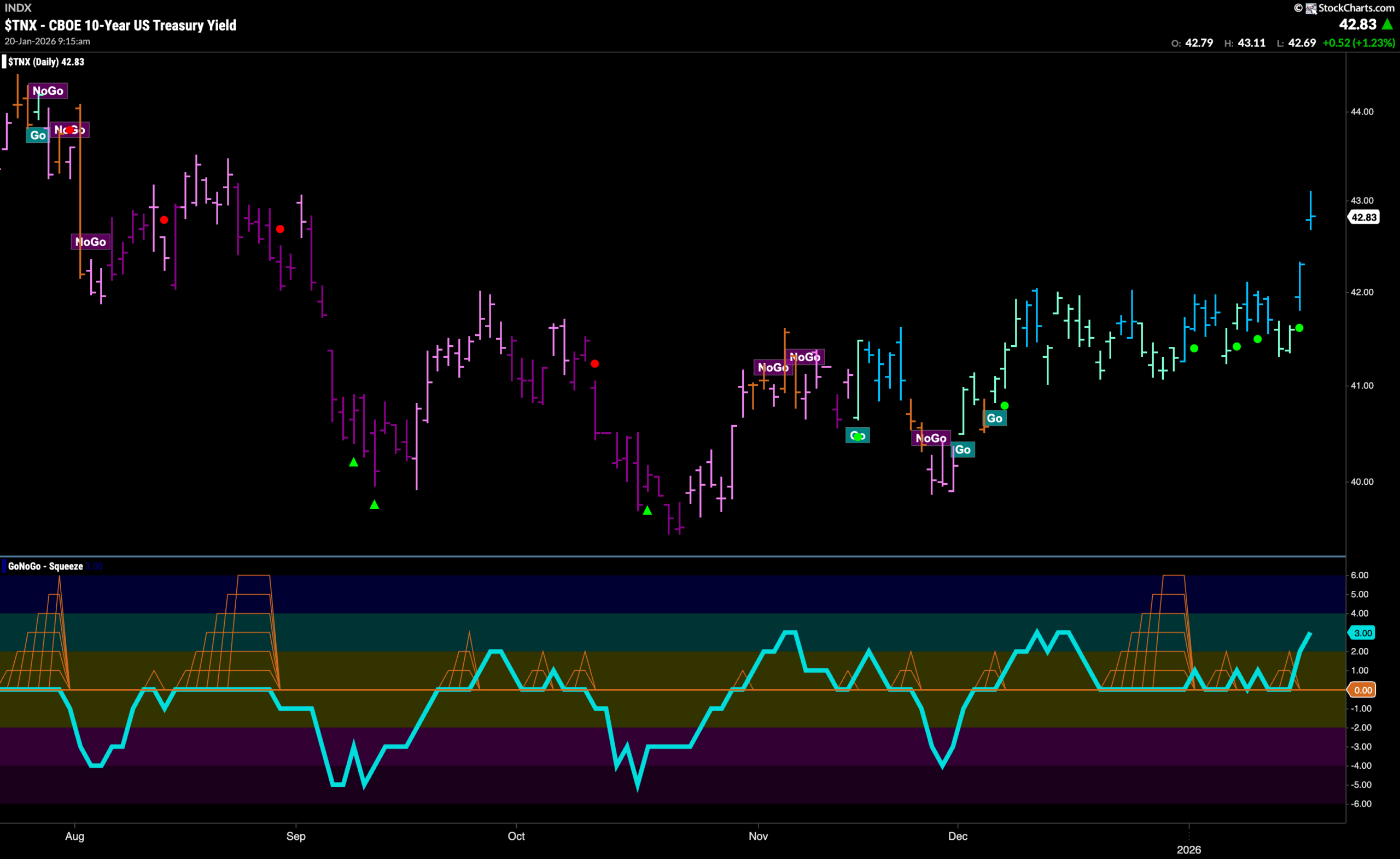
Treasury Rates Gap Higher
GoNoGo Trend shows the trend continues this week and we see rates gap higher on the final bar of the week. Having been watching this level for some weeks, we note that this is very bullish for rates. This comes also after GoNoGo Oscillator finds support yet again at the zero line bouncing back into positive territory. This tells us that momentum is resurgent in the direction of the “Go” trend. We will watch to see if rates consolidate these higher levels in the coming days.
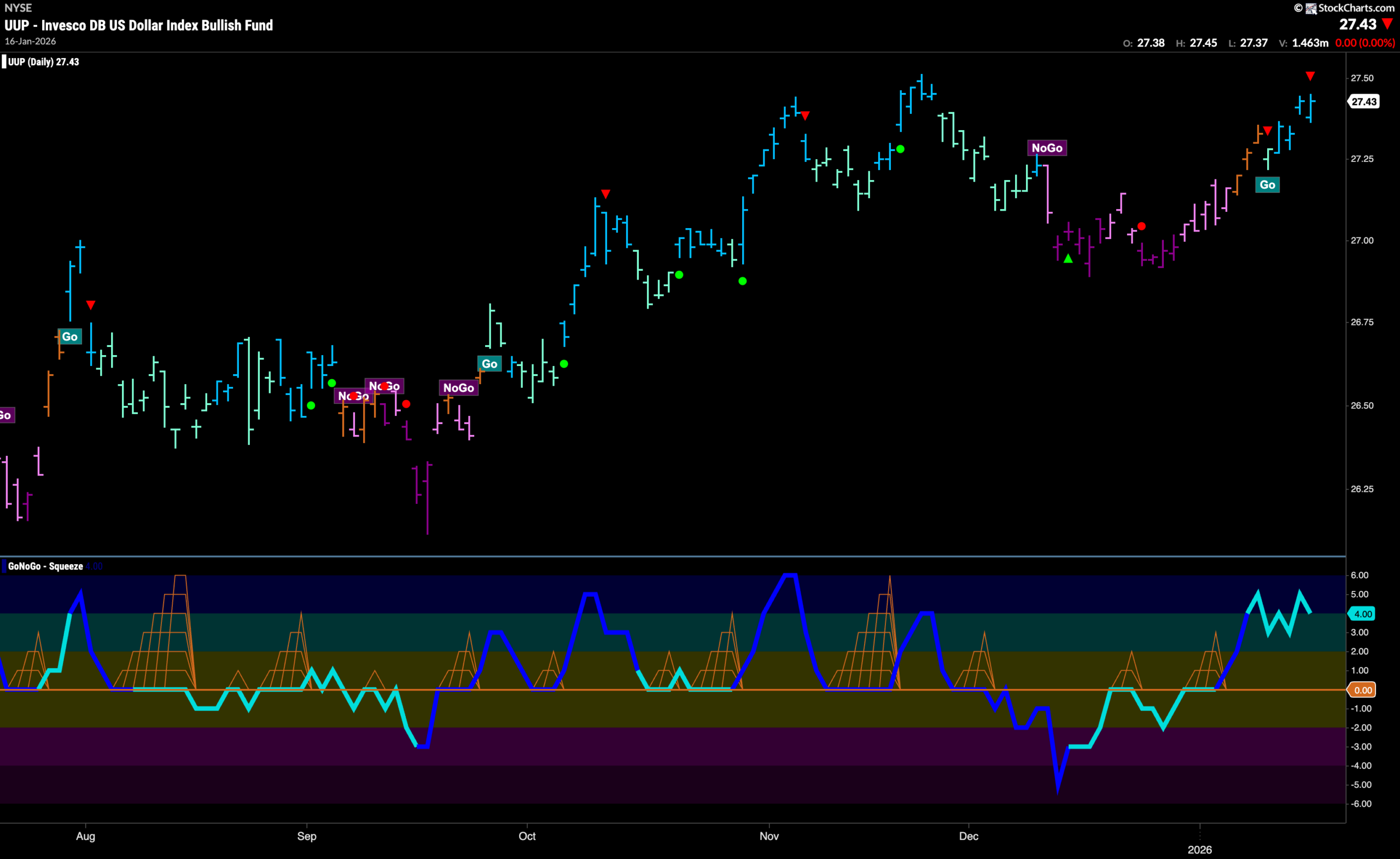
Dollar Enters New Trend But Fast Approaches Resistance
The chart below shows that the green back entered a “Go” trend last week and has quickly moved higher. This shows that price has run up against resistance from prior highs and we see that there is a Go Countertrend Correction Icon (red arrow) on the chart. This tells us that price may struggle in the short term to go higher due to waning momentum. We look to the lower panel and see that GoNoGo Oscillator is falling out of overbought territory at a value of 4.
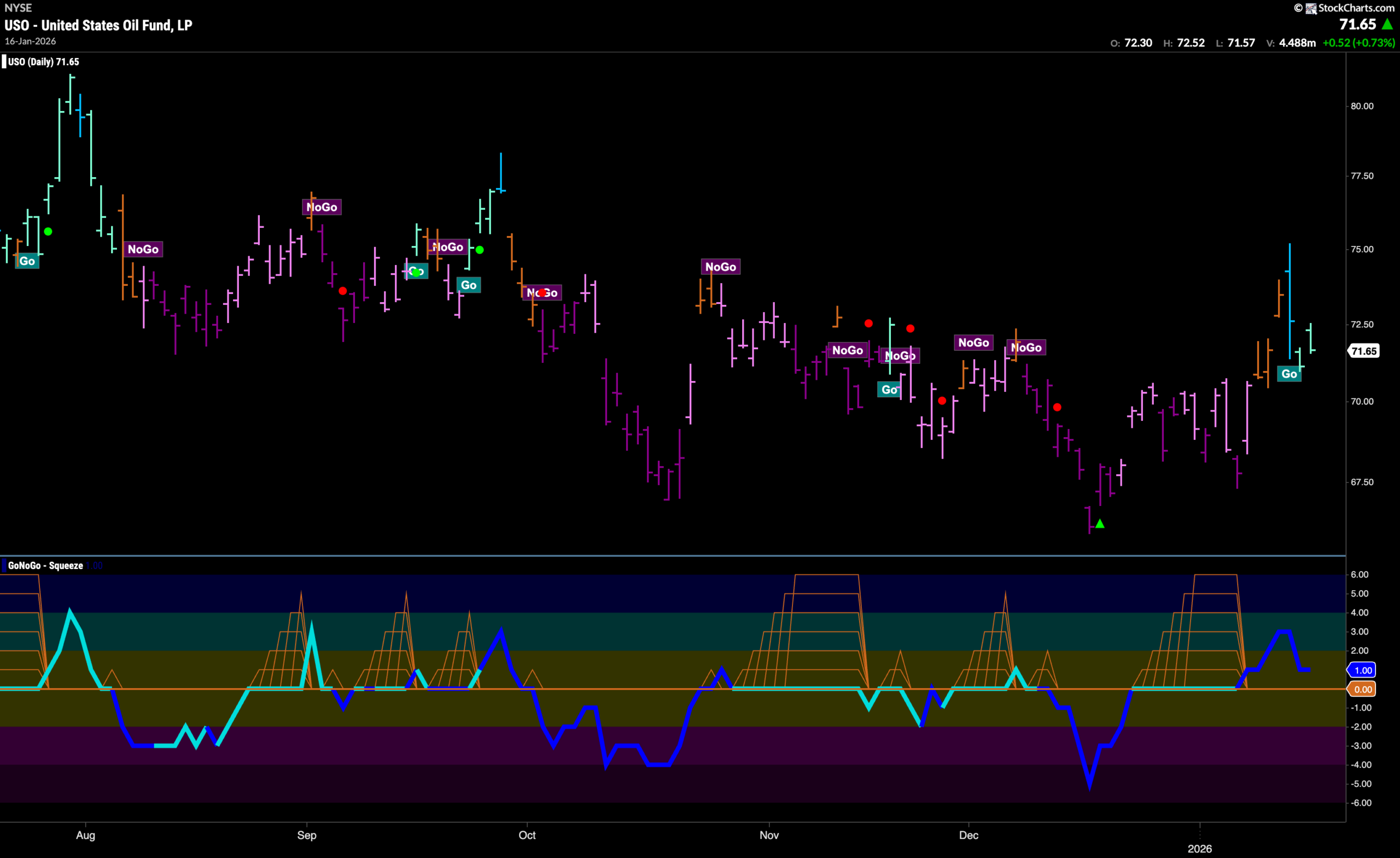
Oil Already Struggling in New “Go” Trend
GoNoGo Trend shows that the “Go” trend was only one bar old when the indicator painted weakness with an aqua bar. Now we watch to see if price can consolidate above the most recent highs from the prior trend. If we look at the lower panel, we can see that GoNoGo Oscillator having rallied out of a Max GoNoGo Squeeze into positive territory is now falling fast back toward the zero line. We will watch to see if that level provides much needed support for the fledgling “Go” trend.
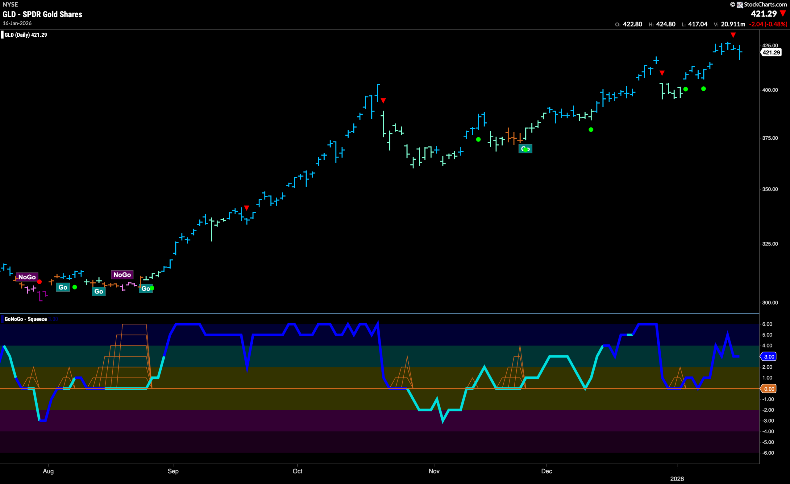
Gold “Go” Spends Week at Highs
The trend in Gold continued this week as we saw a gap to a new high on the first bar and that was followed by strong blue “Go” bars the entire week as price remained at elevated levels. We do see a Go Countertrend Correction Icon (red arrow) indicating that price may struggle to go higher in the short term due to waning momentum. However, there should now be support in the form of the gap if price were to fall a little. Looking at the lower panel, we see that GoNoGo Oscillator has fallen out of overbought territory but is still in positive territory at a value of 3. This tells us that momentum is confirming the trend for the time being.
Sector RelMap
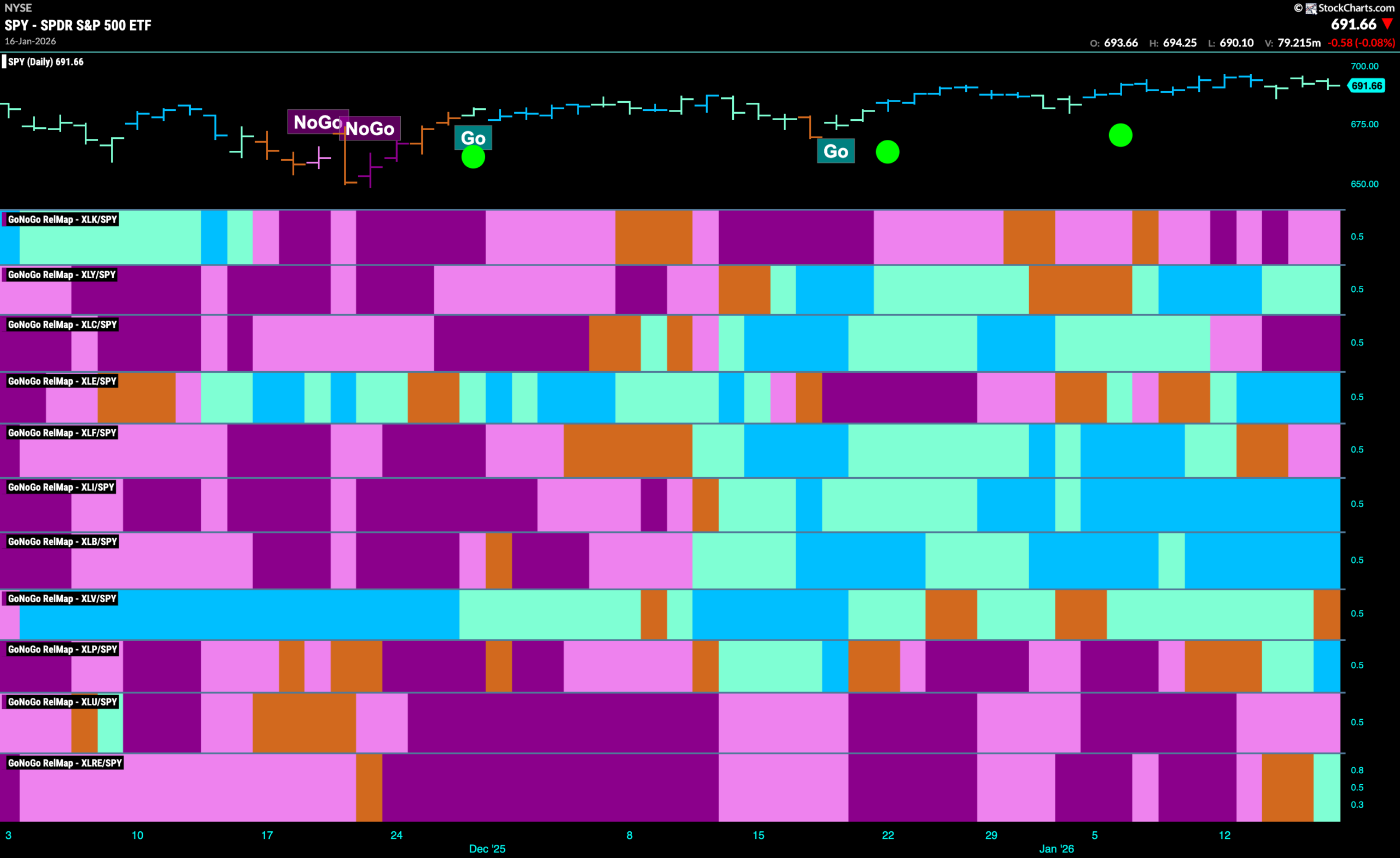
Below is the GoNoGo Sector RelMap. This GoNoGo RelMap applies the GoNoGo Trend to the relative strength ratios of the sectors to the base index. With this view we can get a sense of the relative out performance and relative underperformance of the sectors. 6 sectors are in relative “Go” trends. $XLY, $XLE, $XLI, $XLB, $XLP, and $XLRE are painting relative “Go” bars.
Energy Sub-Group RelMap
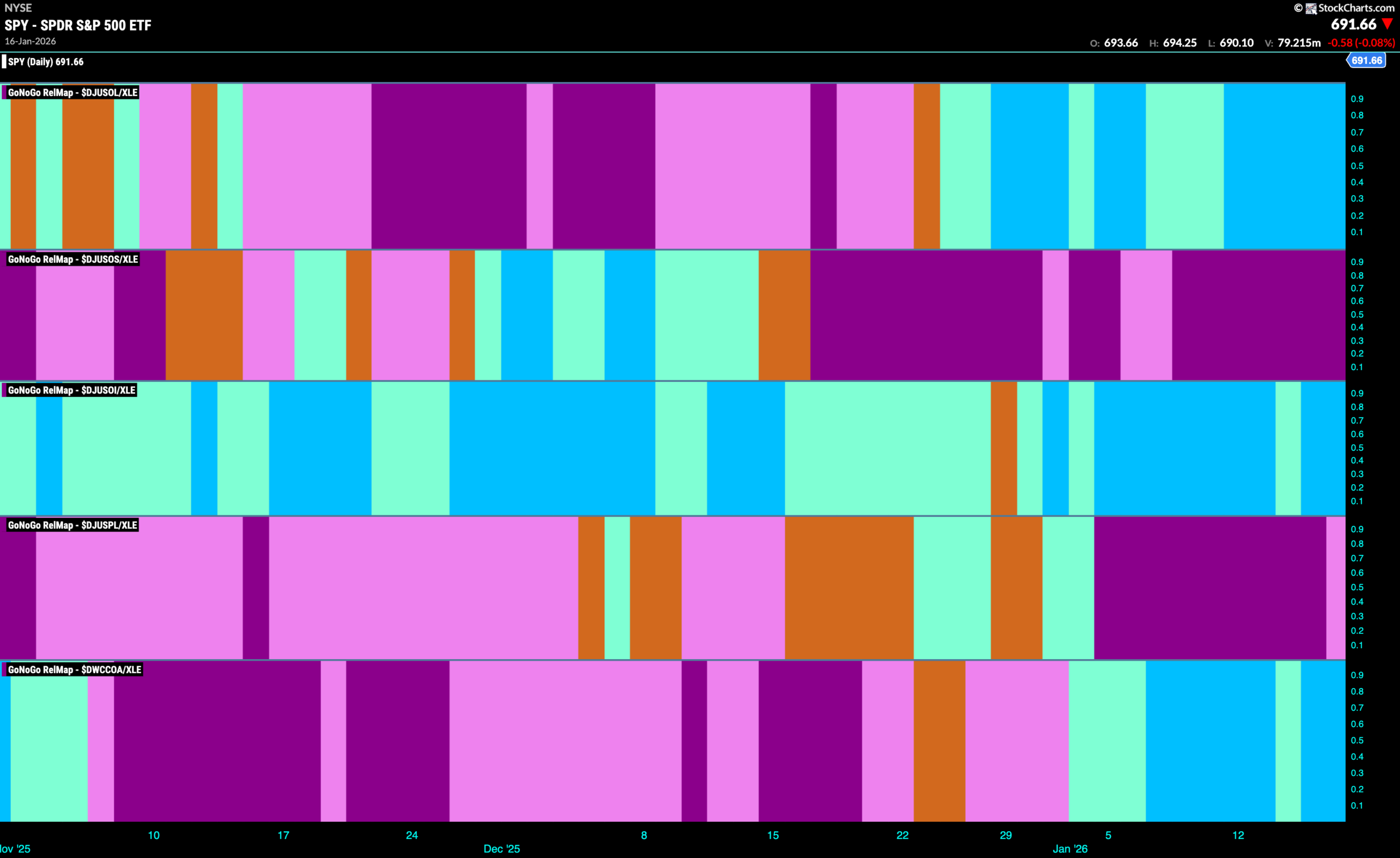
The chart below shows a relative trend breakdown of the sub groups within the energy sector this week. The Sub-Group RelMap plots the GoNoGo Trend of each sub index to the $XLE. We saw in the above GoNoGo Sector RelMap that $XLE is an out-performing sector and paints strong relative “Go” bars. When we look at the below RelMap we can see that the coal index in the lowest panel is painting strong blue “Go” bars on a relative basis.
$AREC In Strong “Go” Trend
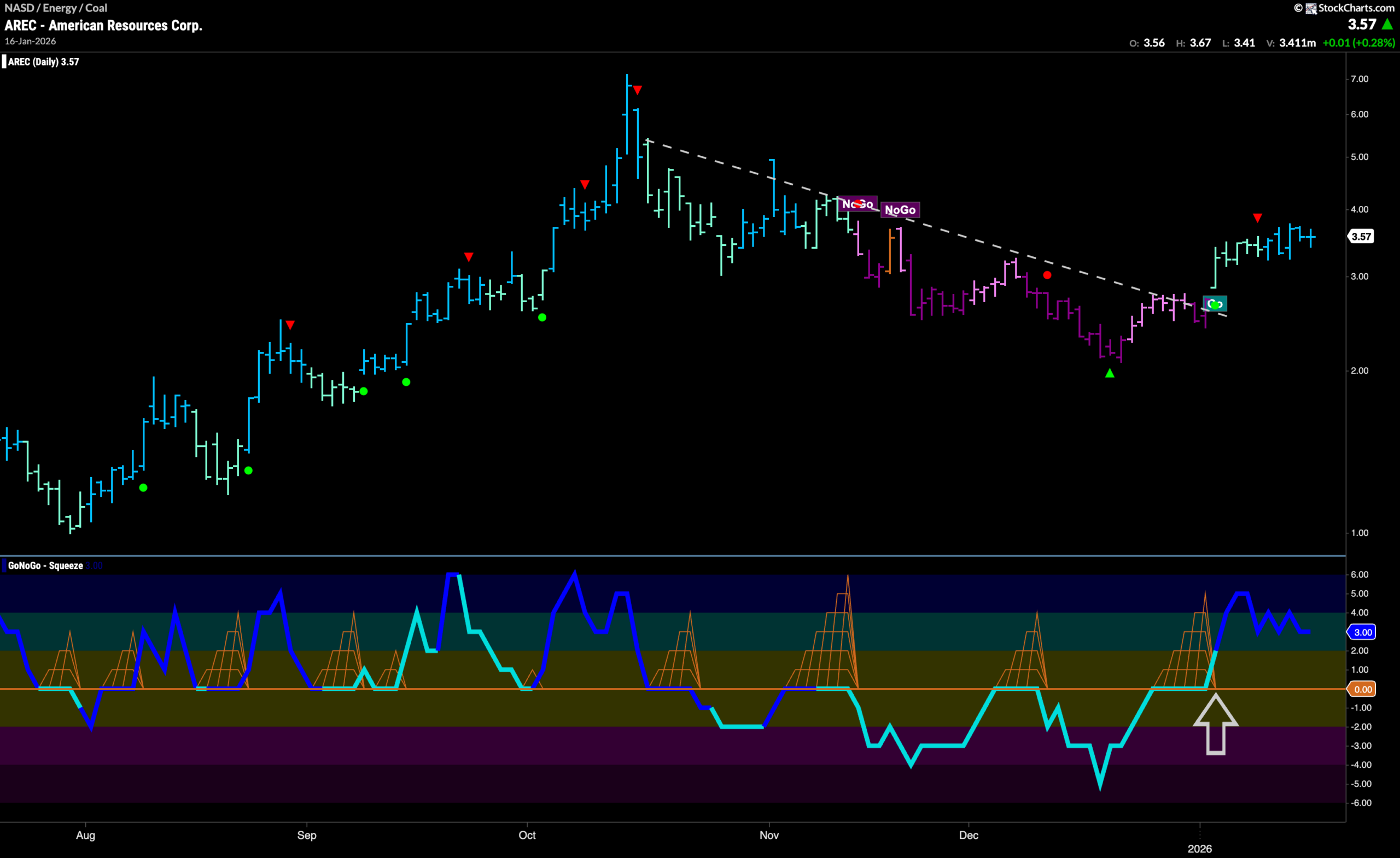
GoNoGo Trend shows that $AREC has enjoyed a strong week as the indicator paints strong blue bars as the trend takes hold. This comes after a clean break of a downward sloping trend line saw the beginning of the trend a few weeks ago. This new trend and break higher came as GoNoGo Oscillator broke out of a Max GoNoGo Squeeze into positive territory and on increasing volume. Now, momentum is in positive territory but no longer overbought at a value of 3. This tells us that momentum is inline with the underlying “Go” trend.
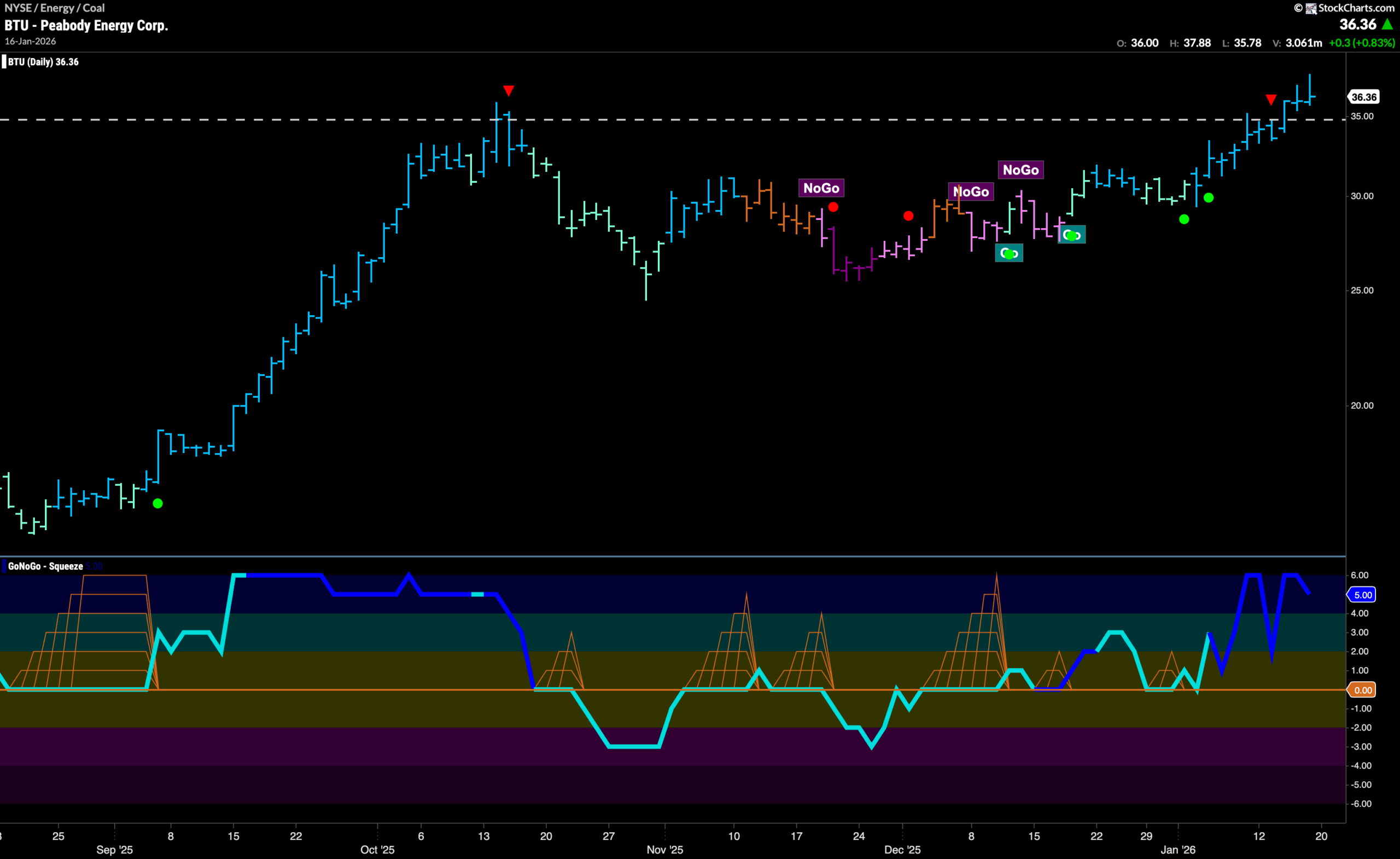
$BTU Breaks to New High
$BTU has made a break for new highs this past week. We can see that after a period of sideways correction that caused GoNoGo Trend to roll through amber “Go Fish” bars and then “NoGo” bars, the “Go” trend returned and we saw price run up against horizontal resistance that we see on the chart from the prior high in October. GoNoGo Oscillator found support at zero twice launching price higher on the back of multiple Go Trend Continuation Icons (green circles). Now, we see that momentum remains in overbought territory. We will watch to see if price can consolidate at these levels and find support at what was once resistance before potentially climbing higher.