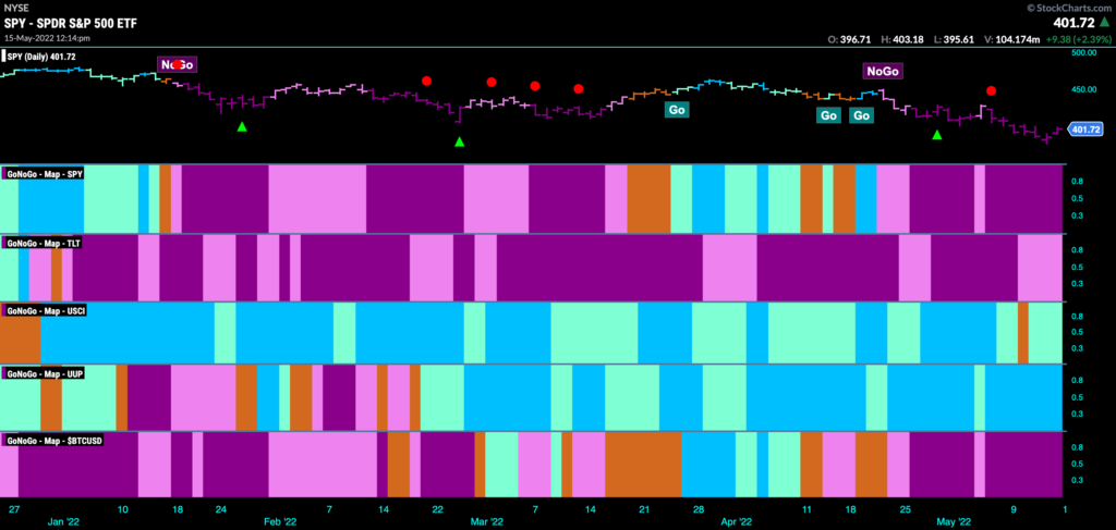
Good morning and welcome to this week’s Flight Path. Let’s take a look at the GoNoGo Asset map below. Here we are again. Equities “NoGo” trend is strong as we see uninterrupted purple bars this week. Treasury bonds remain in a “NoGo” albeit painting weaker pink bars. Commodities are hanging on to the “Go” trend that has been in place for some time as the dollar goes from strength to strength. It’s been another tough week for bitcoin as well.
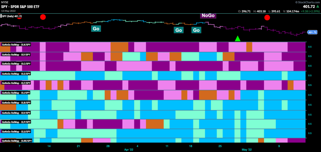
Sector Performance
Below is the GoNoGo Sector Relmap. This GoNoGo Relmap applies the GoNoGo Trend to the relative strength ratios of the sectors to the base index. Looking at this map, we can quickly see where the relative outperformance is coming from as well as which sectors are lagging on a relative basis. Defense is still the play. “Go” trends on a relative basis abound in the value sectors such as staples, utilities and of course energy, materials and industrials. Growth remains to be avoided as it is technology, communications and discretionary dragging the index lower. Financials, after a flirtation with an amber “Go Fish” bar has resumed its “NoGo” trend this week.
I “SPY” a new low
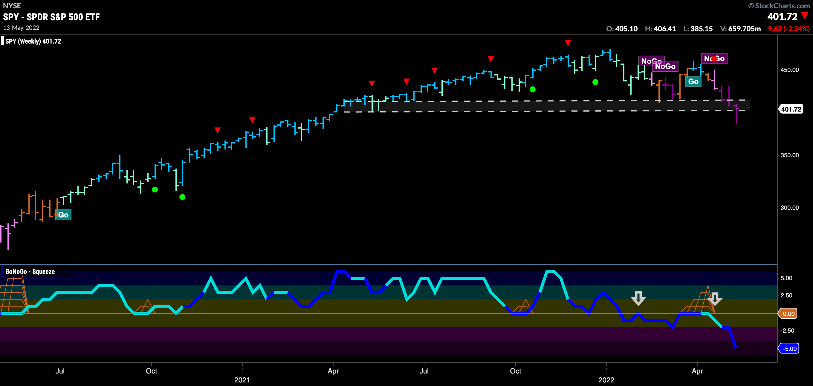
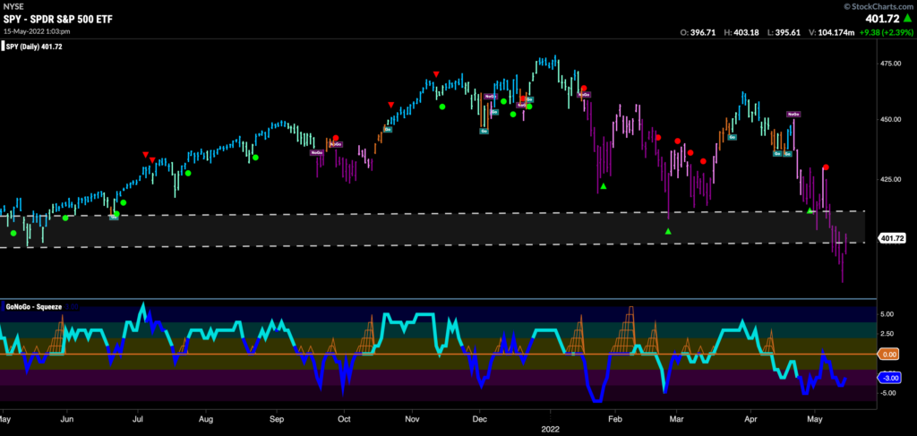
Below is the daily chart of $SPY prices with GoNoGo suite of tools applied to weekly prices. We can clearly see how important these price levels are. Well and truly embroiled in a “NoGo” on the longer term chart, investors are looking to see if there is enough support here to prevent further price deterioration. GoNoGo Oscillator broke below zero on heavy volume earlier in the year and has since been rejected by zero confirming the change in trend to “NoGo” in the price chart above.

The daily chart brings these levels into a bit more focus. We can see that price crashed through support but on Friday was able to rally enough to hover around the lower bound. However, the ‘NoGo” trend is painting strong purple bars as GoNoGo Oscillator is in negative territory on heavy volume having been turned away by zero earlier in the week.
Financials are Falling
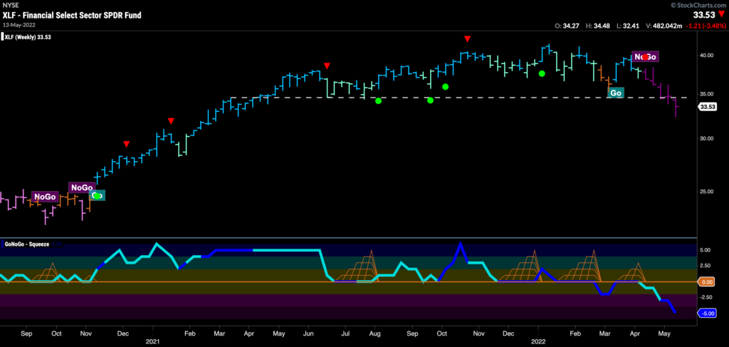
See the weekly GoNoGo Chart of the financials sector $XLF. You can see a similar picture to that of $SPY above. GoNoGo Trend paints a clearly bearish picture as the “NoGo” has seen a run of weekly strong purple “NoGo” bars that has pushed price below horizontal support. GoNoGo Oscillator confirms having broken through the zero line on heavy volume a couple of months ago and now is once again falling on heavy volume.
Bank of America Needs Bailing Out
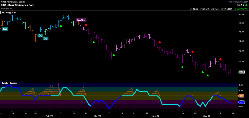
As financials fall, let’s look at one of our largest banks. Below is the GoNoGo Chart of $BAC. As you can see, the “NoGo” trend has been in place since February and a series of lower highs and lows has pushed price ever lower. Recently, we have seen another “NoGo” trend continuation icon telling us that momentum is resurgent in the direction of the “NoGo” trend.
Elan Effect Over for Twitter?
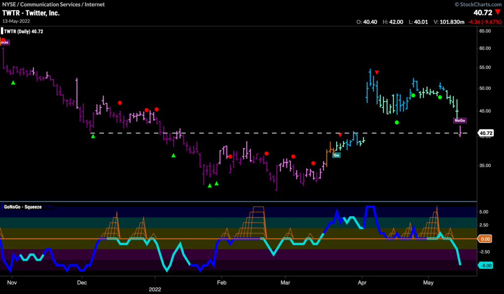
The chart below shows $TWTR daily prices with GoNoGo suite of tools applied. A correction against the highs of the Elan Musk takeover announcement has caused price to fill the gap. This often happens and is not a surprise. However, the last price bar also induced a trend change as we see GoNoGo Trend painting a pink “NoGo” bar as price tests the support from the lower bound of the gap. With GoNoGo Oscillator in oversold territory it appears the market is validating lower prices.
Twitter’s Longer Term View
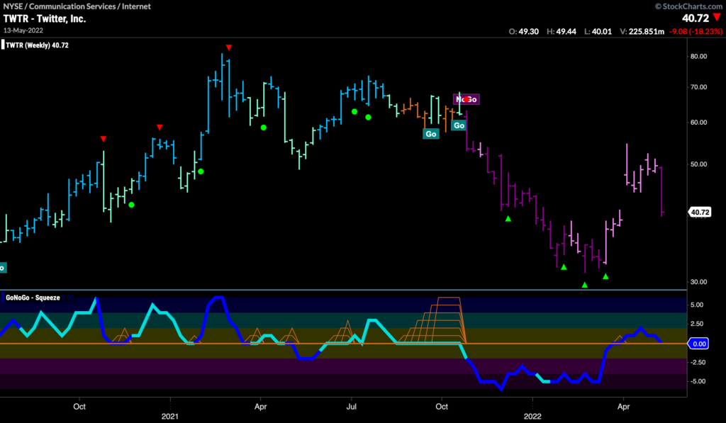
If we zoom out, we can see that the excitement of the new “Go” trend in Twitter hasn’t been enough to bring price out of a strong “NoGo” trend. In fact, price has set a lower high. GoNoGo Oscillator is testing the zero line from above and so we will watch closely to see if this becomes support or if it falls back through the zero line to confirm the “NoGo” price trend. If GoNoGo Oscillator finds support then we could expect price to rally in the short term.
Exxon Mobil Setting Up for an Attack on Highs
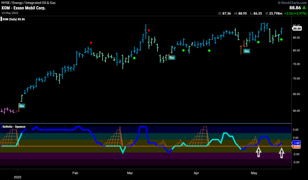
I’d be remiss to not show some oil company charts as the energy trade is still outperforming. The daily chart below shows the GoNoGo suite of tools on $XOM. The “Go” trend resumed after a few amber “Go Fish” bars last month that held at a higher low. Now, GoNoGo Trend paints a strong blue “Go” bar and GoNoGo Oscillator finds support again at the zero line on heavy volume. This suggests that momentum is on the side of the “Go” trend and we see another Go Trend Continuation icon under price.
$XOM Zoomed Out
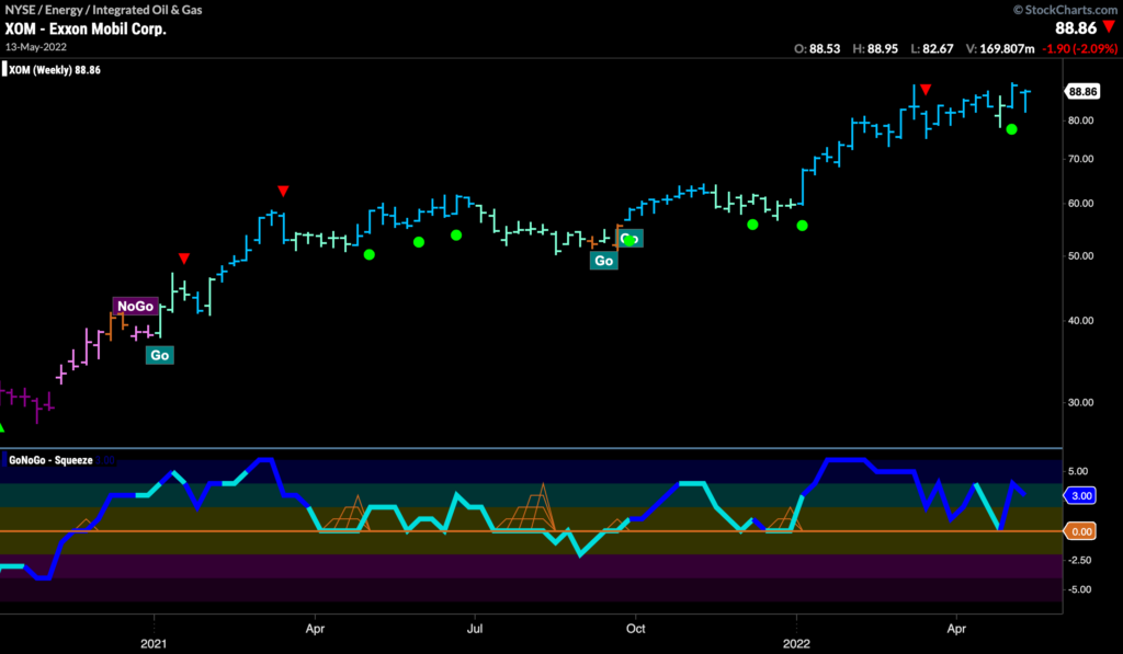
The weekly GoNoGo chart shows just how strong the “Go” trend is for $XOM. GoNoGo Trend shows that price is in a strong “Go” trend as wee see bright blue bars. GoNoGo Oscillator has found support at the zero line on heavy volume.
Wheat Standing Tall
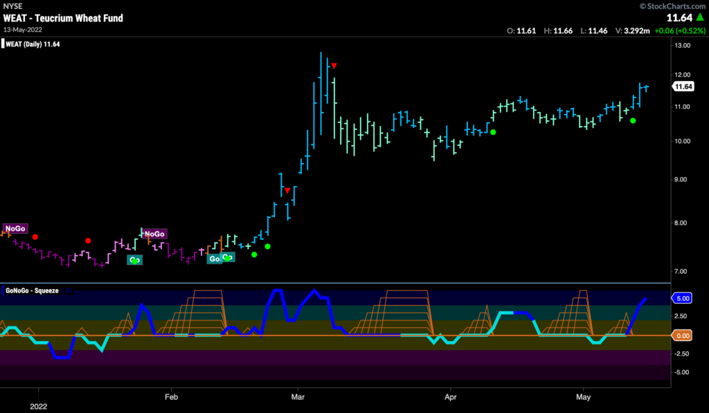
As we’ve noted before, it isn’t just oil. The commodity trade has been strong for other assets. The chart below shows daily prices for $WEAT and we can see that although the parabolic move we saw in March will take some eclipsing; the “Go” trend has remained stoutly in place with GoNoGo Oscillator largely finding support at the zero line. Recently, we have seen a Go Trend Continuation Icon (green circle) as the oscillator rallied off the zero line on heavy volume suggesting that momentum is in support of the “Go” trend. We will look for price to make an attack on those March highs.
