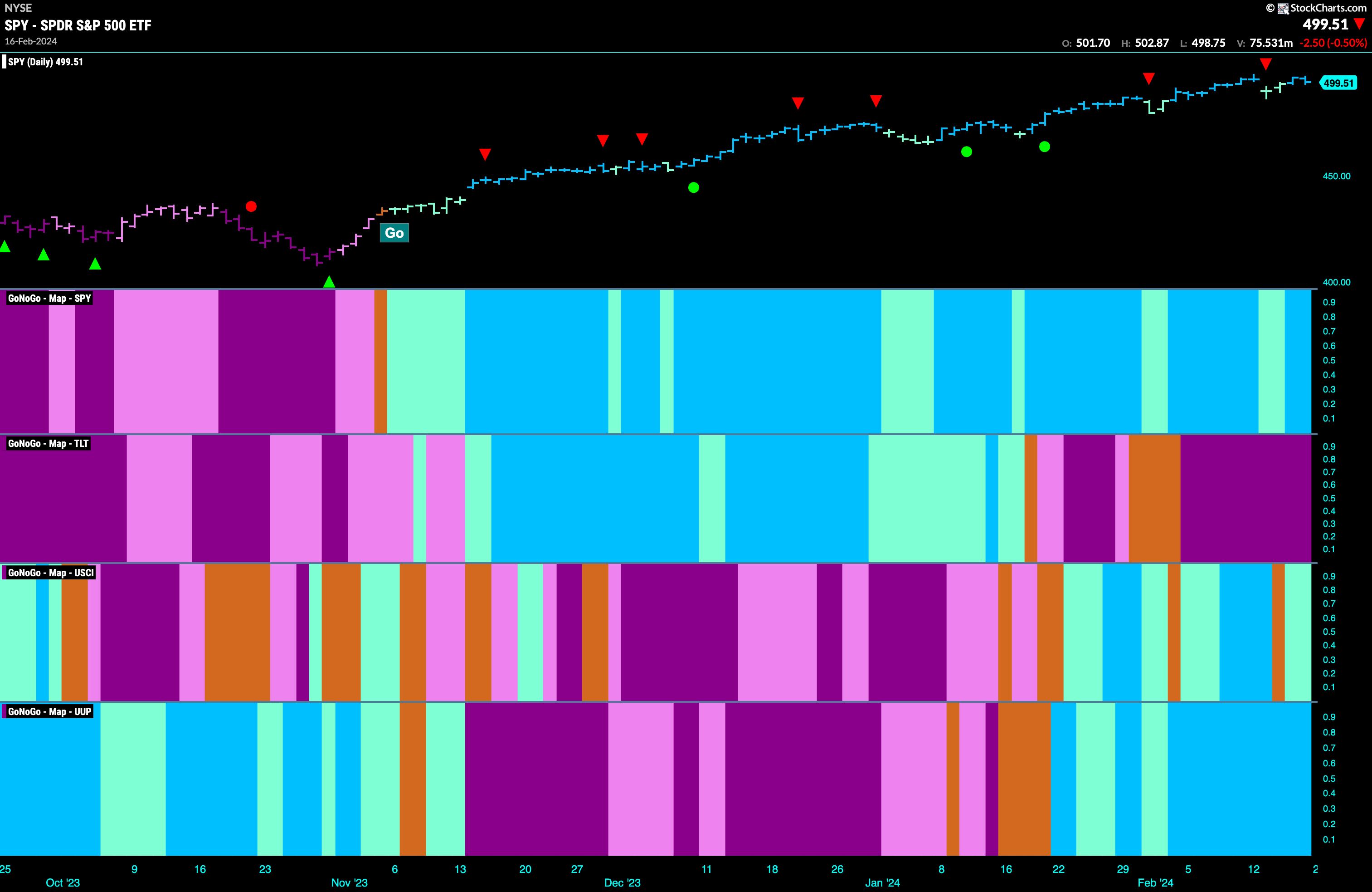
Good morning and welcome to this week’s Flight Path. Equities recovered after a poor start to the week and ended with strong blue “Go” bars and close to testing the most recent high. Treasury bond prices as you can see continued to struggle painting a string of strong purple “NoGo” bars. We will look at what this means for rates later in this note. The U.S. commodity index managed to hold on to its “Go” trend after an amber “Go Fish” bar of uncertainty and painted aqua bars as the week came to a close. The dollar saw its “Go” trend continue and remain strong as it painted strong blue “Go” bars.
U.S. Equities Remain in Strong “Go” trend
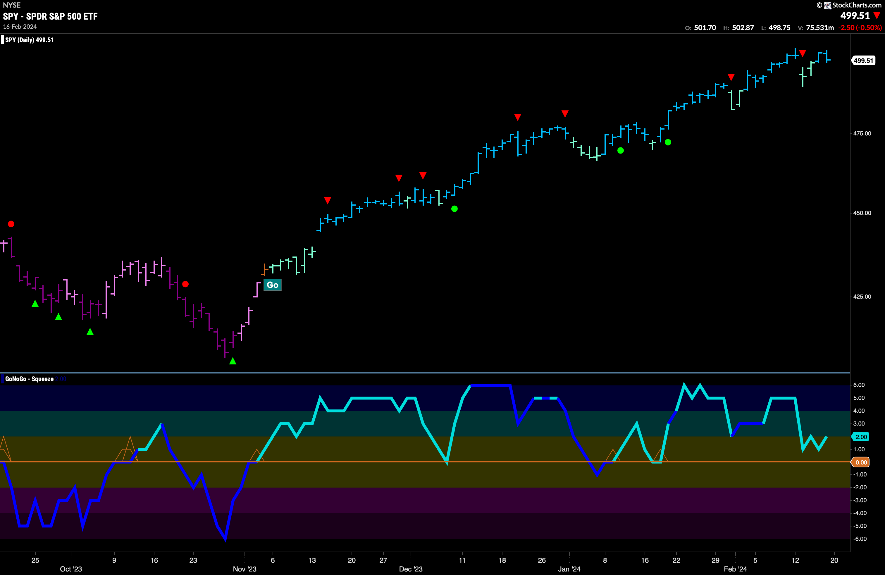
After another higher high at the beginning of last week equity prices fell sharply and we saw a Go Countertrend Correction Icon (red arrow) suggesting price may struggle to go higher in the short term as GoNoGo Trend painted weaker aqua bars. By the end of the week however, the trend quickly strengthened and the indicator was able to paint bright blue bars as price climbed close to prior highs. GoNoGo Oscillator got close to zero but never made it, turning up into positive territory where it now is at a value of 2. Momentum remains positive in the direction of the underlying “Go” trend.
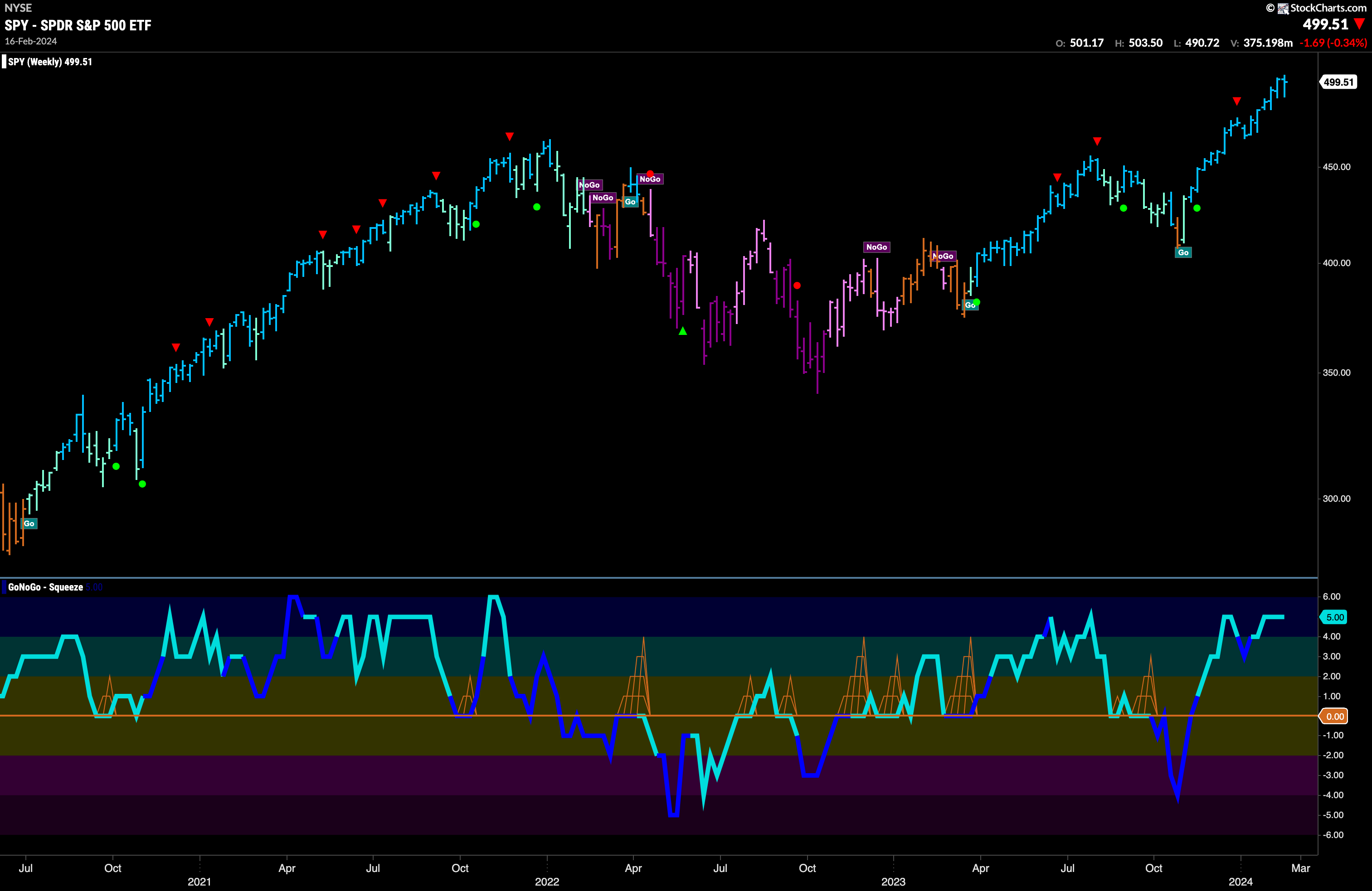
The weekly chart continues to show strength in this current “Go” trend. We can see that we painted another strong blue “Go” bar as price is just about at all time highs still. GoNoGo Oscillator remains overbought at a value of 5 but volume is not heavy. We will watch to see if momentum cools in the coming weeks which could indicator a pause for price and signal a Go Countertrend Correction Icon (red arrow).
Rates Set Higher High
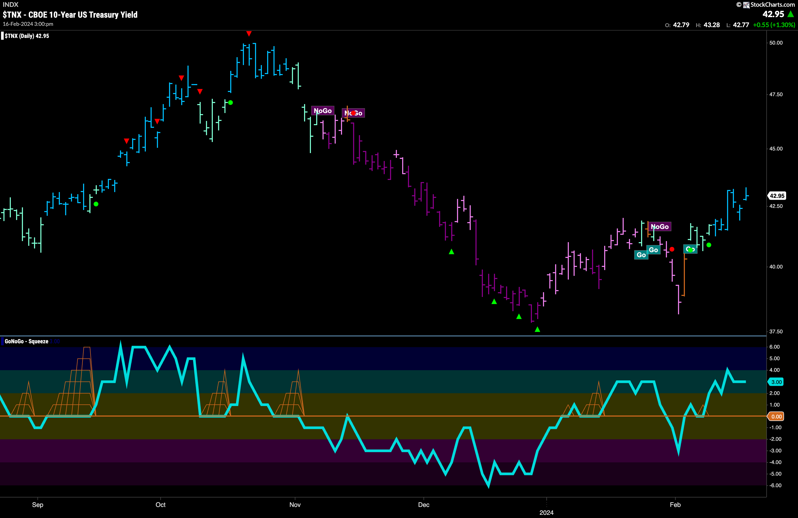
Treasury rates saw strength this week as GoNoGo Trend painted a string of bright blue “Go” bars. Reflecting this strength, price has hit a new higher high as this “Go” trend progresses. GoNoGo Oscillator after having broken through the zero line over a week ago is now comfortably in positive territory but not overbought at a value of 3. We now see a strong “Go” trend in place and positive volume confirming the trend.
The Dollar Hits Resistance at Prior High
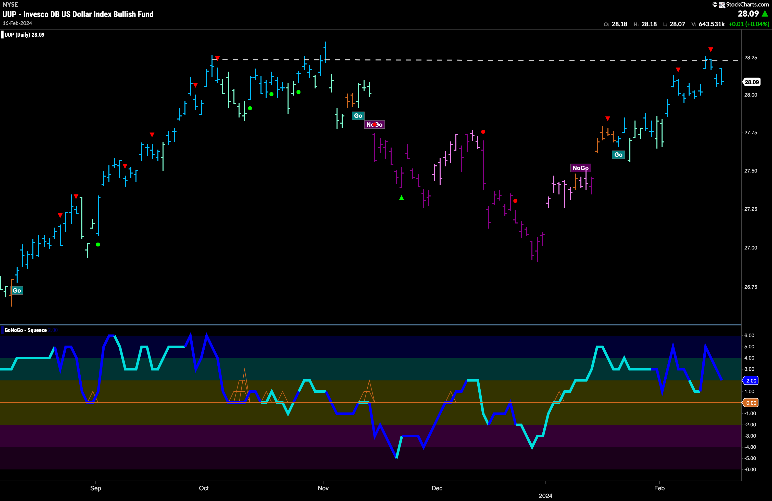
The chart below shows that the “Go” trend remained strong this week as we saw uninterrupted bright blue bars and price jumped higher to make an attempt at a new higher high. However, it met with resistance at this level and we saw a Go Countertrend Correction Icon (red arrow) indicating that price may struggle to move higher in the short term. Price then fell from those levels. Now, GoNoGo Trend is still painting strong blue “Go” bars and GoNoGo Oscillator is in positive territory at a value of 2 and volume is heavy. We will look for support if the oscillator falls to the zero line.
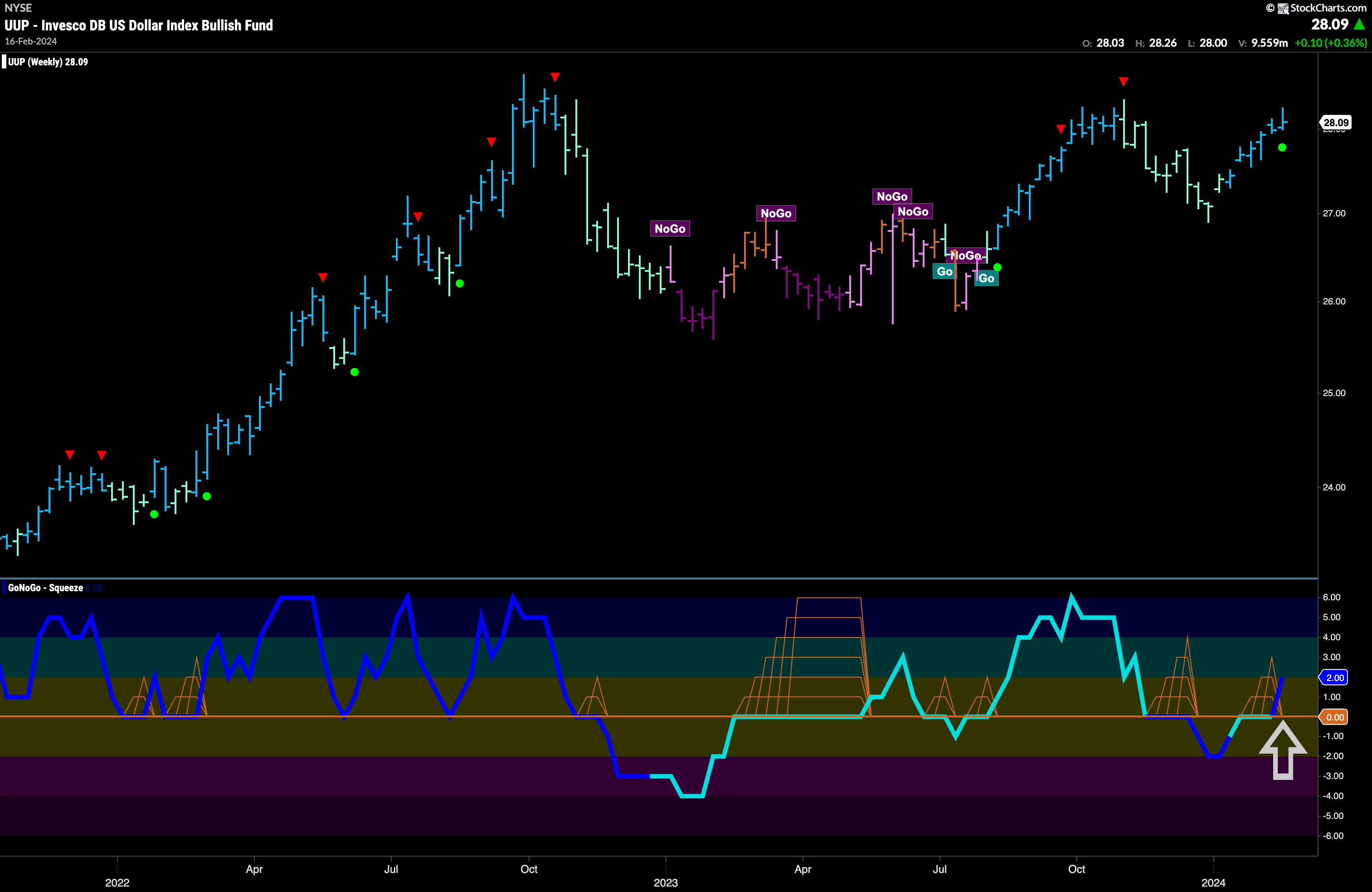
The longer term chart shows us that the “Go” trend remains healthy. We saw GoNoGo Oscillator break into positive territory on last week’s close after having been stuck at the zero line for a few weeks. This tells us that the market has made a decision and come down in favor of positive momentum and potentially higher prices. We see a Go Trend Continuation Icon (green circle) under the price bar and that tells us that momentum is resurgent in the direction of the underlying “Go” trend and so we can look for price to make an attempt at a new higher high.
Oil Trend Continues
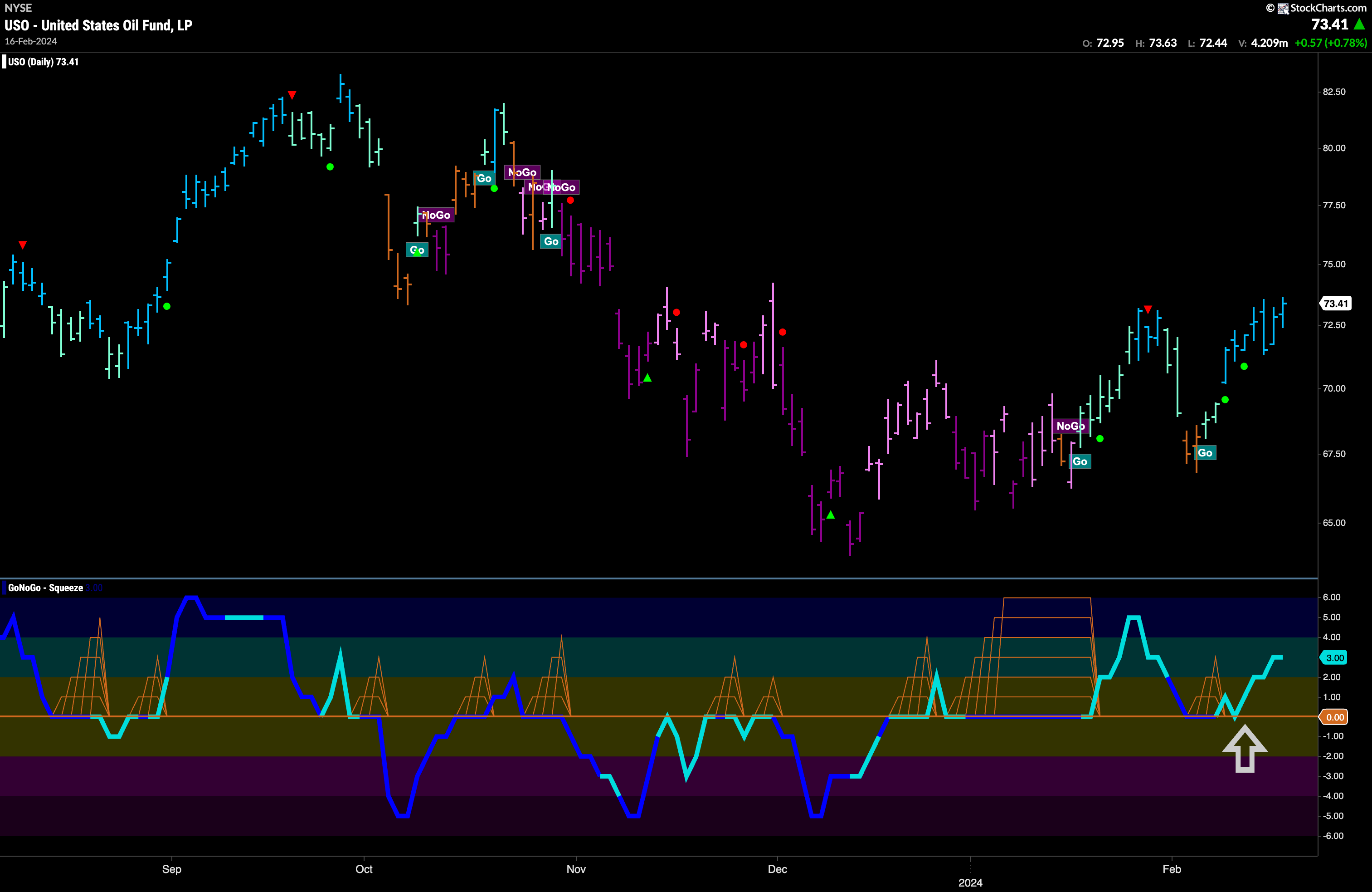
GoNoGo Trend painted an uninterrupted string of bright blue “Go” bars this week as the trend showed strength. Having found support again at the zero line early in the week the GoNoGo Oscillator has rallied into positive territory giving support to the to current “Go” trend. We will look for price to consolidate at these levels and potentially make an attempt to move higher and set a new high.
Gold In “NoGo” but Found Support
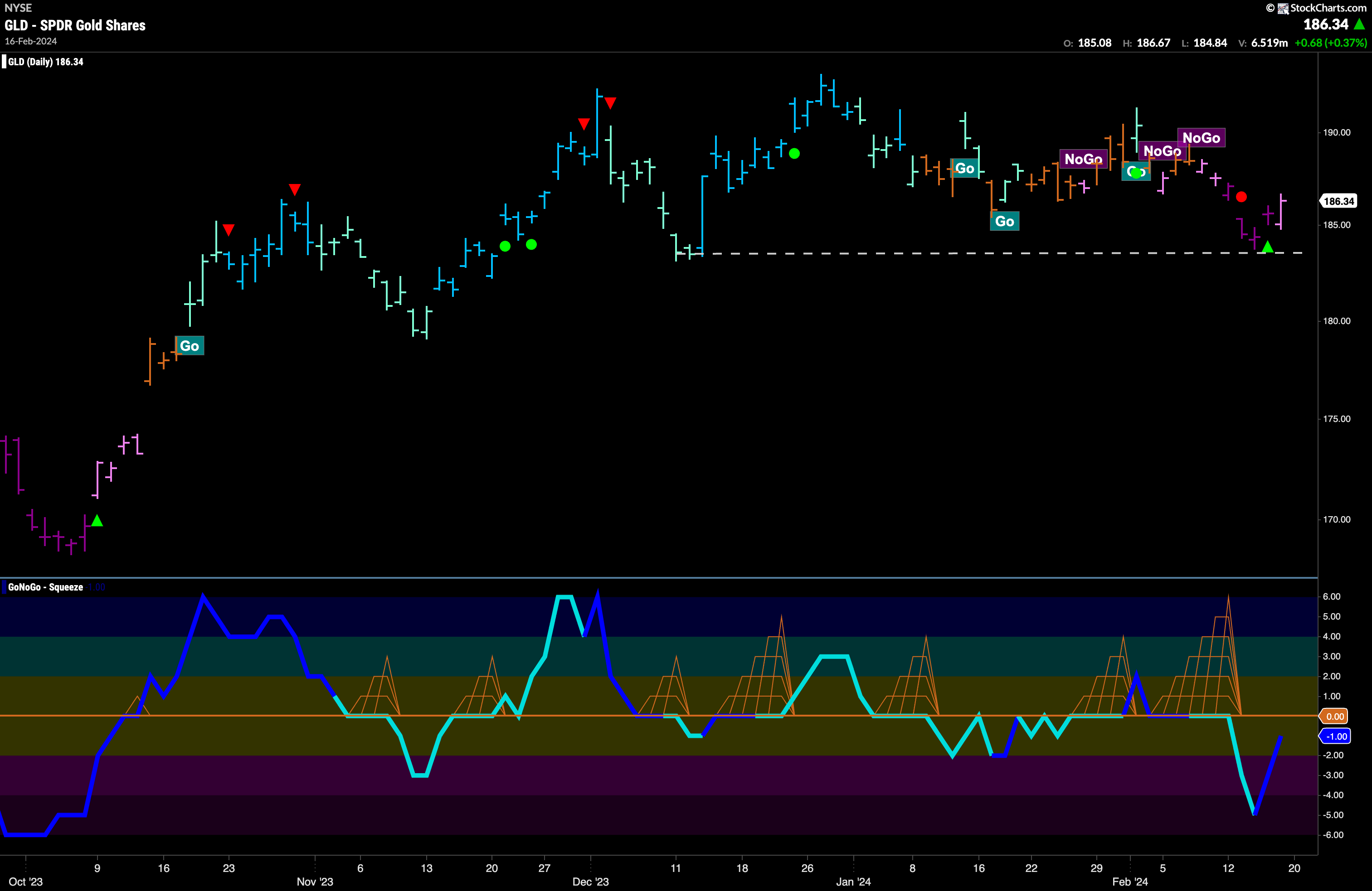
Gold continues to confound investors. After entering a “NoGo” trend we saw price fall but last week stopped abruptly after finding support at prior lows. We saw a NoGo Countertrend Correction Icon (green arrow) indicating that price could struggle to go lower in the short term and indeed the end of the week saw price climb and GoNoGo Trend paint a weaker pink bar. GoNoGo Oscillator is in negative territory on heavy volume but rising toward the zero line at a volume of -1. We will watch to see if it is met with resistance at that level should it get there.
Sector RelMap
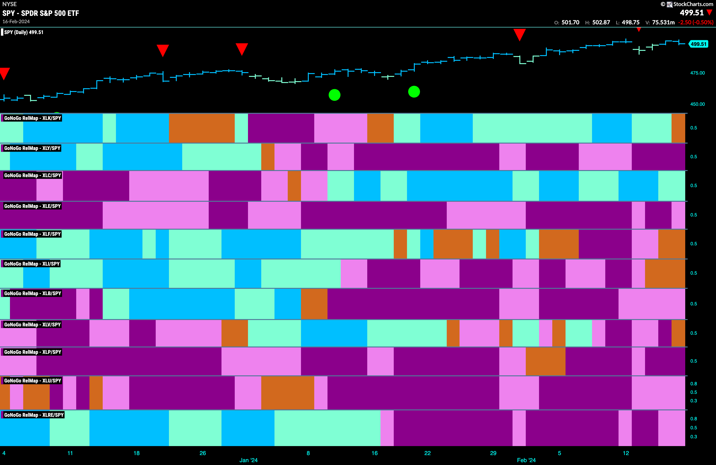
Below is the GoNoGo Sector RelMap. This GoNoGo RelMap applies the GoNoGo Trend to the relative strength ratios of the sectors to the base index. Looking at this map, we can quickly see where the relative outperformance is coming from as well as which sectors are lagging on a relative basis. Only 1 sector is outperforming the base index this week. $XLC is painting relative “Go” bars.
$XLC Looking For Higher Highs
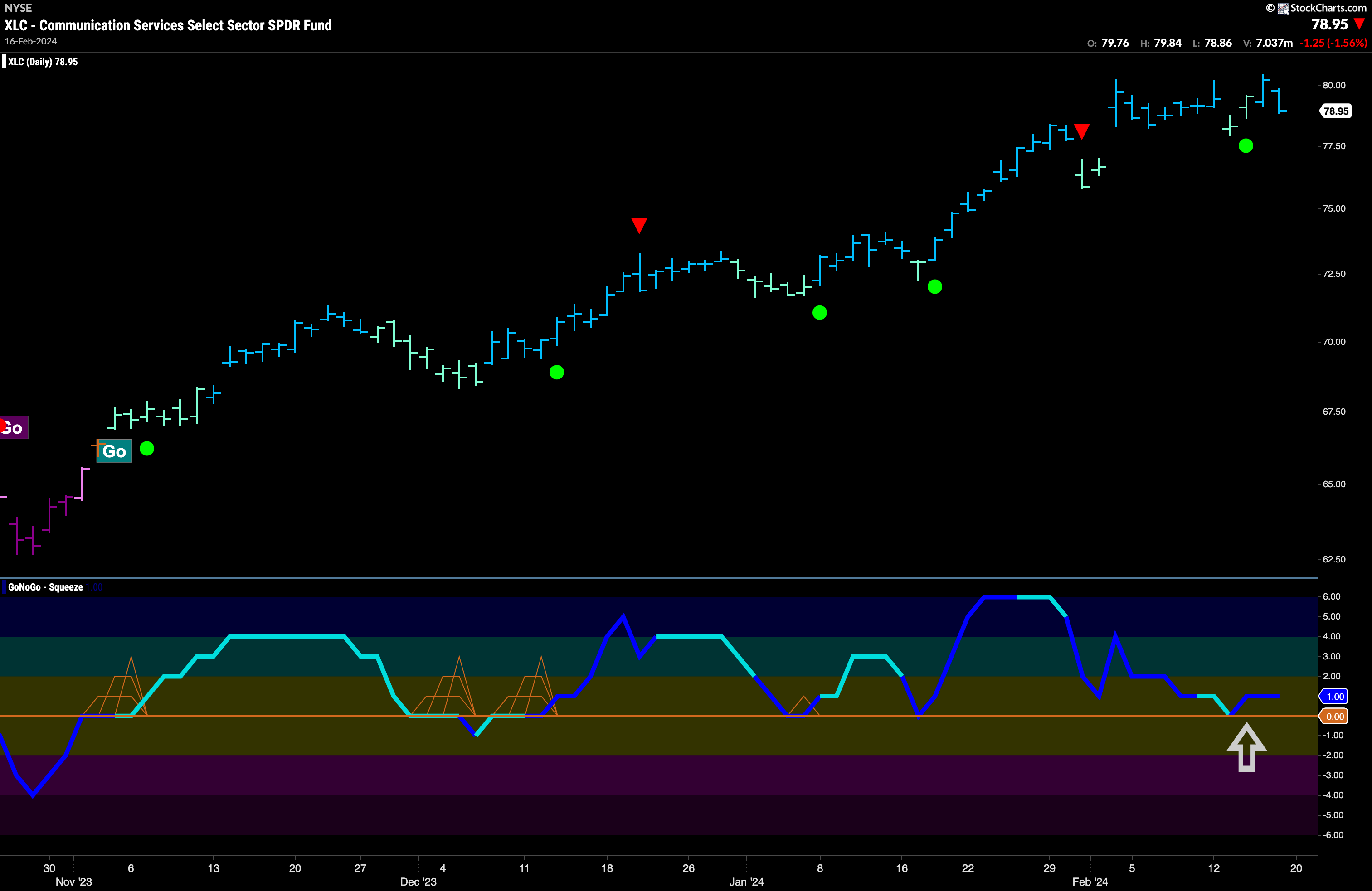
$XLC has been in a pretty “Go” trend since early December of last year. Since then it has made a series of higher highs and higher lows with GoNoGo Oscillator finding support at the zero line giving plenty of trend continuation signals (green circles). As we look at the chart below, we can see that GoNoGo Oscillator has once again found support at the zero line as it bounced back into positive territory with heavy volume. This comes after price has moved mostly sideways for a few weeks. We will look to see if this will give price the push it needs to move higher.
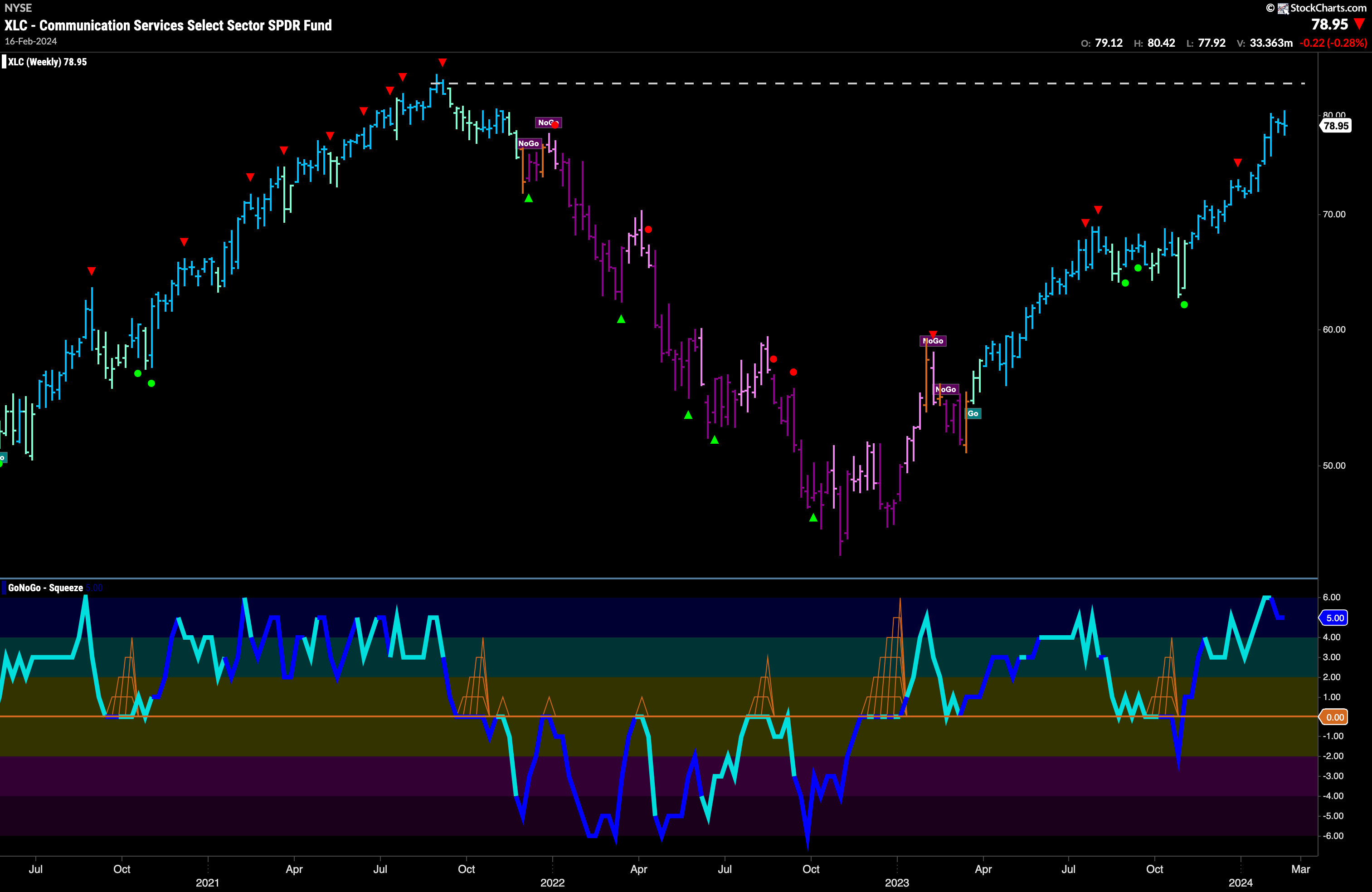
The weekly chart shows that although there is recent outperformance from the communications sector relative to the base index (see Sector RelMap above), the sector still has room to run before it matches and surpasses its own all time highs. With strong blue “Go” bars, and momentum clearly on the side of the “Go” trend, we will watch to see if price can continue higher over the next weeks/months and perhaps challenge for new highs.
Communications Sub-Group RelMap
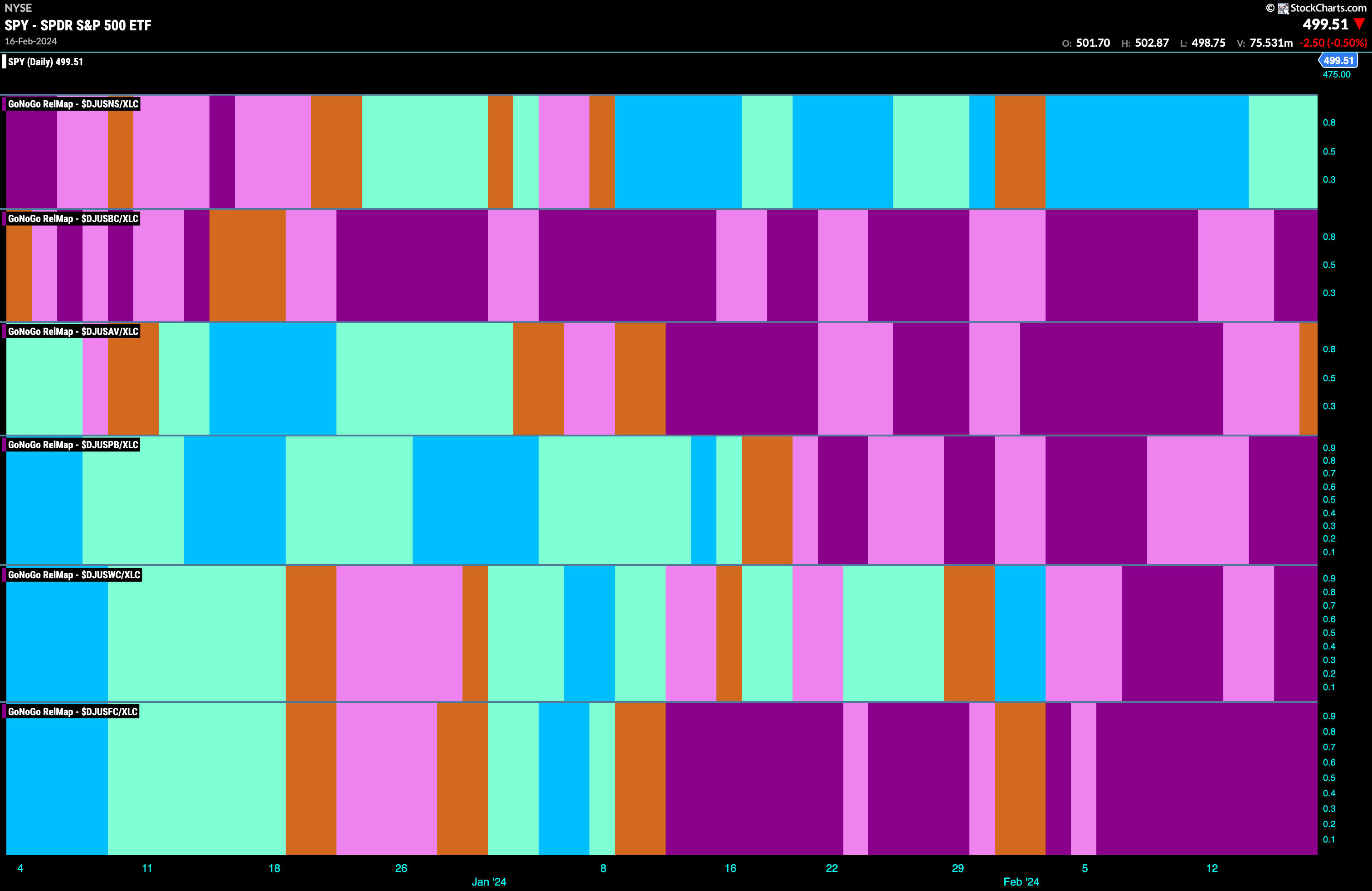
The GoNoGo Sector RelMap above shows that the communications sector continues to outperform on a relative basis for another week. Below, we see the individual groups of the sector relative to the sector itself. We apply the GoNoGo Trend to those ratios to understand where the relative outperformance is coming from within a sector. There is no doubt where the recent outperformance has come from within the communications sector. The Internet Index (top panel) has been in a “Go” trend for weeks now.
Internet Index Looks for Trend Continuation
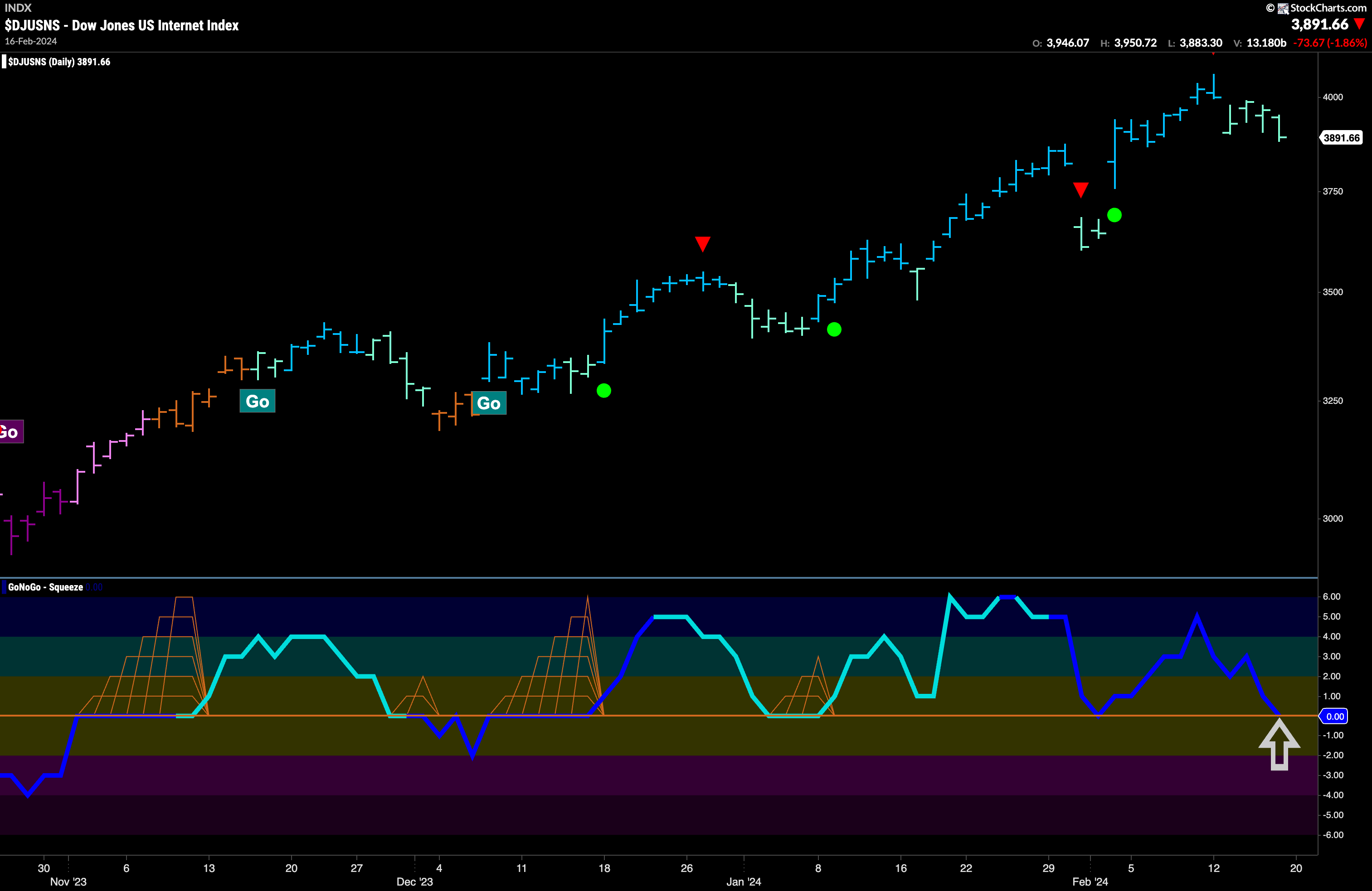
Let’s take a look at a chart of the internet index. Like the communications sector, it has been in a nice “Go” trend making a series of higher highs and higher lows with GoNoGo Oscillator primarily finding support at the zero line during that time. We are at another inflection point now, Price has pulled back following a Go Countertrend Correction Icon (red arrow) and GoNoGo Trend has painted several weaker aqua bar. GoNoGo Oscillator has fallen to test the zero line from above and volume is heavy. If this “Go” trend is to remain healthy we will expect the GoNoGo Oscillator to find support again at zero and if it does we will see a Go Trend Continuation Icon (green circle) under the price bar and will look for price to make an attempt at a new high.
Rising to a Crexendo?
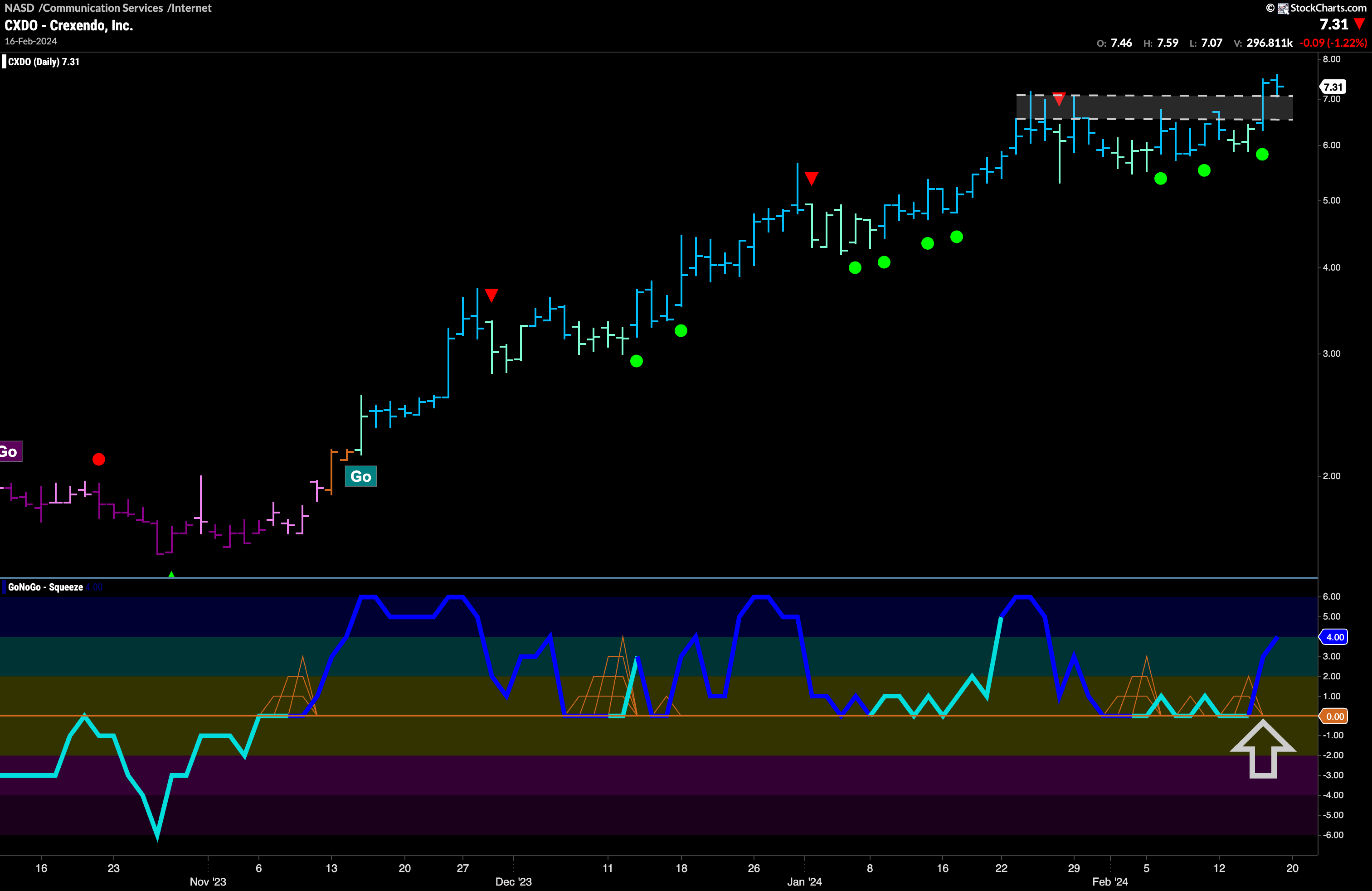
$CXDO has been taking full advantage of the “Go” trend in the internet index. We can see that since November of last year a “Go” trend has been in place with GoNoGo Oscillator finding support at zero during that time. At the end of January, we saw a Go Countertrend Correction Icon (red arrow) suggesting that price may struggle in the short term to go higher. As price moved mostly sideways since that signal, GoNoGo Oscillator continued to find support at the zero line and we have seen a clustering of Go Trend Continuation Icons (green circles). The oscillator has rallied sharply into positive territory and volume is heavy, propelling price above resistance to new highs. We will look for price to consolidate at these levels and move higher from here.
$SY About to Change Trend?
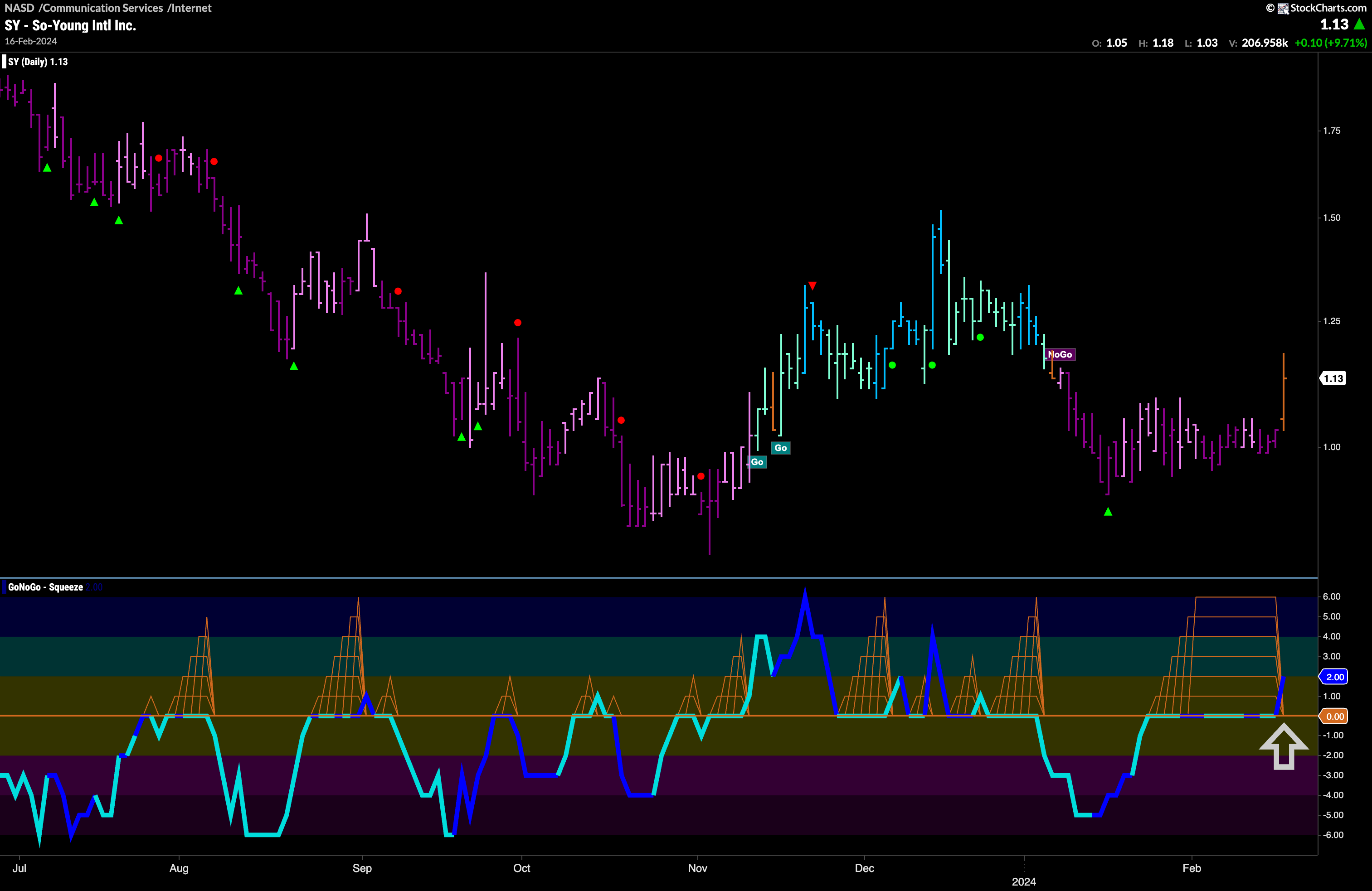
A security in the internet index that hasn’t been doing as well as some is $SY. We can see that an attempt at a “Go” trend last year was short lived. GoNoGo Oscillator fell back below the zero line out of a Max GoNoGo Squeeze an this was followed by GoNoGo Trend moving into another “NoGo” in January. Is it time for $SY to join the outperformance party? As price failed to go lower after the NoGo Countertrend Correction Icon (green arrow) we saw GoNoGo Oscillator ride the zero line allowing for an extended Max GoNoGo Squeeze. This told us that there was a tug of war over the future direction of price. This Max GoNoGo Squeeze has now been broken sharply into positive territory with heavy volume. GoNoGo Trend has painted an amber “Go Fish” bar representing uncertainty in the “NoGo” trend. We will look to see if this momentum breakout will give price the push it needs to move higher and into a “Go” trend.
