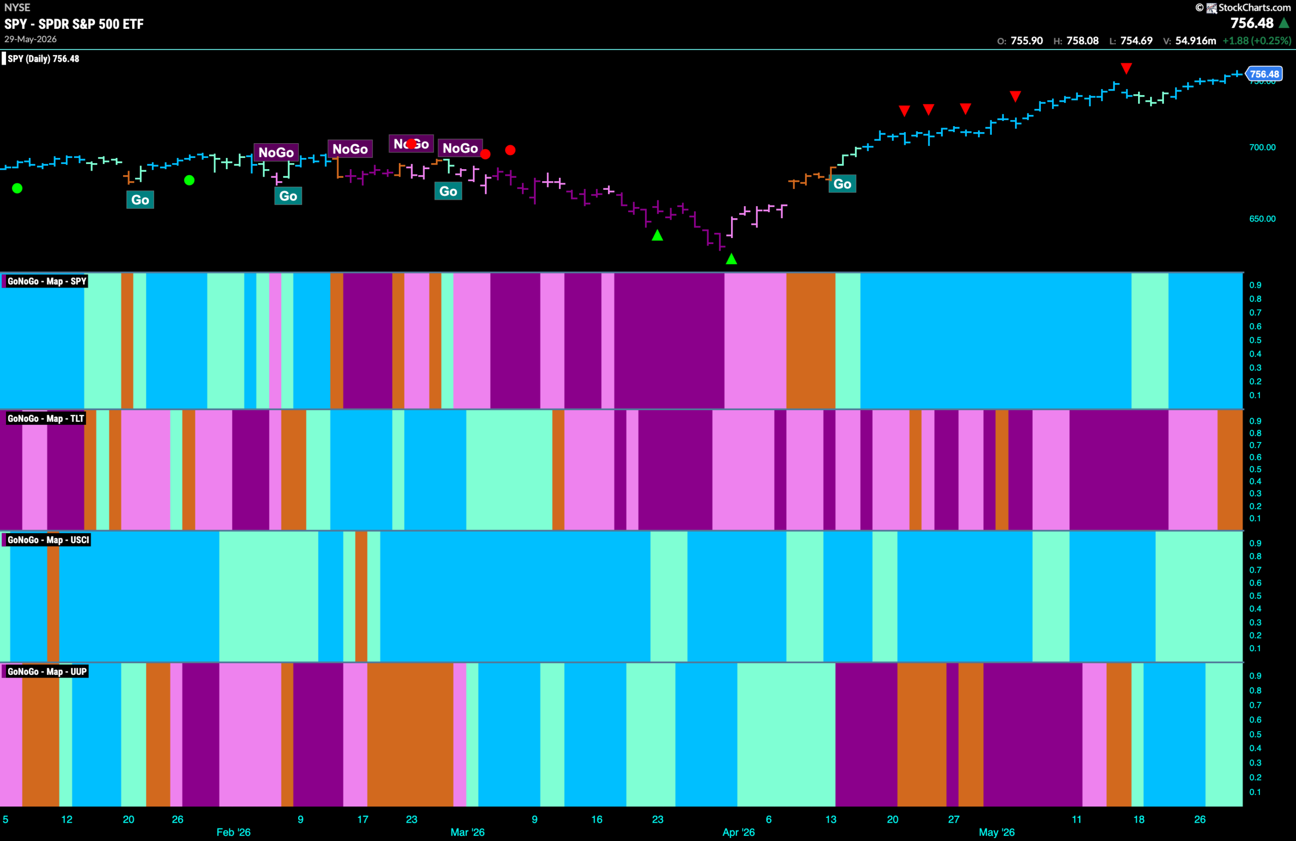
Good morning and welcome to this week’s Flight Path. The equity trend remains very strong for another week as after last week’s glimpse of weaker aqua bars we have seen another run of strong blue “Go” bars as price runs on to another higher high. Treasury bond prices have for now fallen out of the “NoGo” trend they were in and paint amber “Go Fish” bars of uncertainty. U.S. commodities remain in a “Go” trend but we see an entire week of weaker aqua bars. The dollar, for now also remains in a “Go” trend but we saw a couple of weaker aqua bars as the week came to a close.
$SPY Hits Another Higher High
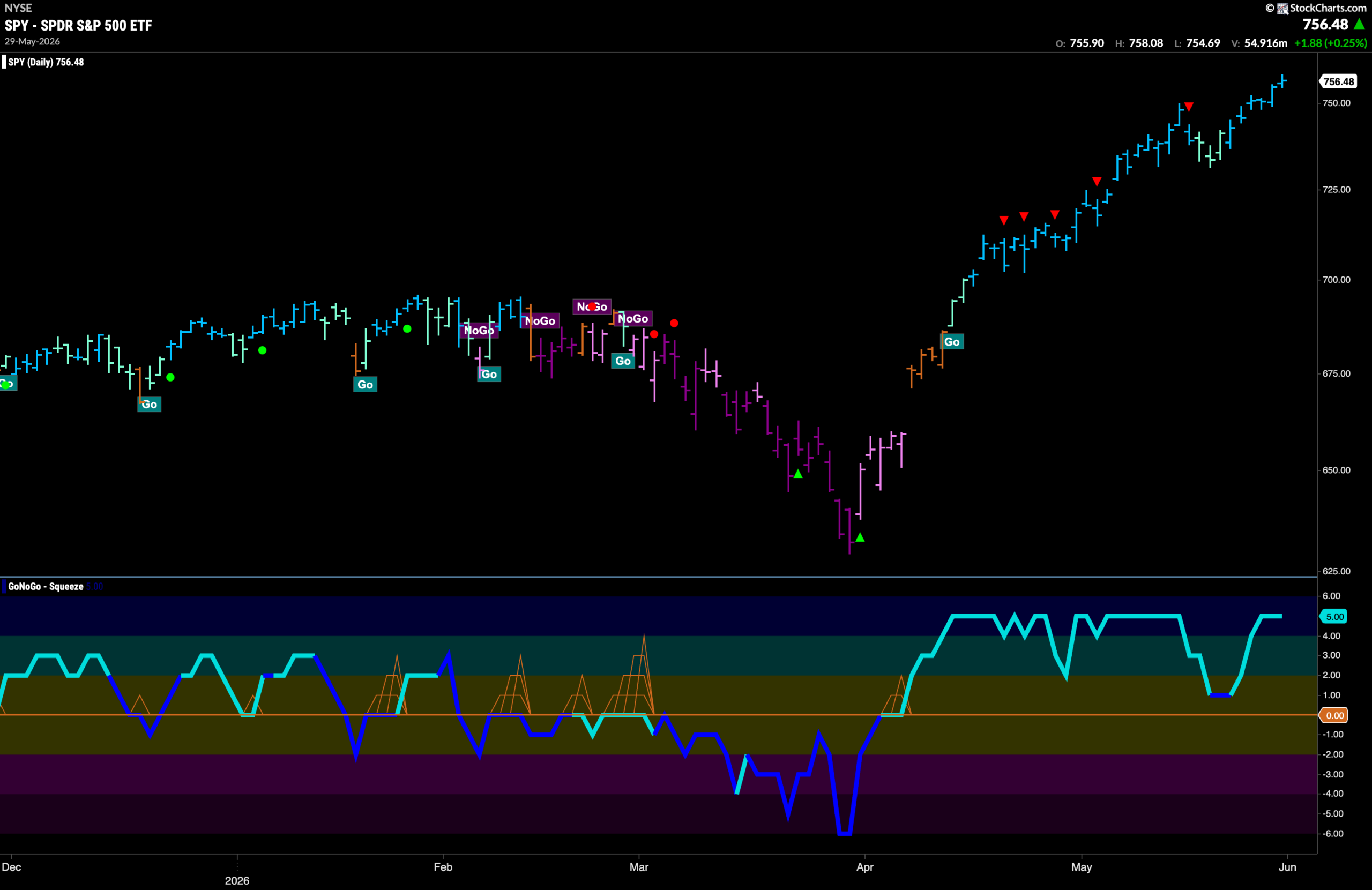
The GoNoGo chart below shows that the “Go” trend has remained for U.S. equities with the indicator painting “Go” bars and price hitting another higher high. After the last high, we saw a Go Countertrend Correction Icon (red arrow) indicating that price may struggle to go higher in the short term and indeed we saw GoNoGo Trend paint weaker aqua bars as price fell from the high. However, before even touching zero, GoNoGo Oscillator rebounded and momentum stayed strong as GoNoGo Trend again painted strength with bright blue bars as price soared to another higher high. Now, with momentum again showing overbought conditions we will watch to see if the market enthusiasm stays strong or wanes in the coming days.
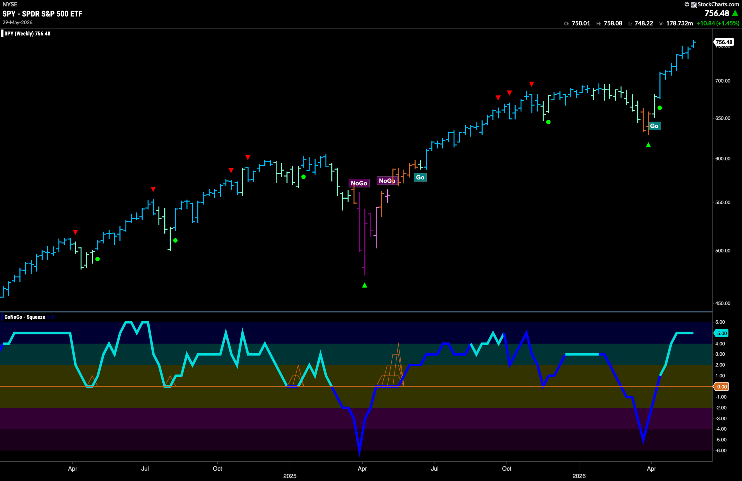
The weekly chart shows that the GoNoGo Trend indicator paints another strong blue weekly “Go” bar as price continues its climb. We see nothing but strength on the larger time frame as momentum stays elevated at overbought conditions and we will watch to see what happens in the coming week.
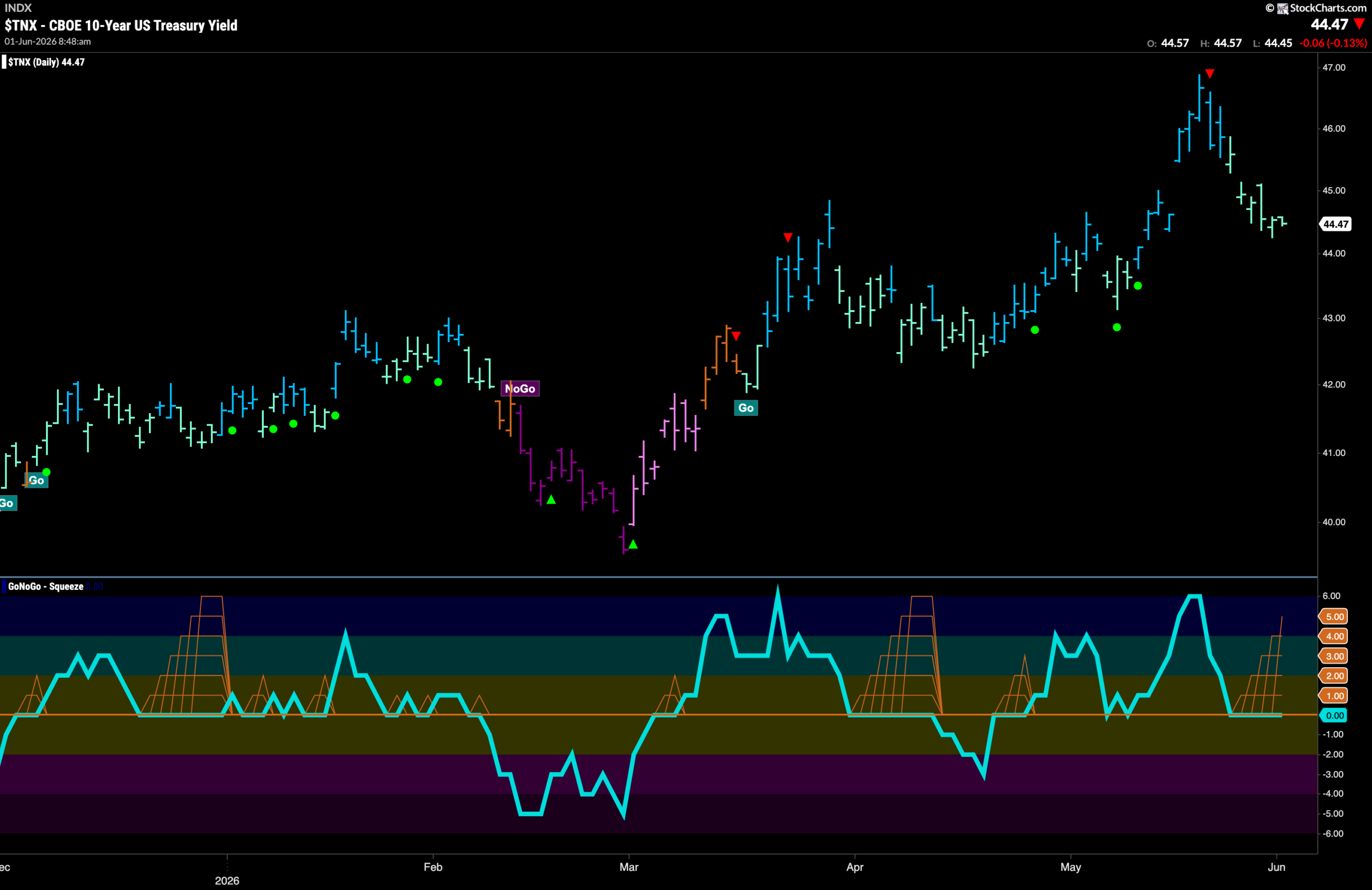
Treasury Rates Fall After High
GoNoGo Trend shows that the “Go” trend is still in place but rates have fallen from the last high. This comes after a Go Countertrend Correction Icon (red arrow) indicated that rates would struggle to go higher due to waning momentum. We saw a series of weaker aqua bars since and GoNoGo Oscillator has fallen to test the zero line from above where we are seeing a GoNoGo Squeeze rise to its Max. We will watch closely for the direction of the Squeeze break this week to give us a hint at the next direction for rates.
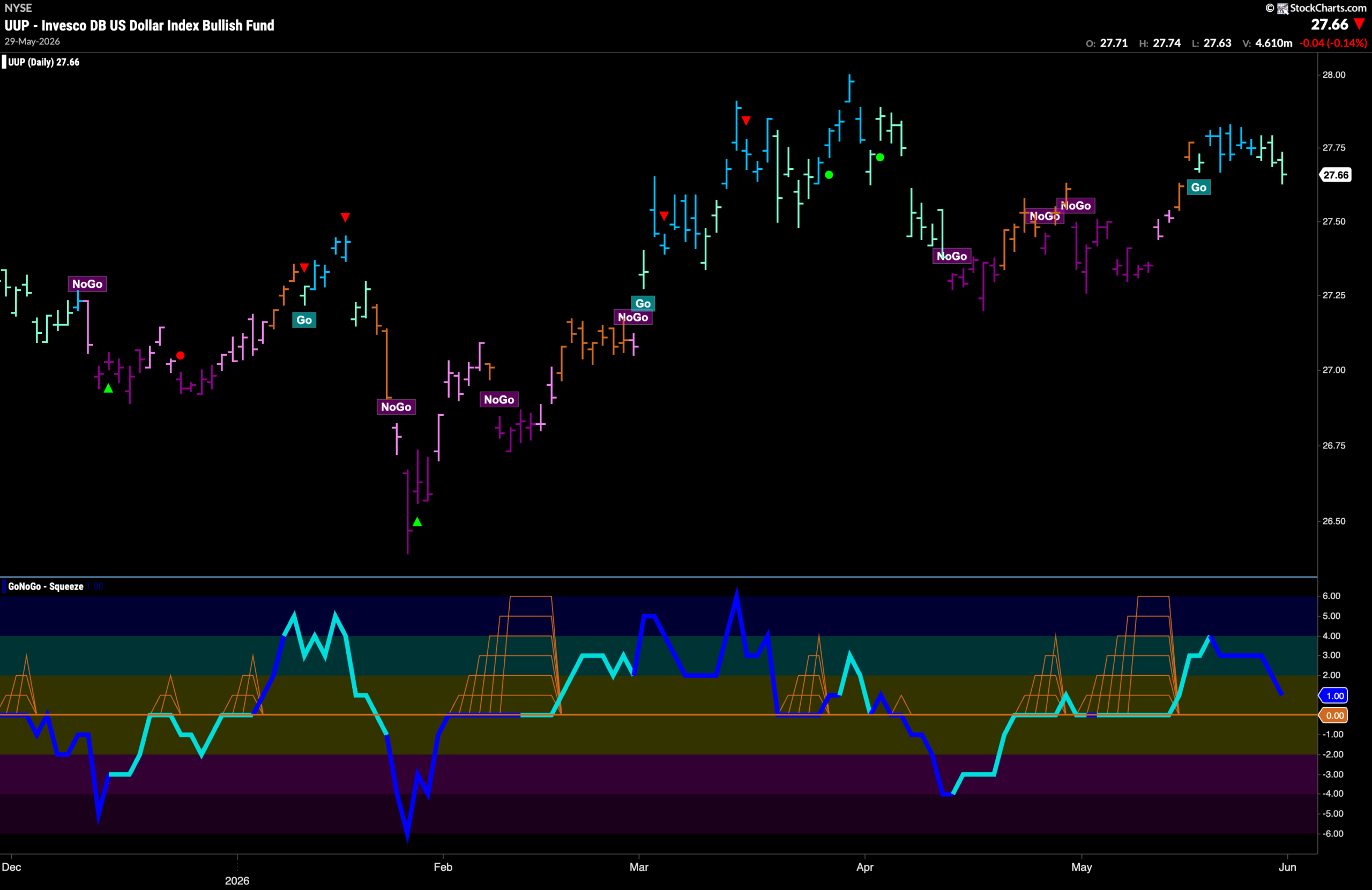
Dollar ($UUP) Sees New “Go” Weaken
The chart below shows that the new “Go” trend in the dollar is showing weakness as price floats mostly sideways since making a short term high last week. With GoNoGo Trend painting aqua bars, we can see that GoNoGo Oscillator is falling toward the zero line and is at a value of 1. It will be important for this new “Go” Trend for the oscillator to stay at or above the zero line. This would tell us that momentum is confirming the “Go” trend that we are seeing in price.
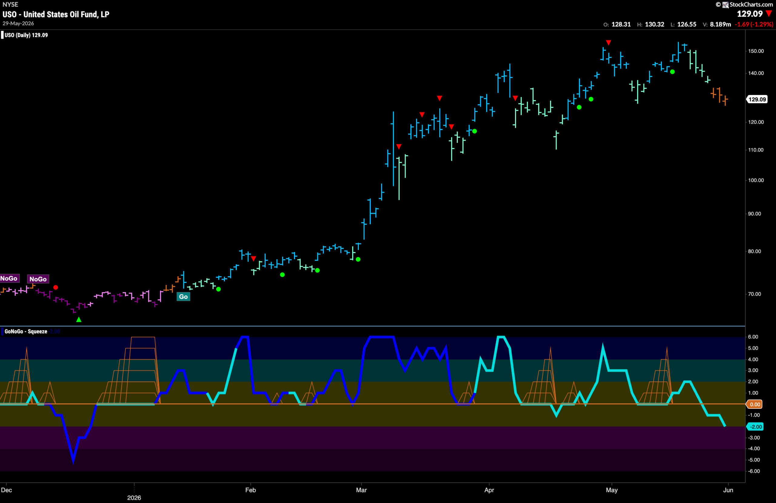
Oil ($USO) Shows Market Uncertainty with “Go Fish” bars
GoNoGo Trend shows that the “Go” trend has failed for the first time in several months as GoNoGo Trend paints amber “Go Fish” bars. This comes after price painted 4 weaker aqua “Go” bars and after GoNoGo Oscillator failed to find support at zero. This tells us that momentum is leaning negative and we will watch to see if this is enough to push the price trend from “Go Fish” to “NoGo” in the coming days.
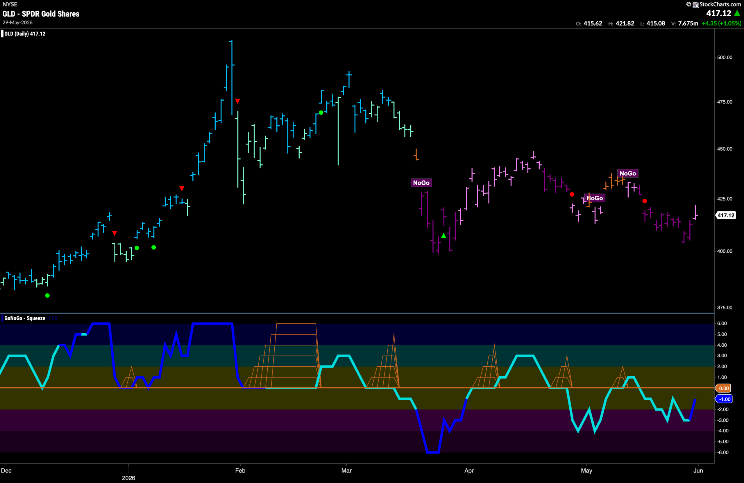
Gold ($GLD) “NoGo” Continues but Paints Weak Pink Bar
The “NoGo” trend continues for gold this week as price fell lower on purple bars. However, we did see a final pink “NoGo” bar indicating weakness as price tries to rally. GoNoGo Oscillator is still below zero but is rising toward that level and we will watch to see if it finds resistance when it gets there or if it can break back above the zero line. If it fails at zero, we can expect more downside pressure and an attempt for price to fall to challenge prior lows.
Sector RelMap
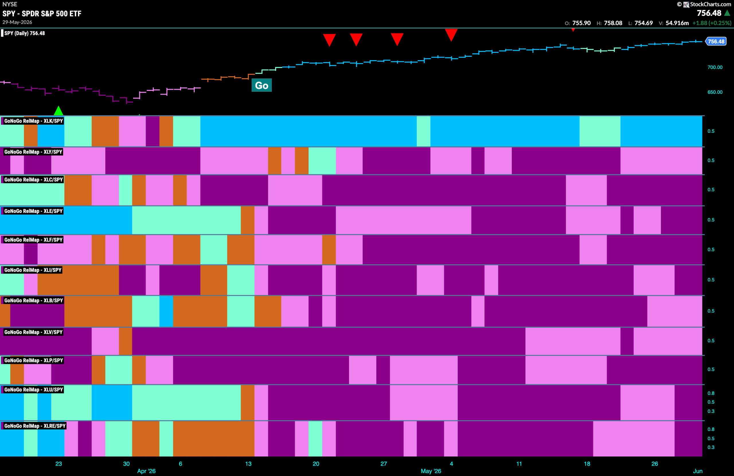
Below is the GoNoGo Sector RelMap. This GoNoGo RelMap applies the GoNoGo Trend to the relative strength ratios of the sectors to the base index. With this view we can get a sense of the relative out performance and relative underperformance of the sectors. 1 sector is in a relative “Go” trend. $XLK, is painting relative “Go” bars.
Technology Sub-Group RelMap
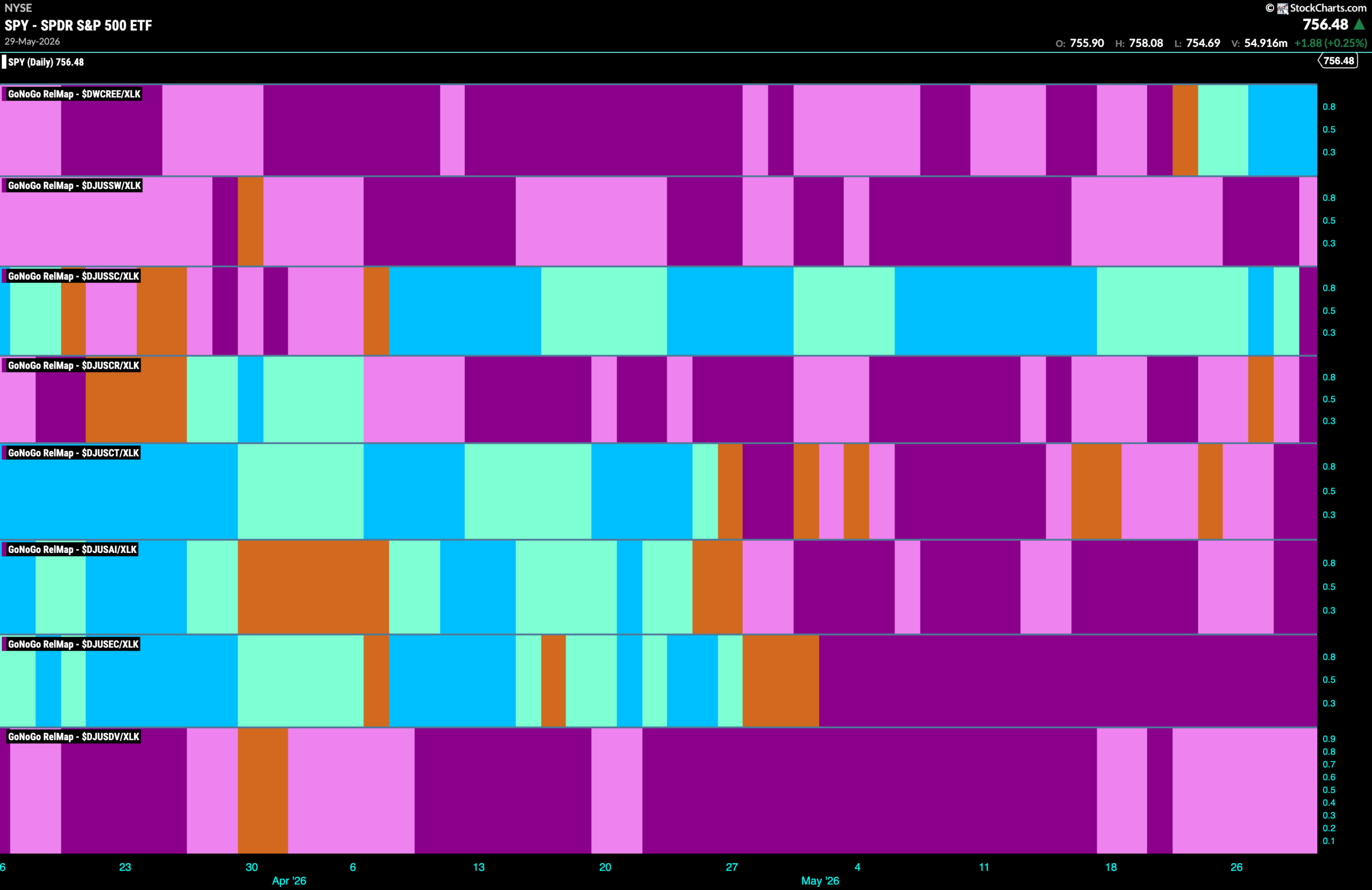
The chart below shows a relative trend breakdown of the sub groups within the technology sector this week. The Sub-Group RelMap plots the GoNoGo Trend of each sub index to the $XLK. We saw in the above GoNoGo Sector HeatMap that $XLK continues to outperform and paints relative “Go” bars. When we look at the below RelMap we can see that the telecommunications index in the top panel has begun to paint strong blue “Go” bars on a relative basis.
$LITE Falls out of “Go” Trend
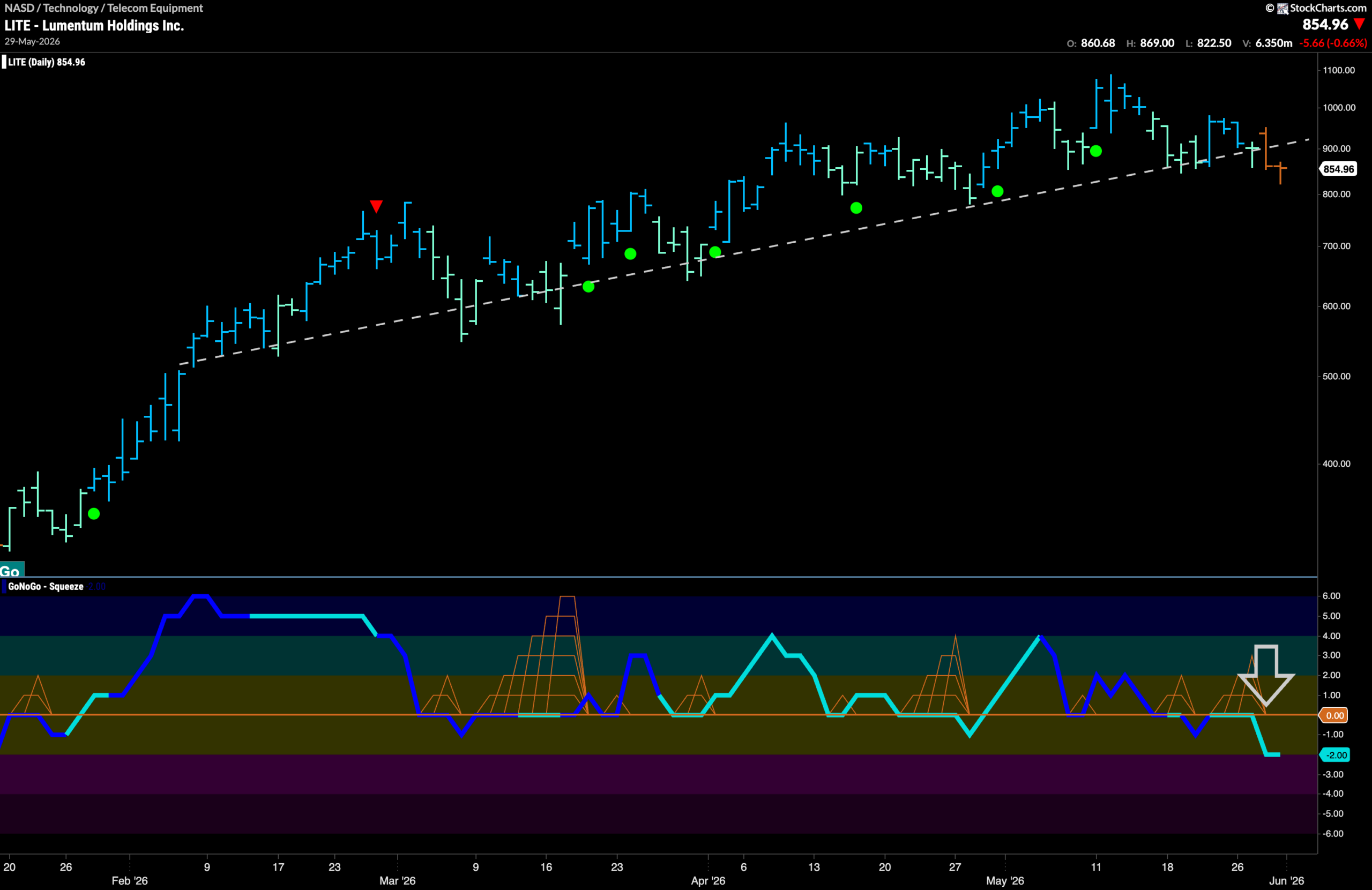
The GoNoGo Chart below shows a change in trend. We will watch carefully as the long term trend line is broken and GoNoGo Trend paints market uncertainty with amber “Go Fish” bars. Is this going against the trend of the industry group or is this an early sign of things to come? We look at the oscillator panel and we can see that GoNoGo Oscillator has been turned away from zero and is in negative territory at a value of -2. We see that there is negative momentum here and so we will watch to see if there is a change to a “NoGo” in the price panel above.
$VIAV Looks to Hold Trendline Support
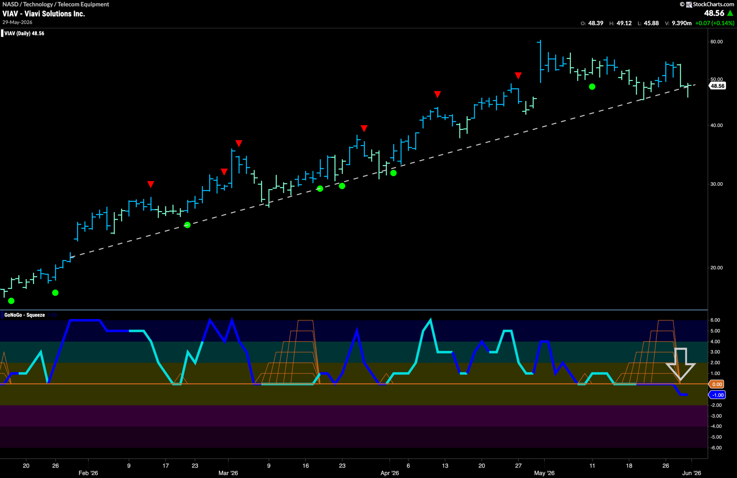
The “Go” trend that has been in place for several months looks to be tested in the coming days. After a higher high at the beginning of May, we have seen price fall from that high on mostly weaker aqua bars. Once, support was found at the upward sloping trend line as GoNoGo Oscillator rode the zero line and we saw a Max GoNoGo Squeeze build. Now, however, as price tests support again, we see that GoNoGo Oscillator has broken out of the Max GoNoGo Squeeze into negative territory. We can say now that momentum is out of line with the “Go” trend. We will watch to see if the trend line is broken in the coming days.