The end of March marks the end of the first quarter in 2021. With the unprecedented rebound off the Covid crash of just one year ago, many areas are consolidating gains. Frustrating for many tactical investors, the profit-taking and pace of rotation to underrepresented sectors of the economy during the 2020 rally has left markets choppy. To better understand capital allocations for the quarter ahead GoNoGo Research will dedicate this issue of Flight Path to a broad look at trends across asset classes and global indices.
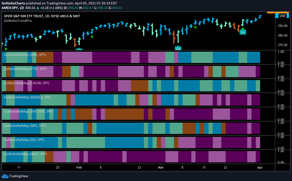
The GoNoGo Heat Map® above shows us the relative daily trend performance of a cross section of global indices to the S&P 500. What jumps off the chart here is that it is Europe, with the exception of the United Kingdom, that have started to outperform. The emerging markets, long the leaders in this global equity surge have started to underperform on a relative basis. You can see from panel 4 on, the NoGo trends that have emerged for indices like Sensex, Shanghai Composite, Nikkei 225, Hang Seng and Bovvespa.
MSCI China
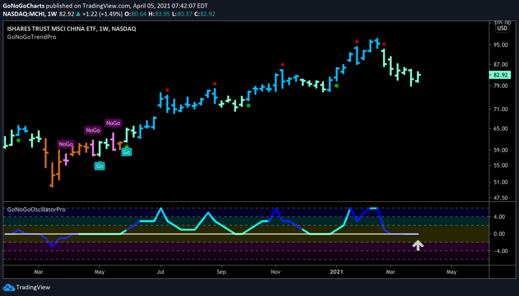
The GoNoGo chart below shows weekly prices for the Ishares MSCI China ETF. The question we are asking after looking at the prior RelMap chart is whether the daily underperformance is an opportunity for emerging market bulls to re enter a larger up trend.
- The GoNoGo Trend is still a “Go”, albeit painting weaker, aqua bars
- The trend has weakened after the red counter trend correction arrows appeared above price
- The GoNoGo Oscillator is now riding the zero line indicating reduced momentum, typical in a correction
- We will look to see if the oscillator can find support at the zero line and rally into positive territory, indicating that this is a correction of a strong, longterm up trend, rather than a reversal
- If the GoNoGo Oscillator cannot hold the zero line, we would be prepared for further bearish price action
DOLLAR DENTING EMERGING MARKETS
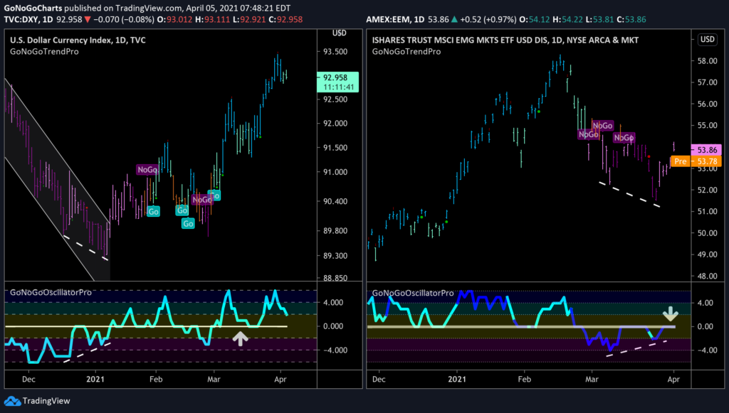
What is causing the emerging markets to struggle? To be sure, part of the problem is the recent strength in the dollar. A strong dollar puts pressure on global equities and we have been highlighting the dollar strength over the last several months. The side by charts below outline the different fortunes of the $DXY and $EEM.
- As you’d expect, the charts are inverse images of each other
- The dollar index has seen a strong rally, setting higher highs and higher lows. The opposite is true for $EEM
- An interesting note to consider is the GoNoGo Oscillator on the $EEM chart (right chart) as it tests the zero line from below
- If it is turned away from here then we would expect to see price turn down once again
- If it can break through the zero line into positive territory, then that would suggest that it is trying to rally higher
- The positive divergence that we are seeing on the $EEM chart is a bullish sign
U.S. INDEX ROTATION
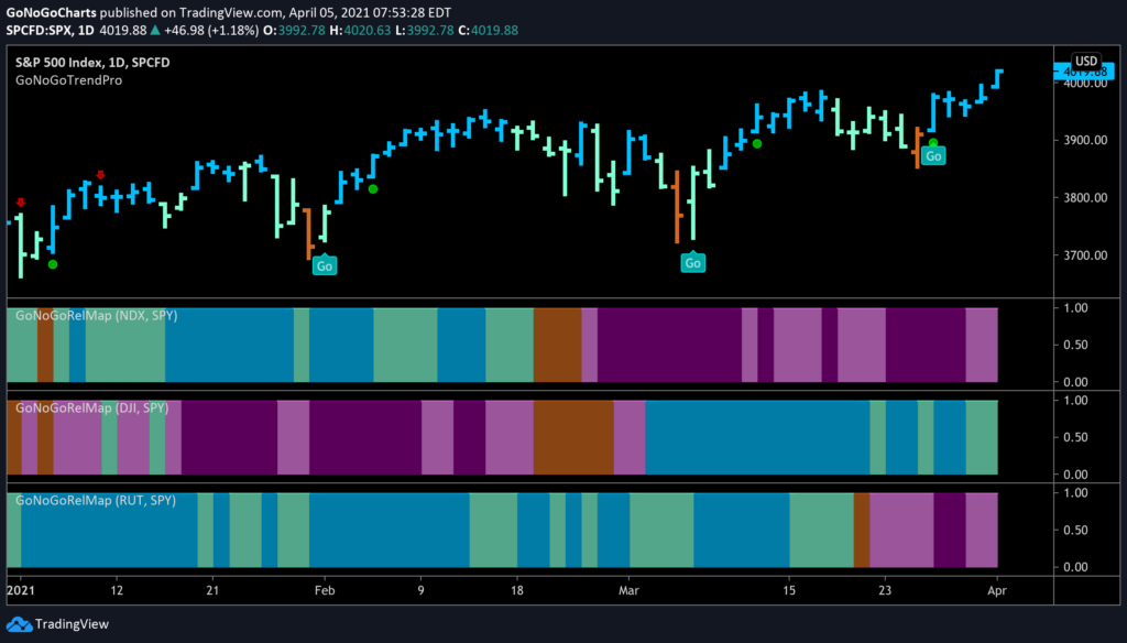
We saw small cap take over from mega cap technology as the leader in this equity bull market, but now we are seeing small caps struggle as well. Where is the leadership now? We are seeing outperformance on a relative basis over the last several weeks from the Dow Jones Industrial Average. This is in line with the theme of industrial companies being well positioned in an economy set to reopen. The chart below shows the GoNoGo RelMap of the $NDX, $DJI, $RUT.
- The “NoGo” trends remain in place for the tech heavy Nasdaq and the small cap Russell 2000
- The Dow Jones Industrial Average is holding on to its “Go” trend
WHAT’S DRIVING THE DOW?
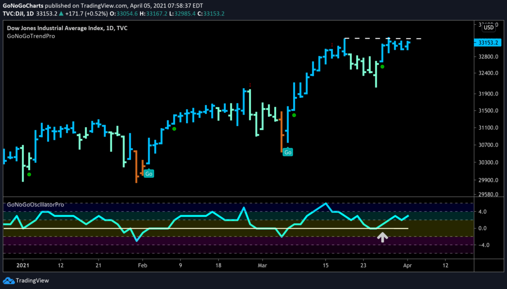
The below chart shows the $DJI on its own, with the GoNoGo Trend and Oscillator applied
- This past week saw the GoNoGo Trend identify a Go trend after months of solid underperformance
- We see price butting up against resistance currently in the form of prior all time highs
- The GoNoGo Oscillator has recently rallied off the zero line giving us a low risk trend continuation green circle under price
- We would like to see price break above resistance and the GoNoGo Oscillator to match its prior high
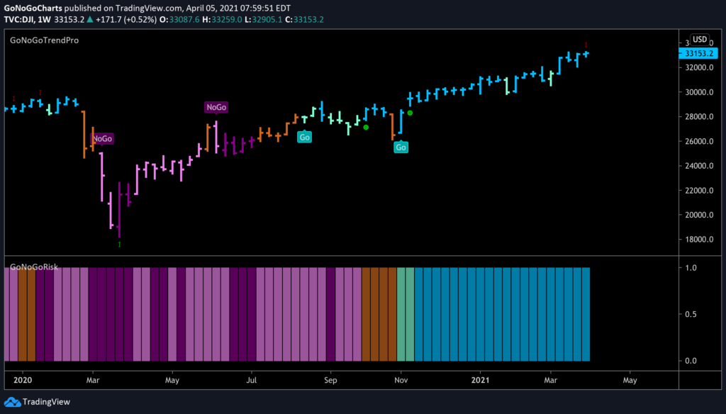
Will there be a continued, sustained move higher in equities over the longer time frame? We commented in Launch Conditions this weekend on the trend we are seeing in the ratio between high yield bonds and treasuries. This is a common risk proxy used by analysts. The GoNoGo Risk chart below shows that risk environment clearly as a panel below price.
- The $DJI price has rallied strongly since pandemic lows
- The GoNoGo Risk, while a little slower to confirm the trend, has been strongly a “Go” with no interruptions
CATCHING COMMODITIES
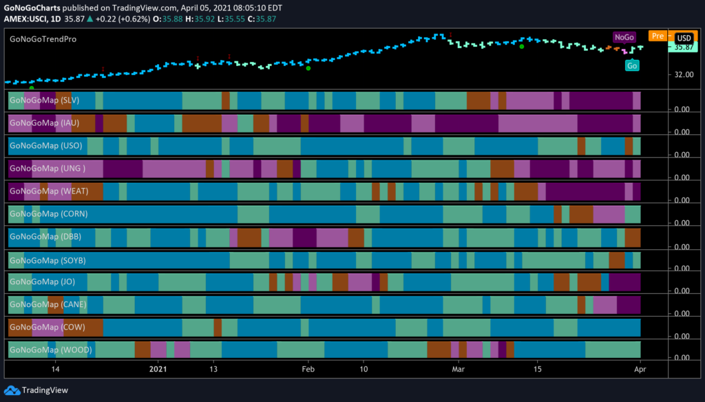
The GoNoGo HeatMap below shows the pure trend performance of major commodities using the unique trend identification concepts in the GoNoGo Trend indicator.
- While commodities as a group have re-entered a “Go” trend, it is a mixed back in terms of which commodities are strongly trending
- The precious metals continue in their “NoGo” trends, with Silver joining Gold more recently in a bearish environment
- There are some trends to be found of course, with Oil (third panel) and Lumber (last panel) still looking very healthy
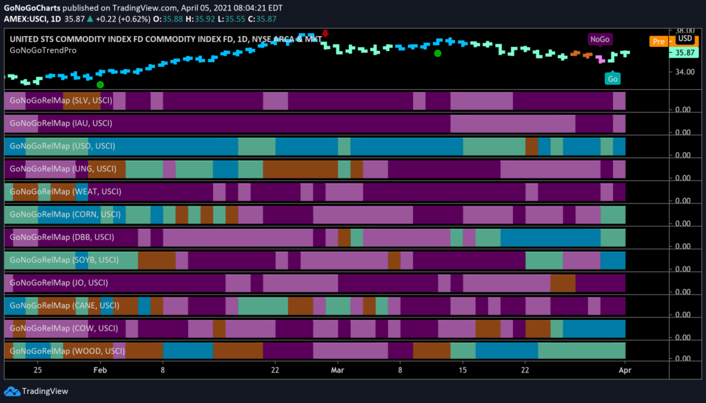
A GoNoGo RelMap really highlights the leaders here. We have talked about how on a relative basis, oil has been the lone driver of alpha for weeks. This isn’t the case now.
- Oil sees its “Go” trend persist, with strong blue bars returning this week
- Base metals, $CORN, $SOYB, $COW and $WOOD have all joined the commodity party recently
- This broader participation in commodity strength is a healthy sign for those that see a commodity super bull cycle taking place
CRYPTO GAINS
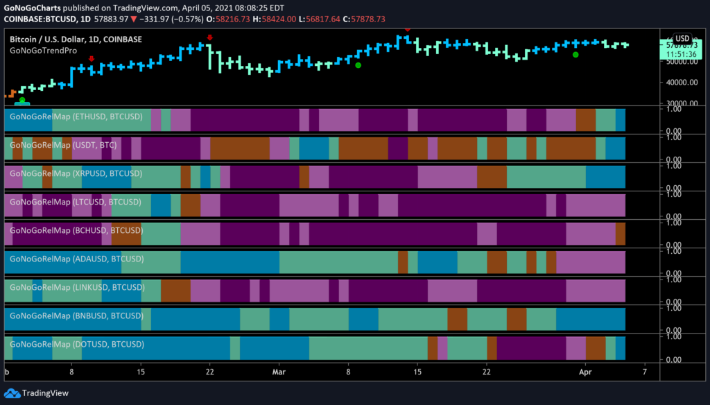
Finally, let’s look at the crypto market. The below GoNoGo RelMap shows 10 of the largest cryptocurrencies by market cap and their relative GoNoGo Trend performance to Bitcoin. Generally Bitcoin leads coins higher or lower, but it is still possible using the allocation suggestions of trend rotation to find opportunities to drive alpha
- $USDT has started to outperform along with $XRP, $BNB and $DOT
- Perhaps ETHBTC is the most exciting pair as Ethereum is the second largest crypto currency
- This week, ETHBTC entered a “Go” trend for the first time since early February and ended the week painting the strongest blue “Go” bars
ETHEREUM LOOKS EXCELENT
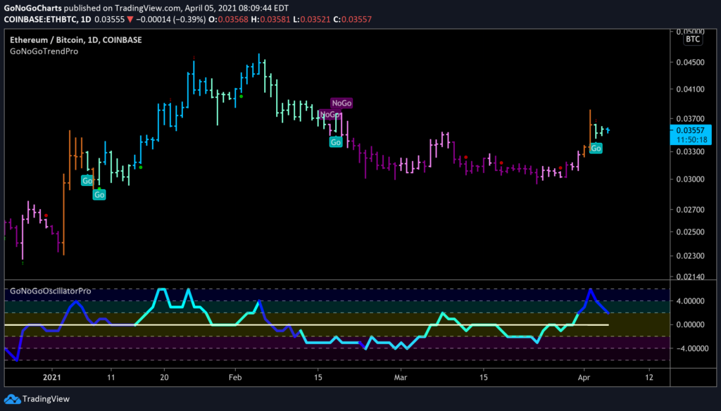
Let’s finish then with a GoNoGo Chart of that relationship between Ethereum and Bitcoin. Will Ethereum be a good way to take advantage of future crypto gains and outpace bitcoin intself?
- After underperforming big brother Bitcoin for the past 2 months, we are now seeing signs of outperformance
- GoNoGo Trend has identified a “Go” trend and the most recent bar has seen it strengthen to a bright blue bar
- Having been generally below the zero line during this underperformance, we saw the GoNoGo Oscillator break above zero with heavy volume (depicted by the darker blue line of the oscillator)
- The GoNoGo Oscillator’s break above zero preceded the GoNoGo Trend color change in the panel above.
- We would like to see the GoNoGo Oscillator find support at zero which would suggest further gains for this pair
