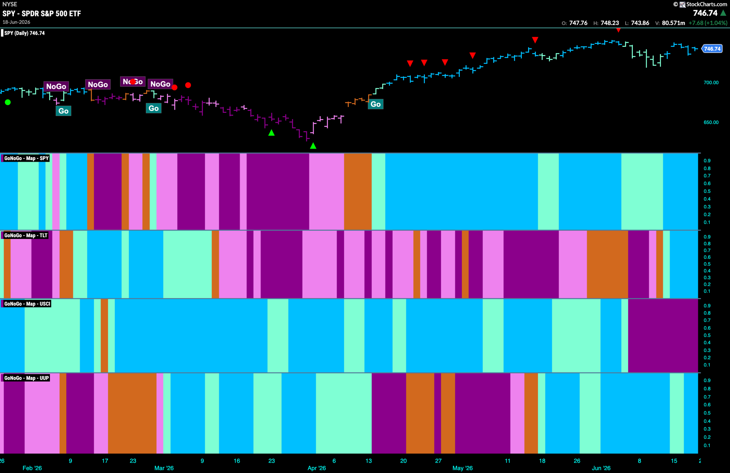
Good morning and welcome to this week’s Flight Path. The equity trend remains a “Go” and we saw a return to strength last week with an uninterrupted string of bright blue “Go” bars. Treasury bond prices saw the new “Go” trend strengthen as after a single aqua bar the indicator painted strong blue. U.S. commodities remained in a strong “NoGo” trend with a week of purple bars and the dollar saw its “Go” trend stay strong as the indicator painted more bright blue bars to end the week.
$SPY Recovers but Sets Lower Low
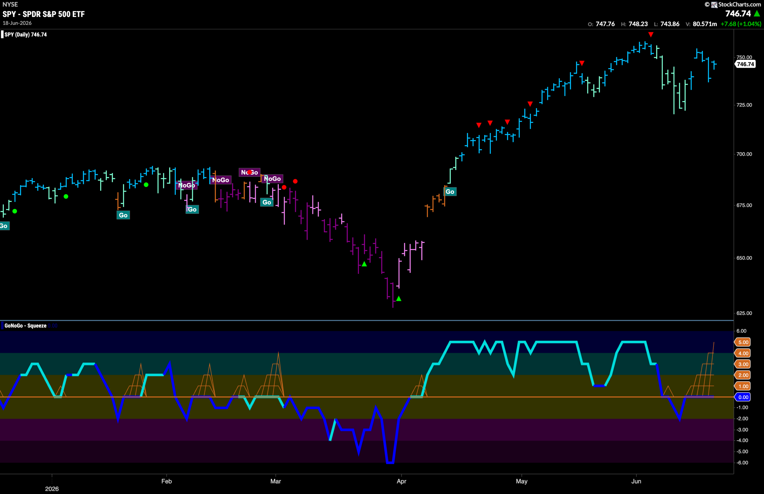
The GoNoGo chart below shows that the “Go” trend has found its feet this past week with a run of bright blue bars following the weakness we saw the week before. However, we see that a new lower low was set on those paler aqua bars and it will be important to watch to see if price can set a new higher high in the coming weeks or if it follows the lower low with a lower high. GoNoGo Oscillator reflects this pivotal moment as it rides the zero line causing a near Max GoNoGo Squeeze. We will pay attention to the direction of the break of the Squeeze.
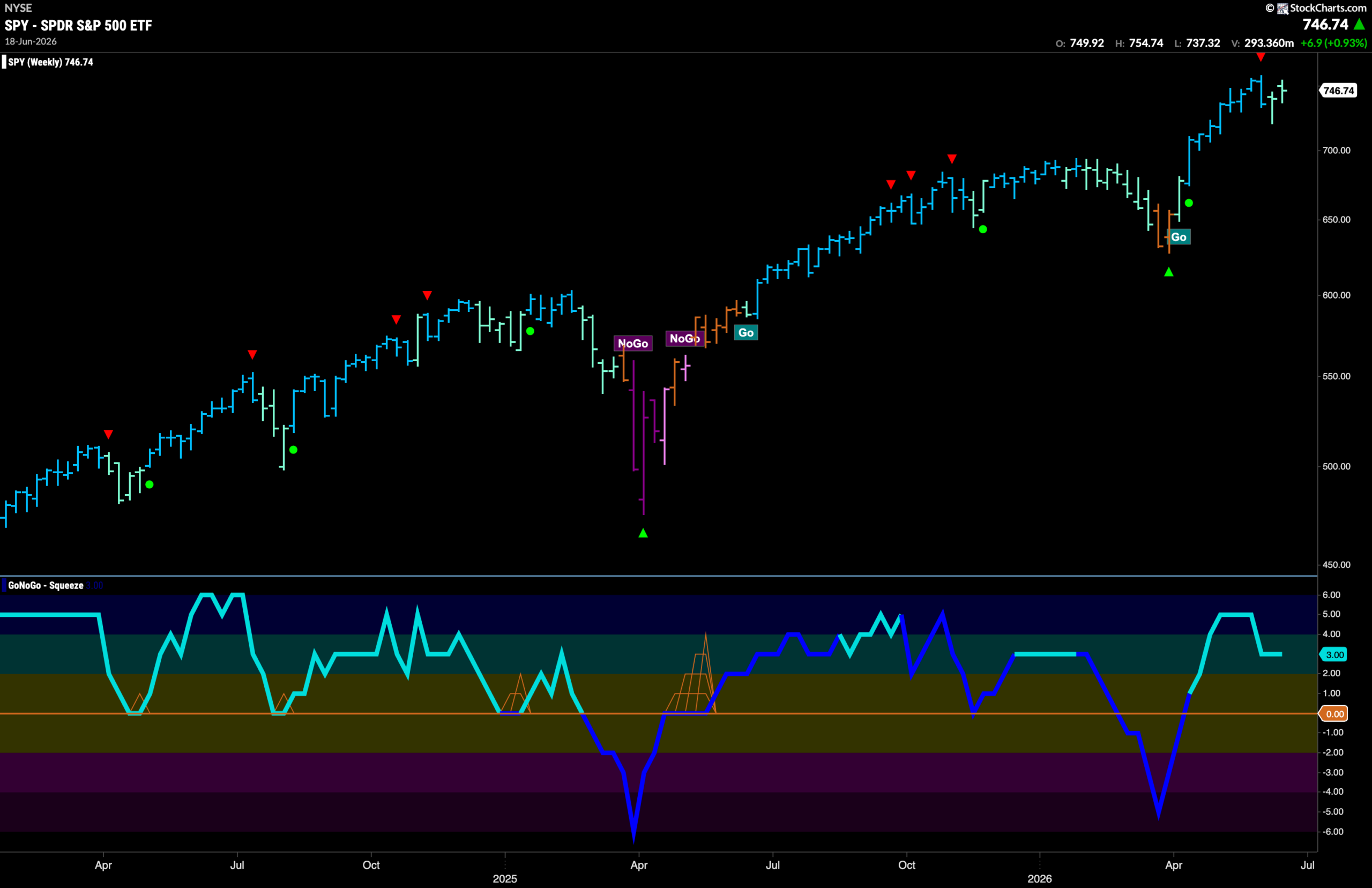
The weekly chart shows that the GoNoGo Trend indicator paints another weaker aqua “Go” bar this week but the trend remains intact. This weakness follows the Go Countertrend Correction icon (red arrow) that we saw a couple of bars ago at the high. GoNoGo Oscillator is in positive territory but no longer overbought at a value of 3.
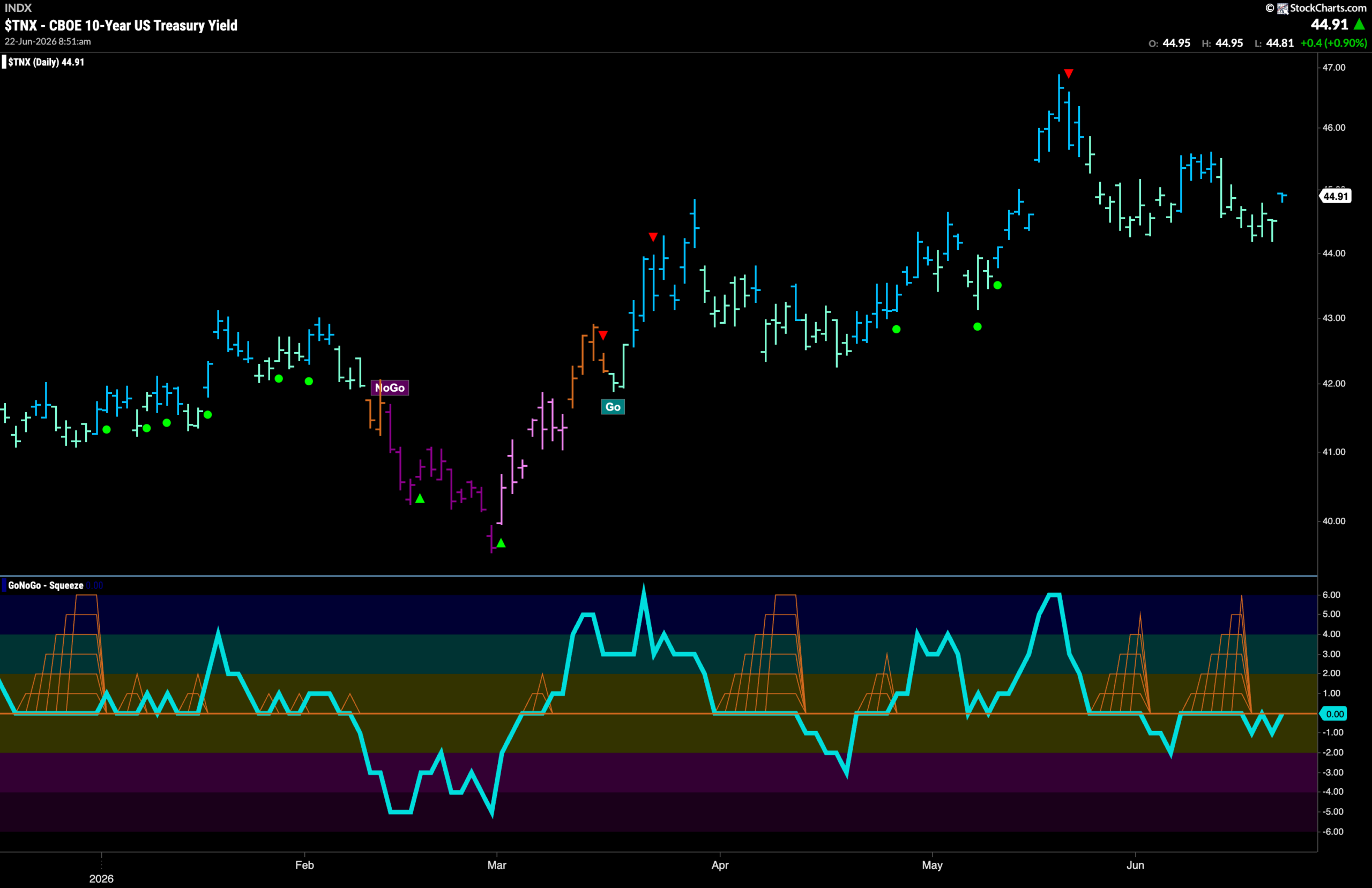
Treasury Rates Stay in “Go” Trend
GoNoGo Trend shows that the “Go” trend is still in place but we saw rates fail to set a higher high and several weaker “Go” bars return last week. Rates seem to have found support at prior lows and so we will watch to see if this provides a springboard for new highs this week. GoNoGo Oscillator is back at zero having been unable to get above the zero line now for several weeks.
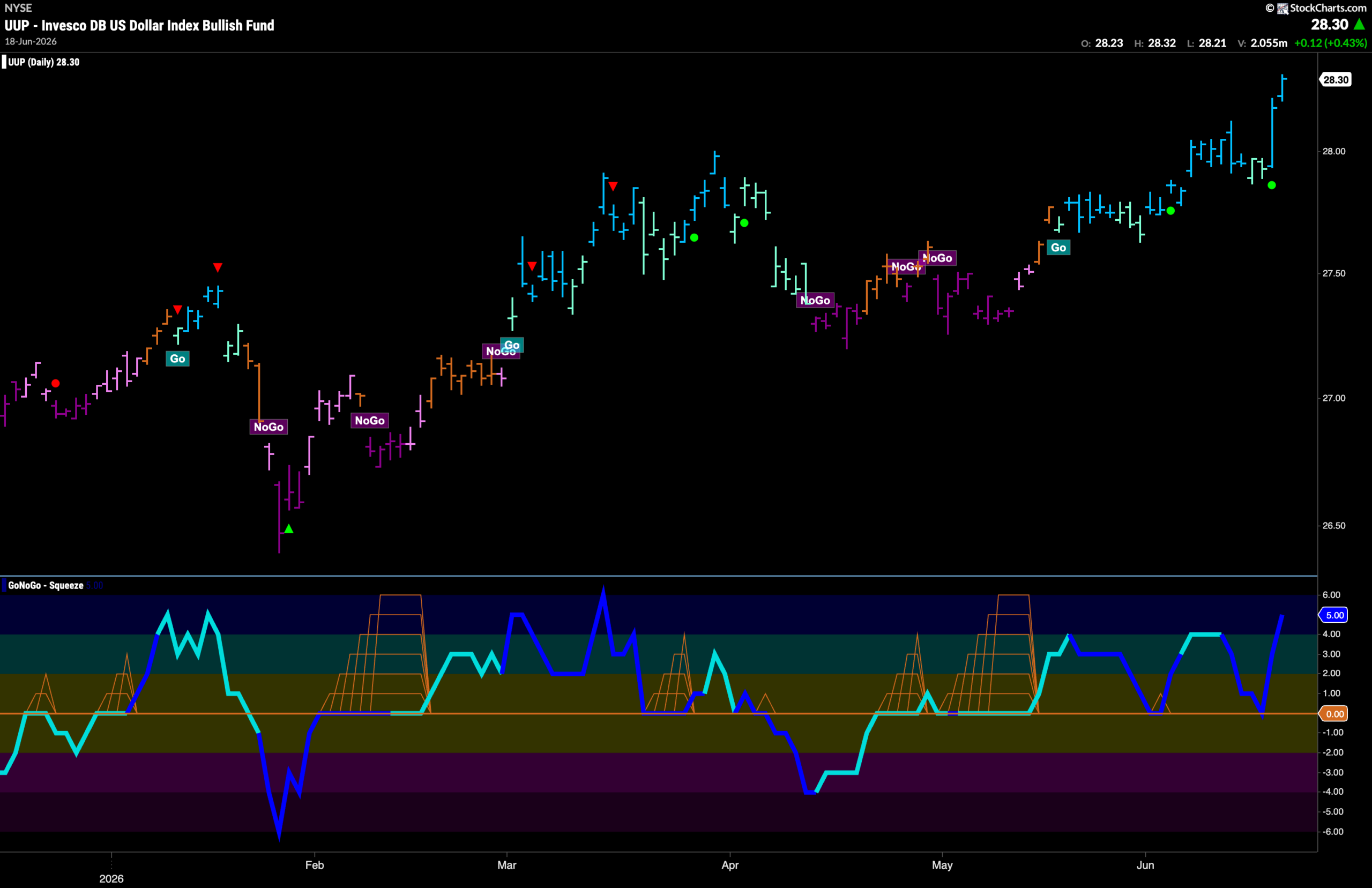
Dollar ($UUP) Hits Higher High
The chart below shows that the “Go” trend has gone from strength to strength as price soared at the end of last week on bright blue “Go” bars. These new highs were buoyed by the surge in momentum as we saw a Go Trend Continuation Icon (green circle) telling us that momentum was clearly on the side of the “Go” trend. Now, we see that GoNoGo Oscillator has climbed into overbought territory. We will watch to see if this level of enthusiasm can be maintained.
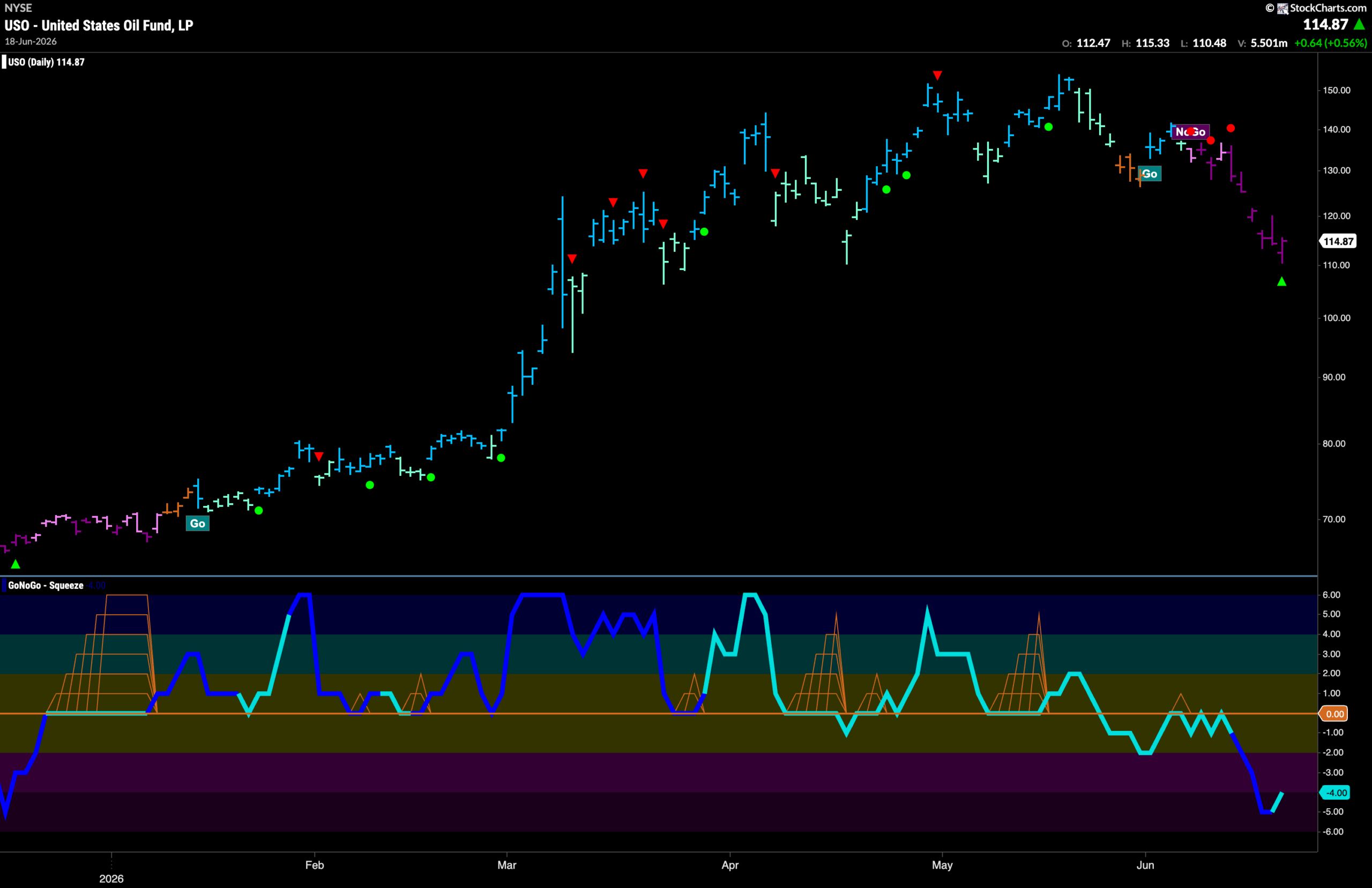
Oil ($USO) Drops Lower on Strong “NoGo” Bars
GoNoGo Trend shows that the new ‘NoGo” trend stayed strong last week as we saw new price lows on purple “NoGo” bars. This came after multiple NoGo Trend Continuation Icons (red circles) telling us that momentum was surging in the direction of the “NoGo” trend. Now, at the low, we see a NoGo Countertrend Correction Icon (green arrow). This tells us that price may struggle to go lower in the short term due to waning momentum. We will watch to see if price consolidates these lows in the coming days.
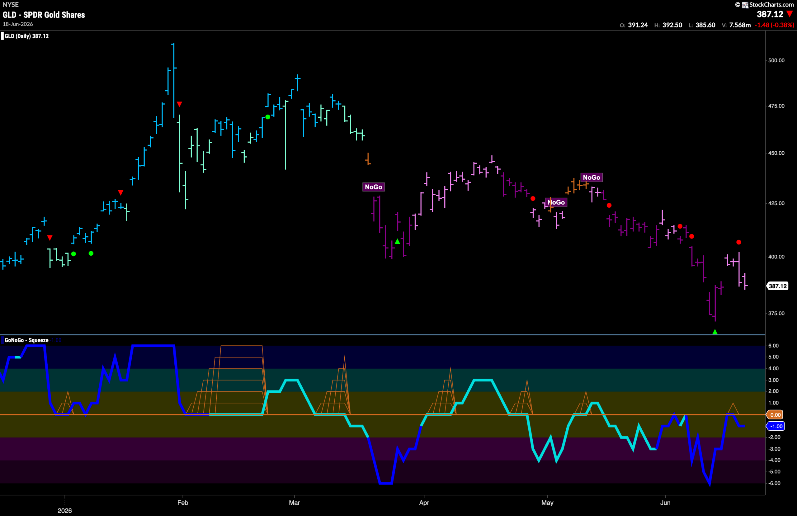
Gold ($GLD) “NoGo” Trend Continues Amid Weakness
The “NoGo” trend continues for gold this week but we see weaker pink bars as price tries to rally off the lows. This came after a NoGo Countertrend Correction Icon (green arrow) suggested price may struggle to go lower in the short term due to waning momentum. Now, having set a new lower low, we see that GoNoGo Oscillator tested the zero line from below and was turned back into negative territory. This triggered a NoGo Trend Continuation Icon (red circle) above price and we will expect more downward pressure on Gold prices in the coming days.
Sector RelMap
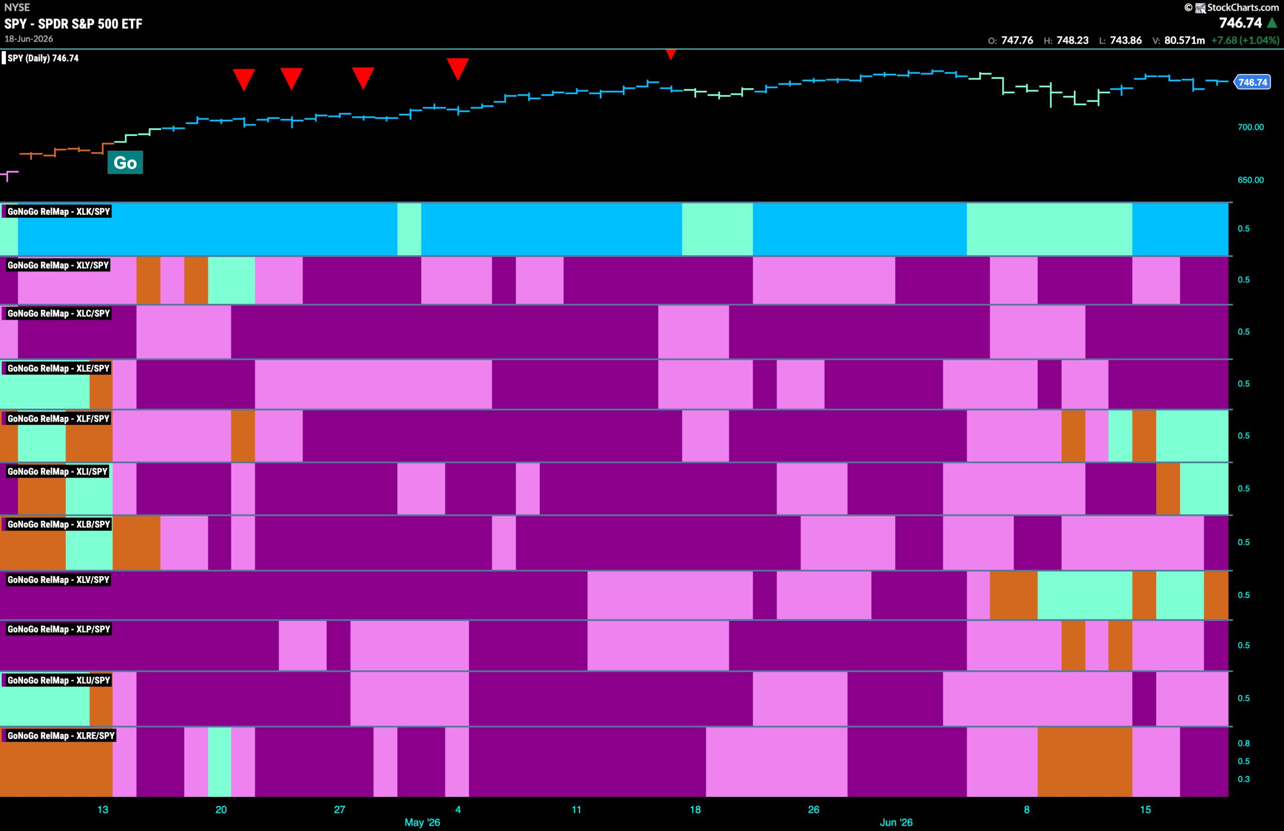
Below is the GoNoGo Sector RelMap. This GoNoGo RelMap applies the GoNoGo Trend to the relative strength ratios of the sectors to the base index. With this view we can get a sense of the relative out performance and relative underperformance of the sectors. 3 sectors are in a relative “Go” trend. $XLF, is beginning to outperform, painting relative “Go” bars in the 6th panel.
Financials Sub-Group RelMap
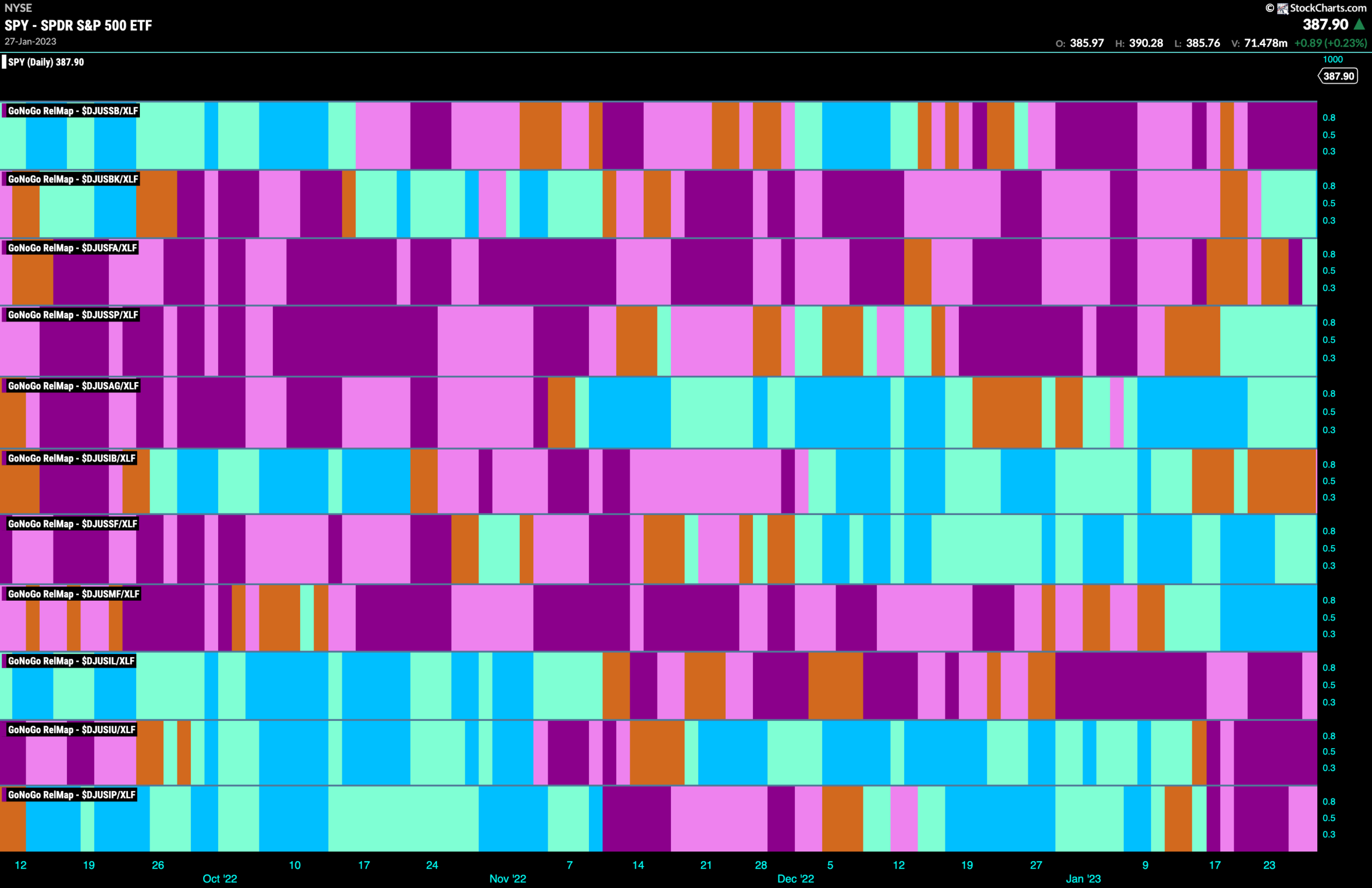
The chart below shows a relative trend breakdown of the sub groups within the financials sector this week. The Sub-Group RelMap plots the GoNoGo Trend of each sub index to the $XLF. We saw in the above GoNoGo Sector HeatMap that $XLF is painting new relative “Go” bars. When we look at the below RelMap we can see that the mortgage finance index in the 8th panel is painting strong blue “Go” bars on a relative basis.
$AGM Breaks to New Highs in “Go” Trend
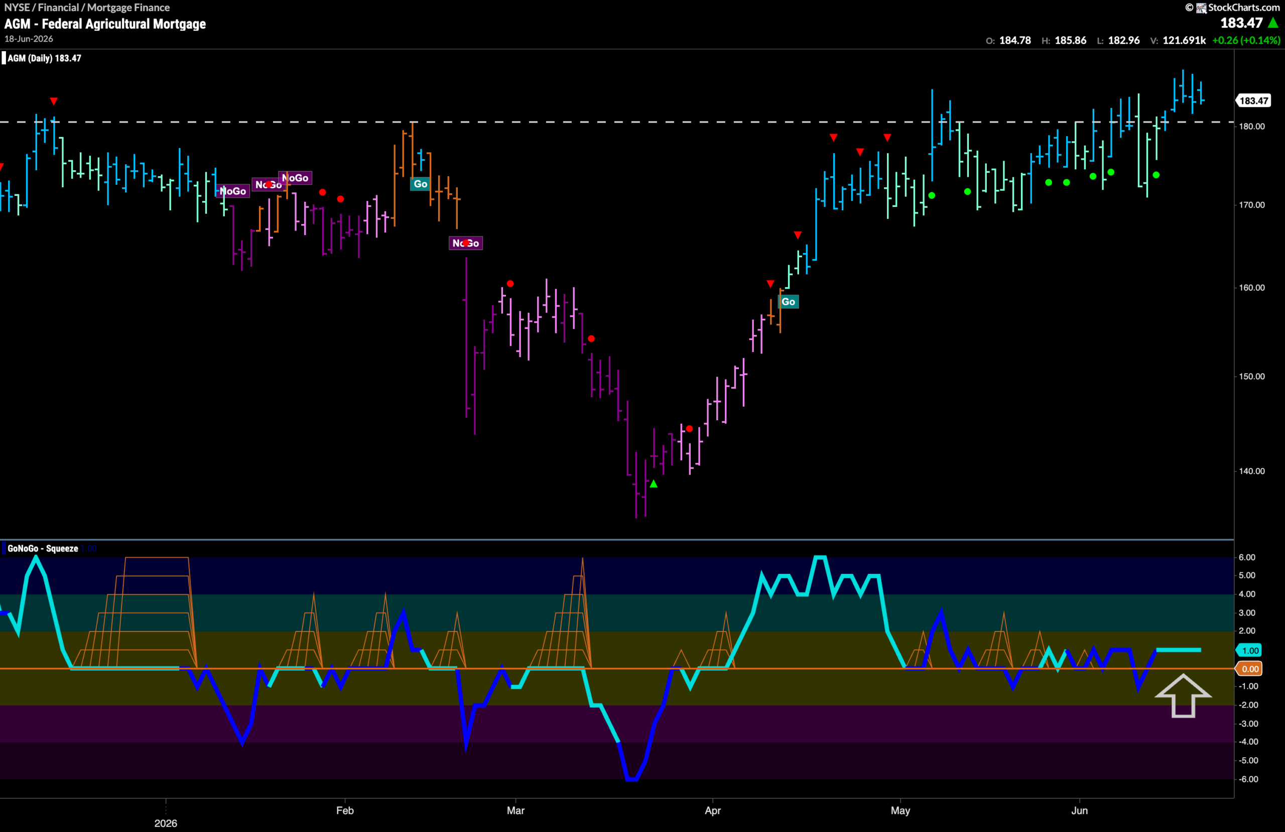
The GoNoGo Chart below shows that price has moved higher over the past week and is now clearly above the horizontal level we see on the chart. This has happened as GoNoGo Trend paints strong blue “Go” bars. We can see if we look to the lower panel that GoNoGo Oscillator during this sideways consolidation period has been generally finding support at the zero line indicating momentum remaining on the side of the “Go” trend. Visually we can see this with multiple Go Trend Continuation Icons (green circles). It will be important for the oscillator to continue to stay at or above zero as price attempts to climb higher in the coming days.
$EFC Looks For Support at Prior High Levels
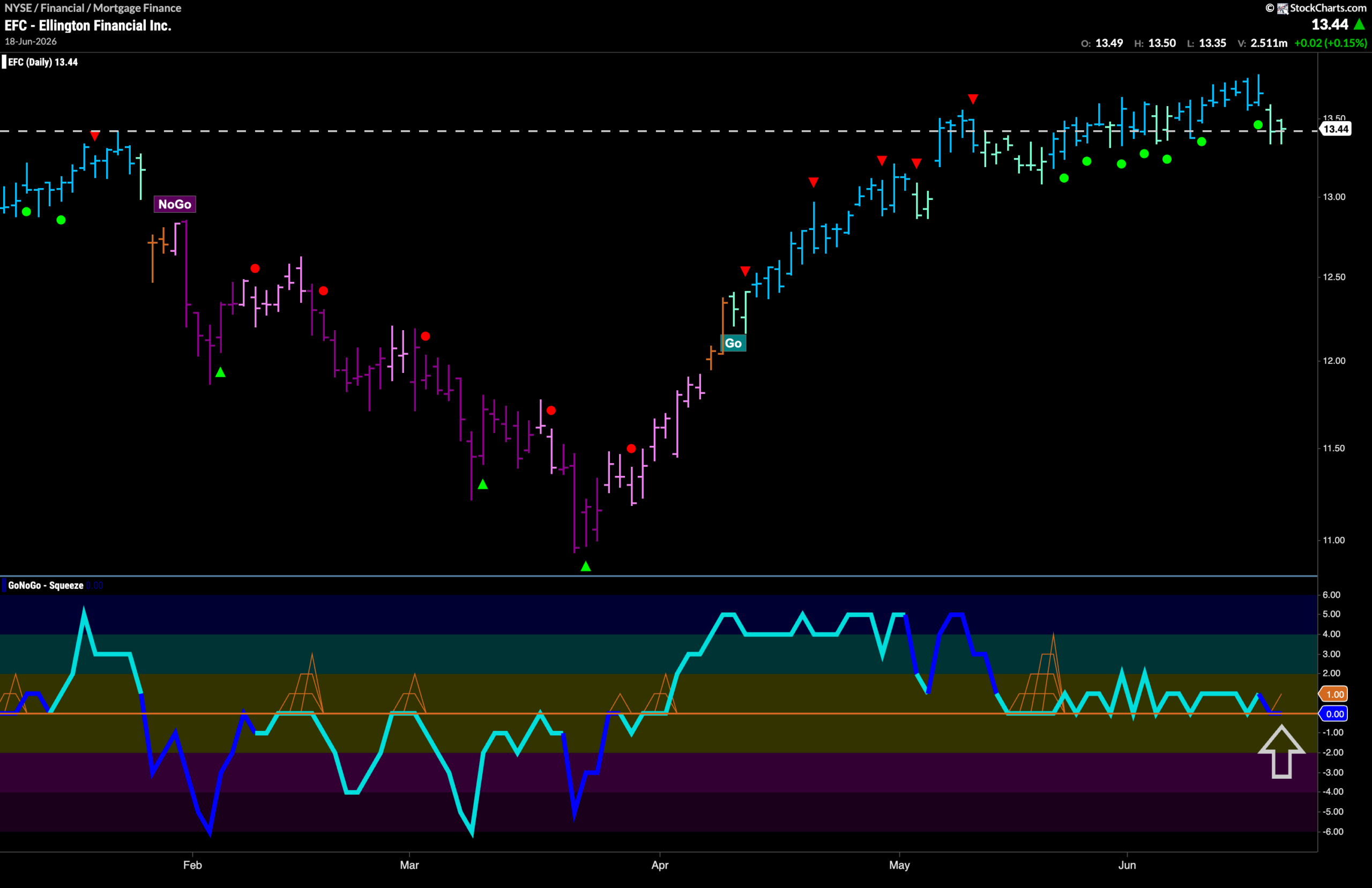
The “Go” trend continues for EFC but we do see that GoNoGo Trend painted weaker aqua bars as price fell from the new higher high. Price is now resting at an important level that has been an area of heavy congestion over the past few months. We look at the GoNoGo Oscillator panel and we can see that it has repeatedly found support at the zero line and we therefore see a clustering of Go Trend Continuation Icons (green circles) under price. This tells us that momentum remains in the direction of the “Go” trend. Again, we see the oscillator testing zero from above. It will be important to watch for support again if the “Go” trend is to remain healthy.