
The trends of late 2020 have continued into the new year. The risk-on environment has created greater opportunities for investors in equities, industrial/agricultural commodities, and digital assets than it has for gold, treasuries, or cash. As trend-followers, GoNoGo Charts are designed to work across all asset classes and timeframes but do not seek to identify absolute tops and bottoms. Rather, GoNoGo Charts digest the weight of the evidence provided by the market to help analysts and investors find high probability opportunities to participate in trending securities.
Against a backdrop of social unrest, political upheaval, depressing job loss data, and geopolitical unease between Russia, China, and the United States, we still see equities, commodities, and cryptocurrencies rallying to new highs. Before launching into another week of trading, please take the time to understand what the landscape for investing is offering in terms of major market trends across asset classes and around the globe. Click into the Launch Conditions chart pack below to give yourself context for how you want to be positioned alongside major market trends.
Open your Weekly Launch Conditions Chart Pack
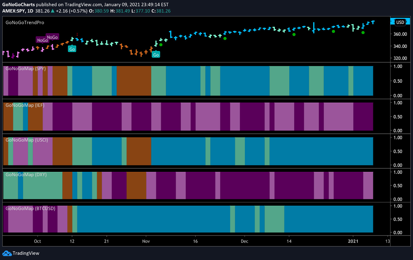
Take note of the technical picture across the major asset classes. The weight of the evidence is clear, major breakouts and all-time record highs across risk assets tell us we are in the early stages of a new bull market. Let’s start by looking at a GoNoGo Heatmap® of the major asset classes below.

The GoNoGo Heat Map® above shows us the daily trend performance of five asset classes: Equities, Bonds, Commodities, Currencies, and Digital Assets from the US perspective. The takeaway remains the same as it has been for several weeks: Equities, commodities, and the cryptocurrency markets are now in established “Go” trends.
Panel 1 – Global stocks continue in the strong “Go” trend – painting blue & aqua bars for many weeks. SPDR® S&P 500® ETF Trust seeks to provide investment results that correspond generally to the price and yield performance of the S&P 500 Index. It is a diversified large-cap U.S. index that holds companies across all eleven GICS sectors.
Panel 2 – Government bonds, continue to paint strong purple “NoGo” bars. $IEF tracks a market-value-weighted index of debt issued by the US Treasury with 7-10 years to maturity remaining.
Panel 3 – Commodities are a “Go,” continuing to paint strong blue bars. $USCI tracks an equal-weighted index of 14 commodity futures contracts and holds at least one precious metal, industrial metal, energy, livestock, soft, and grain commodity.
Panel 4 – The US Dollar remains in a persistent “NoGo” trend. $DXY is an index of the value of the United States Dollar relative to a basket of foreign currencies.
Panel 5 – Bitcoin continues in a strong “Go” trend. We saw continued strength this week on blue bars as prices climbed daily to new all-time highs.
S&P SOARS TO 3800
The GoNoGo chart below shows daily prices of the S&P 500. The trend channel outlined below was highlighted last week in Flight Path research. As last week’s trading session unfolded, price found support at the lower bound of the trend channel and continued in the strong “Go” trend.
As expected, it was the interaction of GoNoGo Oscillator with the zero line that provided a leading indicator of the ensuing price action. As price fell to the bottom of the channel, GoNoGo Oscillator dropped to test the zero-line and it once again found support. In healthy “Go” trends the oscillator will most often find support at zero. On Wednesday, GoNoGo Charts signaled another low-risk green entry icon under price preceding the rally back to the upper bound of the trend channel. Since then, the oscillator has risen on heavy volume now approaching overbought conditions.

SECTOR STRENGTH
With equities continuing to advance, a look at the sectors which make up the S&P 500 will help characterize the market internals of this rally. While there will likely be some trending stock in each sector group, it is the outperforming sectors that are comprised of the most “Go” trends. A comparative view across the sectors highlights these fruitful opportunities. GoNoGo RelMap® applies the methodology behind GoNoGo Trend to the relative strength ratio of securities against a common benchmark. In the chart below we can see each sector’s performance relative to the broad S&P 500 index.
Interestingly, six sectors outperformed the broad S&P 500 index last week. New “Go” trends are emerging in materials ($XLB), Consumer Discretionary ($XLY), & Health Care ($XLV). Energy and Financials ($XLE & $XLF) continue strong relative outperformance and Tech ($XLK) with the heaviest weighting in the index paints aqua bars of weak trend conditions for narrow outperformance.

PEDDLING PELOTON
Looking at the consumer discretionary sector for long opportunities we’ll take a look at a chart of Peloton. The stationary bike company has had a storied year since the pandemic forced millions of people to stay inside. The incredible rally from the March 2020 low around $17 to almost $170 was a boon for anyone that held the stock in their portfolio. Investors often ask after a security has had a large run, “Is there more upside potential?”
The daily GoNoGo Chart below shows a fantastic setup. After a new “Go” trend was established in early December 2020, a strong move up followed. This was then met with a short-term counter-trend correction (signaled by the red arrow) and weaker aqua bars. This consolidation in price caused the GoNoGo Oscillator to fall to the zero line. After riding the zero line for a few days, GoNoGo Oscillator rallied back into positive territory to close last week’s session. This triggered a low-risk entry icon to appear under price (green circle) as momentum flows back into the stock. Look for $PTON to attack the highs of December 24th in the near term.

FINANCIALS REACH A GLASS CEILING?
One of the sectors that regained strong outperformance to the S&P index through the final months of 2020 was the financial sector. Last week was no exception as the $XLF traded sharply higher. Rising yields bolster the earning potential of the constituents in this sector. However, the weekly chart below of the financial sector ETF shows that price is running up to a significant resistance level. There is likely to be overhead supply at such significant prior highs as the pre-COVID peak of February 2020. Investors with $XLF holdings need to monitor closely for potential struggles ahead.
At the moment, the trend is a strong “Go” and GoNoGo Oscillator is overbought. If $XLF struggles at resistance, look for the oscillator to fall back toward zero and price to consolidate in the short term.

Looking into individual stocks we will see how the fund flows to $XLF may have strengthened the trends for specific companies and where there may be signs of trend exhaustion.
Jefferies Financial Group ($JEF) was featured in the December 7th issue of Flight Path. In that newsletter, we noted that given the surging sector performance, investors may take note of an entry signal for $JEF. GoNoGo Charts signaled a low-risk entry on December 9th, and then again on the 28th, after which price rallied almost 12%. Most recently, GoNoGo Trend signaled a counter-trend correction (red arrows) that indicates we will likely see a consolidation in the short term. Remember, consolidation can happen through corrective price action, or over time.
If investors believe that the financial sector may face serious headwinds from the resistance we noted on the weekly chart above, then taking profits now would be the most cautious approach.

Whatever your process as an investor or trader, we encourage you to maintain an objective view. Look at the weight of the evidence and position your portfolio according to what the market is telling us. GoNoGo Charts were designed over years to blend a complete set of technical information into a clear and concise single picture that never obscures the most important indicator of all Price!