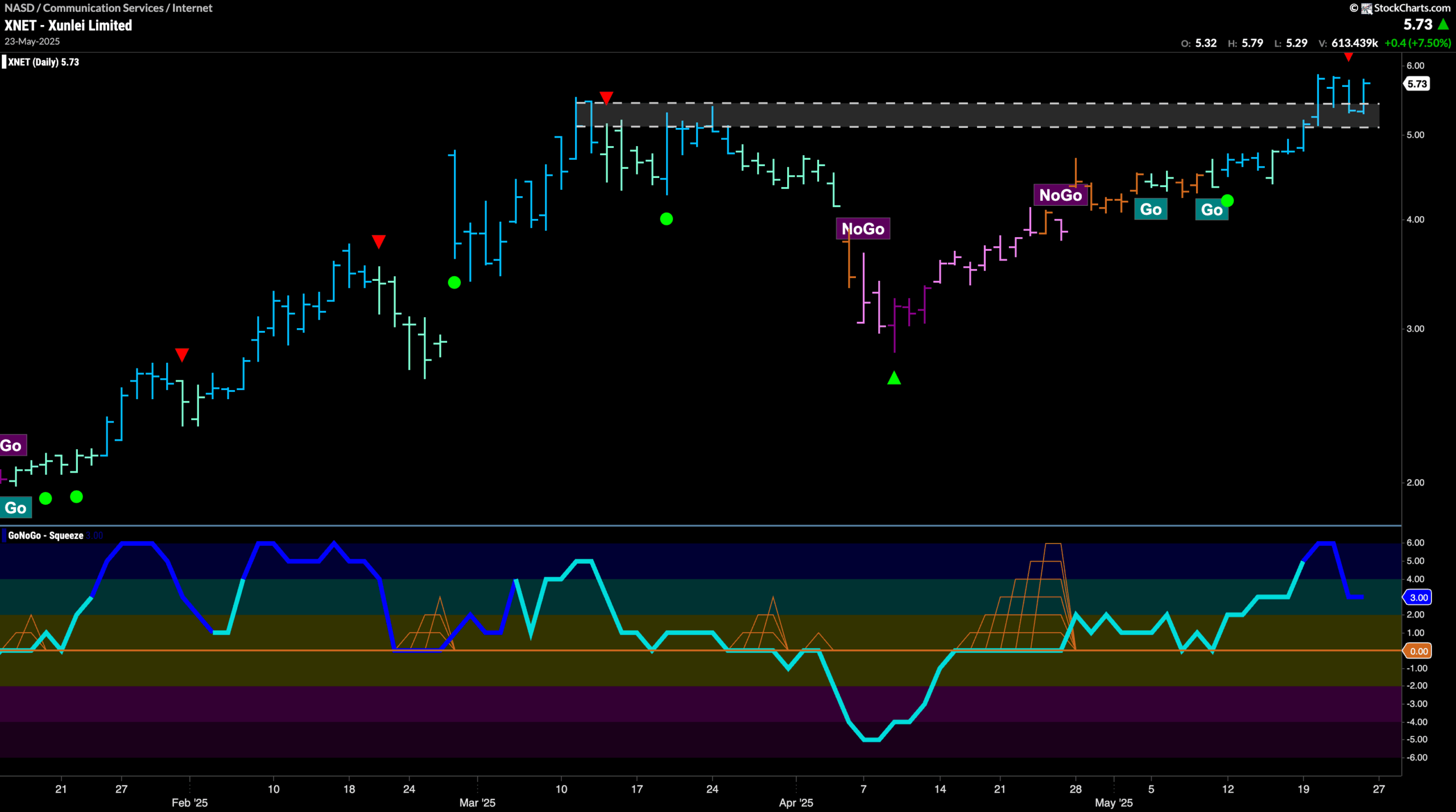
Good morning and welcome to this week’s Flight Path. The equity trend remained in a “Go” trend but we see weaker aqua bars this week as price falls from its recent high. Treasury bond prices paint strong purple bars as the “NoGo” is strong. We see weakness creeping in for U.S. commodities as GoNoGo Trend paints a few aqua bars to end the week. The dollar, while hanging on to its “NoGo” trend also displays weakness as we see the indicator painting pink bars.
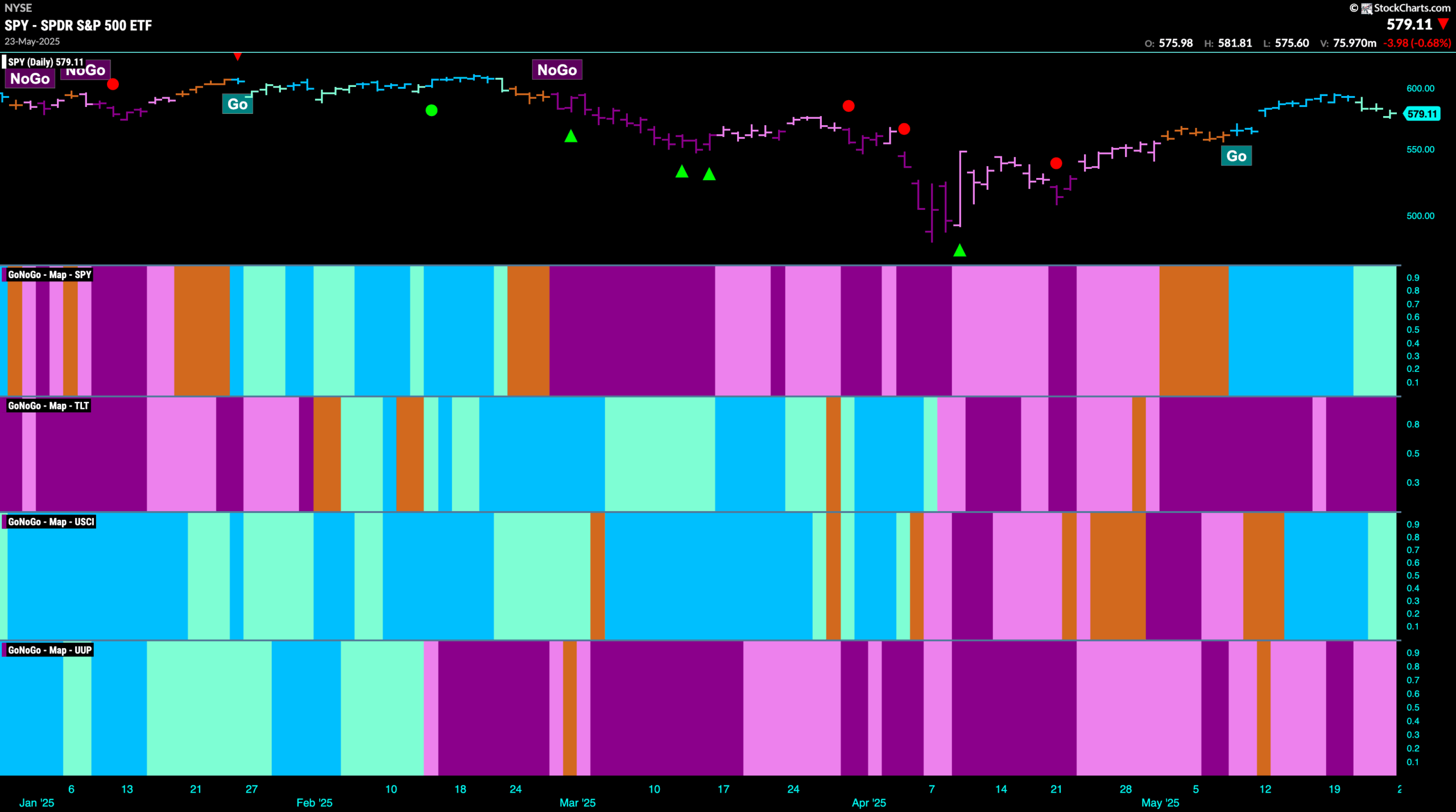
$SPY Paints Weaker Aqua “Go” Bars
The GoNoGo chart below shows that the “Go” trend survived the week but we do see that GoNoGo Trend is painting weaker bars after price hit the latest higher high. We turn our attention to the lower panel and we see that GoNoGo Oscillator is testing the zero line from above and we see that volume has picked up (darker blue of oscillator). We will watch to see if it finds support at this level. If it does, that would tell us that momentum is resurgent in the direction of the “Go” trend and we would expect price to set a higher low before challenging for new highs.
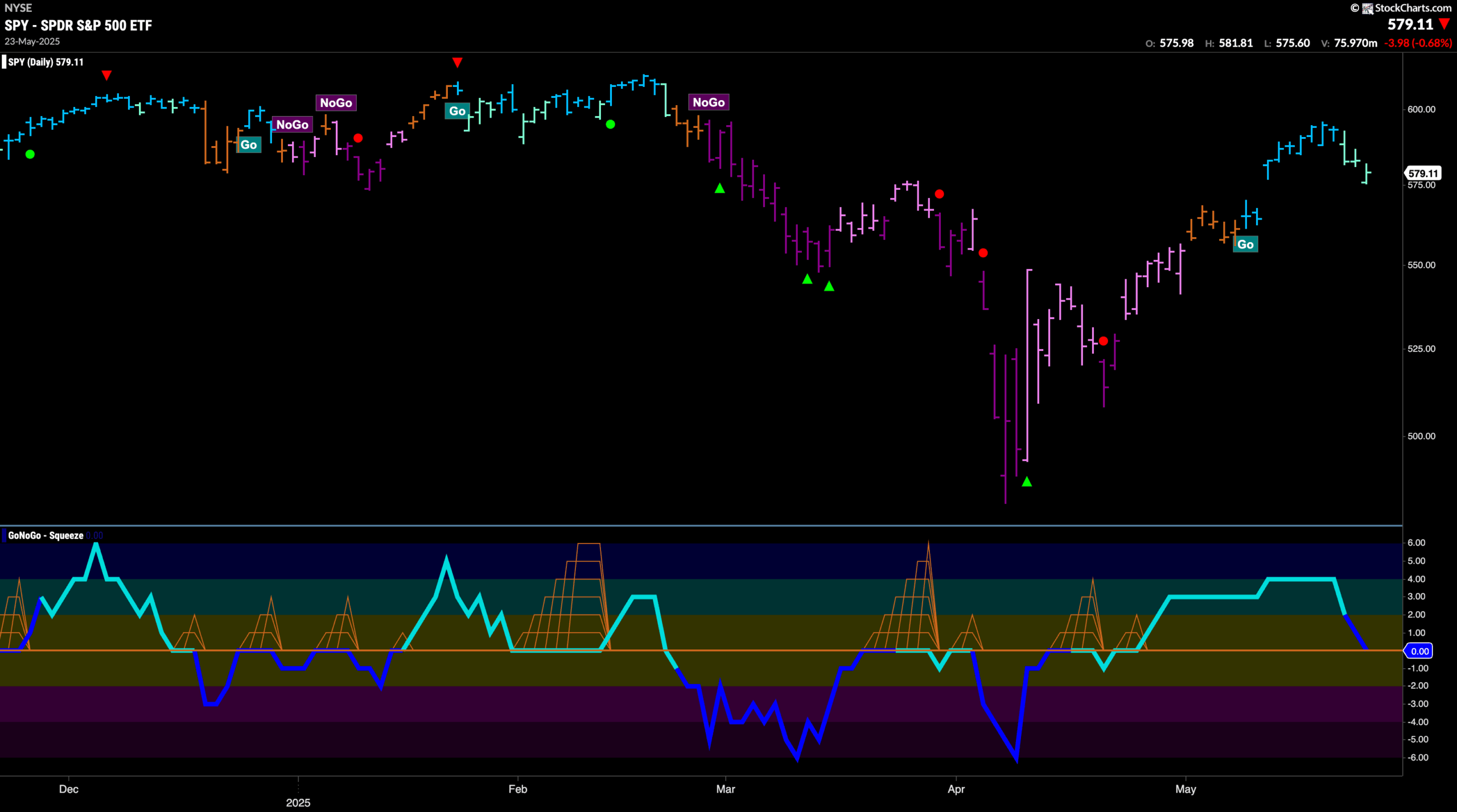
The weekly chart shows us continued uncertainty as GoNoGo Trend paints amber “Go Fish” bars. GoNoGo Oscillator is currently riding the zero line and volume is heavy. We are looking at a GoNoGo Squeeze forming and it will be important to note the direction of the break of the Squeeze. If we see the oscillator break into positive territory that would hint at the bulls taking control and we may see trend change in the panel above.
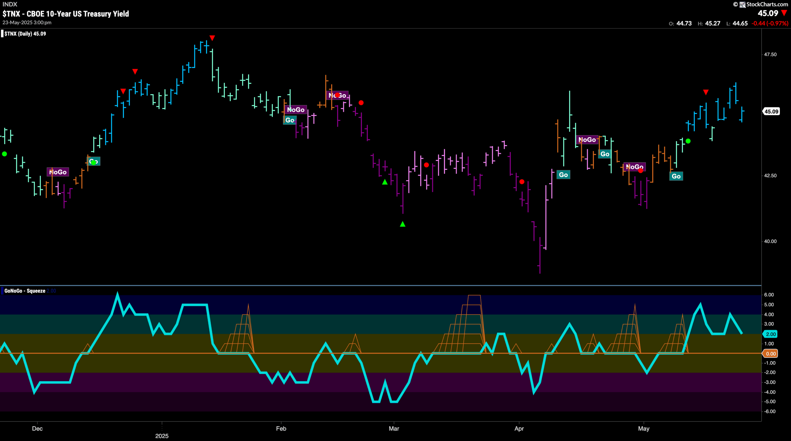
Treasury Remain In “Go” Trend
GoNoGo Trend shows that the “Go” trend has continued this week and we see new highs for rates and GoNoGo Trend painting strong blue bars. There is congestion from prior levels on the chart but we will look to see if rates can consolidate at these levels. When we look at the GoNoGo Oscillator panel, we see that we are falling toward the zero line but still at a value of 2. This tells us that momentum is on the side of the “Go” trend.
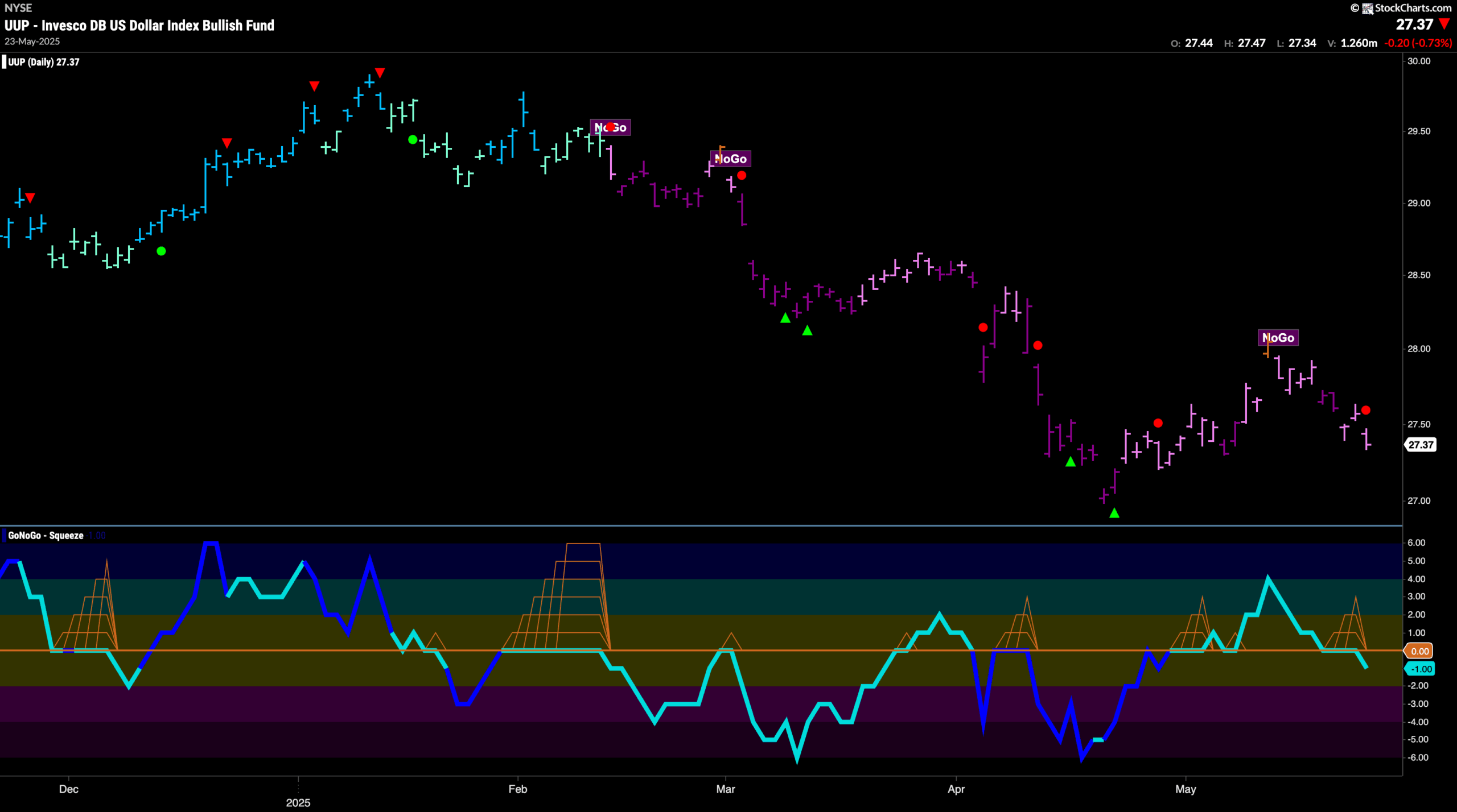
Dollar Sees “NoGo” Sticking Around
This week showed us that the “NoGo” trend is proving to be pesky. Price has fallen steadily since the lower high that was punctuated by an amber “Go Fish” bar a few weeks ago. Now, with GoNoGo Trend painting pink “NoGo” bars, we see that GoNoGo Oscillator is breaking back through the zero line into negative territory. This has triggered a NoGo Trend Continuation Icon (red circle) to appear above the price bar and tells us that momentum is resurgent in the direction of the “NoGo” trend.
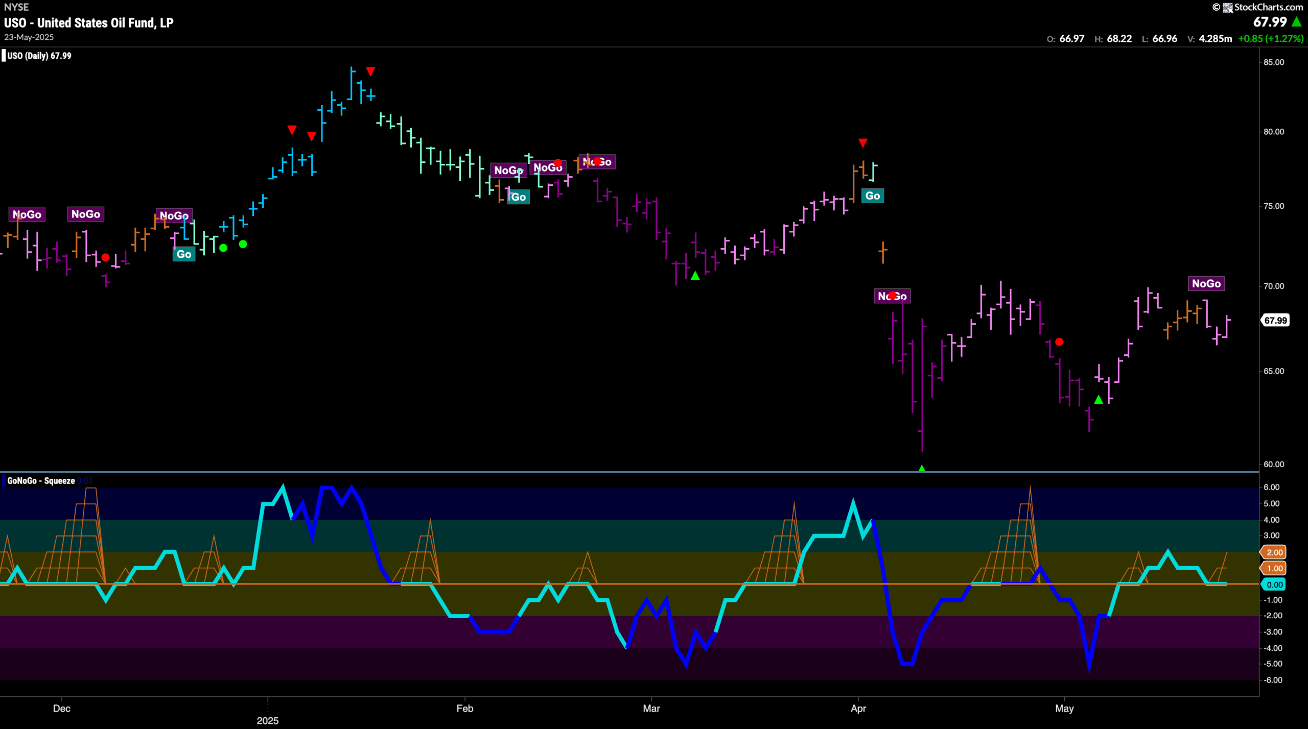
Oil Range Narrows as “NoGo” Hangs On
GoNoGo Trend shows us that “NoGo” bars returned for oil after a week dominated by uncertainty. Pink “NoGo” bars have followed a string of amber “Go Fish” bars and we see that price has not been able to break to a new higher high. GoNoGo Oscillator has quickly fallen to re-test the zero line from above and so we will watch to see if it finds support this time or if it breaks back into negative territory which would confirm the “NoGo” trend.
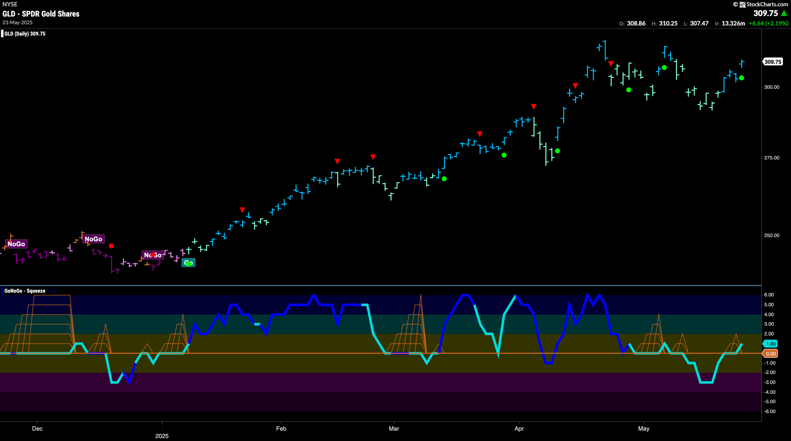
Gold “Go” Trend Finds Some Strength
Gold prices performed well this week as GoNoGo Trend painted a string of strong blue “Go” bars. We are getting closer to challenging for new higher highs but we are not there yet. GoNoGo Oscillator broke back into positive territory this week which was a good sign for the bugs as this tells us that momentum is back in the direction of the underlying “Go” trend and we see a Go Trend Continuation Icon (green circle) under the price bar. We will watch to see if this gives price the push it needs to strive for a new high.
Sector RelMap
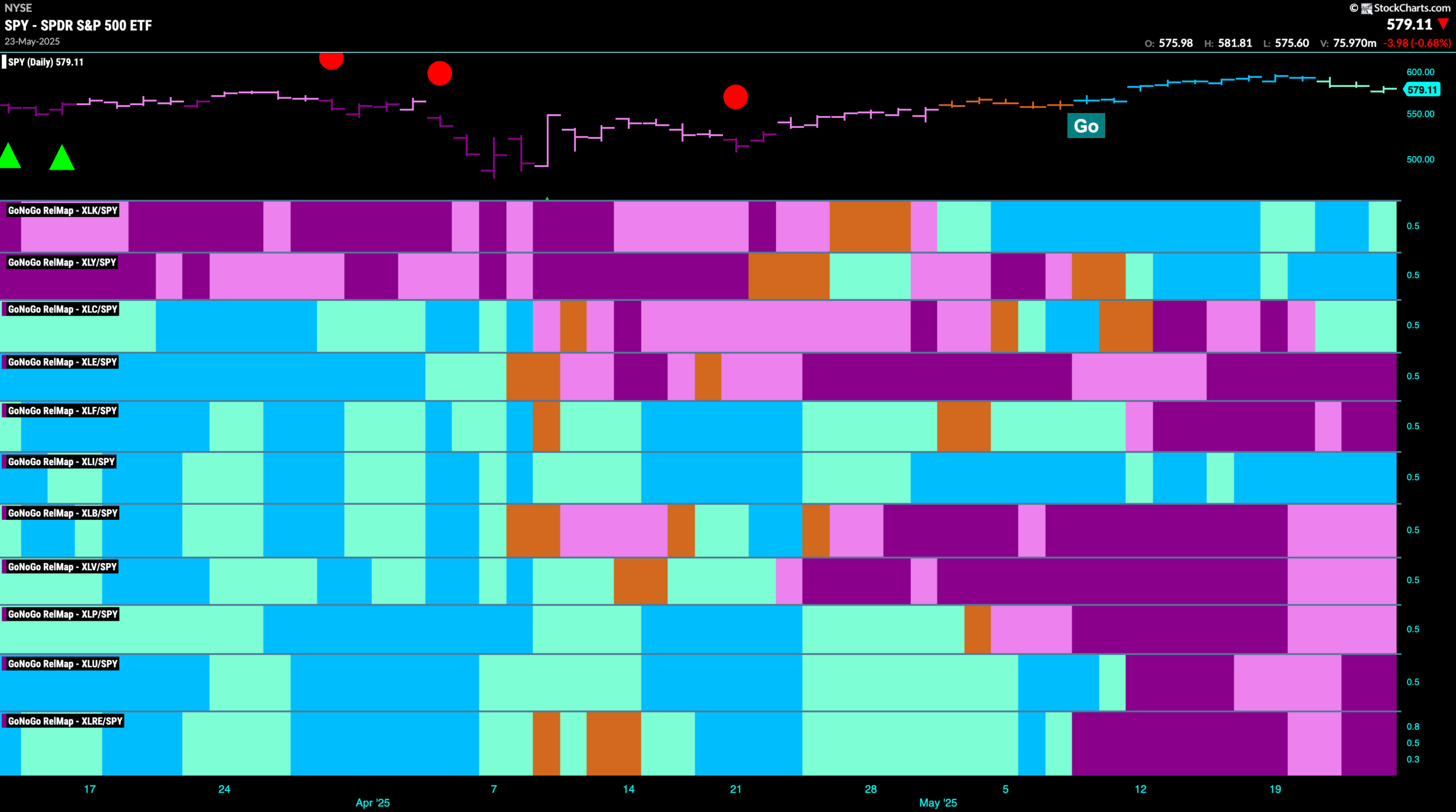
Below is the GoNoGo Sector RelMap. This GoNoGo RelMap applies the GoNoGo Trend to the relative strength ratios of the sectors to the base index. With this view we can get a sense of the relative out performance and relative underperformance of the sectors. 4 sectors are in relative “Go” trends. $XLK, $XLY, $XLC and $XLI, are painting relative “Go” bars.
Communications Sub-Group RelMap
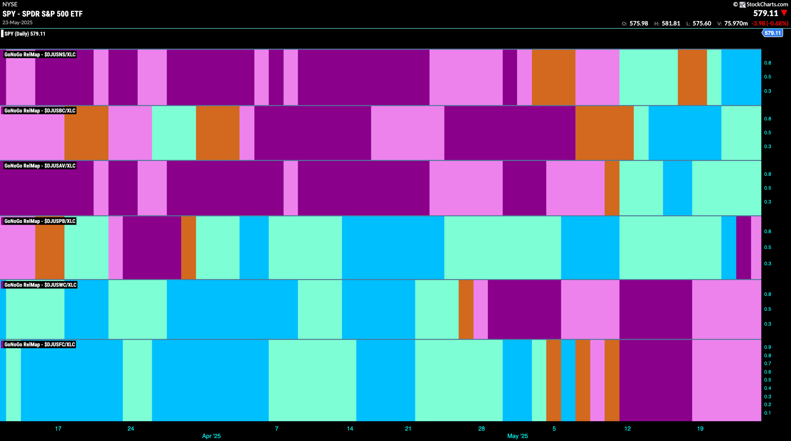
The chart below shows a relative trend breakdown of the sub groups within the communications sector this week. The Sub-Group RelMap plots the GoNoGo Trend of each sub index to the $XLC. We saw in the above GoNoGo Sector RelMap that $XLC is a recent out-performer of the base index. When we look at the below RelMap we can see that in the top panel, the internet index is finding strength as it paints relative bright blue “Go” bars.
$NFLX at New Highs
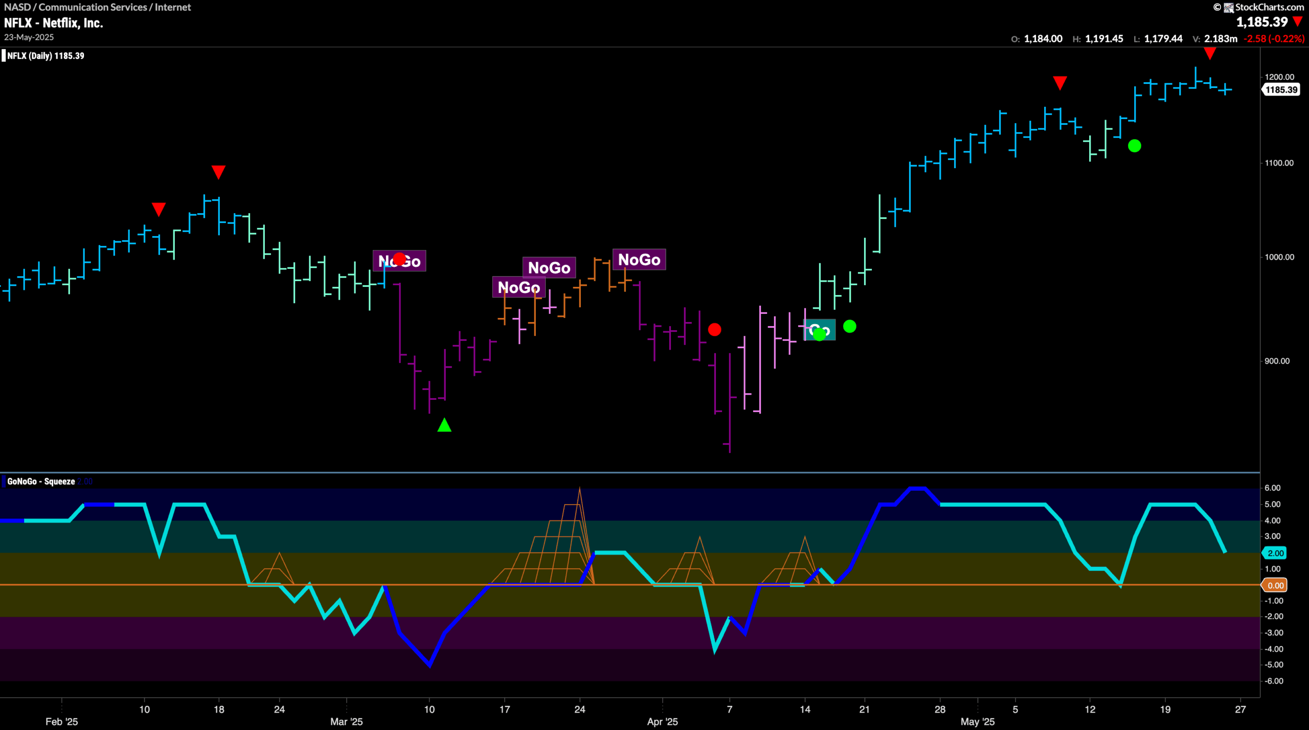
GoNoGo Trend shows that we are in a strong “Go” trend as the indicator paints bright blue bars. We see a Go Countertrend Correction Icon (red arrow) after this last high which tells us that in the short term we may struggle to go higher. We will look for price to consolidate at these levels this week. When we look at the oscillator panel we see that GoNoGo Oscillator is falling toward the zero line. If it finds support here as it has done already in this trend, we will know that momentum is resurgent in the direction of the “Go” trend and will expect price to climb.
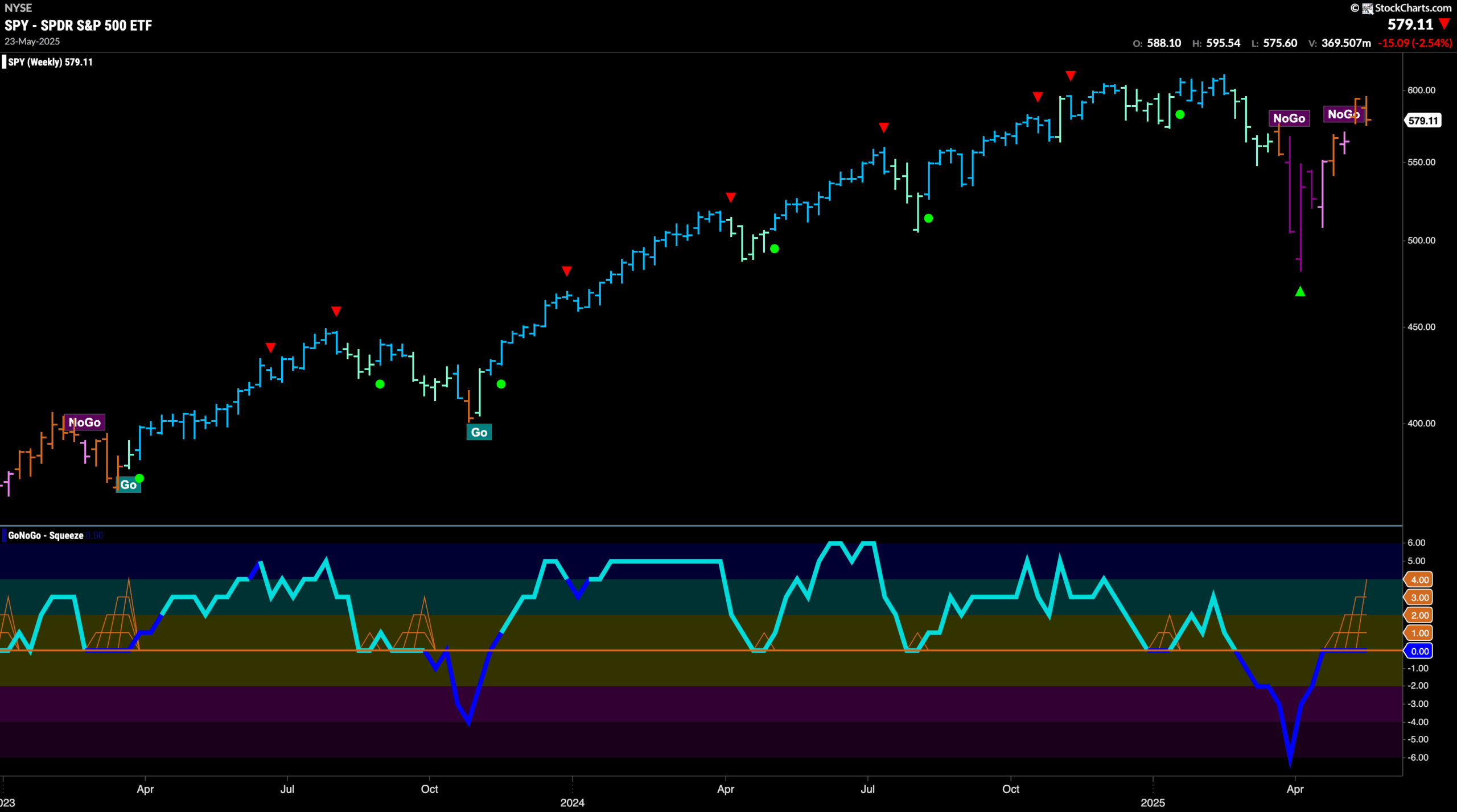
$XNET Consolidates New Highs
The chart below shows that we are also in a strong “Go” trend for $XNET. Having broken through the channel resistance that we see in the form of prior highs, we will watch to see if price can consolidate at these higher levels. The Go Countertrend Correction Icon (red arrow) tells us to be patient, as in the short term, price may struggle to go higher. When we look at the oscillator panel we see that it is positive at a value of 3 and there is heavy volume at these prices. We will look for the oscillator to stay positive to support these higher prices.
