
As you already know, Friday’s news of the discovery of the Omicron coronavirus variant prompted a sell-off in riskier asset classes and a rally in safe-havens, such as Treasuries. What is worth discussing is the validity of using GoNoGo Charts to responsibly manage risk. Learning from our experience is what creates better outcomes in the future.
Trend following investors emphasize how to capture the large, sustained moves and the discipline required to let winners run. Using GoNoGo Charts to stay on the right side of market trends is key, but the tools are also incredibly well-attuned to identifying when those trends will bend, or even break as was the case with Friday’s shocking news.
How to Sell Using GoNoGo Charts
For illustrative purposes, let’s consider an investor who was heavily invested in small-cap securities which were breaking out of a choppy rangebound quagmire that began early in Q1 2021. How would that trader have trimmed their position based on the GoNoGo Charts? At first glance, the daily chart below of the Russell 2000 $IWM shows that trend conditions held the pale aqua “Go” trend through Wednesday’s trading Nov 24th, only to gap down on a neutral bar in Friday’s sell-off.

For those using the complete suite of GoNoGo tools, they noticed GoNoGo Oscillator® fall to the zero line on heavy volume Monday, Nov 15th. Research from Connie Brown, CMT, and other expert technicians tells us that within trend, momentum will oscillate with surges and contractions, but (if the “Go” trend is healthy) should remain positive. GoNoGo Oscillator offers an objective level at which neutral readings should find support and then rally back to positive territory. We look for support at the zero line in Go trends and resistance at zero in NoGo trends.
Analysts saw the price action of $IWM quietly contracting over five trading days as GoNoGo Oscillator rode the zero line. GoNoGo Squeeze® identifies the pent-up volatility that comes with a momentum stalemate. As the grid climbs, the gridlock between buyer’s and seller’s momentum grows, increasing the probability of a higher volatility move once the tug-of-war resolves.
GoNoGo Oscillator broke out of the squeeze to the downside on heavy volume (white line) on Monday, Nov 22nd. For traders tightly managing risk, this was the first indication that trend conditions were sharply deteriorating. At this point, moving to a shorter timeframe could help the investor exit small-cap holdings in advance of further damage.
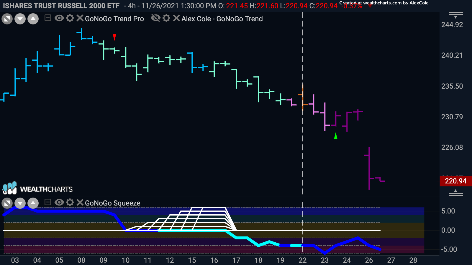
For that shorter timeframe, we could drill into the 4-hour chart of $IWM to see that GoNoGo Trend® had already flagged a “NoGo” for this smaller periodicity but closed the 22nd on a neutral amber bar. To avoid being shaken out too quickly, investors may decide to wait for the close of the next bar – midday Tuesday, Nov 23rd. Here we see GoNoGo Oscillator remained negative on heavy volume. Price action corrected further on a pink bar and the “NoGo” trend conditions were flagged again. Providing ample signals ahead of Friday’s selling pressure – ten points or almost 5% higher than Friday’s close.

With better charts, come better decisions.
Because GoNoGo Charts are clean and free of indicator overload, analysts would have also seen the failure of the breakout above the yearlong trading range visually as the countertrend correction continued right back to support.
The Bigger Picture
Even with last week’s dip, we cannot forget how durable and persistent the GoNoGo Trend has been for US equities which are up sharply so far this year. Consider the weekly GoNoGo Chart of $SPY the S&P500 ETF:

The “Go” trend has been uninterrupted on the weekly chart since July of 2020. GoNoGo Oscillator has not once dipped into negative momentum.
Seasonal factors also favor the trend follower of US Equities. The stock market has historically done well after Thanksgiving. Thanksgiving marks a turn into the home stretch for the year and shifts the attention to the holiday shopping season. Since 1950, the S&P 500 has risen by an average of 1.5% in December, logging a post-holiday gain more than 80% of the time.
Americans are ardent consumers. Despite inflation concerns, retail sales jumped 1.7 percent in October as Americans continue spending. And, at 4.2%, wage growth is now the highest it’s been since Thanksgiving of 2007, providing additional fuel for consumers.
Another long-term barometer of economic expansion is corporate profit growth which has been reported in spades. Since the start of the year, we have seen strong profit growth in each quarterly reporting as the economy recovered from COVID-19, with S&P 500 EPS growing 143% y/y in 1Q21, 94% in 2Q21 and currently tracking a 38% y/y increase in 3Q21. Historically, there has been a strong correlation between profit growth and investment spending (CAPEX) a year later. Corporate reporting of profit growth in 2021 suggests that capital expenditures should accelerate into 2022 and potentially lead to increases in productivity and output.
Ways to Visualize Risk
If and when CAPEX spending works its way into the US economy, that could be a tailwind for US Equity trends. Until then, we’ll look at the evidence currently in front of us. One method that has been helpful analysis for GoNoGo Research is to visualize trend conditions of a risk proxy – for this, we will use the ratio of High Yield Bonds to US Treasuries $HYG/TLT. If investors are buying more junk bonds than government bonds, the risk appetite is higher. If the trend is a “NoGo,” investors are positioning for defense. Currently, the credit markets are signaling risk avoidance on the weekly timeframe presented in the GoNoGo ratio chart below of junk to treasuries $HYG/TLT.

Last week was a bit of an anomaly as investors “gobbled up” government bonds amidst Friday’s sell-off. The 10-yr yield was down 16 basis points to 1.49% ahead of the bond market close at 2:00 p.m. ET Friday – a sharp move after brushing up against 1.70% early in Wednesday’s session.
Defense vs. Offense
Another indication of whether the equity market is “risk-on” is to look at what sectors are leading the market. We’ve not seen leadership from defensive sectors such as Utilities $XLU, nor have we seen Consumer Staples ($XLP) outpace Consumer Discretionary ($XLY). If you think about the types of companies and products in these sectors, it makes sense that luxury goods like Tesla vehicles are more sensitive to economic drawdowns than say toilet paper and soap.
One of our favorite charts is Cisco vs Sysco $CCSCO/SYY which answers the question: “Are investors buying more shares of toilet paper companies or computer networking?” The chart below shows a strong “Go” for Cisco over Sysco. Risk on.

Growth vs. Value
Before the variant news on Friday, the market was experiencing a rotation into value stocks from growth stocks amid growing expectations for the Fed to be more aggressive in tightening policy. Specifically, information technology stocks suffered as rising Treasury yields made expected corporate profits far in the future less valuable in today’s terms. See the hourly chart below of S&P Growth over S&P Value ETFs $SPYG/SPYV which depicts a sharp reversal of the ratio beginning with Monday’s trading session. The vertical white line marks the start of Friday’s trading where growth/value ratio popped back to neutral amber bars. Despite a falling ratio, GoNoGo Oscillator shows no seller momentum. The oscillator is at zero on light volume.

What we Know About Inflation in the U.S.
The United States is experiencing the fastest Inflation in 31 Years: The Consumer Price Index rose 6.2 percent in October from a year earlier, its sharpest increase since 1990. Inflation metrics are a constant thread for financial news media because the mission and mandate of the Federal Reserve Bank are inflation-target based.
Expectations of the Federal Reserve initiating rate hikes have been further exacerbated by weekly initial unemployment claims (199,000) which fell to their lowest level since Nov. 15, 1969. However, Friday’s bond buying brought yields lower and that is a tailwind for growth-oriented equities. The threat of new variants and rising infection rates for the coronavirus worldwide may push off rate hikes even further. This supports continued trends in the growth sectors of the economy. Consider the Nasdaq 100 depicted in the daily GoNoGo chart below of $QQQ:

The index has held a weaker Go trend and a squeeze is building at the zero line of the GoNoGo Oscillator.
Into the Metaverse
Within the holiday shopping spree madness, one chart that pops out is that of Roblox Corporation. A gaming developer with a $74.5 billion market capitalization. The GoNoGo Chart below shows a 46% gain since the Go flag on Nov 1st.

What Does the Energy Sector say about Oil Markets?
Last week, the U.S. confirmed plans to release 50 million barrels of oil from the Strategic Petroleum Reserve over several months. China, India, Japan, South Korea, and the UK are also expected to tap into their oil reserves to hopefully reduce gasoline prices, which are a key part of headline consumer price inflation figures.
Yet, Oil prices actually rose on the news before selling off Friday. The announcement was widely anticipated, and the market seemed to think OPEC and Russia will simply reduce production to offset the move. See the daily chart of $USO below:

Despite Friday’s impact on oil as a commodity, oil and gas companies have weathered the news with less volatility. For those investors who have to maintain exposure to some energy sector names, see the chart below of Marathon Oil, $MRO. GoNoGo Trend is painting an amber “Go Fish” bar but has not yet moved into a “NoGo” trend. GoNoGo Oscillator is hovering around zero where we will need to see it rally into positive territory in order to position for a return to the “Go” trend in price.