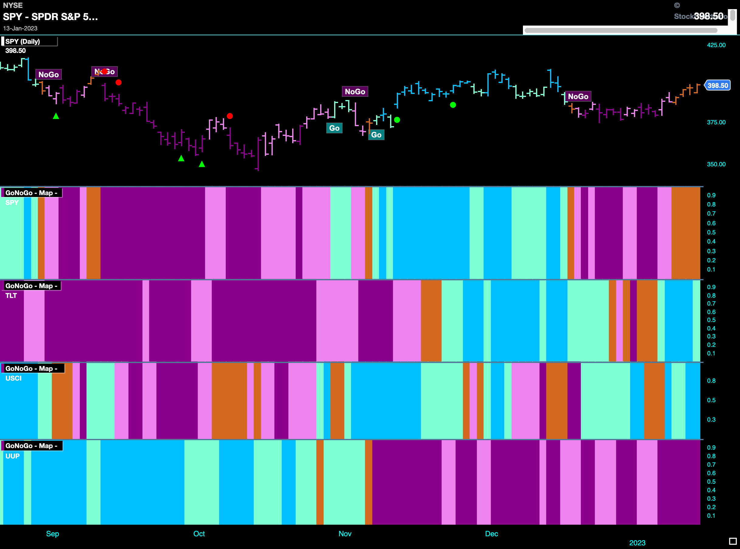
Good morning and welcome to this week’s Flight Path. Let’s take a look at the GoNoGo Asset map below. A big change this week U.S. equities trying to leave the “NoGo” trend behind. A run of amber “Go Fish” bars could serve as a transition to a new trend. Treasury bond prices moved to a “Go” trend this week while commodities were able to get back to “Go” bars after a sprinkling of uncertainty last week. The dollar continued to struggle.
Equities Try to Break Free
GoNoGo Oscillator broke above the zero line at the start of the week and that was quickly followed by GoNoGo Trend painting a string of amber “Go Fish” bars which signal a tug of war between bulls and bears. We will watch to see this week if a “Go” returns to propel prices higher.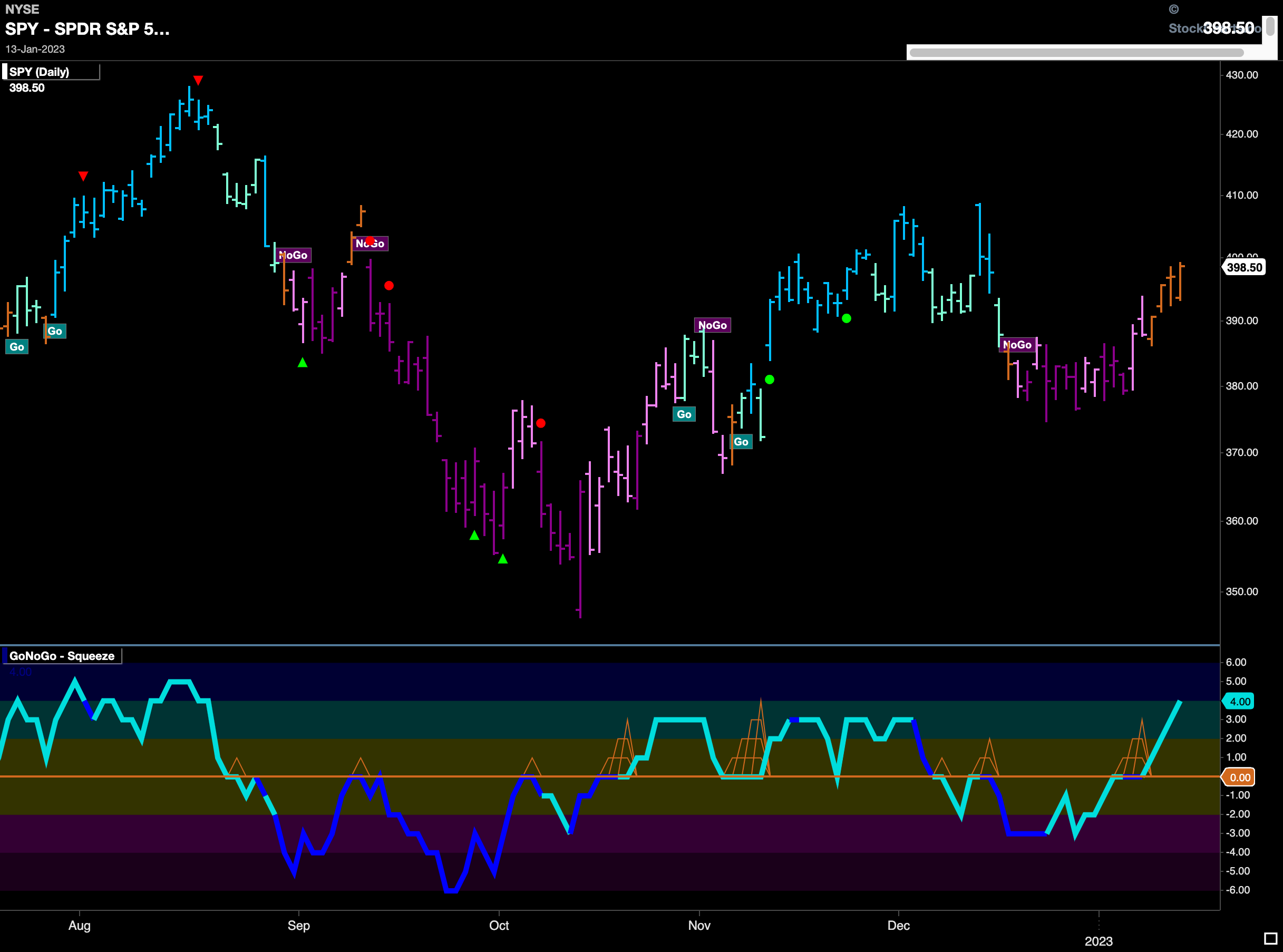
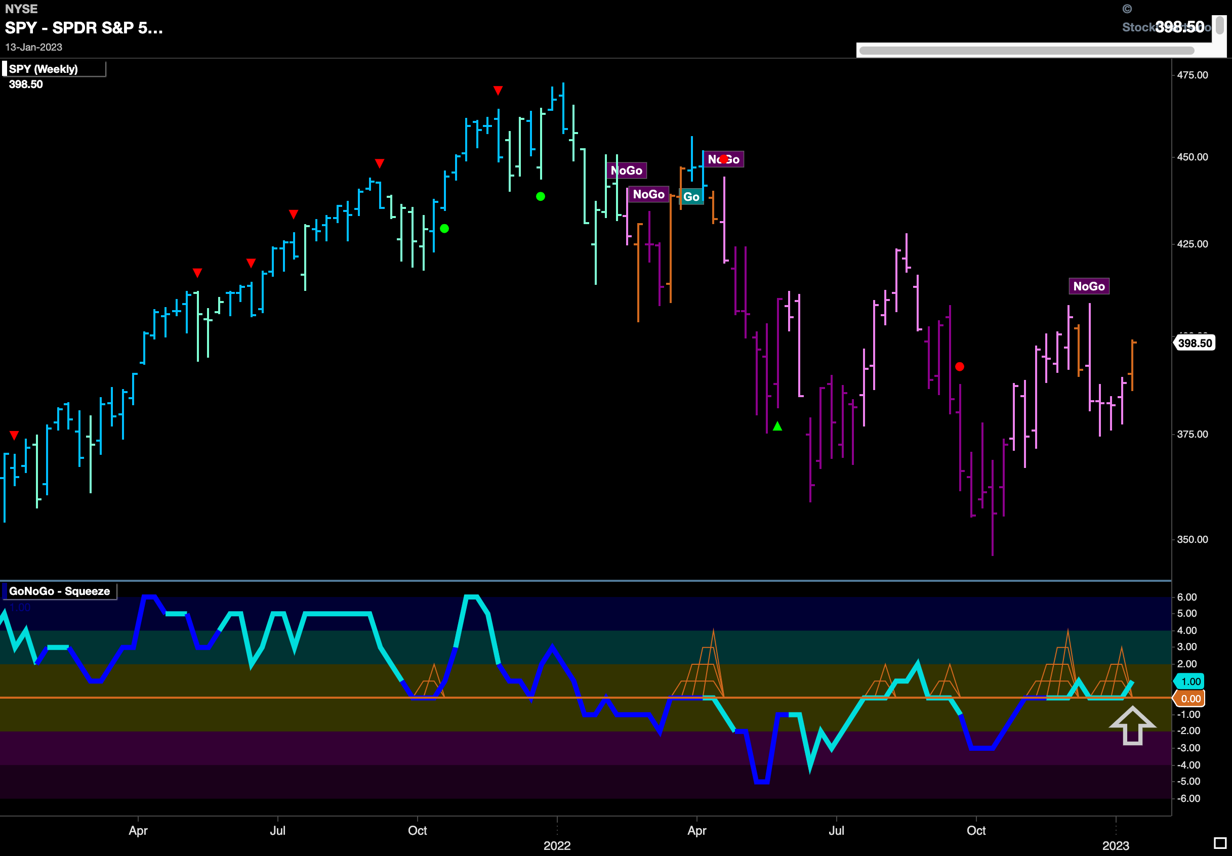
The longer term weekly chart shows that the “NoGo” has been abandoned for an amber bar as uncertainty is evident on the larger time frame as well. Importantly, GoNoGo Oscillator has found support again at the zero line and so with momentum staying in positive territory that might give price the push it needs to move higher.
Treasury Remain Depressed this Week
Treasury bond prices moved lower again this week and now are close to prior lows. We have seen GoNoGo Oscillator reverse from positive territory and is now once again below zero confirming the “NoGo” trend that we see in price. We will look to see if there is a new low made this week.
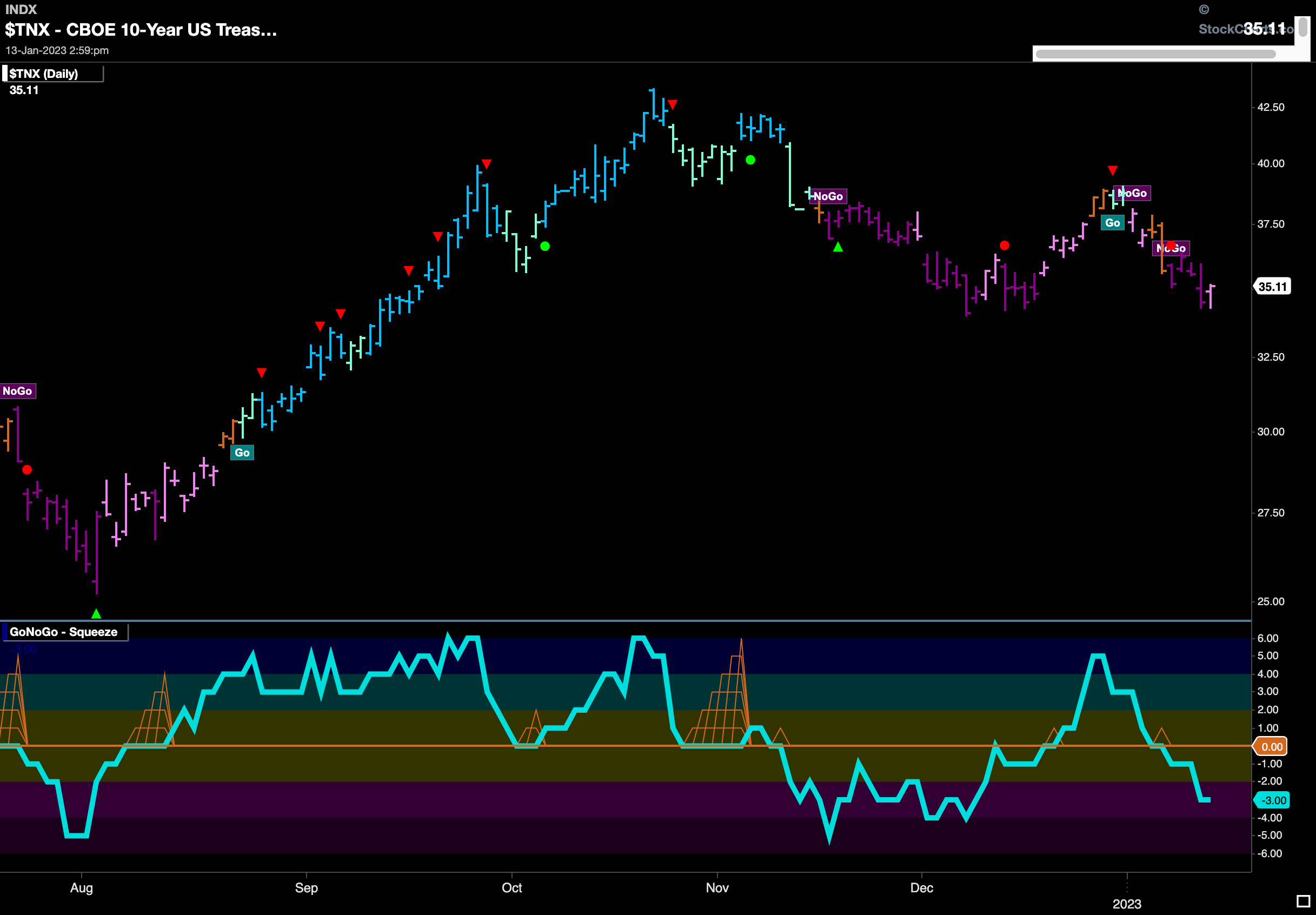
There is a threat to the longer term “Go” trend in treasury prices. As price came off a high and we saw a Go CounterTrend Correction Icon (red arrow) indicate that prices may struggle to move higher in the short term, we noted how GoNoGo Oscillator fell to test the zero line. As it rode the zero line, visualizing the tug of war between bulls and bears, we saw a Max GoNoGo Squeeze (amber grid). If the trend is healthy, we know that the oscillator should stay at or above zero. Last week’s price action saw GoNoGo Oscillator break out of the Max GoNoGo Squeeze into negative territory. We will watch to see if this is a brief foray or the start of something more significant.
The Dollar Made Lower Lows
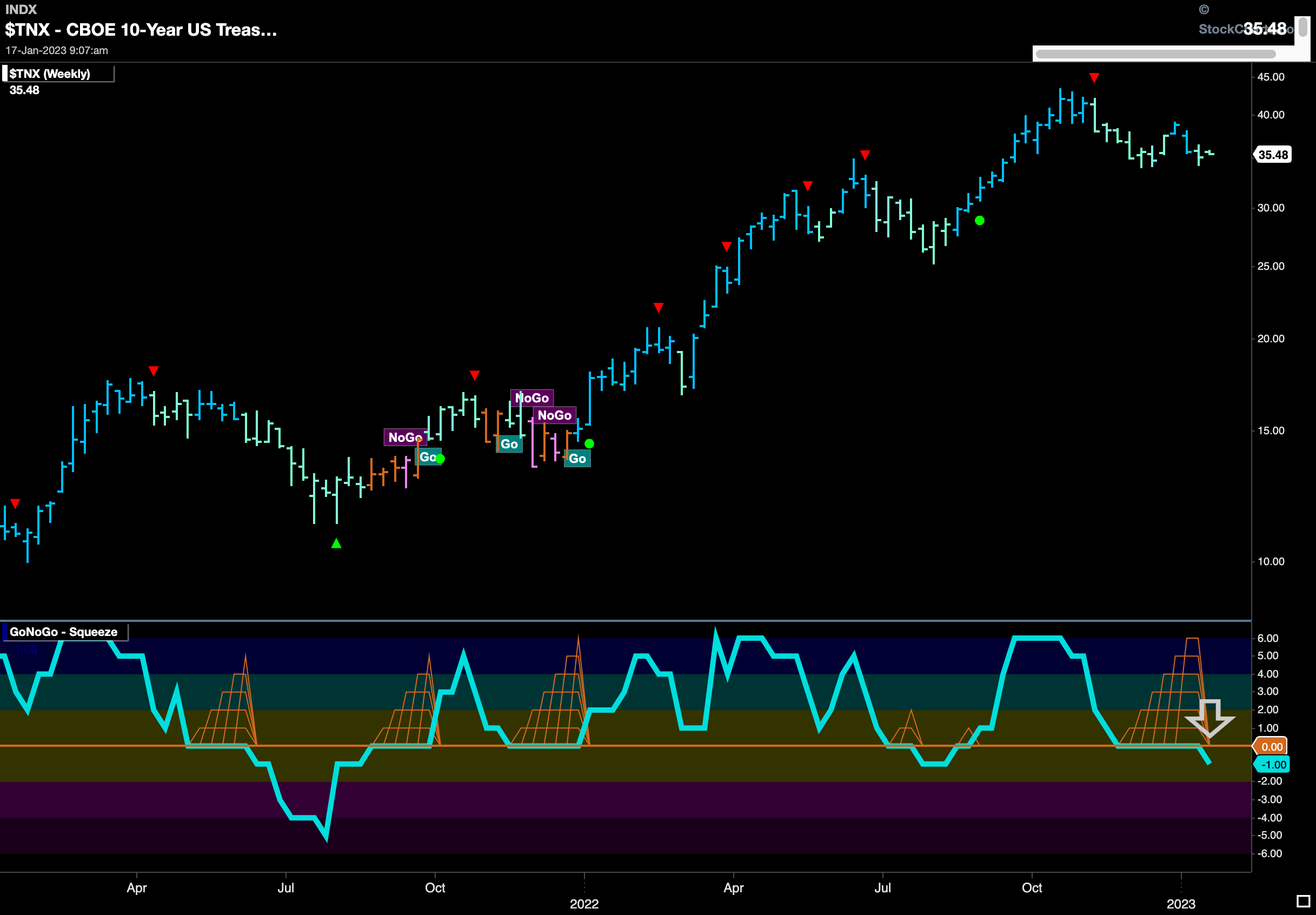
Price fell further this week as we saw a new low. GoNoGo Oscillator fell back below the zero line and so now we see a “NoGo” trend in place painting strong purple bars and GoNoGo Oscillator confirming that momentum is once again on the side of the “NoGo”. This is a bearish looking chart for the dollar as price is lower than the low from last summer.
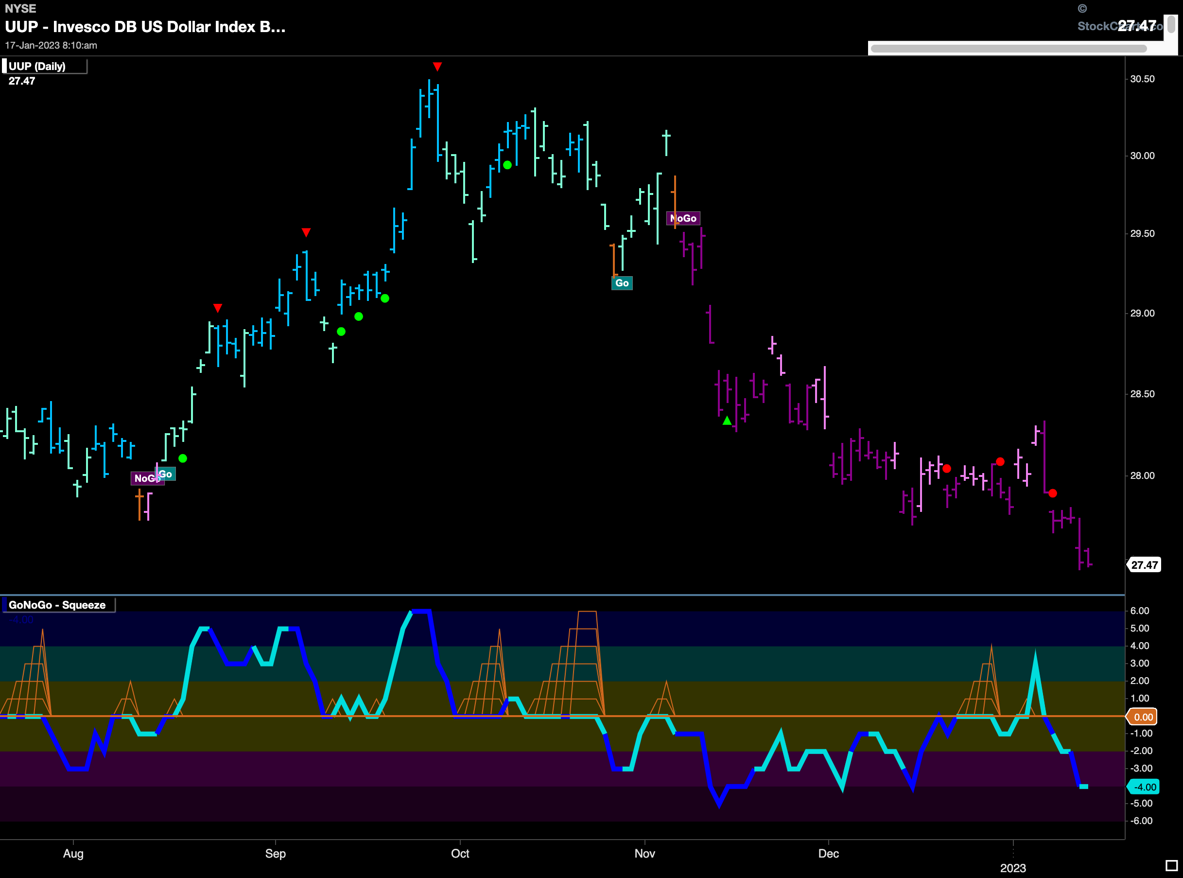
The weekly chart shows that there was follow through as the “NoGo” (spotted last week) strengthened to paint a strong purple bar. Also, we see GoNoGo Oscillator fall further into negative territory confirming the “NoGo” in price. Traditional technical analysis shows that last week’s price action broke below an important support level and so it would be no surprise for the green back to suffer further price deterioration going forward.
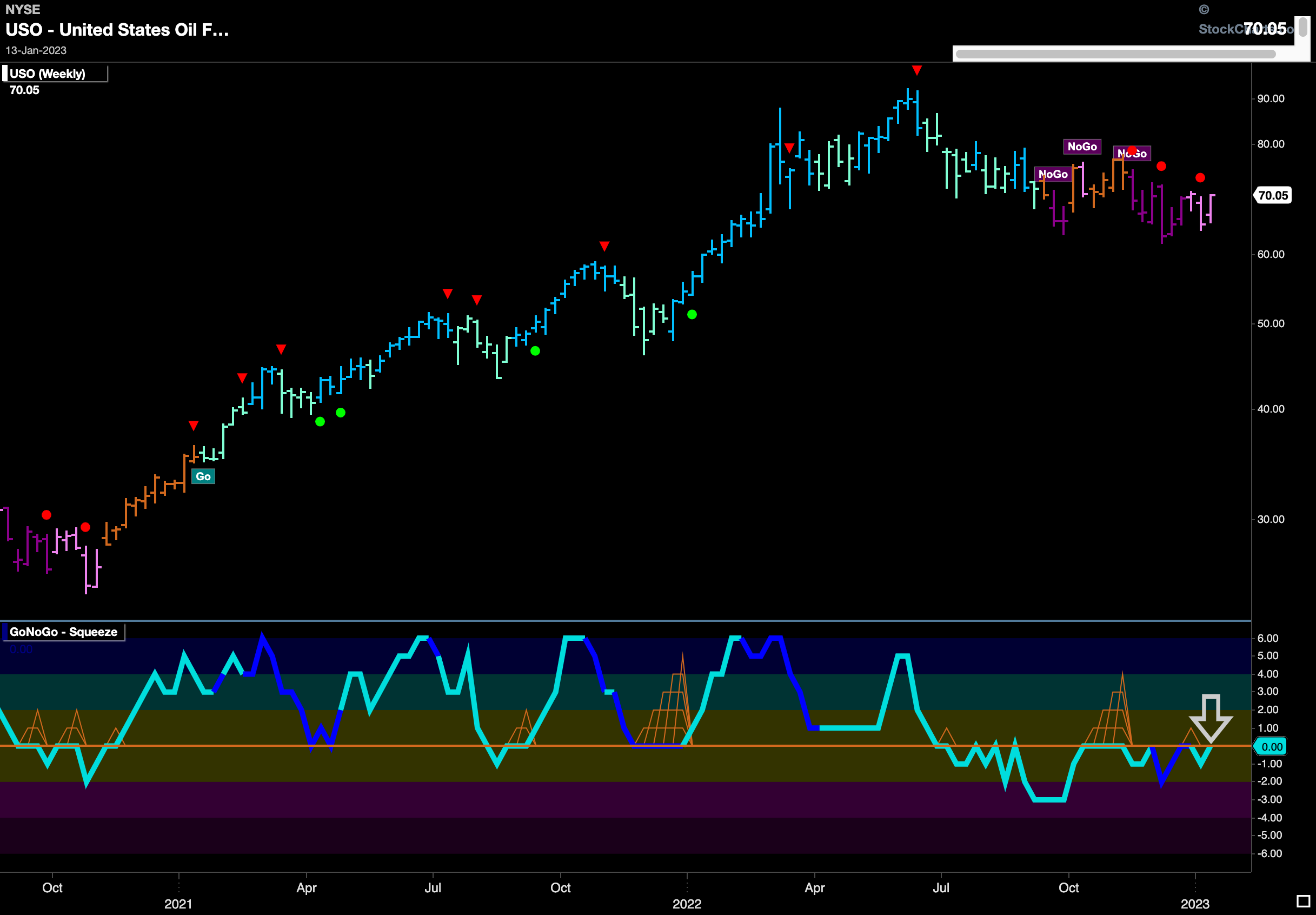
“NoGo” in Oil Continues… Weakly
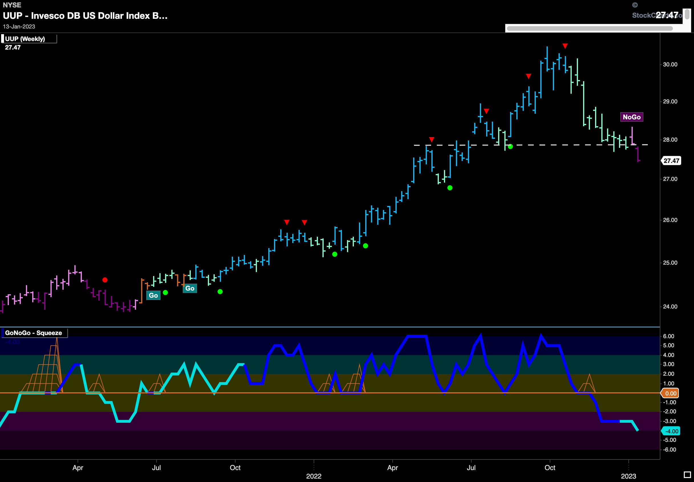
Another weak pink “NoGo” bar was painted last week in $USO as prices rallied. GoNoGo Oscillator shows that negative momentum dried up and we are right back at zero testing that level from below. We will need to see if the oscillator stays in negative territory in order for us to have much faith in the strength of the “NoGo” in oil.
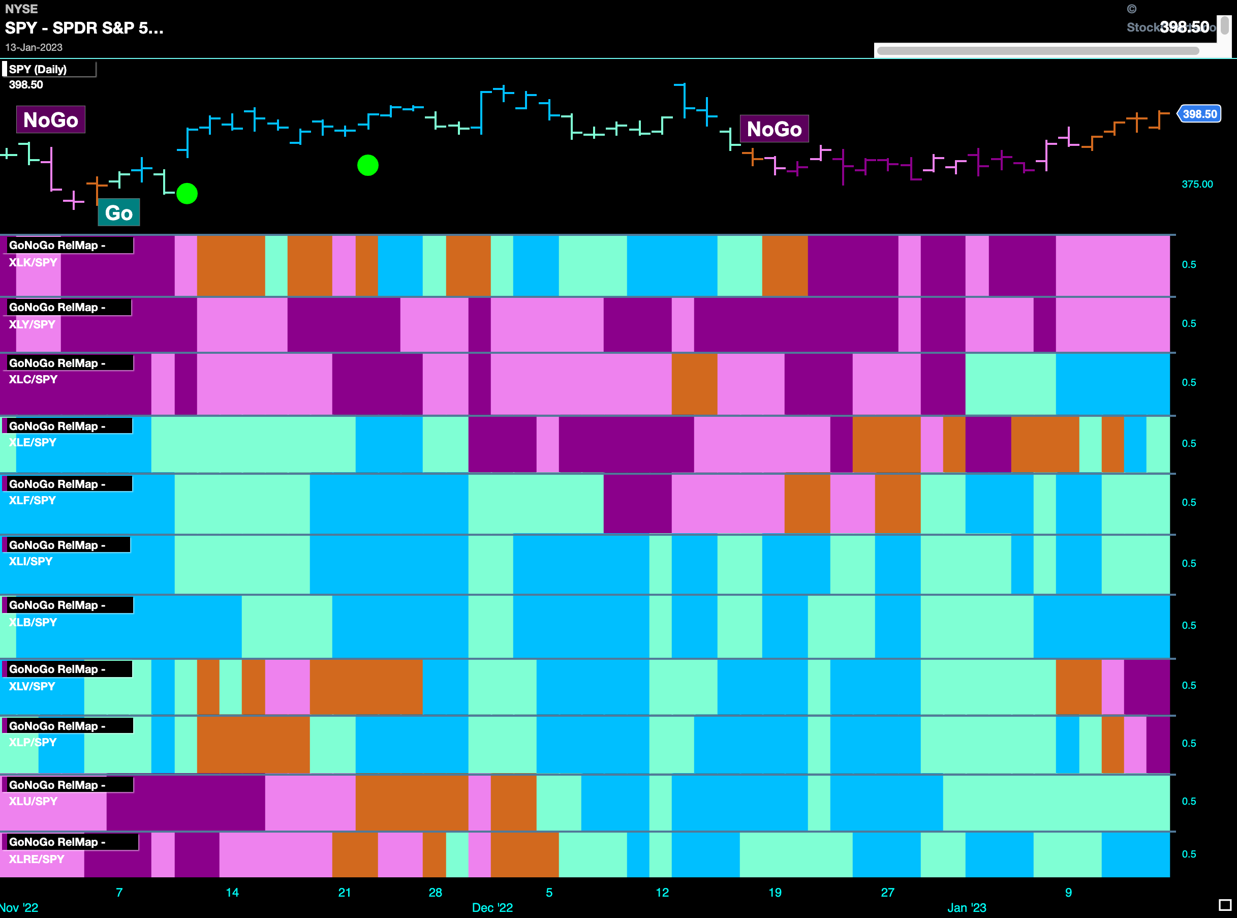
Sector RelMap
Below is the GoNoGo Sector RelMap. This GoNoGo RelMap applies the GoNoGo Trend to the relative strength ratios of the sectors to the base index. Looking at this map, we can quickly see where the relative outperformance is coming from as well as which sectors are lagging on a relative basis. 7 sectors are outperforming the base this week. $XLC, $XLE, $XLF, $XLI, $XLB, $XLU, and $XLRE, are painting “Go” bars.
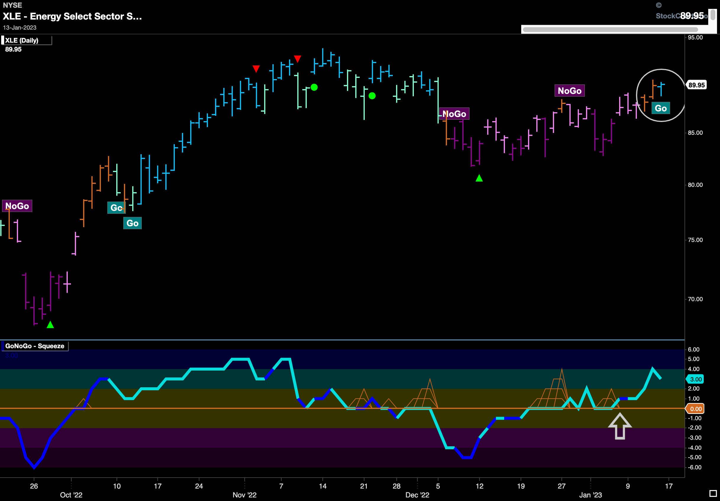
$XLE Wants to Make a “Go” of it!
After a mostly sideways “NoGo” correction, the energy sector looks to return to a “Go” trend on the daily chart below. We saw in the weekly chart of $USO the struggles it is going through to maintain its “NoGo” trend. Here, we see the energy sector painting a first strong blue “Go” bar. This comes after a couple of amber “Go Fish” bars and following GoNoGo Oscillator’s break above the zero line. This told us that there was positive momentum several bars ahead of the color change.
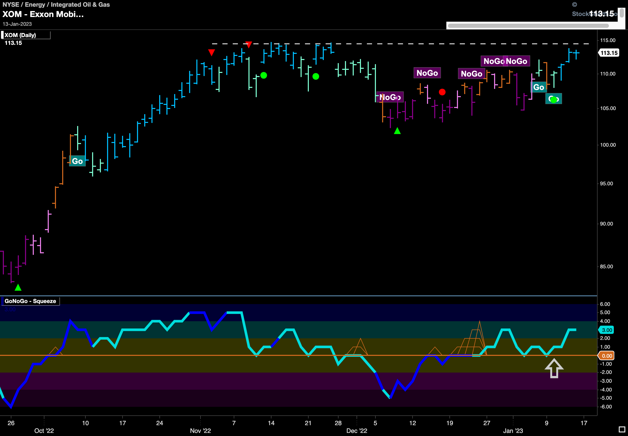
$XOM in “Go” Trend Ready to Attack Resistance
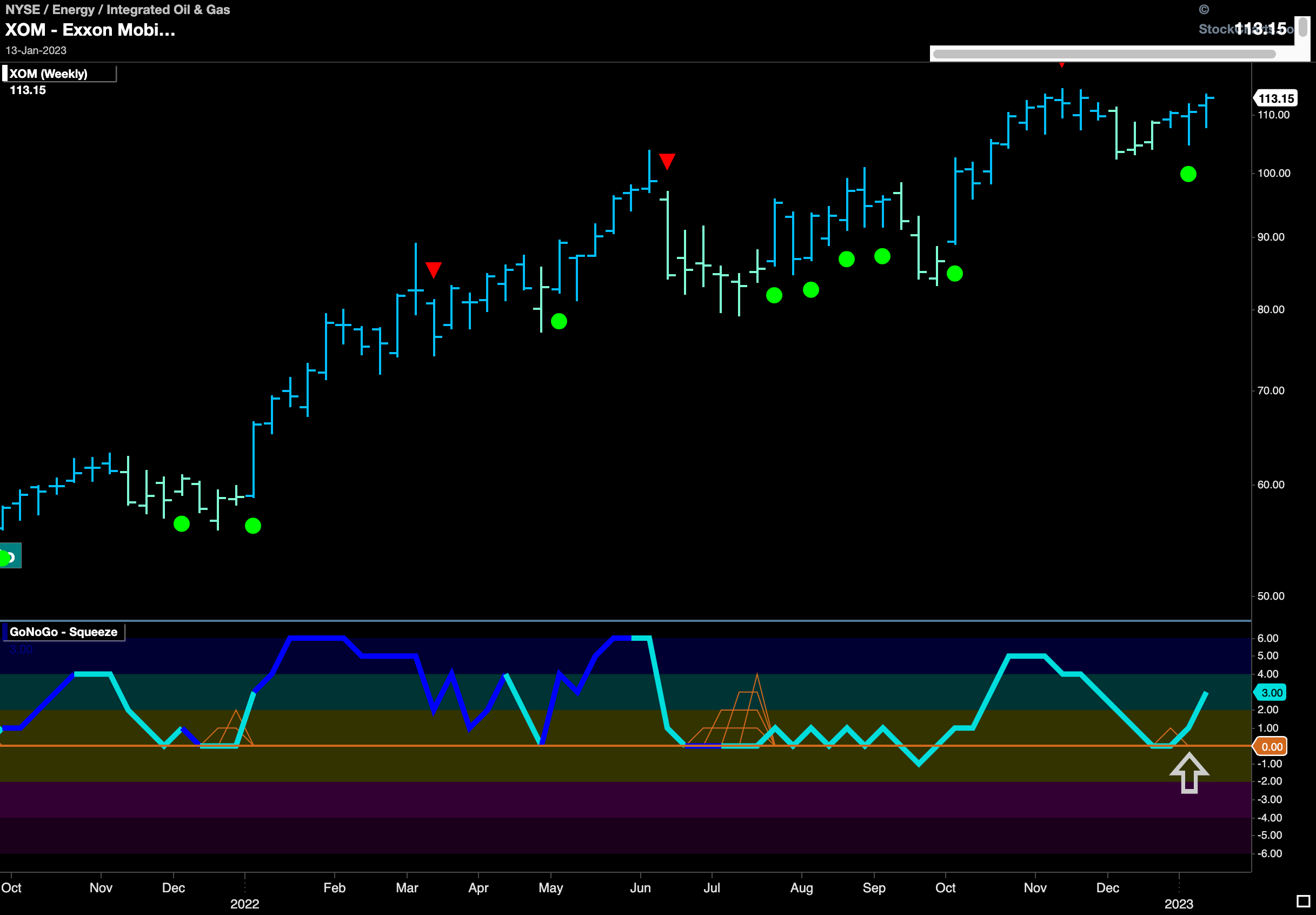
Exxon Mobile looks ready to take advantage of the energy sectors return to a “Go” trend. We can see that for several bars now GoNoGo Trend has shown price emerging out of the “NoGo” correction as it painted amber “Go Fish” bars and aqua “Go” bars before settling into a string of strong blue bars. Below, we see GoNoGo Oscillator broke above zero out of a small GoNoGo Squeeze during price’s sideways movement and now has successfully found support at that level. This confirms that momentum is on the side of this new “Go” trend. Look for price to make an attempt at a new high above the horizontal resistance we see on the chart.
The weekly chart shows that we should be believers in any return to “Go” trends on the smaller timeframe charts. This “Go” trend has been in place for some time and we can see how well the zero line has given Go Trend Continuation indications each time the GoNoGo Oscillator has found support at the zero line while in the “Go” trend. We note here that we see support again, with a new Go Trend Continuation Icon telling us that momentum is resurgent in the direction of the strong blue “Go” trend. 