
Good morning and welcome to this week’s Flight Path. Let’s take a look at the below GoNoGo Asset Map for this week. The cracks deepened this week. The asset map shows the GoNoGo Trend applied to the major asset classes and displayed as a panel as the colors change with price trend. Equities have painted two “NoGo” bars to end the week as it couldn’t hold onto the “Go” trend. After the amber “Go Fish” bars we saw to end the week before, a “NoGo” trend is now in place as markets sold off. Treasury bond prices remain in a strong “NoGo” as commodities and the dollar stay strong.

Struggles for the S&P 500 continue
Below is the chart of $SPY with GoNoGo Trend and GoNoGo Oscillator applied. We noted a week ago that the index was in trouble after seeing GoNoGo Oscillator fail to find support at the zero line. Compounding that, GoNoGo Trend saw amber “Go Fish” bars of uncertainty creep in. The end of last week saw a complete move toward a “NoGo” trend as prices fell lower on pink “NoGo” bars. GoNoGo Oscillator is in negative territory but not yet oversold. We can look for price to test the lows from March.

Sector Performance
Below is the GoNoGo Sector Relmap. This GoNoGo Relmap applies the GoNoGo Trend to the relative strength ratios of the sectors to the base index. Looking at this map, we can quickly see where the relative outperformance is coming from as well as which sectors are lagging on a relative basis. This picture remains similar to weeks past. The defensive sectors continue to lead; energy, materials, staples, utilities, healthcare, real estate. Technology, communications, financials continue to struggle.

Rates Rising Ever Higher
Rates continue to run. The daily GoNoGo Chart below shows that the 10 year treasury rates have made new higher highs this week. Since the Go trend that was identified at the beginning of the year we have seen GoNoGo Oscillator primarily find support at the zero line and several Go Trend Continuation icons (green circles) that informed us the trend was to continue. Now at new highs, we see a Go Countertrend correction arrow as momentum comes off its highs. Remembering the long term chart, we wonder if the historical downtrend in rates is to be broken this year as prices close in on highs from 2018.
As rates rise, we could see headwinds continue to batter growth stocks and tailwinds filling the sails of the defensive sectors.

Technology Continues to be a Drag
Below is the daily GoNoGo Chart of the technology sector. As we saw last week, the growth sector is underperforming the main index and that continues this week. Price pushes down close to prior lows as we end the week on a pink “NoGo” bar. Last week we noted that GoNoGo Oscillator was testing the zero line and we saw it break below zero on heavy volume. As prices approach the lows from March we see the oscillator is in negative territory but not yet oversold.

Sony Sinking like a Stone
Sony, synonymous with technology, has struggled massively this year. Below we see the GoNoGo daily chart with the Trend and Oscillator applied. we can see that we ended last week on a new lower low as the “NoGo” took fresh hold a few weeks ago. A feeble attempt was made to break out of the bearishness at the end of March but it was short lived. With the market as a whole starting to struggle and the rotation out of growth equities seemingly set to continue, Sony does not look good.

On a weekly chart, things look even worse. Having fallen into a “NoGo” in February, that trend has strengthened with price making lower lows on strong purple bars. The last two bars have seen price break below long term support levels stretching back a full year. With this level broken, look out below.

If we step down to a two hour chart, we could be looking for opportunities to participate in this “NoGo”. The GoNoGo Chart below shows the last month of 120 minute bars for Sony. We can see that the most recent intraday “NoGo” began at the very end of March, and NoGo Trend Continuation (red circles) gave us several opportunities to either get out, or get in to the strong move to the downside. The most recent of these moments came on Thursday of last week with GoNoGo Oscillator breaking out of a max GoNoGo Squeeze to the downside as prices moved lower again.

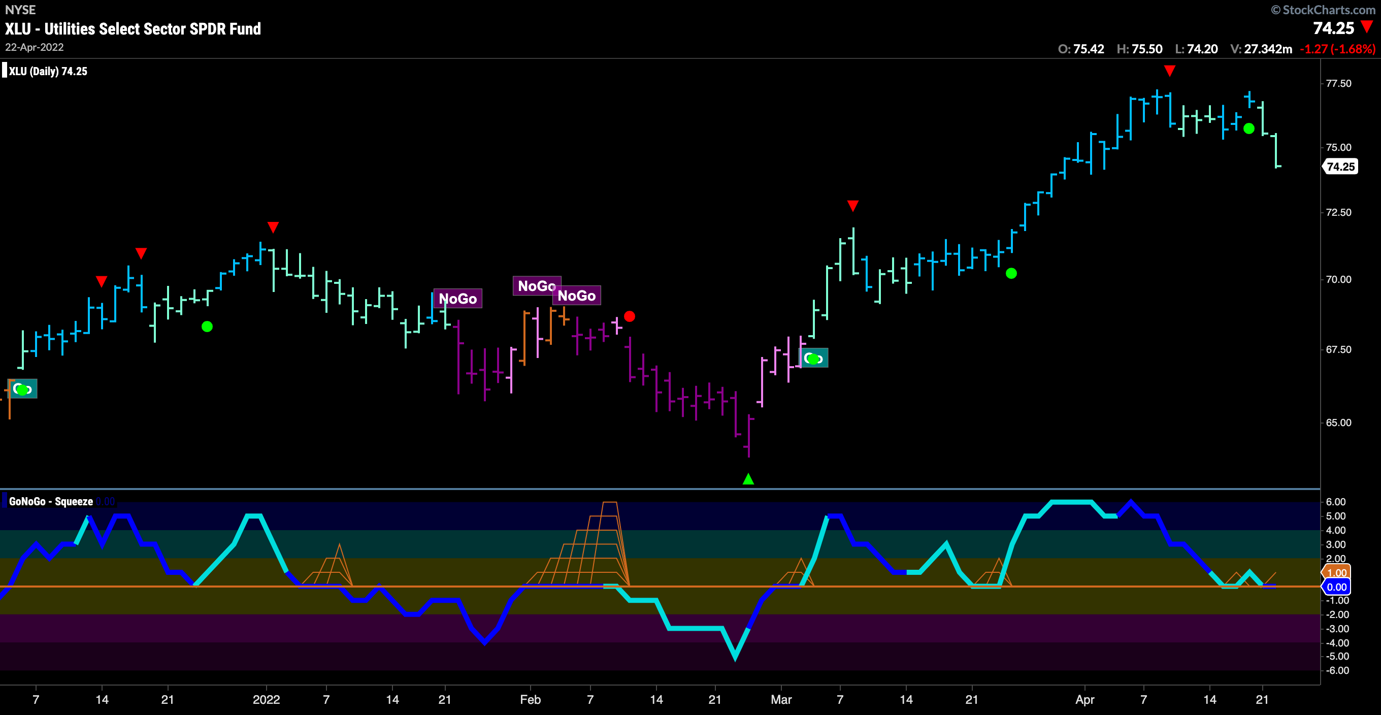
Utilities Sector Keeping the Lights On!
It is not all doom and gloom! Utilities are strong again this week on a relative basis as we saw in the GoNoGo Sector RelMap at the outset of this note. Yes, price took a hit to end the week as the market moved lower, but for utilities this move has brought GoNoGo Oscillator to the zero line, where we can look to see if it finds support. We will watch to see if utilities can hold on to the “Go” trend as the market continues to play defense.

UGI Corp Holding Co. Sets up Move Higher?
If utilities finds the support that we are looking for at the zero line, then we can look for opportunities in companies that have strong GoNoGo charts. The chart below shows the GoNoGo chart of $UGI on daily bars. We like this set up as a “Go” trend emerges after a strong “NoGo” correction. GoNoGo Oscillator broke out of a max GoNoGo Squeeze into positive territory at the end of March. This spelled trouble for the “NoGo” as it was illustrating positive momentum. After another GoNoGo Squeeze as the oscillator rode the zero line in April, it was broken to the upside again. The oscillator finding support at zero like this confirms the new “Go” trend that has been identified. We will look for the zero line to hold again.

If we step down in time frame to look for an entry, we can see the importance of the level at which the stock is trading currently. The 4hr GoNoGo Chart below shows that price broke above strong resistance. Looking at the dashed line on the chart we see polarity. What was support on the left side became resistance after it was broken. Now, price is retesting this level from above where we can expect it to find support. With that, GoNoGo Oscillator is testing the zero line from above. If this support holds, we can expect price to attack recent high above $38.