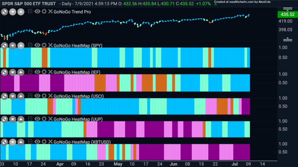
Where are the “Go” trends? The U.S. markets continue to edge higher and yet there are some interesting questions that will need to be answered if prices are to continue to rise. The GoNoGo Asset Class Heat Map below shows that there are “Go” trends currently in equities, treasury bond prices, and the U.S. Dollar. Commodities which had been strong for so long have succumbed to the pressures of a “NoGo” trend. Bitcoin, the last panel, continues to flounder painting strong purple “NoGo” bars.
Time for Treasuries?
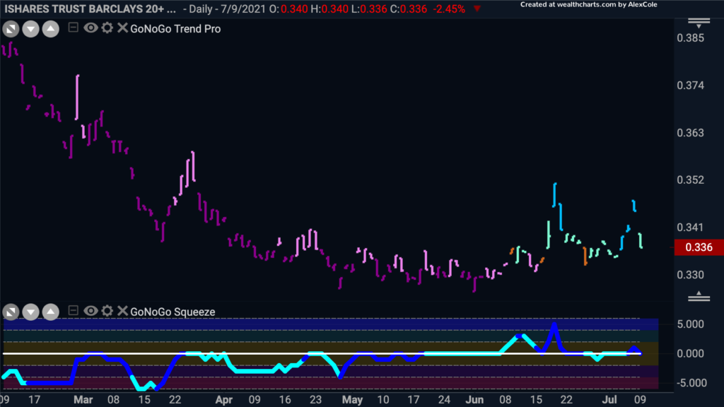
Parking money in treasury bonds has not been the thing to do since the post coronavirus rally started early last year. The chart below shows that the ratio of treasury bond prices to the S&P 500 was in a strong, downward sloping “NoGo” trend for that entire time. Recently though, the blended inputs of the GoNoGo Trend indicator have let us know that this environment has changed. Since mid June, the GoNoGo Trend has been able to paint mostly blue “Go” bars, and the GoNoGo Oscillator has largely found support at the zero line. With the Oscillator testing zero again from above, it will be important to note whether or not this level is broken this time.
Growth Sectors Back in Favor
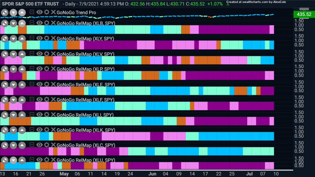
It’s a mixed bag for equities now. As we can see from the Asset Class Map, the risk on appetites are dwindling somewhat. For most of the 2020 rally we saw “Go” trends in equities, commodities and cryptocurrencies. Now, equities struggle on alone as the dollar and treasuries find their feet. This is not typically as healthy of an environment the general markets. So, how are equities managing to continue higher? We are seeing rotation back into the discretionary sectors. No longer are the markets being buoyed by the industrial sectors that surged during the end of 2020 when the “reopening” theme was strong. The GoNoGo Sector RelMap below shows that the “Go” trends are back in technology, consumer discretionary, healthcare and communications.
Growth Sectors Back in Favor
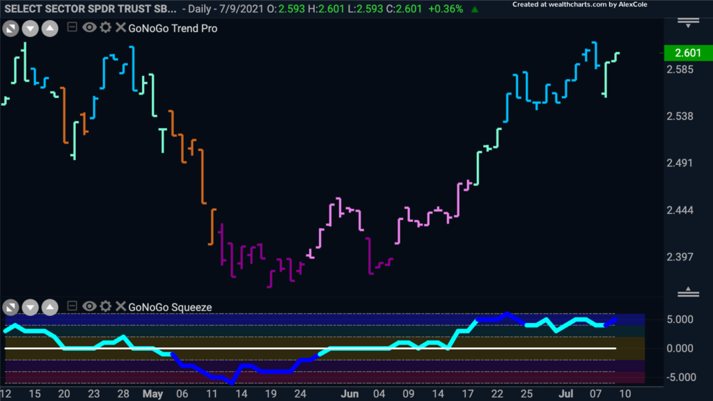
This chart shows the relative strength of $XLY/$XLP. As we can see, the relative outperformance of the discretionary sector is clear during the last few weeks as the “Go” trend has been identified and has rallied strongly. It is worth noting however, that price is approaching levels that were resistance in April. We will keep an eye on this trend to see if opportunities continue to present themselves in the discretionary space.
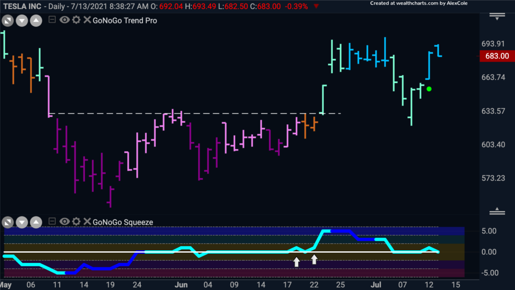
Right now, the trend as we can see in growth mega cap names is a “Go”, so let’s take a look at the GoNoGo chart of TSLA to see what the technicals say. The GoNoGo Trend is a “Go”, with the trend having found support at levels that once were resistance from the “NoGo” consolidation that we saw through much of May and June. On the prior bar, we saw that support again, with the GoNoGo Chart firing off a Go Re-entry green circle indicating that momentum has come back in the direction of the “Go” trend. We will continue to watch to see if the GoNoGo Oscillator holds the zero line as support.
Failing Financials
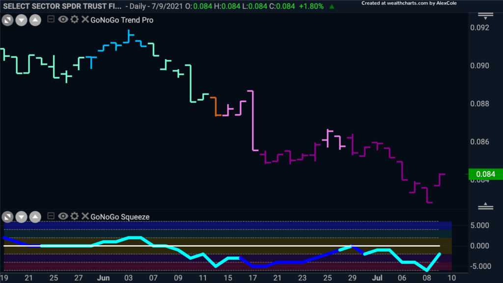
Over the last few weeks, the financials sector has again struggled on a relative basis to the market as a whole. The chart below shows the ratio of financials to the S&P 500 with the GoNoGo Charts applied. We can see that a strong “NoGo” is in place as price made a lower low this week and the GoNoGo Oscillator is in negative territory.
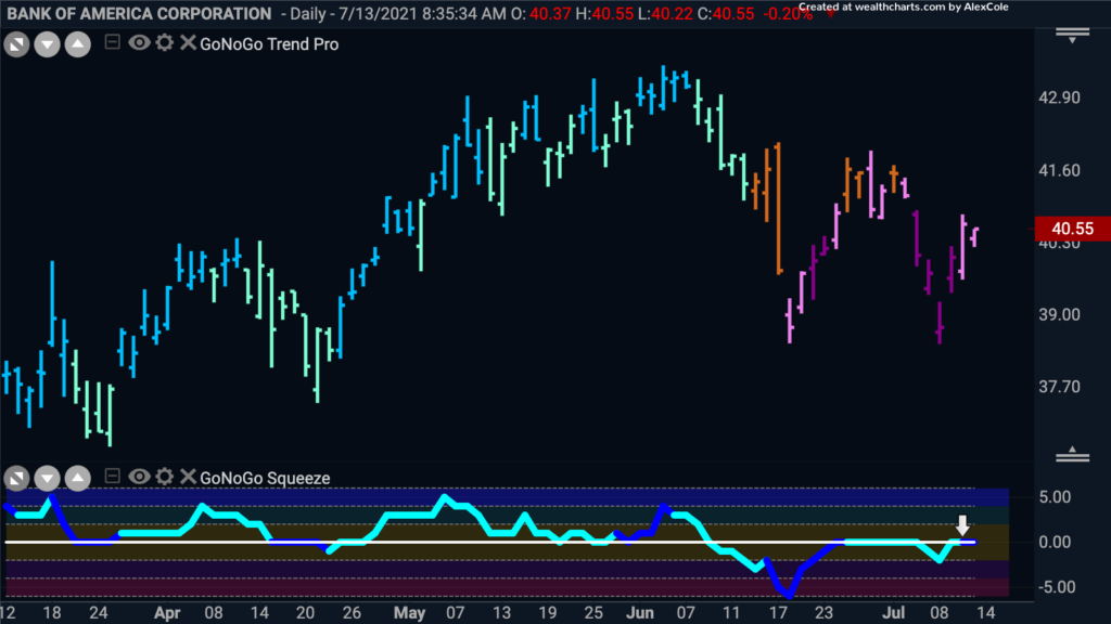
Let’s Not Bank on Bank of America
If the trend is strongly against financials, we can take a look at individual securities to see if there are opportunities to participate in the “NoGo” trend. Below is a chart of Bank of America. We can see that since mid June, the “NoGo” trend has taken hold and that we are now testing the zero line from below in the oscillator panel. If the GoNoGo Oscillator is turned away from the zero line again, we will see a fresh NoGo trend re-entry icon appear above price, indicating that momentum has come back in the direction of the NoGo trend, offering perhaps a good opportunity to take part in the move lower.
