
The markets delivered a strong rally last week. U.S. stocks posted their best weekly gain since November. The S&P 500, Nasdaq Composite, and small-cap Russell 2000 indexes all reached fresh record highs. Crude oil traded to the highest levels in more than a year, logging an almost 10% gain for the week. And while the attention has been largely focused on the erratic trading of the equities space, there was a new “Go” trend flagged last week on the US Dollar Index.
GoNoGo Research has discussed the early signs of divergence in the structural downtrend in the dollar index for weeks, but $DXY is now a “Go” painting strong blue bars and rallying higher into the end of the week. We will take a close look at the GoNoGo Chart of $DXY at the end of this note. If this new “Go” trend lasts, what does a strong dollar mean for the existing trends among the major asset classes? This week we will focus our analysis on commodities and how the trend in $DXY might affect various trends across dollar-denominated hard assets such as grains, lumber, and precious metals.

The GoNoGo Heat Map® above shows us the daily trend performance of five asset classes: Equities, Bonds, Commodities, Currencies, and Digital Assets from the US perspective. The risk-on trade remains the same as it has been for several weeks: Equities, commodities, and the cryptocurrency markets are in established “Go” trends. The notable exception is the strengthening “Go” trend for $DXY
Panel 1 – Stocks jumped right back into the “Go” trend this week and finished the week with strong blue bars. The S&P 500® ETF, $SPY, seeks to provide investment results that correspond generally to the price performance of the S&P.
Panel 2 – Government bonds, continue to paint “NoGo” bars, with uninterrupted strong purple bars this week. $IEF tracks a market-value-weighted index of debt issued by the US Treasury with 7-10 years to maturity remaining.
Panel 3 – Commodities are a “Go” and the trend strengthened this week on strong blue bars. $USCI tracks an equal-weighted index of 14 commodity futures contracts and holds at least one precious metal, industrial metal, energy, livestock, soft, and grain commodity.
Panel 4 – The US Dollar fell out of the “NoGo” trend painted amber “Go Fish” bands before breaking out to a new “Go” trend and accelerating to strong blue bars. $DXY is an index of the value of the United States Dollar relative to a basket of foreign currencies.
Panel 5 – Bitcoin’s “Go” trend resumes in full force this week as the strongest blue “Go” bars return.
Commodities are a “Go”
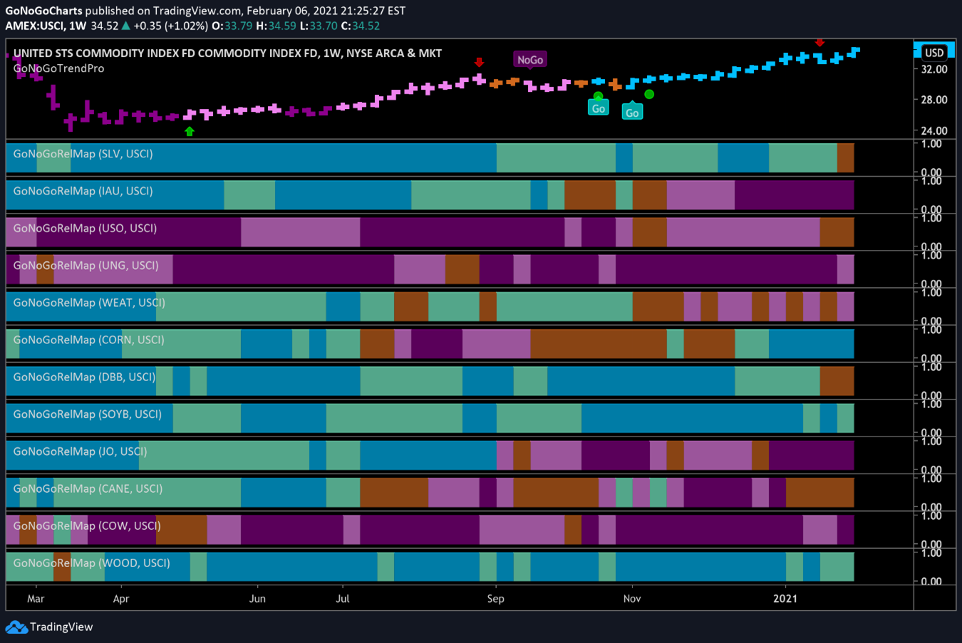
The GoNoGo RelMap® below shows the GoNoGo Trend applied to the relative strength ratio of various commodities against the $USCI commodity index as a base. This is a weekly chart and we can start here to see the major trends. Never forget that when in doubt, zoom out! We can see that corn (panel 6), soybeans (panel 8), and lumber (last panel) are in long term “Go” trends. We can also see that silver (in the top panel) while painting an amber band at the end of the week has been an outperformer for the entire period shown on this chart. This trend started long before the short squeeze drama even had a name, much less celebrity spokespeople!

Soaring Soybeans
The GoNoGo Daily chart below shows that $SOYB has been in a very strong trend since the summer of 2020. We have seen price move in waves as it often does in a trend. As though it were climbing a flight of stairs, price surges on strong momentum and is depicted by bright blue “Go” bars, but is followed by areas of correction/consolidation as GoNoGo Oscillator falls to the zero line while the GoNoGo Trend paints the weaker trend conditions as aqua “Go” bars.
After another correction against the trend over the last several weeks, GoNoGo Oscillator has once again fallen to zero and we will look to see if it can find support. The oscillator should rally if the trend is to continue.

Let’s zoom in on the price action and pull up a GoNoGo Squeeze® chart to highlight the recent period of consolidation. As price movements have narrowed, volume has lessened as depicted by the lighter green oscillator line.
When GoNoGo Oscillator drops to the zero line and remains at zero, it tells us that momentum is neither overbought nor oversold. In other words, enthusiastic buying and selling and volatile price swings have diminished.
This contracted volatility often leads to a decisive move in either direction once the stalemate is broken. To highlight this tug-of-war between buyers and sellers, the graphical grid of GoNoGo Squeeze climbs to an extreme, as it has in the chart below. If GoNoGo Oscillator breaks out of the squeeze into positive territory, we will see a new low-risk trend continuation icon under the price bar and likely a surge in price.

Sweet-Corn
The GoNoGo Chart below shows daily prices for the $CORN ETF, and we see a similar tale being told to that of soybeans. The trend has been a strong “Go” since summer 2020. In a very strong move, price broke out to the upside of the upward sloping trend channel and is now finding support at what used to be resistance at the upper bound of the channel. This is the concept of polarity. In the case of an upward sloping trend line, what was once resistance is now support.

Zooming in, we can see that price is currently butting up against overhead supply. Demand for $CORN will need to bid up all those sellers before prices move higher.
There is a slight cause for concern here, and that is the bearish divergence between GoNoGo Trend and GoNoGo Oscillator. We will need to see the GoNoGo Oscillator rally higher in order for price to be able to overcome the resistance that we see on the chart. If that happens, then further gains are likely.

Let’s “Go” Lumber
$WOOD, the lumber ETF has also seen impressive gains over the past several months. However, just like the charts of its commodity colleagues discussed above, price-action is facing significant resistance at these levels.
In this case, the consolidation is taking the form of a sideways channel. Price is currently running up against the upper bound of the channel for the third time. But is there reason to think that perhaps this time it will succeed in breaking out?
Price is again at the top of the channel, but in this instance, GoNoGo Oscillator has found support at the zero line and is rallying into positive territory on heavy volume. Of course, it will require continued demand and a momentum thrust to clear the overhead supply.

Is the silver squeeze over?
Last week, market participants and many financial news pundits were extremely focused on the potential short squeeze in silver. The context of the short positions for hedgers meant that this was never going to become the next “meme” of Wall St. Bets.
The chart below is the daily chart of $SLV. You may remember looking at this fund over multiple time frames last week. If the price last week was artificially inflated due to emotions and unrealistic expectations, we will watch this week to see if price can make a more sustainable move higher.
GoNoGo Oscillator has found support at the zero line and with heavy volume is trying to climb into positive territory. With the long-term trend still in play, the path of least resistance is higher. Note the low-risk entry that is signaled on the daily chart (green circle) for Silver.

The Case for Cash
After highlighting this chart of the US Dollar Index ($DXY) over the past several weeks, we have seen more bullish action this week that has helped establish a stronger short-term “Go” trend for the greenback.
Perhaps last week’s stock market volatility spooked institutional investors into raising cash, or the geopolitical rift between the US and China has shifted assets away from the Yuan as a store of value. Whatever the reason, the dollar index is trying to break out of the doldrums of its long-term downtrend. The most critical question is how far $DXY can go before it gets overwhelmed by the larger time frame downtrend?

Investors can look to a GoNoGo Weekly chart to try to answer that question. Many Wall St. analysts spoke of medium-term resistance around $95 last week. This is a valid level, framed by the lows of June 2020. However, Dollar Bulls have their work cut out to even get there.
The weekly GoNoGo chart below suggests that we may already be at overhead supply. There is a lot of supply in the range of $92-$94 and we may encounter strong resistance in this range before approaching $95.
Since many commodities are priced in U.S. Dollars, it is true that a stronger dollar in the near-term may add headwinds to the commodities trends already hitting resistance. However, we do not yet see the dollar breaking out of its longer timeframe “NoGo.” If $DXY is unable to maintain this new directional trend, the strong “Go” trends we see in corn, soybeans, lumber, and others may well continue.