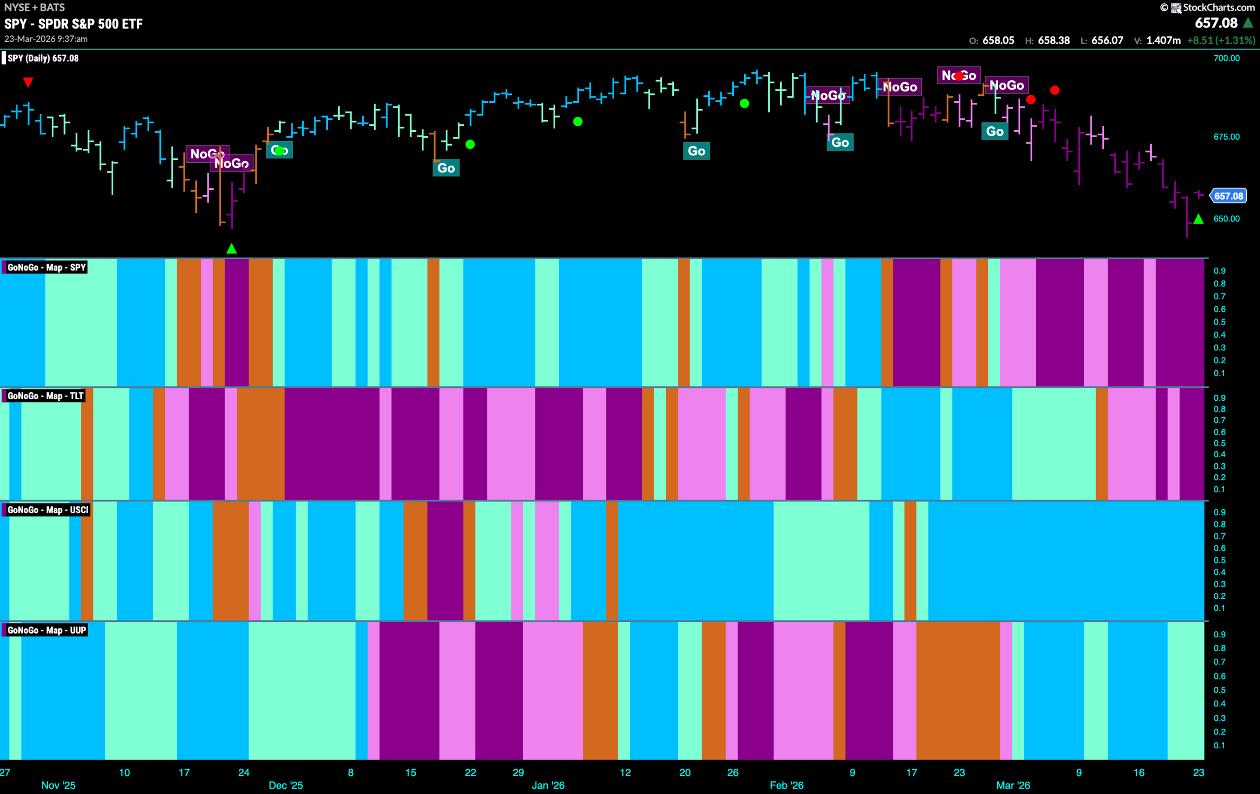
Good morning and welcome to this week’s Flight Path. The equity trend remained a “NoGo” with the indicator painting strong purple bars as price made an attempt at lower lows. Treasury bond prices remained in the “NoGo” trend as well and we saw strength as the indicator painted strong purple bars to end the week. U.S. commodities saw the “Go” trend continue with another week of uninterrupted bright blue bars and the dollar was able to hang on to its “Go” trend this week although we do see some weakness with paler aqua bars.
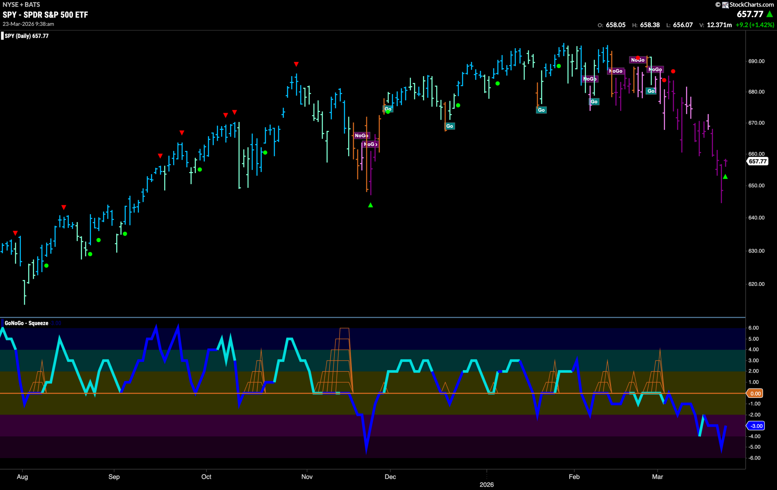
$SPY Tests Lows From Late 2025
The GoNoGo chart below shows that the “NoGo” was strong this week as price fell on strong purple bars. We note that price caught support as it threatened the lows from late last year. We will watch to see this week if price can rally from here. We see that GoNoGo Oscillator has risen out of oversold territory and volume is heavy as we see a NoGo Countertrend Correction Icon (green arrow) suggesting that price may struggle to go lower in the short term due to waning momentum.
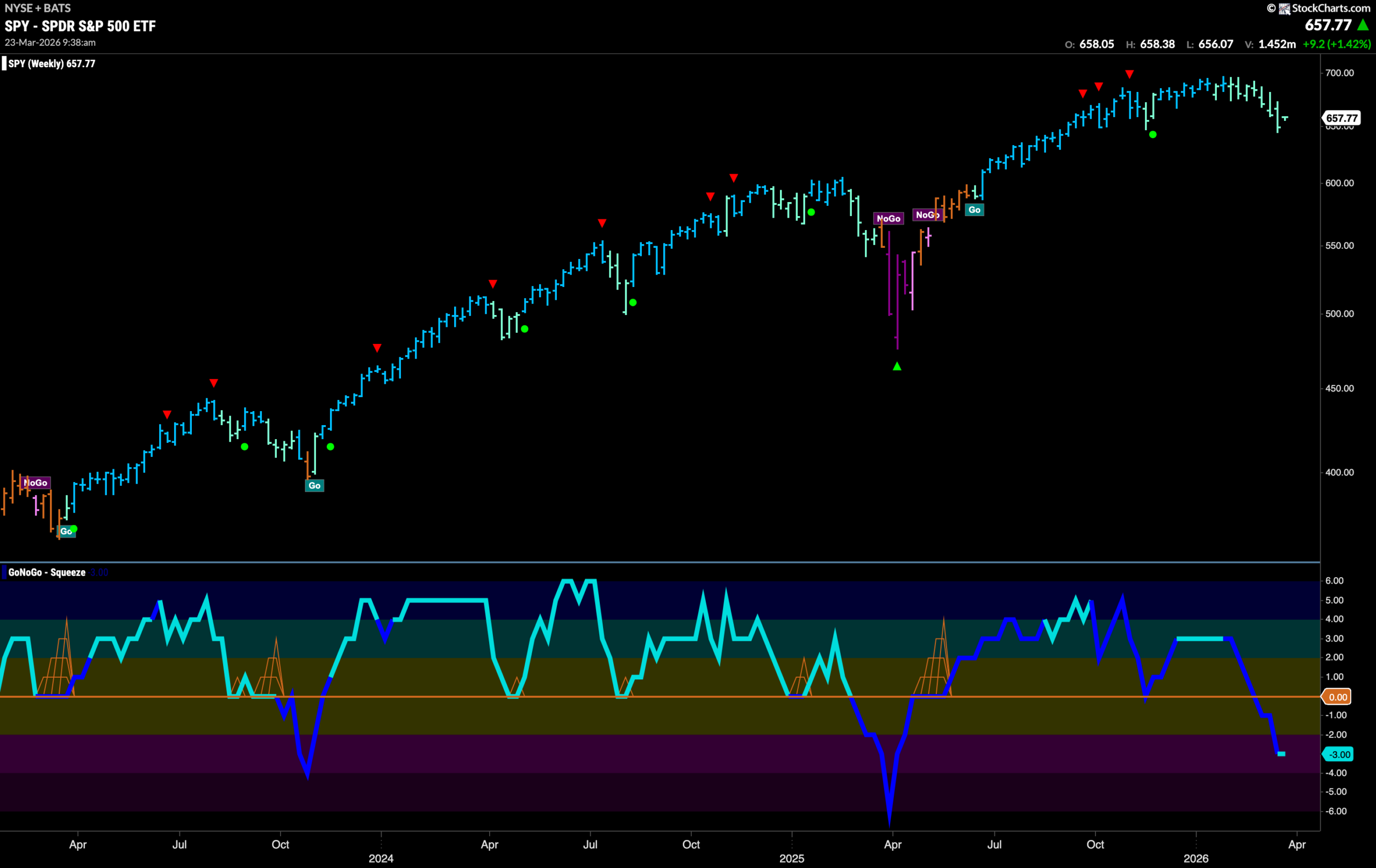
The weekly chart shows that on the large time frame we have seen sustained weakness as GoNoGo Trend paints another pale aqua bar. The “Go” trend is further threatened by GoNoGo Oscillator falling deeper into negative territory. It is now at a value of -3. With momentum out of step with the “Go” trend we will watch to see if there is further downside pressure on price.
Treasury Rates Enter Strong “Go” Trend
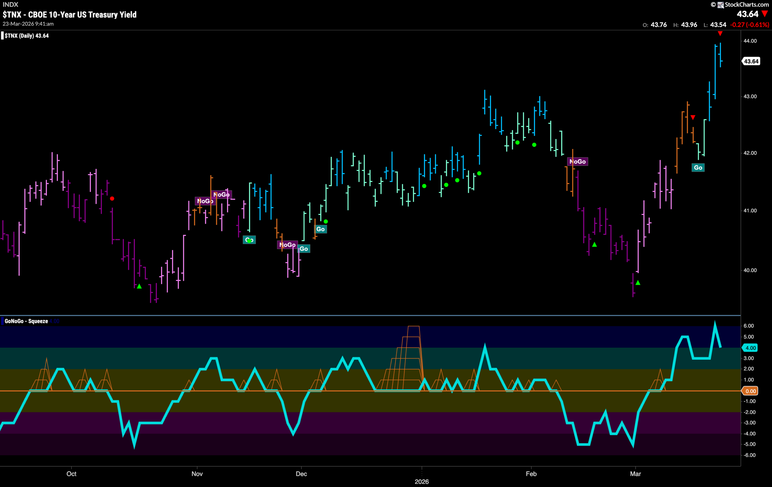
GoNoGo Trend shows the trend changed last week and rates entered a “Go” trend with strong blue bars making new highs. GoNoGo Oscillator rose quickly into overbought territory as enthusiasm was strong behind the change in trend. We will watch to see if rates can consolidate at these highs in the coming days. We will also pay close attention to the oscillator to see if it stays at or above the zero line.
Dollar Remains in “Go” Trend but Weakens
The chart below shows that the dollar remained in a “Go” trend but we do see weakness as the indicator paints a few paler aqua bars after price falls from the high and a Go Countertrend Correction Icon (red arrow). GoNoGo Oscillator has fallen to test the zero line from above and volume is heavy. It will be important for the health of the “Go” trend that momentum finds support and remains in positive territory. If it does, then we will expect the trend to continue. 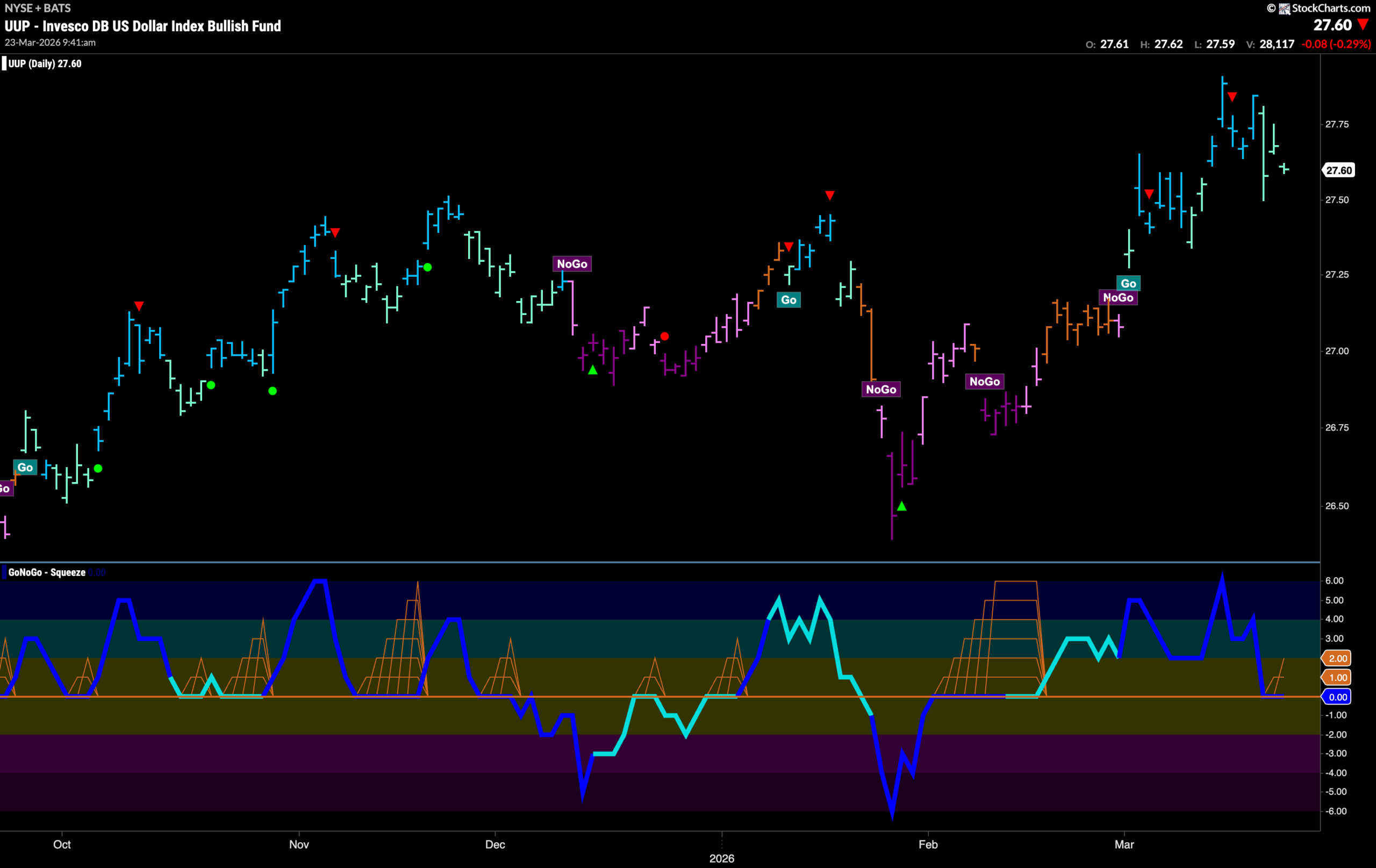
Oil Remains in “Go” Trend
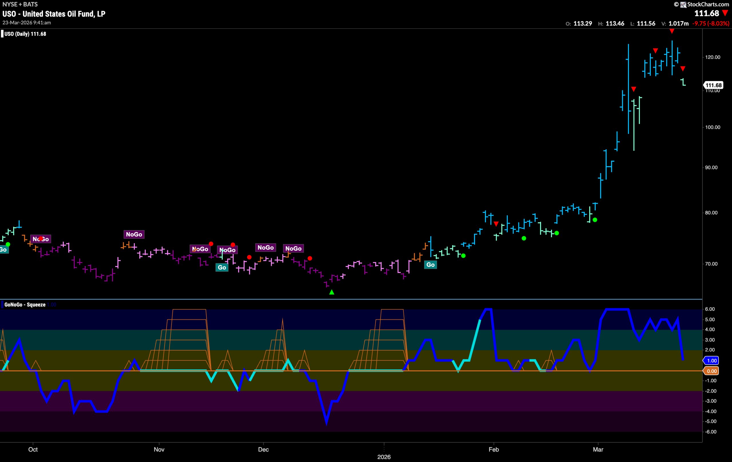
GoNoGo Trend shows that the “Go” trend remains for oil. After an incredible rise over the past month we see several Go Countertrend Correction Icons (red arrows) indicating that price may struggle to go higher in the short term. Indeed, on the current bar we see price falling on a weaker aqua color. This has caused GoNoGo Oscillator to fall sharply toward the zero line. We will watch closely to see if it finds support at that level should it get there. For this “Go” trend to thrive we will need to see momentum support found at zero and that would give us signs of Go Trend Continuation.
Gold Enters New “NoGo” Trend
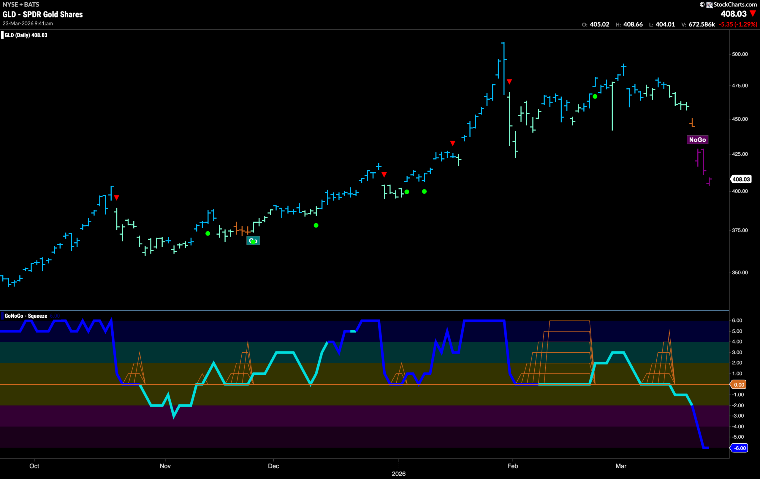
The trend in Gold has changed and after a single amber “Go Fish” bar we see a strong “NoGo” in place with the indicator painting purple bars. This came after GoNoGo Oscillator broke out of a small GoNoGo Squeeze into negative territory. Now, the oscillator is at an extreme oversold level on heavy volume. We will watch to see how much further the precious metal will fall in the coming days.
Sector RelMap
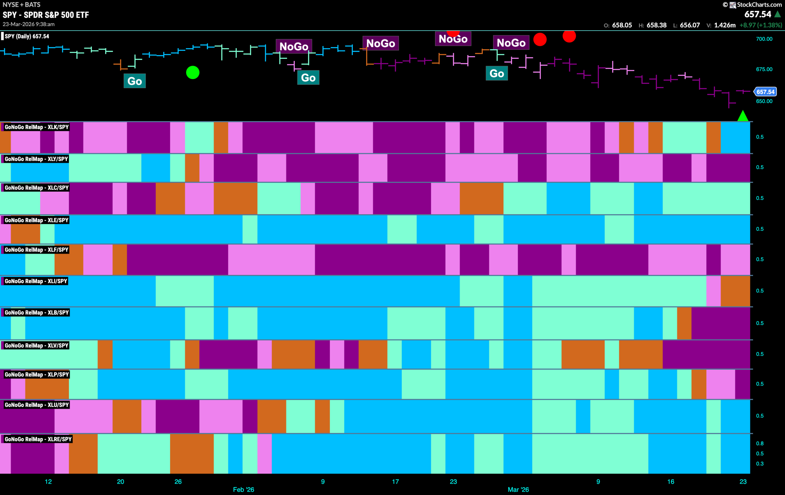
Below is the GoNoGo Sector RelMap. This GoNoGo RelMap applies the GoNoGo Trend to the relative strength ratios of the sectors to the base index. With this view we can get a sense of the relative out performance and relative underperformance of the sectors. 5 sectors are in relative “Go” trends. $XLK, XLC, $XLE, $XLU, and $XLRE are painting relative “Go” bars.
Technology Sub-Group RelMap
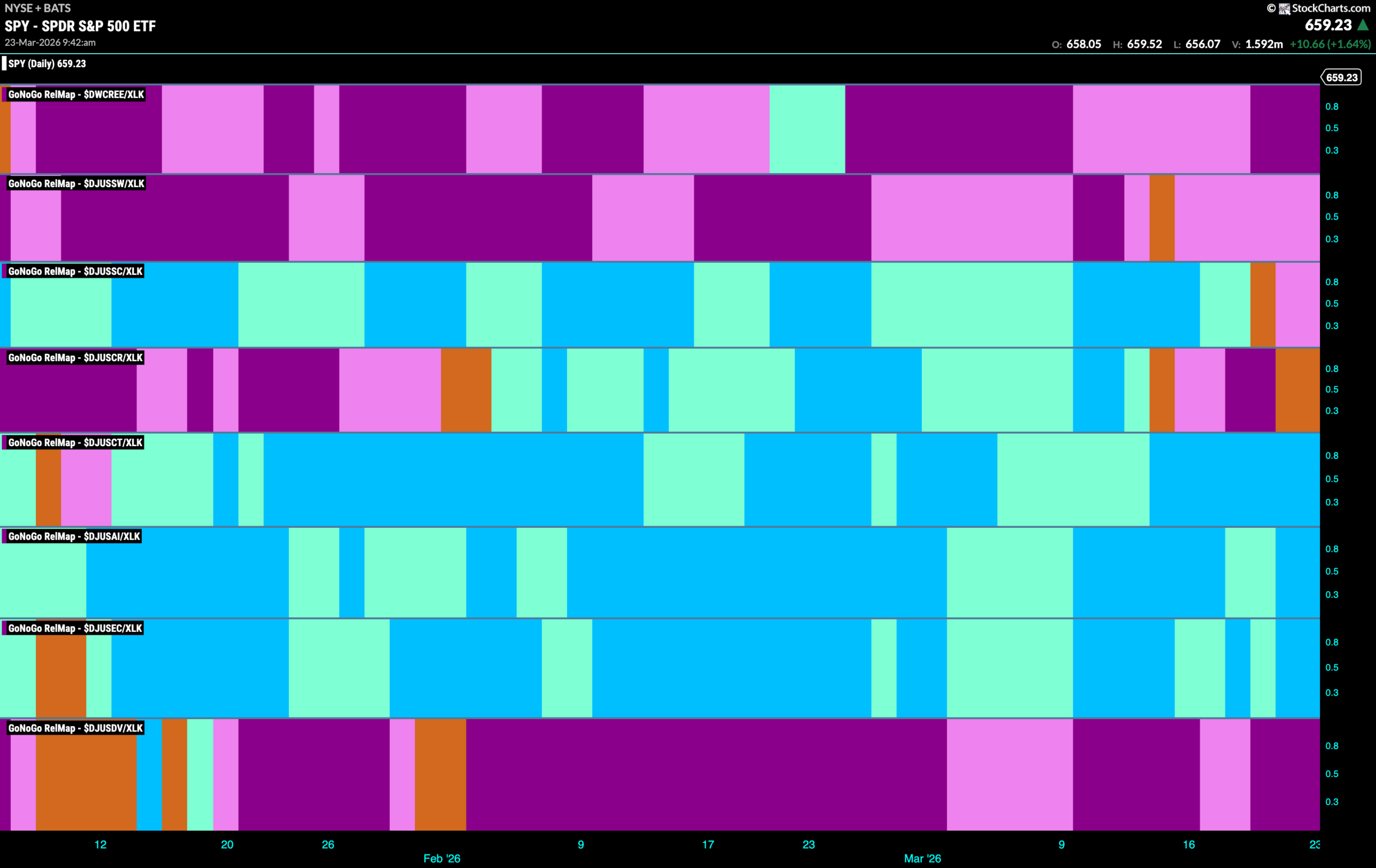
The chart below shows a relative trend breakdown of the sub groups within the technology sector this week. The Sub-Group RelMap plots the GoNoGo Trend of each sub index to the $XLK. We saw in the above GoNoGo Sector RelMap that $XLK is a new out-performer and paints strong relative “Go” bars. When we look at the below RelMap we can see that the electronic equipment index in the 6th panel is painting strong blue “Go” bars on a relative basis.
$CMBM Looks to Consolidate New High
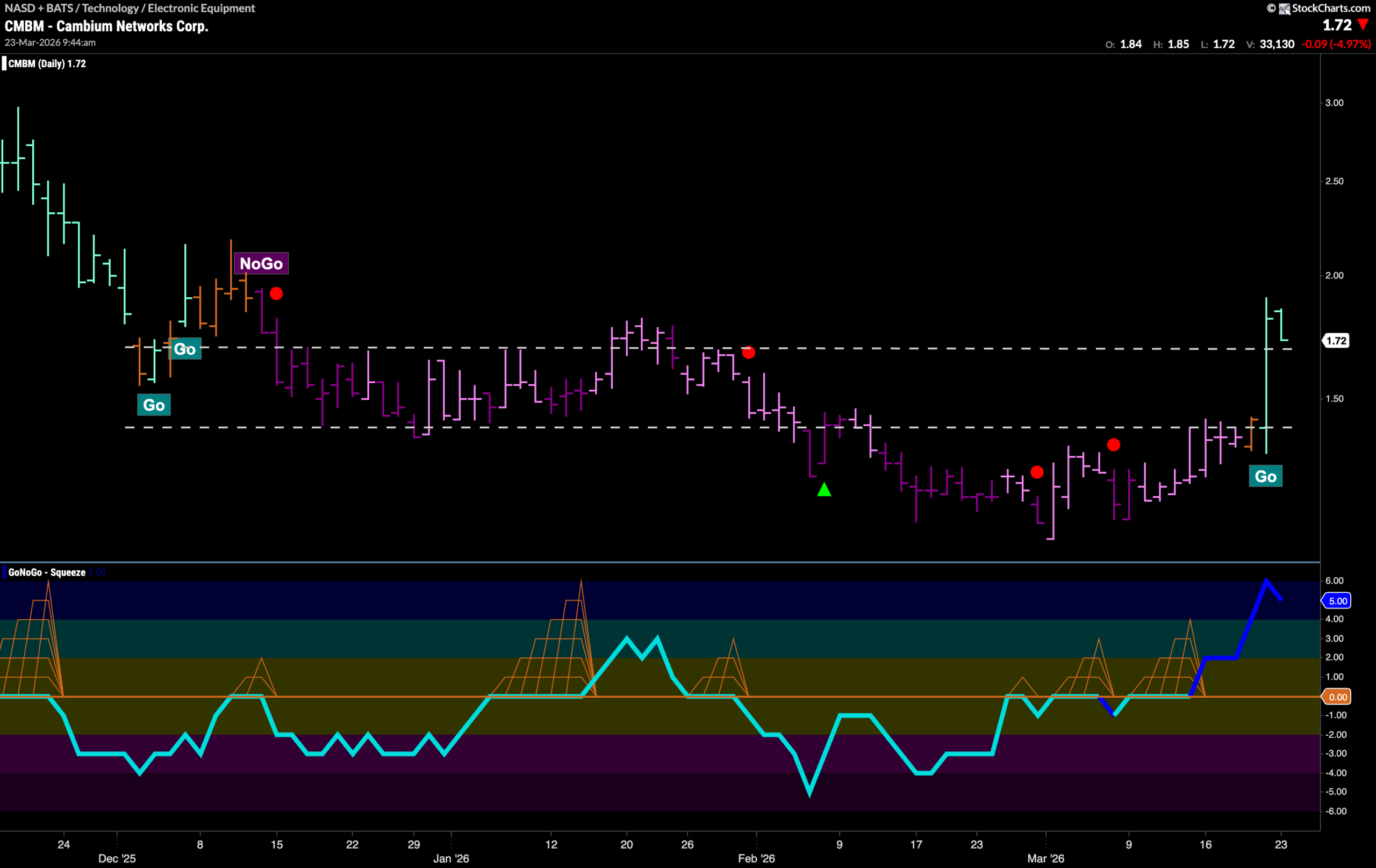
GoNoGo Trend shows that $CMBM has climbed out of the “NoGo” trend that it was in and now paints aqua bars. This comes after a lone amber “Go Fish” bar and after GoNoGo Oscillator broke sharply into negative territory out of multiple small GoNoGo Squeeze formations. In doing so, price has climbed through a heavy congestion area from earlier in the chart and is fighting to stay above it. The concept of polarity suggests that this level may act as support going forward as price tries to rally further from here.
$COHR Looks for Support in “Go” Trend
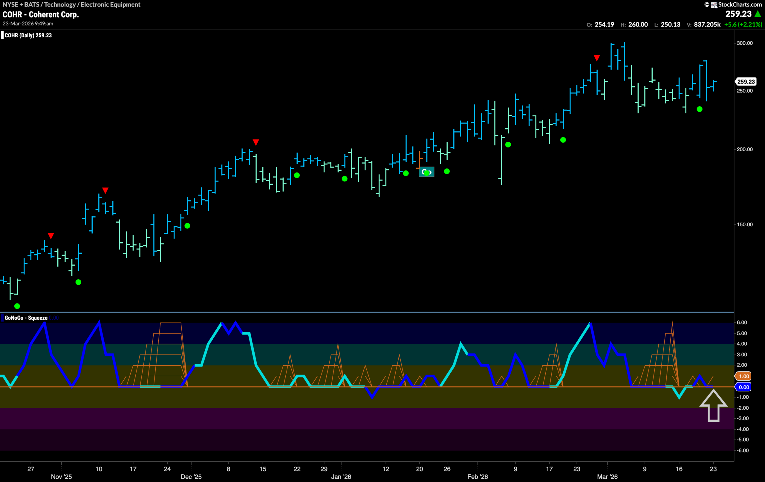
$COHR has been in a “Go” trend for several months and we have seen price make a series of higher highs and higher lows on blue and aqua bars. During this time, GoNoGo Oscillator has been finding support at the zero line each time it has been tested confirming the trend that we see in price. Most recently, price has moved sideways after the last high a few weeks ago and GoNoGo Oscillator has again fallen to test the zero line. We have seen it struggle to find support with a Max GoNoGo Squeeze reflecting the tug of war between buyers and sellers at this level. The oscillator is at zero again currently. We will watch to see if it can bounce back into positive territory again. If it does, that would be a good sign for the “Go” trend and we would look for price to make a run at a new high.