
Last Week, A Quick Review
If you’ve been away, really away, and all you know is that US Equities were up ~1% last week, then you’ve been extremely disciplined about your New Year’s digital detox resolution!
The S&P 500 began the holiday-shortened week with a 1% decline on Tuesday, which struck the alarms for financial news anchors. The S&P was down more than 10% from a record high it reached on January 3 which met their definitions of “a correction.” The definition is arbitrary, but it marked the most significant decline since the 2020 pandemic crash.
Then, early Thursday morning, Russia launched an invasion of Ukraine by land and air, the scale of which surprised markets, triggering a spike in volatility and outsized declines in European equities. The events represent a major escalation in the conflict, marking the worst security crisis Europe has witnessed in decades. While the world watches in terror as the situation continues to unfold through this weekend, markets appear nonplussed. Risk assets tumbled at the start of the Russian operation, but then miraculously recovered.
Markets hate uncertainty, and last week brought an end to speculation and the start of open war against Ukraine. The S&P 500 ended the week with a 0.8% gain after being down as much as 5.4% from the close of the prior week. The Nasdaq Composite (+1.1%) and Russell 2000 (+1.6%) each gained over 1.0% after being down as much 7.1% and 5.7%, respectively. The Dow Jones Industrial Average closed nearly flat after being down 5.3% intraweek.
So…“Tweezer Bottom” or “Dead Cat Bounce?”
Today is the last day of the month and the big question on everyone’s mind is whether this late February rally was a countertrend reflexive rebound within a structural downtrend, or if markets have placed a strategic bottom against which we can place new trades? In this week’s issue of Flight Path from GoNoGo Research, we will look at the weight of the evidence and consider a trading plan for both possible outcomes.
“If it’s obvious, its obviously wrong.” – Joe Granville
Let’s start with the notion that the bottom is in and the bulls are back in charge. Liz Ann Sonders tweeted on Friday that AAII investor bearish sentiment rose to its highest level since 2013. As Sam Stovall once shared regarding the contrarian signals of sentiment extremes: “If everybody’s optimistic, who is left to buy? If everybody’s pessimistic, who’s left to sell?”
Couple the extremely bearish sentiment with the purported head & shoulders topping pattern that was the subject of every trader tweet for the past several choppy weeks and it starts to feel like everyone moved to the same bearish side of the boat just in time for Mr. Market to flip the other direction and toss investors overboard.

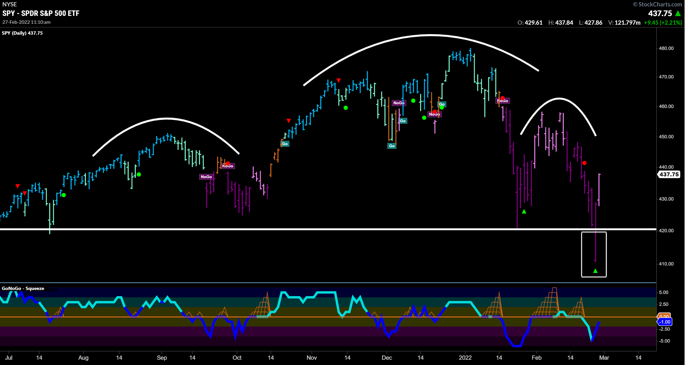
Thursday’s gap down at the open sent the S&P well below the support of January’s low (highlighted in white box). While recording the weekly GoNoGo show for StockChartsTV on Thursday morning, the weight of the evidence was strongly to the downside: a) Strong “NoGo” trend, b) oversold conditions in a negative GoNoGo Oscillator, c) the breakdown through key support (white line at 420).
Now, in view of the rally Thursday afternoon and all through Friday’s session, this failed move could be a massive Bear Trap. A bear trap, (or failed breakdown) is when price breaks a major support level, only to quickly reclaim it. Bear traps often lead to sharp moves higher, which is an arguably bullish setup for this week’s session.
Knowing when we are wrong allows us to exit quickly with a small loss. For anyone shorting the S&P, breaking back above the January lows of 4260 was the clear point to cover. Alan Shaw and the technical team of Smith Barney (now Citi) have rightly observed that from failed moves come fast moves. The “NoGo” trend conditions are in weak form on Friday’s pink bar. If GoNoGo Oscillator can break through the zero-line achieving positive momentum, we could see a reversal of trend conditions. The composite blend of trend indicators shifting to aqua, or blue would allow us to lean into a “Go” trend reversal for large, outsized gains. And the same 4250 level will define a clear exit.
From a behavioral standpoint, the trading activity last week was a great case study. Candlestick charting enthusiasts have noted the “hammer” formation on weekly charts all weekend. What they are referring to is the relative proximity of the open and closing price of the week, but the long wick of the candle dropping to significant lows. Last week’s session closed at the highs of the week after retracing all the large losses on Thursday’s gap down. See the white box highlighting the green candle on the weekly chart below.

The Weight of the Evidence
What is clear about the US Equity markets’ trend is that they are down. A series of lower highs and lower lows. GoNoGo Oscillator is still negative, showing bearish momentum and while the trend condition is in its weaker pink form, it is still a “NoGo.” Consider the Nasdaq 100 which had the most dramatic reversal last week. The chart below is perhaps best considered guilty until proven innocent:

Potentially the most frustrating outcome of last week’s volatile price action would be no resolution. Meaning that – at the index level – markets could continue to grind out choppy weeks and fuel further rotation in what has already been a difficult year for investors. Outcomes are not always binary. To better understand that rotation, we can look to a sector heat map that displays relative trends of each sector against the performance of the benchmark index.
S&P 500 Sector Relative Strength
On an absolute basis, 8 of the 11 sectors closed higher, paced by the defensive-oriented health care (+2.7%), real estate (+2.7%), and utilities (+2.0%) sectors. The consumer discretionary (-2.2%), consumer staples (-0.3%), and financials (-0.3%) sectors closed lower. From a relative strength perspective, the GoNoGo Sector Relmap shows industrials and materials were indecisive, but cyclical sectors largely maintained their outperformance of the benchmark index while growth sectors (tech, communications, and discretionary) underperformed. Healthcare, $XLV, noticeably gained strong blue “Go” conditions relative to the S&P – offering strong absolute and relative performance to end last week’s session.

Oil Touches $100
The price of U.S. crude oil briefly topped $100 per barrel on Thursday morning—the first time that threshold has been reached since 2014. The spike came in the hours after the Russia-Ukraine war broke out, and the price retreated later in the day before ending the week little changed overall. The retracement in commodity prices corroborated the hopes that inflation might not directly worsen in the wake of the Russian invasion. Notably, WTI crude futures settled the week higher by just 0.4% at $91.59 per barrel. See the daily GoNoGo Chart below which illustrates strong blue Go trend conditions, yet the oscillator is riding the zero line and building the grid of GoNoGo Squeeze on heavy volume:

Consequences & Sanctions
In response to the invasion of Ukraine, the U.S. and other Western countries imposed sanctions, targeting Russia’s major banks and restricting exports of technology. Yet the sanctions stopped short of removing Russia from the SWIFT payment system (the system by which global payments are made) and cutting off energy purchases from Russia. Because oil and energy products were not included in the package of sanctions, oil prices eased some, and Russia’s RTS Index tanked 33% – displayed on the weekly GoNoGo Chart below:

Invasion Inflation Relation
Just because oil and energy exports were not sanctioned, the market is not miraculously in the clear regarding inflation. The direct economic impact to the US and allies may have been blunted, but inflation could stay higher for longer. The PCE Price Index, a measure of inflation that the U.S. Federal Reserve uses to help set monetary policy climbed at the highest monthly rate since 1983 – 0.6% m/m in January, leaving it up 6.1% on a year-over-year basis. And, on Friday the government shared that core personal consumption expenditures price index rose at an annual rate of 5.2% in January. The same report showed that consumer spending rose 2.1%.
Trade between the U.S. and Russia is relatively insignificant; however, Russia is a major commodities producer and exporter. Europe gets nearly 40% of its natural gas and 25% of its oil from Russia. Together with Ukraine, Russia accounts for about a quarter of global wheat exports. Thus, the primary risk is a disruption in the supply of energy and other agricultural commodities, which could cause prices to accelerate higher and drive inflation higher for longer.
Below is a daily chart of Wheat Futures which shot higher by 10.35% last week (nearly 17% at Thursday’s high):

The Russia-Ukraine conflict complicates central banks’ efforts to tame inflation because it exacerbates the same problem policymakers are trying to address, at a time that they would normally ease policy to help growth. Last week, the 2-yr yield rose 12 basis points to 1.59% on continued expectations for the Fed to hike rates at least six times in the near term. The 10-yr yield rose six basis points to 1.99%. See the $TNX daily chart below of 10-yr Yields:

Additionally, the US Dollar had a strong week, gaining substantially as the Ukraine situation unfolded. However, with risk-on conditions coming back in the closing stages of the week, the Dollar gave some of its gains back. The $DXY index finally closed the week 0.5% higher at 96.541, but is showing renewed strength in premarket trading:

Mining and Minerals
A few trends to keep an eye on this week are mining and industrial metals; specifically, uranium, and copper. See the chart below of $URNM. The North Shore Global Uranium Mining ETF is made up of a basket of companies that are involved in the mining, exploration, development, and production of uranium as well as companies that hold physical uranium, uranium royalties, or other non-mining assets. Price action was strong to the upside on Thursday and Friday which helped $URNM strike neutral trend conditions in a final amber bar. Most notably, GoNoGo Oscillator broke positive on heavy volume ending a max squeeze adding potential for a swift move higher.

And here is a look at Freeport-McMoRan, Inc $FCX which is in a strong blue “Go” trend, resolving a 10-month base with a weekly closing high that hasn’t been hit in a decade. GoNoGo Oscillator is simultaneously rallying positive off the zero-line on heavy volume.

Freeport-McMoRan Inc. (FCX) is a mining company operating geographical assets in Pheonix with proven and probable reserves of copper, gold, and molybdenum, and traded copper producer. The Company’s segments include refined copper products, copper in concentrate, gold, molybdenum, oil, and others.
In fact, the metals and mining industry is performing solidly on both an absolute and relative basis. Below is a look at $XME/SPY – the relative ratio of the metals and mining ETF against the S&P 500 showing a strong week of relative gains above prior resistance on strong blue “Go” trend conditions. GoNoGo Oscillator has rallied positive on heavy volume:

Conclusions
The bearish narrative may have been overdone last week. Short-sellers may have been caught in a grizzly bear trap and the risk-on conditions were pronounced late in the week. However, rotation away from growth sectors, rising inflation, and an appreciating US dollar remain important catalysts to this environment. GoNoGo Charts are designed to keep investors focused on the trend and right now, the alternatives to passive indexing are compelling. Forecasting that the bottom is in while the US Equity Indexes are still in NoGo trends could turn out to be a profitable gamble… but as the legendary Merrill Lynch Chief strategist and first President of the Market Technicians Association once said:
Being too far ahead of your time is indistinguishable from being wrong. - Robert J. Farrell