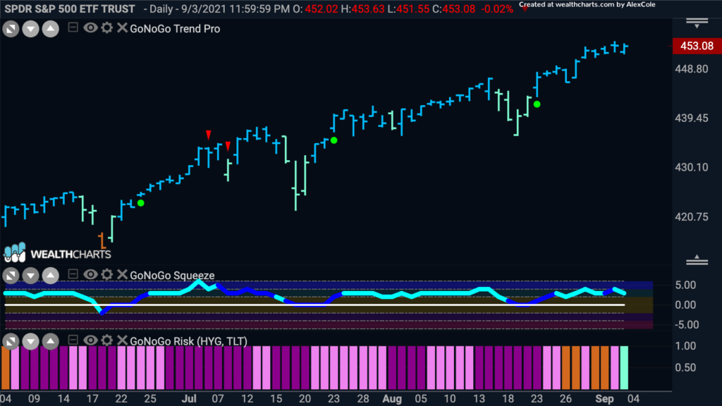
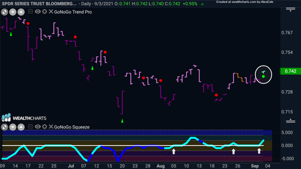
To all those in the U.S. happy Labor Day! After the long weekend its time for Flight Path. Last week we noted that the stock market continues to bounce higher with investors happy to keep allocating money toward the domestic U.S. market. One of the measures we like to look at with GoNoGo Charts is the GoNoGo Trend and Oscillator applied to the ratio of high yield to junk bonds. Using this ratio as a proxy for risk we can comment on the enthusiasm we see in investors taking on riskier investments. Although the major indices have continued to march higher there has been talk of the impending correction that many believe has to come. Perhaps this is why the chart below shows that the GoNoGo Trend on the ratio of $HYG/$TLT has been in a “NoGo” since mid June. However, as if investors have shrugged off these concerns, we see a new “Go” bar painted. The GoNoGo Osscillator has hinted at this changed since breaking above the zero line and find support at that level since.
A Look Across the Assets
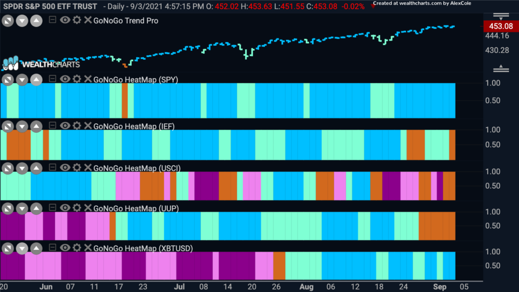
The GoNoGo Charts Asset Map has looked similar for the last few weeks. The “Go” trends are strong in Equities and Bitcoin. Treasuries in the second panel, slipped again to end the week with an amber bar just like the week before. The dollar continues to paint amber “Go Fish” bars as price retreats and the “Go” trend is threatened. In the thrid panel, we see commodities struggle to maintain the “NoGo” trend. There is definitely uncdertainty surrounding the commodities as talks of inflation swirl.
GoNoGo Risk
One of the GoNoGo indicators that helps institutional investors understand a market regime is the GoNoGo Risk. This indicator, shown in the bottom panel of the chart below, allows the user to get a visual sense of the GoNoGo Trend of risk. In this case, the risk proxy being used is the ratio of $HYG/$TLT. As we saw in the more traditional chart at the top of this note, the trend in the $HYG/$TLT risk proxy has entered a “Go”. In this way, we can get see that the market is moving back to a short term risk on environment without having to move away from the GoNoGo price chart of $SPY in the main panel.
Understanding Utilities
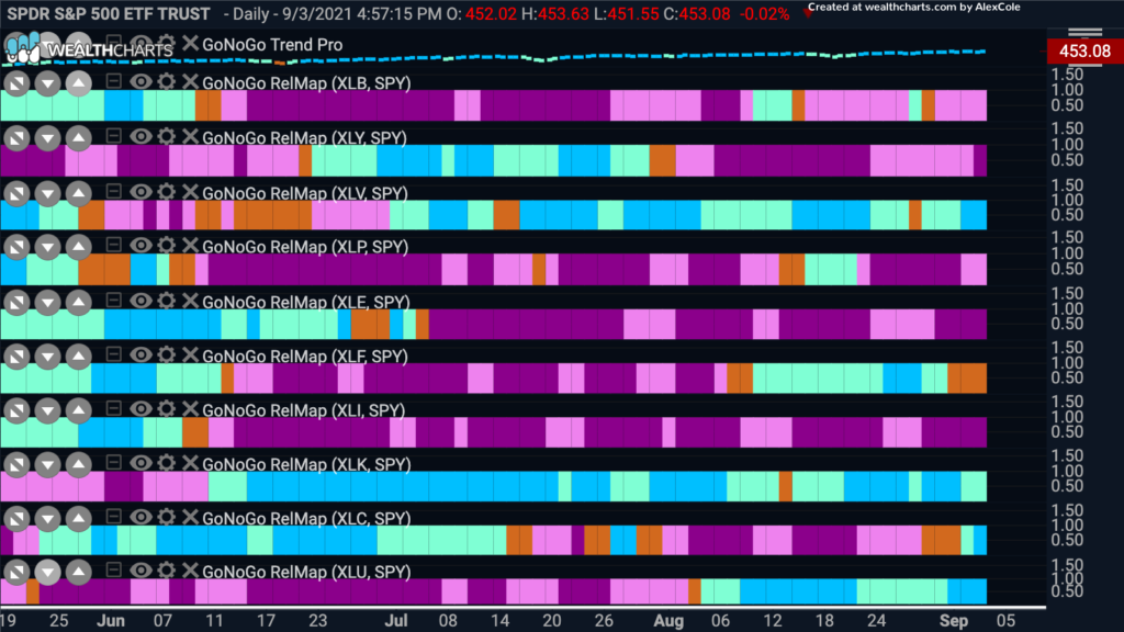
Given that we can look to the equity market for opportunities based on the above analysis, let’s take a look at a GoNoGo Sector RelMap to see where the leaders are. What is driving the gains in the overal stock market? A quick scan tells us that 4 of the sectors are relatively outperforming the base index to end the week. Healthcare, technology, utilities and communications are all painting blue “Go” bars.
NRG Ready to Move Higher
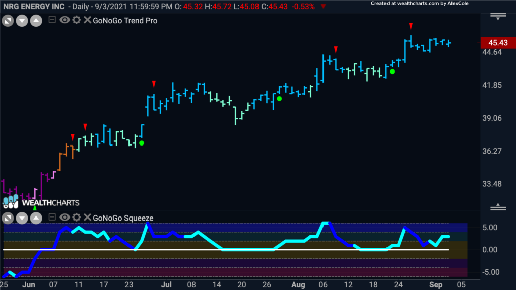
NRG Energy Inc is a utilities company that has been talked about recently as a good value buy. With a trailing 12 month P/E around $10 it seems worth snapping up. Let’s take a look at what the technicals say. Below is a daily GoNoGo Chart. The trend is a “Go” with the indicator painting strong blue or aqua bars since June. We see a series of higher highs and higher lows as the GoNoGo Oscillator has been supported by the zero line the entire time.
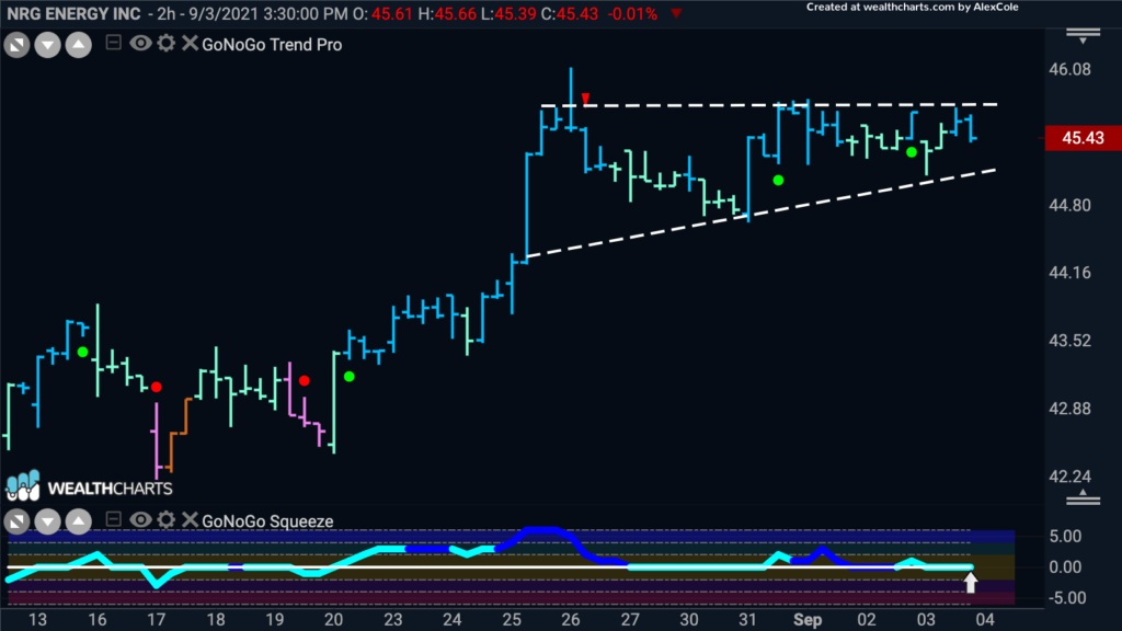
Let’s zoom in to a shorter timeframe for possible entry ideas. Below is a 2hr GoNoGo Chart. Since the most recent jump higher in the middle of August, price has moved mostly sideways as it consolidates allowing investors to digest gains. As the price action allows us to see an ascending triangle, the GoNoGo Oscillator has been mostly at or finding support at the zero line. If it can rally into positive territory, we will see a fresh Go Trend Continuation green circle appear under the price bar suggesting that momentum has come back in the direction of the trend. Price will likely then make an attack on the prior high.
What of That Inflation Talk?
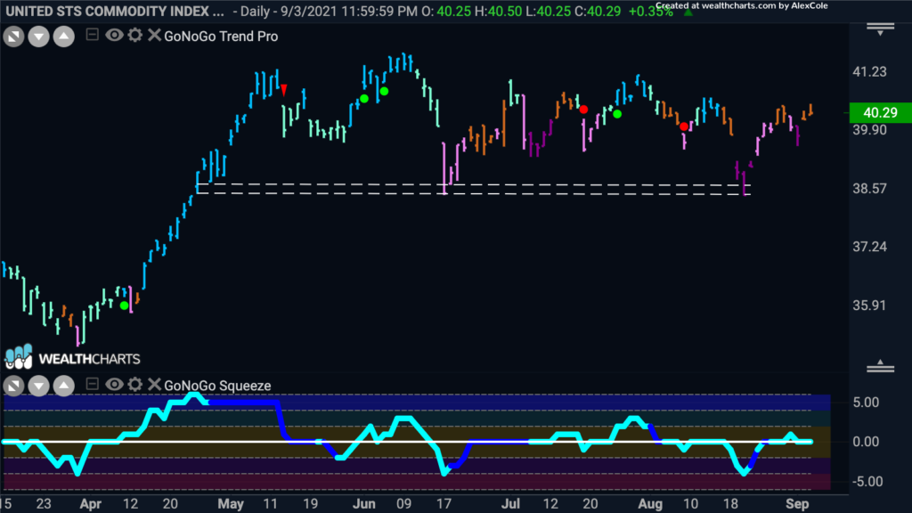
There are still those that fear a correction and we’ll take a look at some commodity ideas as they have been traditionally used as a hedge against rising inflation. The chart below shows the daily GoNoGo chart of the $USCI commodity index. As you can see, price action has been very choppy of late. There does seem to be support at the levels indicated by the dashed white lines but the GoNoGo Trend is struggling to maintain a consistent “Go” or “NoGo”.
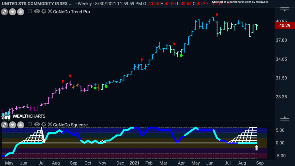
This time let’s zoom out, to get a sense of the larger trend. Below is the weekly chart of the same $USCI and we see that the trend is still a “Go”. As price has moved sideways the GoNoGo Oscillator has fallen to the zero line allowing the climbing grid of the GoNoGo Squeeze to rise to its extreme. All else being equal we expect the oscillator to break out of the squeeze into positive territory which would lead to price moving higher. That being said, we could then look to the daily chart for early signs of a move back to a “Go” trend.
Going For Gold
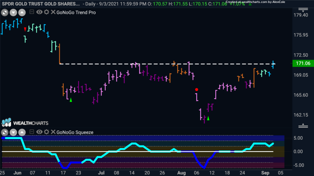
With bullish expectations for commodities, we’ll turn to a chart of $GLD, the SPDR Gold Trust. Price has wallowed in a “NoGo” correction for the past few months but more recently there are signs of life. The GoNoGo Oscillator recently broke into positive territory after having ridden the zero line for several bars. The GoNoGo Trend followed by painting amber “Go Fish” bars and then aqua and blue “Go” bars. The current bar is testing levels that have acted as resistance in the past. We will look to see if price can stay above these levels and the “Go” trend can take hold.
