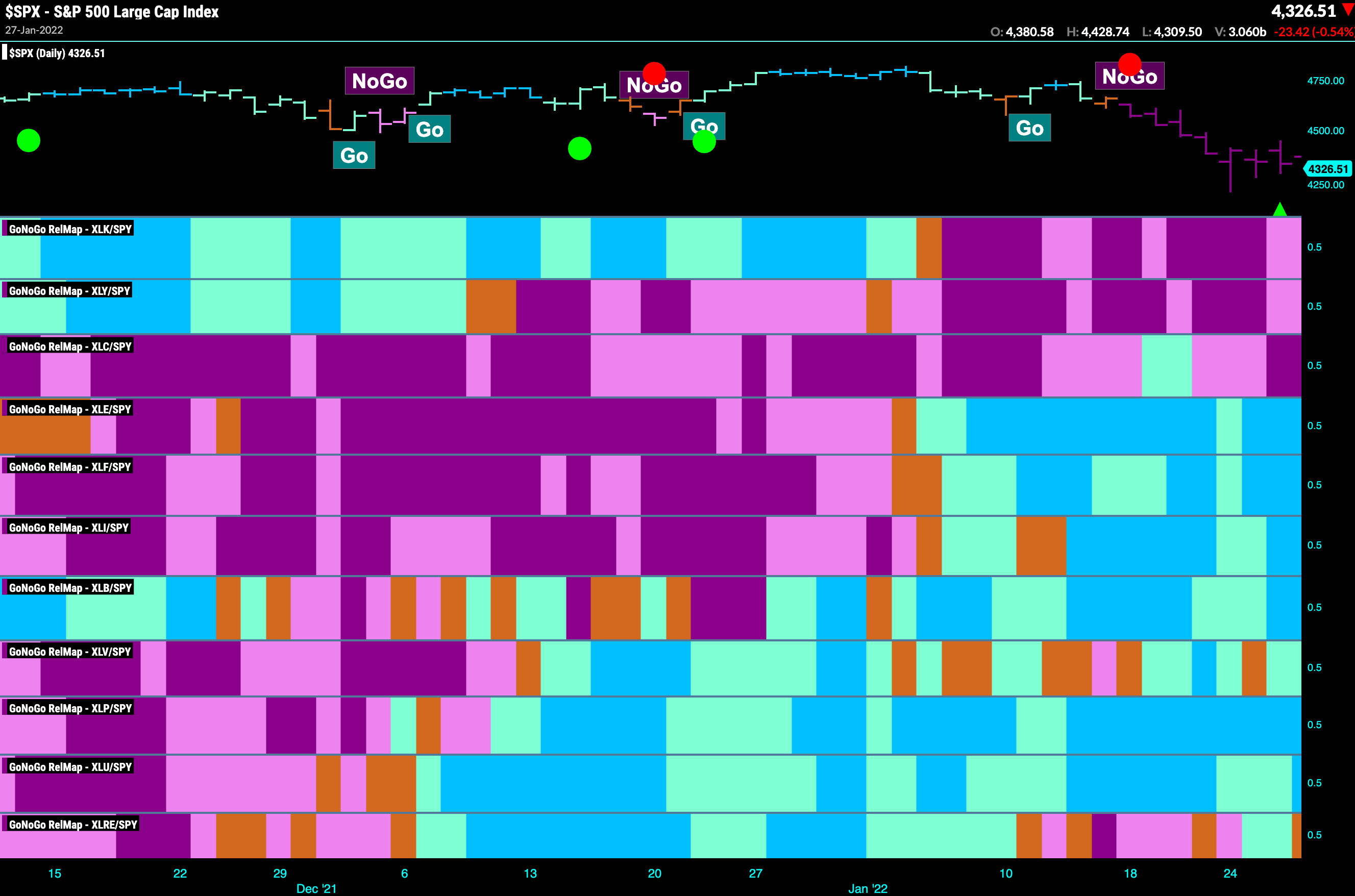
GoNoGo Maps® allow the investor to visualize the relative trend for multiple securities at one time using a “heat map” visual of the securities’ data. The investor can easily pick out leaders and laggards according to asset class, global index, sectors, or the securities in a given portfolio. Between uncorrelated assets, it is easy to see rotation of leadership as the bright blue bullish trend appears for different securities at various points in the time series. The GoNoGo Maps® determine where the “Go” and “NoGo” trends are, helping investors make timely attribution decisions based on GoNoGo Trend identification.
GoNoGo Maps® were developed to quickly screen the market from a top down approach. Investors could compare leadership of asset classes, then drill into sectors, and then find the highest probability trades within individual securities. Alternatively, an investor could see current investments in their portfolio at a glance and rebalance their positioning based on the strongest to weakest trending securities. Finally, the GoNoGo Rel Map®, pictured below, was developed to show the relative GoNoGo Trend for selected securities as compared to the benchmark. In this example, sector ETFs relative to the S&P 500 Index.